In the exercises on this site, type out the code in the exercises, rather than cutting and pasting it for this site: this will help you memorize the tags and concepts.
Build The Main Page Structure
Inside the BODY of your document, put in a HEADER element, a MAIN element, and a FOOTER element.
Use your Visual Studio Code shortcuts to do this: type the start of the tag and then press tab.
<header></header>

<main></main>

<footer></footer>
These will be the three main structures on the site pages.
The structure I’m employing here is common: in a lot of sites, the header and footer are the same from page to page, while content that changes from page to page will typically appear inside the MAIN element.
Build The Header
Inside the header, add an H1 and a list-based NAV menu for the site. Lists are routinely used for menus because a menu is, after all, a list of options.
Shortcut for the list: if you put the link words on their own lines, select that block of text, and then wrap the lines, this equation will do it: nav>ul>li*>a[href=”#”].
<header>

  <h1>Guitar Mania</h1>

 <nav>
   <ul>
    <li><a href="#">Guitars</a></li>
    <li><a href="#">Amps</a></li>
    <li><a href="#">Players</a></li>
    <li><a href="#">Lessons</a></li>
    <li><a href="#">Search</a></li>
    <li><a href="#">Contact</a></li>
  </ul>
 </nav>

</header>
Test your page in the browser. Make sure that this content is showing up. If it isn’t, make sure that you saved your file.
Examine The Main Content Area
Before we build the MAIN content area, let’s review some of the layout screenshots. At this stage, it’s important to get a sense of how our content needs to be organized. In order to make our styling easiest, we need to look for repeating patterns.
Ultimately, there are five sections in the main content area:
- Three sections, each consisting of a heading and three “guitar boxes”
- A featured section, with one heading and a “guitar box”
- A contact form
Phone View
In other words, with the phone view the main elements are stacked in a single column down the page.
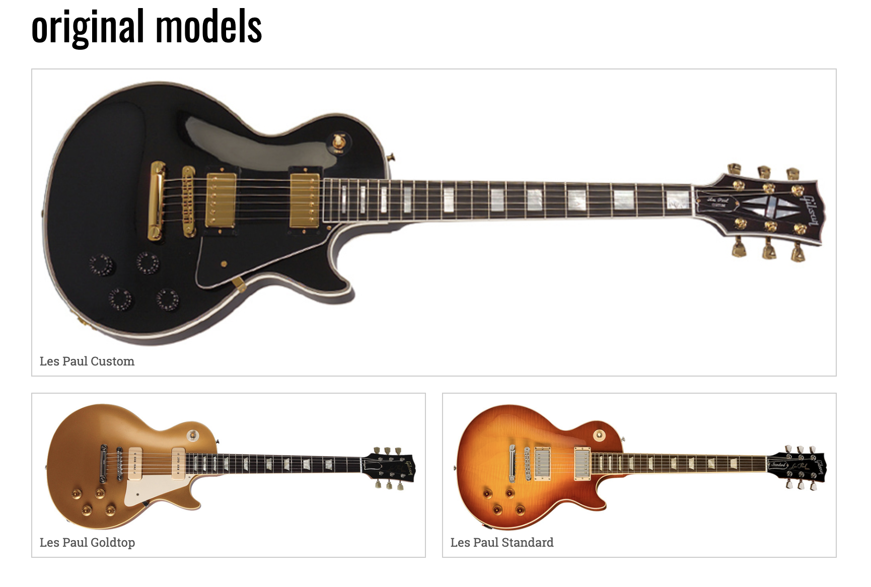
Medium View
In the medium (or “tablet” size) view, we see that the three models sections are arranged like this:
In this view, also, the featured area and form are centered, but still keep the stacked layout from the phone view:
Large View
In the large (desktop) view, each model’s section is arranged in a row of three columns:

As well, the featured area and the form go side-by-side:

Build The Main Content Area
Now we’ll build and test modules, then copy and paste them and change the textual content and image src and alt attributes.
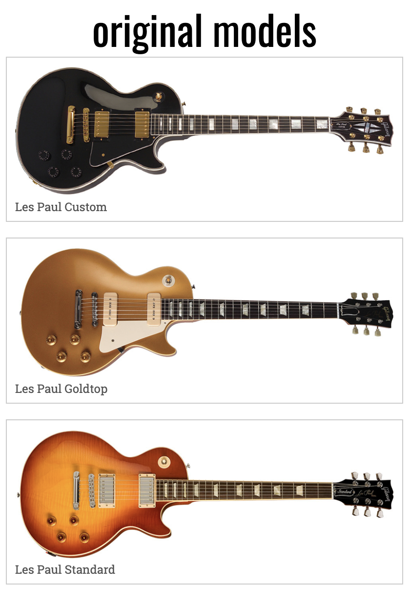
Start with the first section in the main area:
<section class="models-original">

  <h2>Original Models</h2>

  <div class="guitar-small">
      <img src="images/custom.jpg" alt="Les Paul Custom">
      <h3>Les Paul Custom</h3>
  </div>

</section>
Test the page in a browser.
Next, wrap an anchor tag around the image and h3. The idea is that the user will be able to click on either the image or the guitar name and be then taken to a page about that particular guitar model (although we are just using testing “#” links for now):
<div class="guitar-small">
  <a href="#">
    <img src="images/custom.jpg" alt="Les Paul Custom">
    <h3>Les Paul Custom</h3>
  </a>
</div>
Incidentally, even though the anchor tag is an inline element, this use of an inline element wrapping around a block element is in fact allowed in HTML5 (for links, that is).
Test the page again. Make sure that the cursor changes when you mouse over the image and the guitar name.
If everything’s working with the .guitar-small DIV, copy it and paste it twice more right after the first one (but while still inside the SECTION).
With each of these new .guitar-small DIVs, change the h3, the img src, and the img alt attributes. Make sure that the next two guitars are the Les Paul Goldtop and the Les Paul Standard.
Be sure to test the page once you’ve built this first section.
Build the Next Two Sections
Now copy that section and paste it twice.
Give the 1st copied section the following properties:
- Section Class: models-budget
- H2 Text: Budget Models
- Guitars: Junior, Junior (TV Yellow), Special
For the second copied section, use the following properties:
- Section Class: models-artist
- H2 Text: Artist Models
- Guitars: Alex Lifeson, Peter Frampton, Ace Frehley
Test the page. Make sure that all the guitar names and images are correct.
Build The Fourth Section
For the fourth section, copy a previous SECTION, and delete two of the .guitar-small DIVs.
Change the SECTION class to models-featured
Change the H2 text to featured.
Change the DIV class to guitar-big
Use the es175.jpg image.
For the paragraph below the image, use this sentence: It’s not a Les Paul, and this is a Les Paul Site, but the ES-175 is such a beautiful piece of luthiery that we are featuring it anyway.
Add The Contact Form
For the contact form, use this code. Feel free to just copy and paste this block of code: we will explore forms in detail in a later class.
<form action="#" class="contact-form">

  <h2>Contact The Editors</h2>

  <label for="firstname"">First Name</label>
  <input type="text" id="firstname" name="first-name>

  <label for="lastname">Last Name</label>
  <input type="text" id="lastname"  name="last-name">

  <label for="email" name="email">Email</label>
  <input type="email" id="email" name="email">

  <label for="comments">Comments</label>
  <textarea name="comments" id="comments"></textarea>

  <input type="submit" value = "Submit">
</form>
We will cover forms in detail in a later class, so I’m not going to go into what these elements do at this point. Load the page, and the difference between a label, an input, and a textarea should be reasonably clear, though.
Finally, for reasons that will become clear later when we style this area, wrap this new SECTION and FORM in a DIV with a class of featured-form
Ultimately, the code for this part of the page should now look like this.
<div class="featured-form">

  <section class="models-featured">

    <h2>Featured</h2>

    <div class="guitar-big">

      <img src="images/es175.jpg" alt="ES-175">

      <p>It's not a Les Paul, and this is a Les Paul Site, but the ES-175 is such a beautiful piece of luthiery that we are featuring it anyway.</p>
    </div>

  </section>

  <form action="#" class="contact-form">

    <h2>Contact The Editors</h2>

    <label for="firstname" name="first-name">First Name</label>
    <input type="text" id="firstname">

    <label for="lastname" name="last-name">Last Name</label>
    <input type="text" id="lastname">

    <label for="email" name="email">Email</label>
    <input type="email" id="email">

    <label for="comments">Comments</label>
    <textarea name="comments" id="comments"></textarea>
    <input type="submit" value="Submit">
  </form>

</div>
Build the Footer
After all the above markup, making the footer will be easy. We’re just going to add a copyright notice and a backtotop link.
First, add this code to the footer.
<footer>
  <small>Guitar Images courtesy of Gibson Brands, 2013.<br>Used with Permission.</small>
  <a href="#page">top</a>
</footer>
The SMALL tag is used for legalese: the kind of stuff that appears in fine or small print.
You will probably wonder what we’re doing with the HREF value. To make a link within a page, we use a # symbol as the first part of the HREF value.
Then we need to put an ID attribute on the HTML element we want the user to go to on click.
In this case, we might as well put the ID on the BODY of the document.
<body id="page">
That ID, then, becomes the “landing point” for our top link. Since it’s on the opening BODY tag, the browser moves to the top of the page.
Test it in the browser, of course.
Now we are ready to move on to what is typically the first task in our styling of the content: making our images responsive to screen size.