In this exercise, you will need to use container queries.
First, please download the required images.
Then, please examine the screenshots.
And finally, watch this short Loom video.
If this is a test, you may use your notes or the Internet. Talking with anyone other than me, an IA, or other exam invigilator will result a mark of zero.
Page Layout
At all sizes, there will be a menu of four buttons on the left, arranged as in this screenshot.
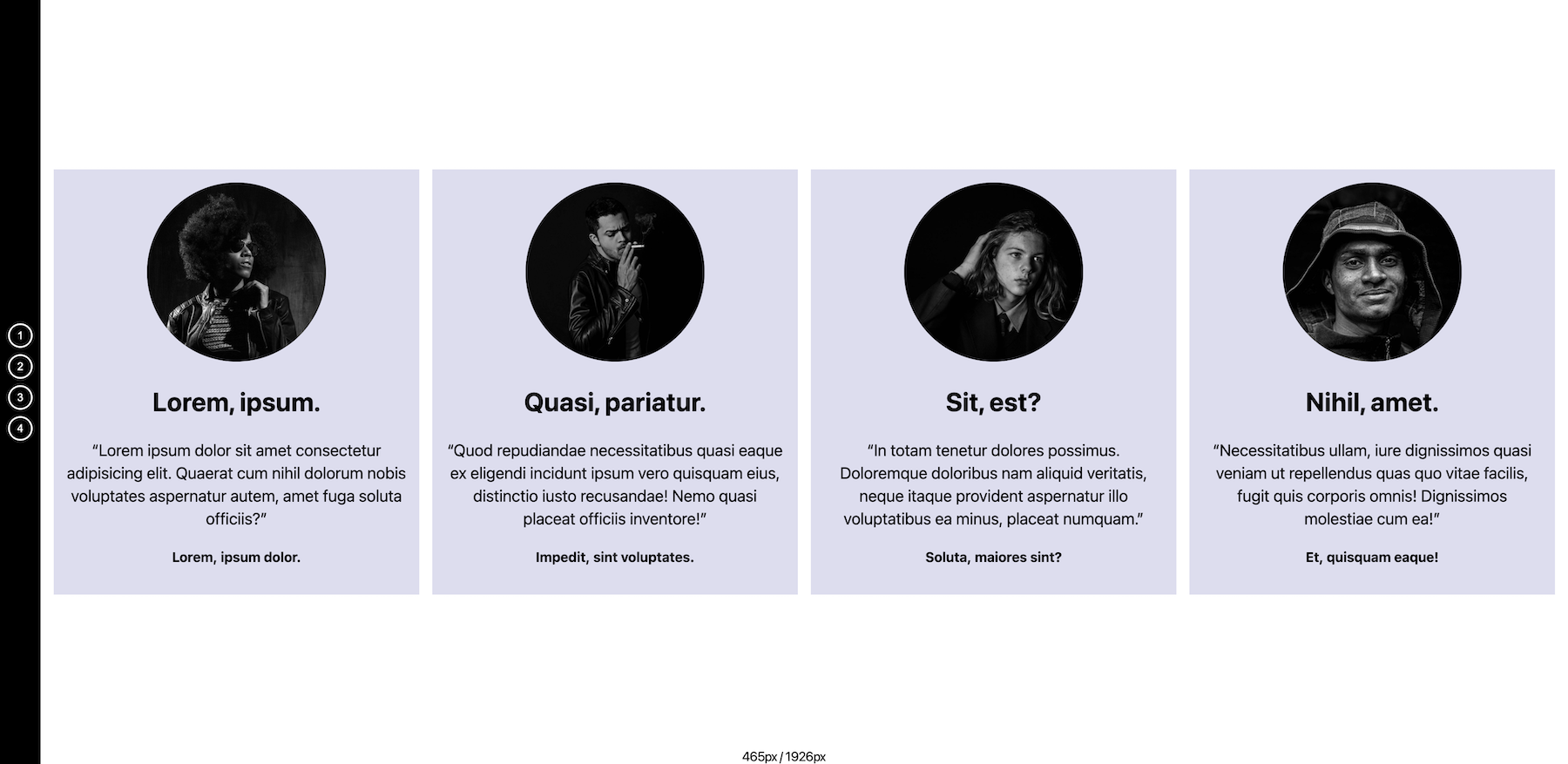
Under 1000px screen width, the main part of the page will have two cards.
At that size, hide cards three and four, setting them to display:none.
Above 1000px screen width, the main part of the page will have four cards.
That is the only media query you will need to use.
Each card will have:
- a rounded image.
- a heading of two words of lorem ipsum.
- a blockquote with 20 words of lorem ipsum.
- a paragraph with 3 words of lorem ipsum.
All lorem ipsum must be unique: text blocks cannot repeat.
Make sure that the visual edges of the boxes always align: no boxes taller than other boxes.
The row of cards in the main part of the page will be vertically centered at all times. It will not wrap at any time.
What the Buttons Do
There are four buttons. Each corresponds to one of the four cards.
When button one is clicked, card one is set to display: none.
If button one is clicked again, card one reverts to display: block.
A button whose card is hidden must have a deeppink background.
Hovered buttons will have a hotpink background.
The other buttons follow this pattern: button two for card two, etc.
What the Cards Do
When a card is “removed” in this way, the remaining horizontal space fills with the remaining cards.
The cards change their appearance as they get bigger. This is accomplished via container queries, not media queries.
There are four card sizes. Their appearance is determined entirely by their width. These widths can be approximate.
| Small Card | Under 310px: Small type & padding |
| Medium Card | Between 310px – 500px: Larger type & padding |
| Large Card | Between 500px – 1000px: Black & White, Columns, Border on Img |
| Extra Large Card | Above 1000px: Column Proportion Adjustment, Quotation Marks, Spacing, Max Width |
If Your JavaScript Does Not Work
Even if you do not get the JS working, make sure your queries work. I will test by removing cards in the inspector.
While writing your code, you will probably want to write styles that temporarily hide cards, so that you can focus on building your container queries without having to click buttons again and again.
A Useful Hint
You will likely use Flexbox to lay out a lot of this content. In doing so, a very useful property will be flex-grow.
A Useful Script
To help your troubleshooting, the script below will output two pieces of information whenever the screen is resized.
- the width of the window
- the width of your first card (assuming it has a class of card-1).
You must create an element with a class of screen-width in your HTML, and presumably position it in your CSS.
const screenWidth = document.querySelector('.screen-width")

const box1 = document.querySelector('.card-1')

window.addEventListener('resize', () => {
  refresh();
})

const refresh = () => {
    screenWidth.textContent = `${box1.offsetWidth}px /
    ${window.innerWidth}px`
}
Marks Breadown
If this is a test, here is the marks breakdown. If it’s an exercise, it’s out of 1 mark, as usual.
| Layout (nav, main, vert. centered row, two / four cards) | 5 |
| JS Toggling of Cards | 5 |
| Small Card | 2 |
| Medium Card | 2 |
| Large Card | 3 |
| Extra Large Card | 3 |
When You Are Done
When done, please make sure that your folder name is firstname-lastname-container-queries, then zip it up and hand it in to Brightspace.