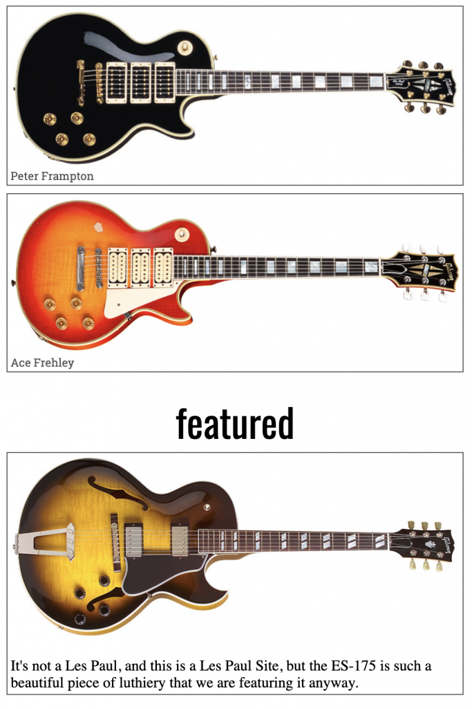
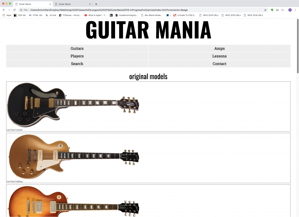
At this point, our default layout looks pretty good. However, we should modify the .guitar-small style just a bit so that the boxes aren’t touching and so that there’s a bit of space between the guitar name and the border.
.guitar-small,
.guitar-big {
  border: 1px solid #555;
  margin-bottom: .5rem;
  padding: .2rem;
}

.guitar-big p {
  margin-bottom: 0;
}
This should, then, nicely separate each guitar box:

Responsive States via Media Queries
Our phone layout is the default right now, appearing at any browser width. For small screen sizes, that’s exactly what we want. However, drawbacks become clear when we make the page wider:

The main reason for this problem is that the guitar images are only 800px wide. As the page gets bigger than that, the alignments no longer work: the H2s are centered, but the guitars are left-aligned (the default alignment).
The solution is to use media queries to deliver additional styles at different browser widths.
Think of media queries as additional stylesheets that apply only under certain conditions.
Let’s make our first one.
When you’re starting out with media queries, it’s a very good idea to make simple test queries to see if your syntax is correct before you try anything more complex.
A media query begins with an “@” sign and then one or possibly more css-like conditions. A media query has its own set of curly braces, so it’s a good idea to keep a comment at the end of each, so that you don’t get confused about which brace is ending which thing (a style or a query).
One example of a media query would be code to control how the page behaves when printed. For example, we could hide advertisements when a page is printed using the following query. Or we could size the type with units that make sense for print (points and inches, in this case).
@media print {

   .ad {
      display: none;
   }

  P {
    font-size: 11pt;
    line-height: 14pt;
    margin-left: .125in;
    margin-right: .125in;
  }

} /* end print styles */
Try the queries below in your stylesheet. At this point, put them below the other styles in your stylesheet.
/* Media Queries ======================================= */

@media screen and (min-width: 800px) {

  body {
    background-color: pink;
  }

}  /*  end 800px query */

@media screen and (min-width: 1200px) {

  body {
    background-color: hotpink;
  }

}  /*  end 1200px query */
Now resize the page. You should now have three different background colors:
- Under 800px: the default white
- Between 800px and 1199px: pink
- At and over 1200px: hotpink
Media queries, in other words, give us the power to adjust our pages to device width or height, or device type, etc.
For this reason, they are a foundational component of responsive web design.
What Screen Widths to Choose
You might be wondering why I chose the widths I used above for my queries. The answer is ultimately this: let your content determine your responsive breakpoints. I chose 800px here because the small images are that width, and that makes the alignments ugly when the page gets wider.
Some people will try to target different phone sizes: the trouble with that, however, is that there are a wide range of different phone sizes, especially in the Android world. If you let your content determine your breakpoints, it should behave well on a wide range of devices.
A Change to the Menu Layout
In our 800px query, let’s modify the NAV UL style. Specifically, add this inside that query. You can also remove the body styles that we put in to test our query syntax.
@media screen and (min-width: 800px) {

  nav ul  {
    grid-template-columns: repeat(3,1fr);
  }

} /* end 800px query */
Save your work and test the page in the browser. Resize it from large to small.
You should now see that the NAV UL changes its layout when the browser window is wider than 800px.
In addition, all the other NAV UL style properties we wrote earlier are still in effect. The styles are cascading, in other words. This means that we need to include in our query only what needs to change at that size.
Incidentally, the repeat() syntax we used here sets up 3 equal-size columns: it means the same as if we had used 1fr 1fr 1fr.
Now go to the 1200px query. Copy the NAV UL style from the 800px query. Change the repeat value to six.
@media screen and (min-width: 1200px) {

  nav ul  {
    grid-template-columns: repeat(6,1fr);
  }

}
Test the page, of course. We should now see, from smallest to largest, the following menu arrangements:


That hopefully wasn’t too hard.
We should now be ready to move on to the responsive styling of the MAIN part of the page.