On the previous page, we examined the desired layout for the main area. We then did the code for the menu responsive states, however, because they were easier to do, and to therefore make your introduction to grid gentler.
We’re should be ready to finish the page now, though, by tackling the rest of the layout issues.
Basic Form Tweaking
First, let’s take care of the form: it’s looking rather awkward:

The problem here? The elements inside the form are INLINE, so the labels are sitting right beside the inputs, which are sitting beside the next labels. Remember: inline elements behave like text: flowing left to right (assuming your page is in a language like English).
However, if we change their DISPLAY property to BLOCK, we’ll fix a lot of what’s wrong with the form.
input, label, textarea {
  display: block;
}

Next, we’ll add a few more styles to overrule some of the default styling of the form elements.
For example, by adding a bit of margin-bottom to the inputs and textarea, we visually group the labels and their associated form inputs more closely, which makes the form more usable (since it reduces confusion over which input each label is associated with).
/* FORMS ===================================== */

input, label, textarea {
  display: block;
}

input, textarea {
  border: 1px solid #555;
  margin-bottom: .5rem;
  width: 100%;
}

textarea {
  min-height: 7rem;
}
The result should look like this:

And that’s the form taken care of.
The Main Content
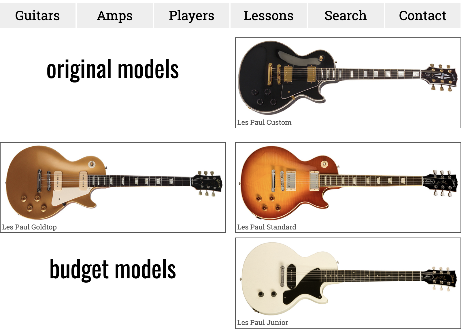
As noted awhile back in this exercise, the main issue with our content is that our guitar pictures are 800px wide, which means that alignments go bad when the page is wider than that.
We will do a number of fixes for that.
A Wrapper Element
First, if we haven’t already done this, add a DIV around all the content that’s inside the BODY. Give that element a CLASS of WRAPPER.
Now, style the wrapper inside the first query (the min-width: 800px one).
@media screen and (min-width: 800px) {

	.wrapper {
		max-width: 800px;
		margin: auto;
	}

} /* end 800px */
(NOTE: to save space, I didn’t include the NAV UL style in the snippet on this page, but it should remain in your query. I will do similar omissions in later code snippets).
Test your page.
You will now see that our content area does not get bigger than 800px. As well, as the page gets bigger than that, the WRAPPER area gets centered: if margin-right and margin-left values are AUTO, the browser will center the block).

So why did we use the WRAPPER DIV? Simply to prevent us from having to style the header, footer, and main max-widths separately. By putting them into another box (the DIV), we then have to style only a single element.
Anyway, our layout is tidy and fine for the medium size screen, but it’s a bit boring. Let’s modify it.
A True Grid, with Rows
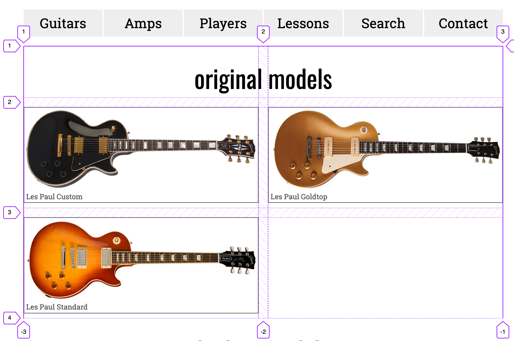
In the 800px query let’s turn our SECTIONs into GRID containers. Rather than style the SECTION tag, however, I would use classes here. We probably don’t want ALL SECTIONS in our website to have this behaviour.
@media screen and (min-width: 800px) {

	.models-original,
	.models-budget,
	.models-artist {
		display: grid;
		grid-template-columns: 1fr 1fr;
		grid-gap: 1rem;
	}

} /* end 800px query */
Test the page. The results might seem confusing at first:
The problem here is that the browser is making 2 columns, and putting each direct child of the grid container into a single column.
To demonstrate, I’m going to INSPECT the SECTIONs in the Firefox Developer Edition browser’s great tool for visualizing GRID layouts. Instructions on how to use that tool.
Here’s a screenshot of that inspection, with the GRID visualization tool turned on for the first section:

What we need to do here is make the h2 and the first guitar box take two columns, rather than the default one column.
There are several ways we can do this, but all depend on applying a grid-column property for the H2 and the first guitar-box.
ANY of the following CSS “options” will give us what we want with the H2 inside the SECTION:
@media screen and (min-width: 800px) {

  section h2 {

        /* OPTION ONE: */
	grid-column: span 2;

	/* OPTION TWO: */
	grid-column-start: 1;
	grid-column-end: 3;

	/* OPTION THREE:  */
	grid-column: 1 / 3;

	/* OPTION FOUR */
	grid-column: 1 / -1;

  }

} /* end 800px query */
If we look at the page now, the h2 is taking the full width of its container because we have told it to take two columns. Here’s how that looks in the Firefox inspector:
How This Works
With the GRID CONTAINERs (the parent SECTIONs), we used the grid-template-columns property to set up our basic grid.
By default, each child of the grid will take one column and one row.
However, with the the h2s, we used the grid-column property to specify which columns on the grid the element will occupy.
As shown above, there are a number of ways to do that.
With the SPAN syntax, OPTION ONE tells the browser that the element needs to span two columns.
However, as in OPTION TWO, when we use grid-column-start or grid-column-end (or the grid-column shorthand property without the SPAN syntax), the numbers actually refer to specific GRID LINES (which can be seen in the Firefox Inspector screenshot above).
The most versatile of these options, though, is OPTION FOUR (grid-column: 1/-1). When we specify a grid line with a positive or a negative number, the positive number “counts” from the left, while the negative number “counts” from the right.
In that way, we can tell the browser that the H2 will span the entire row, regardless of how many columns it has. This makes that style very responsive.
If this isn’t entirely clear yet, don’t worry: we will practice it more in future grid layout exercises.
Back to the Layout
Next, we need to make the first guitar in each section also span two columns.
Of course, we can’t just style .guitar-small: that would style all of our “guitar boxes”. One easy solution would be to add another class to the first guitar box in each section:
<div class="guitar-small guitar-first">
  <a href="#">
    <img src="images/custom.jpg" alt="Les Paul Custom">
    <h3>Les Paul Custom</h3>
  </a>
</div>
Then we could add that selector to the style that made the H2 take two columns:
section h2,
.guitar-first {
	grid-column: span 2;

/* etc */
}
Another way it could be done, however, would allow us to style the first guitar box in each section without editing the HTML:
section h2,
section .guitar-small:nth-of-type(1) {
	grid-column: span 2;

/* etc */
}
That css is more complex, but the nth-of-type() selector is very useful, because we can target any element by its order in the document.
Either way you do it is fine at this point, though. An additional class applied to the first guitar box is probably the easiest way.
The Next Responsive State
Now we will turn to the bigger query (the 1200px one) and arrange our content differently.
Rather than me continuing with this step-by-step walk-through, examine the following styles and ask yourself why I am using each property and value. Why the max-width of 2400px on the .wrapper style, for example? As well, why is the last style needed?
@media screen and (min-width: 1200px) {

  .wrapper {
	  max-width: 2400px;
  }

  nav ul  {
    grid-template-columns: repeat(6,1fr);
  }

  .models-original,
  .models-budget,
  .models-artist {
	  grid-template-columns: repeat(3,1fr);
  }

  .models-original .guitar-small:nth-of-type(1),
  .models-budget .guitar-small:nth-of-type(1),
  .models-artist .guitar-small:nth-of-type(1) {
	  grid-column: span 1;
  }

} /* end 1200px */
After adding those styles, our layout looks pretty good–that is, until we get to bottom (the featured area and the form).
Your Task
Look at the screenshots for the LARGE and EXTRA LARGE layouts.
Code those parts of the layout.
Don’t worry about doing the h1 poking off the edge of the screen effect.


What To Hand In
If you are a Langara student, rename the project folder yourname-guitarmania and then zip it up and hand it into BrightSpace.
If you are an Emily Carr student, rename the project folder yourname-guitarmania and then zip it up and hand it into our Moodle course shell.