For this exercise, please download the starter files and the screenshots collection.
These are big files, so the download might be a bit longer than that for most of the files on this site.
Inside the starter files archive is a Duplicator package and installer. Install that in a new WordPress database.
Then go to underscores.me and download a new SASSIFIED theme named with your first name. In the author field at the Underscores page, put your first and last name.
Once you’ve downloaded the new underscores theme, install it in the new site and make it the active theme.
Then open up the screenshots collection.
Your task is to make a theme that outputs the site data looking as on the screenshots for the different responsive states. Zoom in on the screenshots.
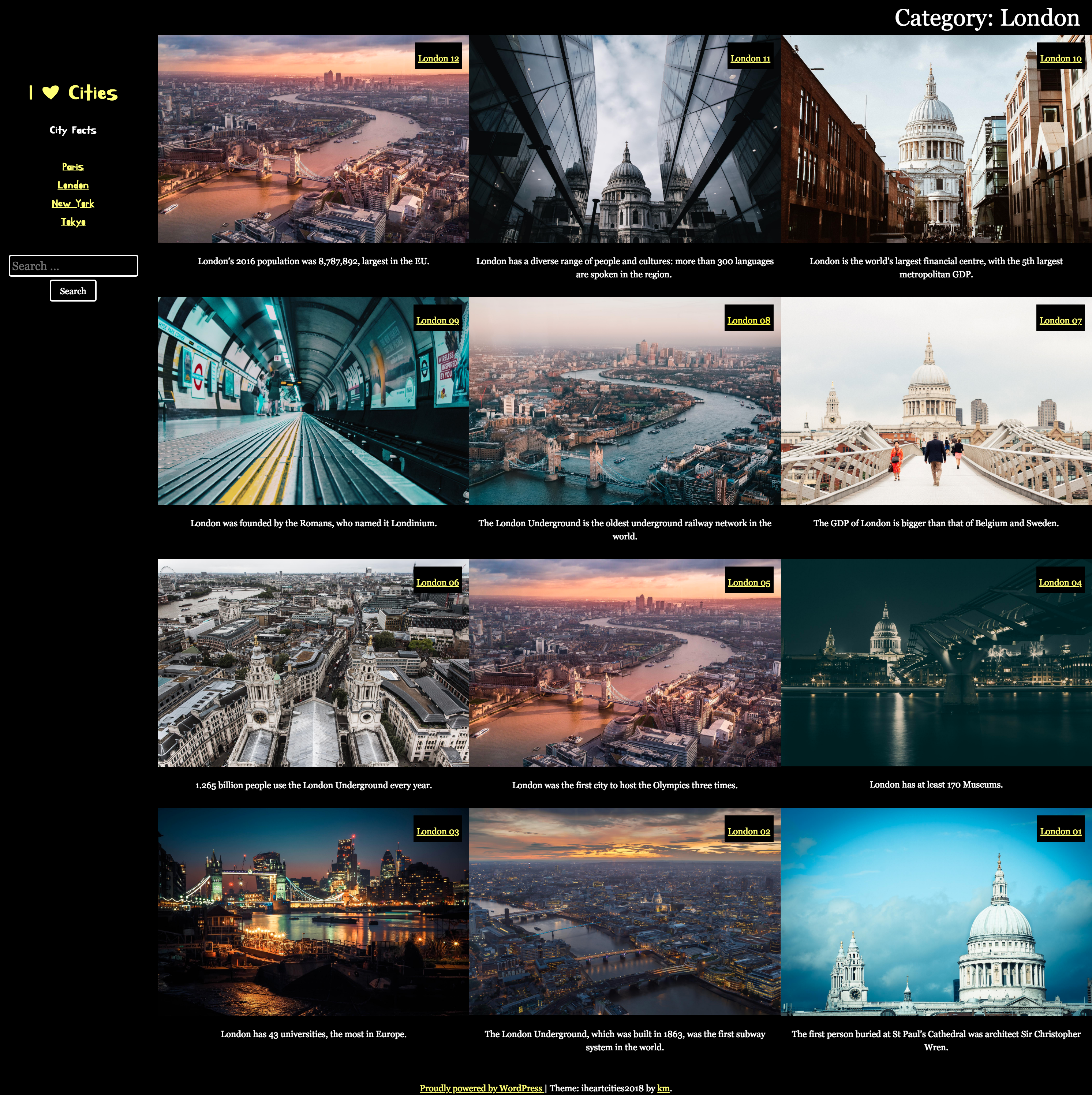
Each post in the site has a title (city + number), a feature image, approximately 5 paragraphs, and a post summary. If you don’t see the post excerpt, go to screen options in the top right of the WordPress dashboard.
You do not need to change anything in the dashboard. You will hand in only your theme. You do not need to use Duplicator at the end to hand in your work. Just hand in your theme to the class handin folder on studentshare.
Common Features
The font used for the site title, site description, and main menu is the google font Kirang Haerang. All other type is the traditional georgia font-stack.
Hovered links are in hotpink.
Single post views show the content. All other pages show the excerpt. No page should show both.
HEADER Area
At phone size, the header area is at the top of the screen. The page scrolls normally.
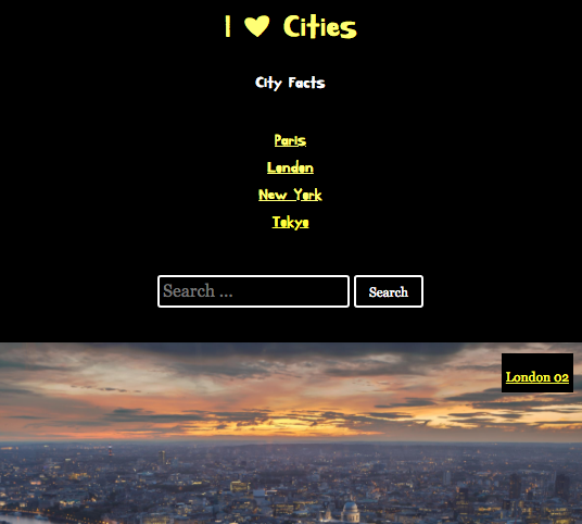
At medium sizes and larger, the header area is on the left. When the page scrolls when the header is on the left, the header area does not move.
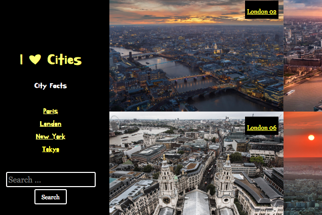
Category & Search Results
Search results and Category pages have three responsive states: small, medium, and large.
Category and Search results show the excerpt below the feature image.
The only difference between the search and category pages is that on the search results show the term(s) searched for in hotpink.
On Search Result and Category pages, clicking the page title or the post thumbnail will take the user to the full post view. On the home page, the user needs to click the post title to be taken to the full post view.
Full Post Page
Single posts have three responsive states: small, medium, and large. The post title in the large view is in hotpink.
Single post views show the post content. They do not show the excerpt.

Home Page
The HOME page essentially follows the layout of the CATEGORY and SEARCH RESULTS pages.
However, the actual posts output are different. In order, they will be:
- three random London posts
- three random Paris posts
- three random Tokyo posts
- three random New York posts
You have two options with the layout home page:
- Regular Marks: follow the layout of the CATEGORY and SEARCH RESULTS page exactly, with the excerpt text appearing below the feature image. If you are going for regular marks, use the CATEGORY results screenshots as your guide.Unlike the Category pages, though, the HOME page does not have a title area, so the articles go to the top and right of the browser window.
- 20% Bonus Marks: follow the CATEGORY & SEARCH RESULTS layout but with the excerpt hidden until hover. On hover, the excerpts appear on top of the feature image with a translucent background color.
The phone size follows the CATEGORY / SEARCH pattern. The HOME PAGE screenshots show this UI pattern, which occurs only at medium and large sizes.IF you attempt the BONUS task, make sure that you code in such a way that you can easily reverse the changes if they do not work.
