First please download the Starter files.
This is a Duplicator Archive for you to install. As part of this process, be sure to create a new Admin account so that you can log into the site.
And please also download the screenshots.
Please use the screenshots to understand the layout and style details required in the site.
Note: if this is a test, don’t update WordPress.
Once you’ve done the installation, install and activate the following theme:
- Neve
Do not install any plugins in the site.
Do not install Neve starter content.
Do not make any edits in the Theme Editor. All code edits must occur in the Customizer.
NOTE: occasionally, the Customizer might not reflect changes you make. If this happens, just reload the page in another tab—testing the way you might test an HTML / CSS project.
Before doing the work, review which tasks will give you the most points, and plan accordingly.
The Scoring of the Test
The test is out of 50 points, with the possibility of a bonus of up to 6 points to make up for anything you might have missed. You cannot score over 50 points, however.
Please scan the tasks before starting: some are easier, or more worth more, than others.
The Graphic You Will Need
Right click and download this logo:
This sad little chicken will be our site logo.
Create Menus (2 points)
Create two menus.
In one menu, add all the site Categories.
For the other menu, make links to Facebook, Twitter, and Instagram.
Normally, these social links would go deeper into those sites (to a group or business page), but in this case, the front of site is fine.
In subsequent steps in the exercise, you will put this menus where they need to go on the page.
Do not worry that the categories in the supplied screenshots are different.
Typographic Considerations (2 points)
- All headings use the Allura font (specified in Dashboard)
- All other text uses the Merriweather font, with a fallback font of Georgia (both specified in Dashboard)
- Make sure that the Site Title on all pages uses Allura (not just on the home page)
The Header (8 points)
Using the Customizer, configure the header to look like this at full width:

And like this at small size (except please remove the site title and tagline)
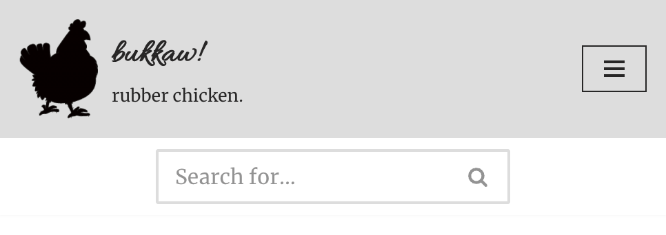
Just test as narrow as Chrome gets. No need in this exercise to use the Device Toolbar button in the Inspector.
Note: the type does not get bigger. That is an illusion created by the different scales of these two screenshots.
Make the chicken logo be smaller in phone view (60px).
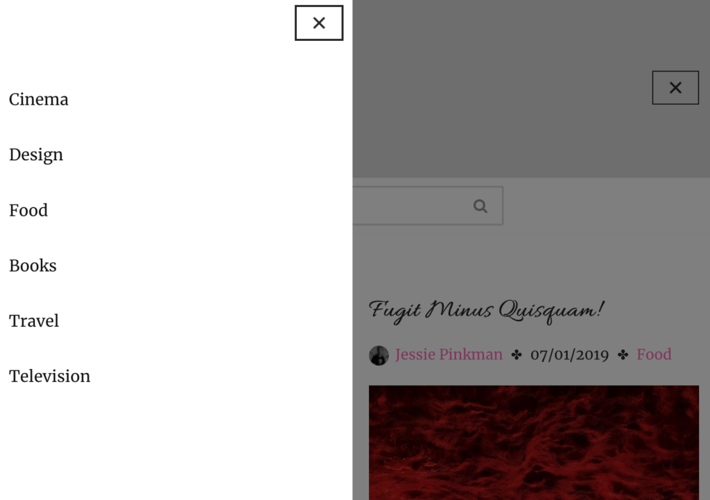
Finally, make sure that clicking on the icon or the site name or description takes the user to the front of the site, and that clicking on the menu icon opens up the main menu on the left side, like this:
Text Format Tweaking (2 points)
First, make sure that the Post Meta (the information after the title, such as author and date) also includes the Post Categories.
Make sure that the following text items start with a lowercase letter, anywhere in the site:
- Menu items
- Post titles
- Category Names
New Users (2 points)
Create four new users with the following information: use the exact name and email addresses. All new users need to be set to author role, not admin.
- Walter White: walterwhite@kevinmc.ca
- Jessie Pinkman: km1@kevinmc.ca (that is a “one” after the “km”)
- Saul Goodman: saulgoodman@kevinmc.ca
- Mike Ehrmantraut: mikeehrmantraut@kevinmc.ca
Using the correct email address is important: it will ensure that each user gets an avatar (profile picture). To ensure accuracy, consider cutting and pasting the email addresses from here.
Assign Content To These Users (2 points)
Reassign authorship of all the posts in the site as follows:
- Mike Ehrmantraut: posts 1 3 5 7
- Jessie Pinkman: posts 2 4 6 8
- Saul Goodman: posts 9 10 11 12
- Walter White: all remaining posts
Make sure that no posts remain assigned to the original author (Kevin McMillan).
Post Formats (7 points)
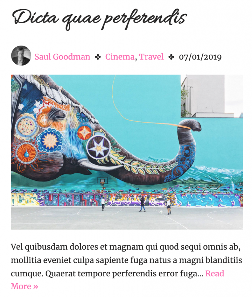
On any page with collections of posts (ie home, category archives, search results, etc), make sure each post has this content, in this order
- Title
- Meta Information: in this order — Author avatar, Author name, Category, Date (with a separator entity called Heavy Four Balloon Spoked Asterisk, which you can find at the toptal.com entity listing page.)
- Feature Image
- Excerpt (with exactly 30 words)
Maximum Width and Number of Posts Per Page(2 points)
Make sure that the content on any part of the site is not allowed to get wider than 1340px.
Make sure that no archive page shows more than 18 posts at a time.
Both of these features can be set in the Dashboard.
Archive Page Layout (5 Points)
Please look at the screenshot of the front page: you will see that the site is using the famous javascript masonry layout technique: flowing content in columns rather than rows.
In other words the posts are not aligning horizontally. Masonry layouts are very useful when you have a mix of box heights, such as that created by the fact that we’re using both landscape and portrait feature images here.
Figure out how to set up this type of layout in the Dashboard.
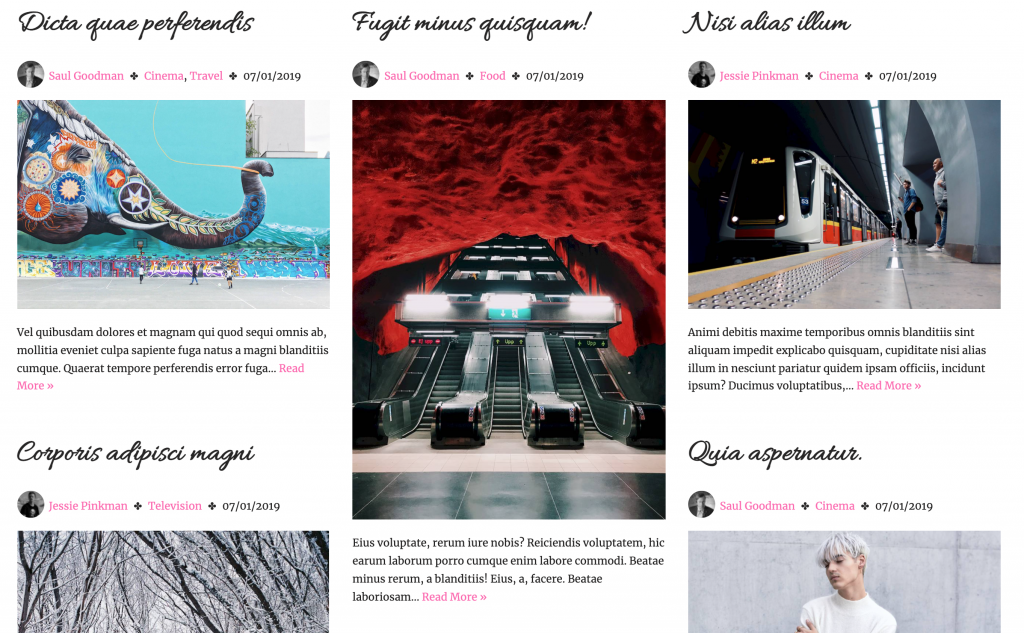
Make sure that any post archive (home, category archives, search, etc) has three columns in desktop view, one column in tablet view, and one column in phone view.
These, too, are dashboard settings rather than CSS changes.
Single Post Views (8 points)
When we click on a post title or feature image, we get taken to the single view of the post.
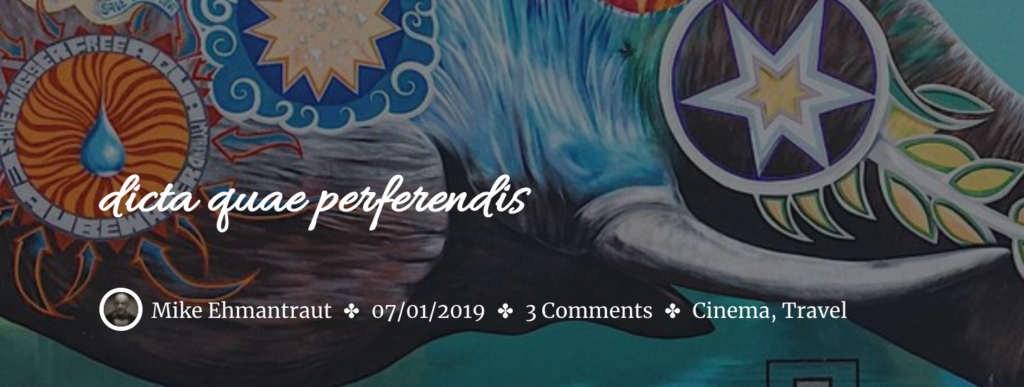
Make sure that single views show the feature image spanning the entire width of the page and the title, meta-data and avatar arranged and styled like this at Desktop widths:
(Ignore the top, grey, area in this screenshot: it was from an earlier version of the exercise).
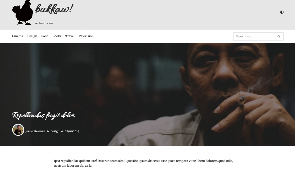
And like this at Tablet and Phone widths:
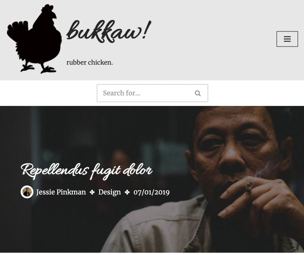
This will involve a mixture of Dashboard (mostly) and possibly a bit of CSS.
The Footer (10 points)
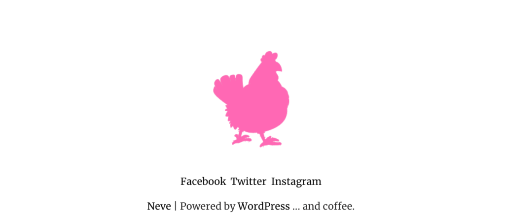
Make sure that the footer looks like this at full size:

Specifically, in Neve’s footer configuration area in the customizer, put the following elements:
- Neve’s Copyright Notice, modified in the Customizer to add the text … and coffee to the Powered by WordPress text. At full size, content aligns to the left.
- Our site logo, but sized to 50% and changed to hotpink by applying a duotone filter in the dashboard
- The social menu. At full size, this content aligns to the right.
At Phone and Tablet sizes, this content stacks and is centered:
A lot of this can be done in the Customizer. You might need to add Custom CSS, as well.
BONUS SECTION
You do not have to do this section, but you can if you have time. These marks are for bonus points, which you can use to make up for anything you might have missed earlier.
Accent Color Change (3 marks)
Set the site’s accent colors to hotpink. This will set the color of most but not all links, including those in the post navigation areas.
This can be done in the Customizer more easily than in CSS, but it can done is CSS, too, if needed.
Avatars (3 points)
Set Avatars that are on the home page to greyscale with the CSS Filter property.
On the front page at phone size, hide the avatars.
Finally, on single views of posts, make the avatar 30px width, with a thick white border. (Make sure that the image stays circular).
This will slightly upscale the image, but that’s ok for the exercise.
When You Are Done
Make a Duplicator package of the site. Do not do this in Safari: it is by default set to open ZIPs on download.
Download the installer.php file and the zip file with a long name.
Do not rename this zip file, or you will break the installation process.
Put them in a folder called yourname-bukkaw.
Zip that folder. Yes, that means you will have a zip inside a zip.
Hand the project into Brightspace (Langara) or Moodle (Emily Carr).
