A really neat way to break out of the boxiness that is a default condition of CSS is to use images that appear non-rectangular.
It’s very common, for example, to see images rounded with CSS. Assuming that the image has equal height and width, this code will make it perfectly round:
.round-image {
   border-radius: 50%;
}
Another interesting thing you can do is to make a clip path. CSS clip paths work similar to clipping paths and clipping masks in applications like Photoshop or InDesign.
The CSS clip-path property allows you to mask an image by drawing a shape in code (circles & polygons). The code below will put a triangular “cut” in the right side of the image it is applied to:
.clipped-image-right-side {
 -webkit-clip-path: polygon(0 0, 100% 0, 95% 50%, 100% 100%, 0 100%);
    clip-path: polygon(0 0, 100% 0, 95% 50%, 100% 100%, 0 100%);
  }}
A variation of the above technique is to make a more complex shape in an application like Illustrator and then to save it as an SVG and use the resulting code as a mask for another image.
To make that mask responsive, however, can seem daunting, because unlike CSS clip-paths, SVG paths do not accept percentage values.
This steps presented here will allow you to overcome that limitation.
To begin, make an SVG file that is the same dimensions as the image(s) you intend to mask.
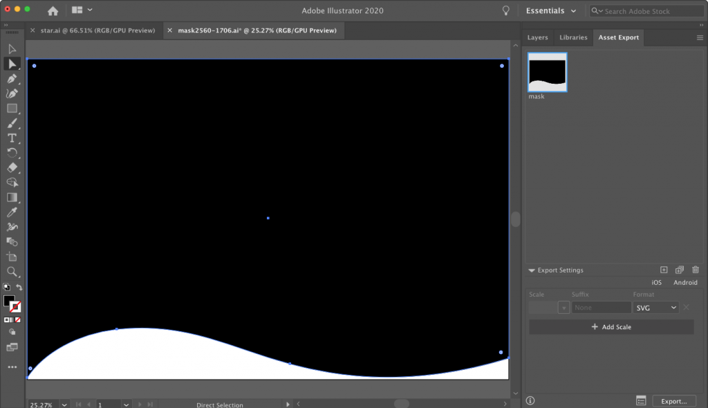
Here I have made a simple shape in Illustrator and have dragged the shape to the Assets Export panel in order to export it as an SVG. In the Assets Export panel, I’ve renamed the shape so that my file management is easier.
Make a new HTML page with an image of the same size as the mask file. Add a stylesheet and include your responsive images code:
img {
max-width: 100%;
height: auto;
}
Export the SVG into your html project folder, presumably into a subfolder.
In Visual Studio Code (or whatever editor you use), open that SVG. Copy the code you see there and paste it into your HTML document.
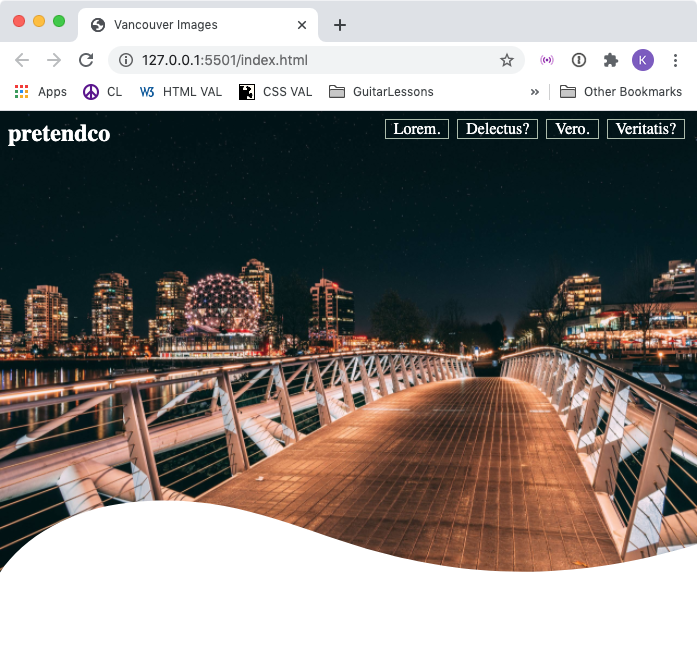
Here I have put it after my image in the HTML:
<div class="feature-image">
    <img src="vancouver-images/vancouver-01.jpg" alt="olympic village">
</div>

<svg xmlns="https://www.w3.org/2000/svg" viewBox="0 0 2560 1695">
    <g id="Layer_2" data-name="Layer 2">
        <g id="Layer_1-2" data-name="Layer 1">
            <path
                d="M2560,1591c-519.45,159.7-909.16,98.71-1162,31-316-84.64-543.28-224.4-923-184C268.28,1460,85,1563,0,1695V0H2560Z" />
        </g>
    </g>
</svg>
Next, simplify the SVG code, removing the xml namespace attribute (xmlns) on the opening SVG, and removing the opening and closing group (<g>) elements too.
<svg viewBox="0 0 2560 1695">
            <path
                d="M2560,1591c-519.45,159.7-909.16,98.71-1162,31-316-84.64-543.28-224.4-923-184C268.28,1460,85,1563,0,1695V0H2560Z" />

</svg>
We’re left only with a self-closing PATH element inside our SVG.
The numbers and letters that are the values of the definition (‘d’) attribute on the path describing the shape.
Make sure that you’ve kept the viewbox attribute intact on the opening SVG tag.
Next, wrap the path in an opening and closing clippath element:
<svg viewBox="0 0 2560 1695">
<clippath>
   <path
d="M2560,1591c-519.45,159.7-909.16,98.71-1162,31-316-84.64-543.28-224.4-923-184C268.28,1460,85,1563,0,1695V0H2560Z" />
</clippath>
</svg>
Add width and height attributes and values to the SVG, then add id and clipPathUnits attributes and values to the opening clippath. Use the attribute values I am using here (and note the case of each attribute).
<svg width="0" height="0" viewBox="0 0 2560 1695"><clippath id="mask" clipPathUnits="objectBoundingBox">
Next, go into your CSS and add a style for the feature image, or the box it’s in. (I’m doing it on the box it’s in.)
.feature-image {
    clip-path: url(#mask);
}
Here, for a clip-path value, we are using the id of clippath in the SVG we copied into the page.
If you test the page, depending on the image you are using for the mask, you might see the mask working. However, this is entirely dependent upon the size of your screen.
Remember how I earlier referred to the viewBox attribute of the svg? The viewbox is based on the size of your original document, and the numbers in the SVG are placing points on the pixel grid created by those dimensions.
So if your image is the same size as the original mask, the masking should work as intended. However, this is obviously not responsive.
An excellent solution is one suggested by longtime CSS guru Eric Meyer: using a transformation that will essentially make the svg grid percentage-based.
To do that, take the two numbers at the end of the viewBox. Mine are 2560 and 1706. Divide the number 1 by each:
- 1/2560 = 0.000390625
- 1/1706 = 000586166471278
If we then scale our svg clippath element by those amounts, we will have a responsive mask:
<clippath id="mask"  clipPathUnits="objectBoundingBox"
transform="scale(0.000390625 0.000586166471278)">
Et voila!