In the following exercise, you will make a sign-up form.
To begin, please download the files you will require: the background image, and a text file containing all the text used in the page. A couple words in the text file may not match the screenshots on this page: don’t worry about that.
Here is the screenshots package.
Change the name of the folder to your-full-name-jazzer.
You can use the Internet, your notes, or previous files.
If this is a test, evidence of other collaboration or someone else doing your exam will be fully investigated.
If this is a test, it is out of 22 marks. In the final section, you have an opportunity to earn “bonus marks” to make up for any that you might have missed.
If this is an exercise, it’s out of 1, and the “bonus task” is part of the regular exercise mark (ie not for bonus marks).
A Loom Video Run-Through
At this Loom Video URL, you’ll find a demonstration of the entire exercise or test, including the “bonus” part.
Marks (If a Test)
| Typography | 5 Marks |
| Layout / Content / Visuals | 12 Marks |
| Interaction / Behaviour | 5 Marks |
| Possible Bonus | 3 Marks |
Text Details
All text uses the georgia, times, “times new roman”, serif font stack. The one exception is the JOIN button or input: it uses whatever the browser default for that element is.
All icons come from Font Awesome: user, envelope, map-marker, circle-question, lock, eye, and eye-slash.
If you run into issues with icons not showing up, make sure that when you search for icons, you search the same version of font awesome that you are downloading (it went to a new version not so long ago….).
The accent color used in the exercise is orange. It appears in some text and some UI elements.
The links in the text (sweetwater and musiciansfriend) can be just testing links, made with just a hashtag (#) as the value of the href attribute.
The link underline will be orange, but it will be a little bit further away from the text than the browser default.
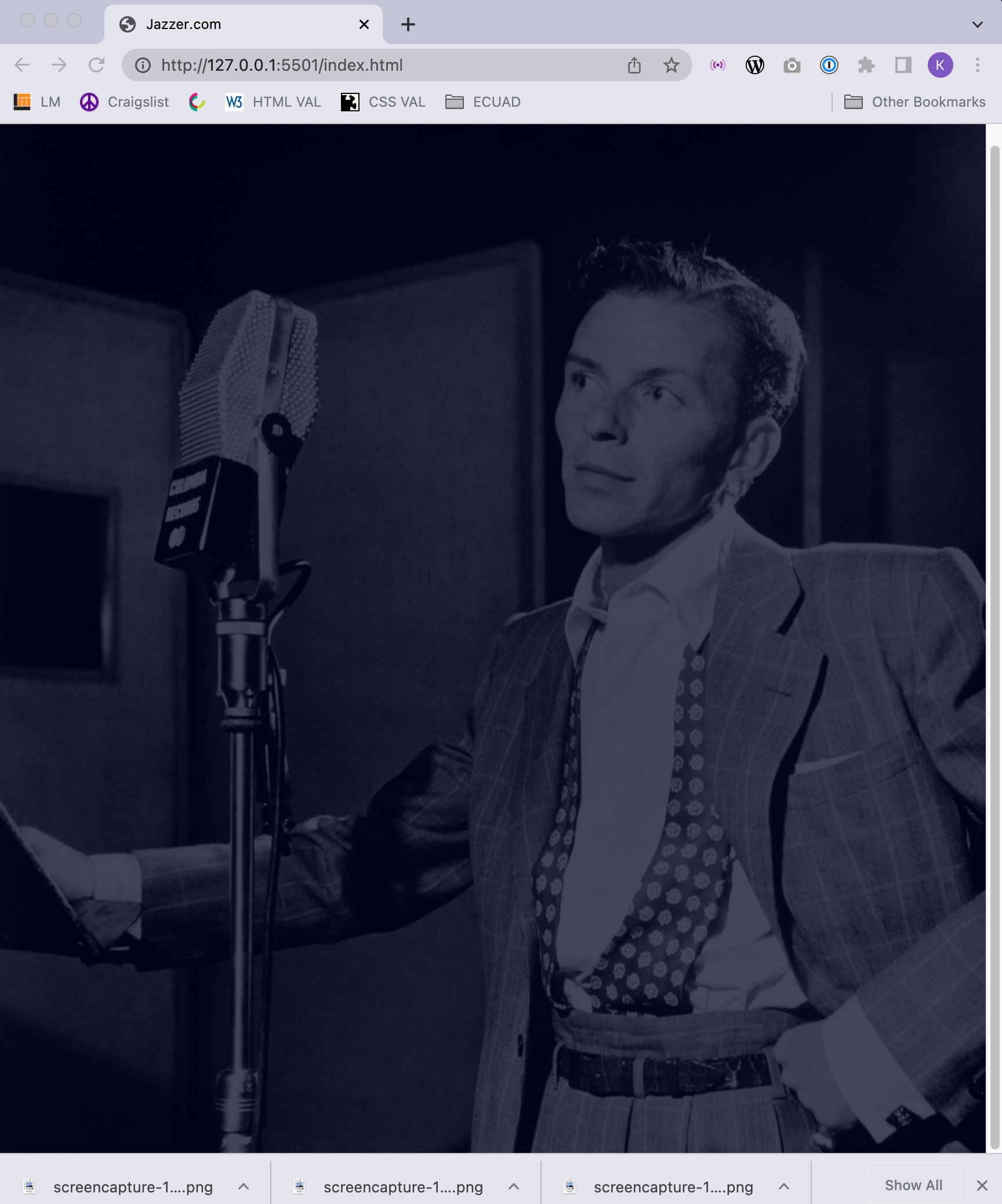
Page Background
The background will use the downloaded image of Frank Sinatra. It will cover the entire background of the page. You must use code to give it a dark blue tint. This will improve the readability of the text in the page. There are a number of different ways you can do this.
Responsive Behavior
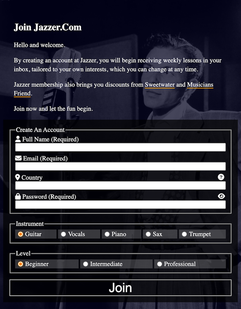
At small screen sizes, the content stacks in a single column. As always, observe the alignments and spacing of elements. Notice how edges of elements line up.
At medium screen sizes, the content is side by side, vertically centered:
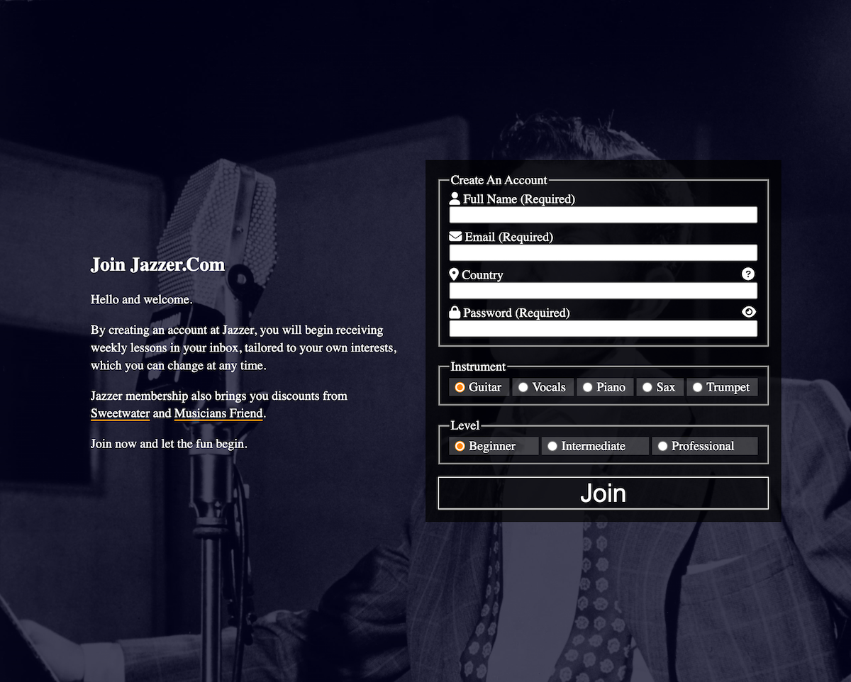
At medium and large sizes, the box containing the form and the text will always be in the horizontal and vertical center of the page.
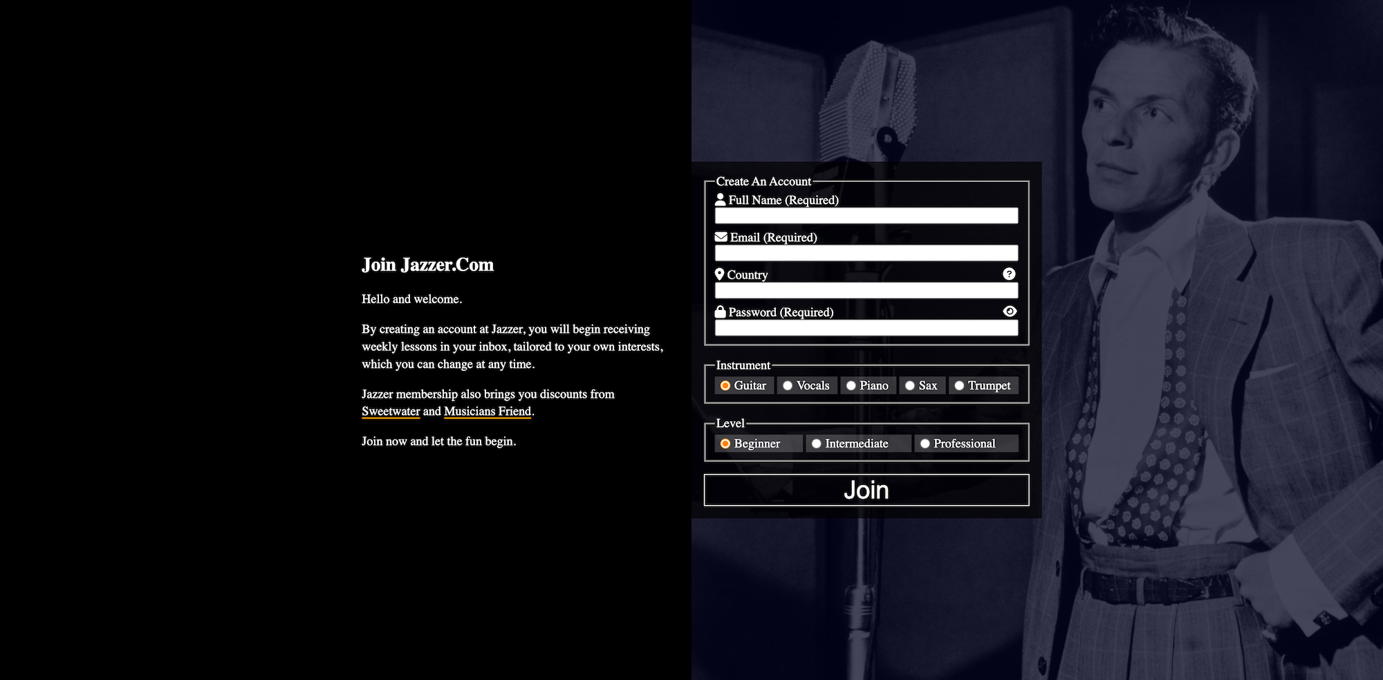
At large screen sizes, the background image placement and size changes:
The Form Markup & Styling
Style all the page elements as they appear in the screenshots.
You have a content area and a single form.
Inside that form are three fieldsets, each with a corresponding legend element.
The three fieldsets are followed by a single submit (“join”) button or input.
Each input (other than the submit input, if you’re using an input) has an associated label.
Make sure that clicking on a label or the associated icon either focusses the cursor in the associated field or checks the associated button.
Make sure that the user can select only one Instrument and only one Level: choose your input types carefully.
Guitar and Beginner must be pre-chosen when the page loads.
Make sure that text in the password input cannot by default be read (ie it displays like the typical ••••••• password text).
Icons for the form elements are listed near the top of this exercise.
Form Interaction / Behavior
Password Policy Details
When the user clicks in the Password field, the password policy details appear underneath that field. When the user clicks anywhere else, those details are no longer visible.
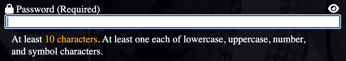
This text must remain accessible when visually hidden.
This should be done with CSS, but you could use JavaScript if you can’t work out a CSS solution.
Country Details
When the user clicks the Info button to the far right of the Country label, the country info details text displays underneath. This does not need to fade in: it can just appear. The form will grow taller: that’s also OK.
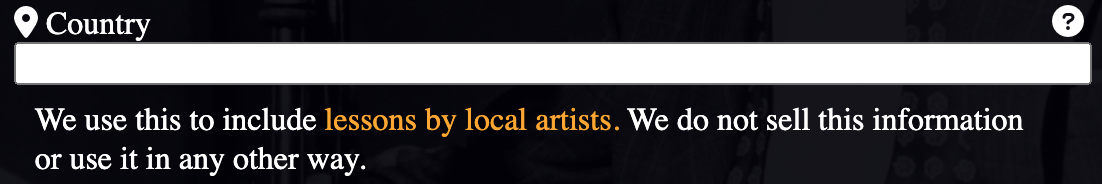
Clicking the Info button again will dismiss that text.
This will likely require some basic JavaScript, but could conceivably be done with clever css, too.
This text must remain accessible when visually hidden.
Additional Form Behaviour
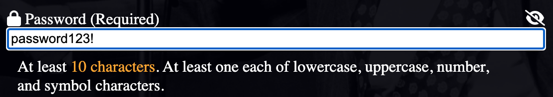
Toggle PW Visibility
When the user clicks on the eye icon, the password text is revealed. When it is clicked again, it sets it back to the typical •••••• display of password text.
This will require basic JavaScript, to modify properties of the password input field.
(A screenshot of the revealed text is seen in the next section).
Toggle PW Visibility Icon
When the user clicks on the eye icon to reveal the password, the icon changes to an eye with a slash through it. This will require JavaScript.
Bonus Task: Change the Buttons’ Appearance When They Are Checked
If this is a test, you can get three bonus points for this task.
In it, you need to change the appearance of the radio buttons in the Instrument and Levels sections. Specifically, turn them orange.
To do this task, you do not need to make custom radio buttons with divs or spans.
Although browsers are very reluctant to give up control over form UI elements, the filter property will be very useful here.
Note: this works in Chrome. I did not test it in any other browser.

When You Are Done
When done, please double-check that you renamed the folder correctly: your-full-name-jazzer
Then zip it up, and hand it into our course hand in folder.
At Langara, that would be BrightSpace. At Emily Carr, Moodle.