This page will explain how to produce the layout from the “Light” Photo Blog Flexbox exercise.
In a few small places, it will modify the design in small ways, in order to improve it.
Emmet Setup
Even though there was an index file provided with the download, let’s practice our Emmet skills in a new file. Make a new file called new-index.html.
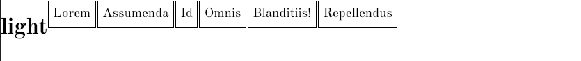
Generate the Menu with this equation:
header>h1{Light}+nav>ul>(li>a[href="#"]>lorem1)*6
That will produce this code:
  <header>
    <h1>light</h1>
    <nav>
      <ul>
        <li><a href="#">Lorem</a></li>
  	<li><a href="#">Assumenda</a></li>
  	<li><a href="#">Id</a></li>
  	<li><a href="#">Omnis</a></li>
  	<li><a href="#">Blanditiis!</a></li>
  	<li><a href="#">Repellendus</a></li>
      </ul>
    </nav>
  </header>
Copy and paste that code below it, remove the H1 and change the header tag in the copied section to footer.
Finally between the header and the footer, try this emmet equation:
main>article>h2>lorem3^.image-box>img[src="images-square/architecture-1000-sq-$$$.jpg"][alt="architecture"]^p>lorem13
Test that equation: inside a MAIN element it will make a single ARTICLE with an h2, a photo in a div, and a paragraph. Now put brackets around the code generating the ARTICLE and then multiply by 30:
main>(article>h2>lorem3^.image-box>img[src="images-square/architecture-1000-sq-$$$.jpg"][alt="architecture"]^p>lorem13)*30
Typography and Responsive Images
First, go to google and get the code to load the Old Standard TT font. Get weights 400 & 700. Add the google font link code to the HEAD of your HTML page.
Then in your stylesheet, add the responsive images code:
img {
  max-width: 100%;
  height: auto;
}
Test that your css is working. Shrink your page. There’s a big part of our mobile layout.
Add some basic typographic styles:
/* TYPOGRAPHY ===================================== */
body {
  margin: 0;
  padding: 0;
  font-family: 'old standard tt', georgia, times, 'times new roman', serif;

  --lightbg: hsla(240,50%,85%,.2);
}

h1 {
  font-size: 2rem;
}

h2 {
  font-size: 1.15rem;
  margin-bottom: .5rem;
}

p {
  font-size: 1rem;
}

h2, p {
  margin-left: .75rem;
  margin-right: .75rem;
}
You might be wondering about the
--lightbg
code in the body style. This is known as a CSS Custom Property. It works like a variable in a programming language. We’ll see how it works near the end of this exercise.
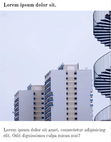
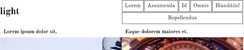
Our articles now look like the image below. The image is going to the edge of the screen and the type has margins to compensate for the removal of the margin and padding on the body tag.
Main Layout
I like to do the big, easy stuff first. In this case, the MAIN area is a relatively easy task–definitely easier than the top menu, for example.
We want our articles in the MAIN area to arrange in 1, 2, 3, and 4 columns depending on screen width. The important thing here is to remember that flex is about the relationship between parents and their child elements. So we need to set the MAIN element to DISPLAY:FLEX to control how the ARTICLES lay out:
@media screen and (min-width:700px) {

  main {
   display: flex;
  }
}
Remember, it’s best to use a mobile-first layout. Since the mobile layout is single-column, we don’t need to go to FLEX until our first responsive breakpoint.
Test your page: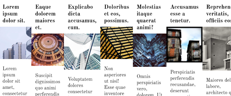
The layout produced by this initial code is probably not want you wanted to see. The reason it’s happening, however, is that the default FLEX-WRAP value is NOWRAP. Let’s change that. I typically use the FLEX-FLOW shorthand (which combines FLEX-DIRECTION and FLEX-FLOW):
@media screen and (min-width:700px) {

  main {
   display: flex;
   flex-flow: row wrap;
  }
}
Now the articles are allowed to wrap. All we have to do now is size them. We could use width here, or we could use flex-basis.
@media screen and (min-width:700px) {

  main {
   display: flex;
   flex-flow: row wrap;
  }

  article {
   flex-basis: 50%;
  }

}
Success: at the 700px breakpoint, the articles go to two-column:
Now resize the browser to find the other breakpoints you will need.
Notice that we’re using how our content behaves (such as typographic line length and type wrapping) to determine where the content needs to be laid our differently, rather than arbitrarily picking random phone and tablet sizes.
Here is all the code we need to change to 3 and 4 column layouts, respectively.
@media screen and (min-width: 1100px) {

  article {
    flex-basis: 33.33%;
  }

}

@media screen and (min-width: 1500px) {

  article {
    flex-basis: 25%;
  }

}
Test your page. Resize and make sure that you now have the four responsive states for the main layout.
Header, Footer, Menus
Now let’s add code that will apply to all the menus. First remove the UL dots and the space reserved for them.
/* MENUS, HEADER, FOOTER ====================== */
nav ul {
  list-style-type: none;
  margin: 0;
  padding: 0;
}
Test that the dots, and the space reserved for them, are removed.
Now set the display properties that will allow the menu ULs—the parents of the LIs we want to arrange–to layout the way they are supposed to in the screenshots. We know that it needs to be flexible, and the top menu at least needs to be able to wrap when needed. Modify the style to the following:
nav ul {
  list-style-type: none;
  margin: 0;
  padding: 0;

  display: flex;
  flex-flow: row wrap;
}
Now our menu items are laid out in a horizontal line. Let’s give the LIs some styling so we can see their box model properties.
nav li {
  border: 1px solid black;
  text-align: center;
  margin: 1px;
}
When we do that, we see that the LI boxes are only as wide as the text of the links inside them. To make them grow, we can use the appropriately-named FLEX-GROW property:
nav li {
  border: 1px solid black;
  text-align: center;
  margin: 1px;
  flex-grow: 1;
}
This tells the browser to divide any space on the UL’s flex row equally between the children (since all the children have the same flex-grow value). In other words, the LIs start at different widths because of the differing lengths of the link text inside them, but they each get an equal share of any remaining space.
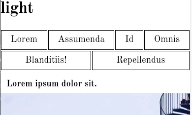
Test your page. You should see the top and bottom menus arranged in a row.
Now add some padding to the links inside the LIs. By making these boxes bigger, we will see how the top menu, in particular, arranges itself according to flex principles.
nav a {
  display: block;
  color: black;
  text-decoration: none;
  font-size: 1.2rem;
  padding: .4rem;
}
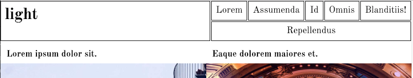
And here’s the effect at the smallest size my browser will go down to:
Header Refinements
So we’ve got the menu doing more or less what we want it to do. Now let’s tackle the header arrangement
We want the two children of the header (the h1 and the nav) to go side by side at the second breakpoint. So in our 700px media query, add the following:
  header {
    display: flex;
    flex-flow: row nowrap;
  }
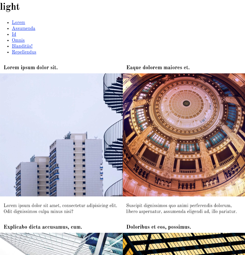
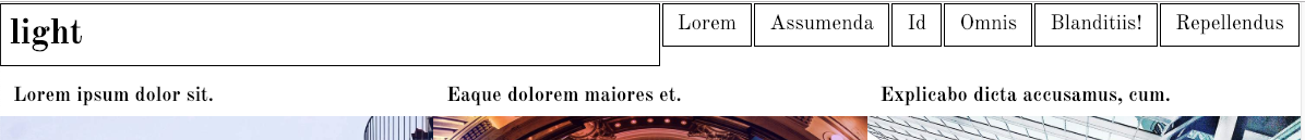
Here is the result:
In that query, add some flex basis to the children. (Here, I’m deviating from the screenshots a tiny bit, to make the alignment of elements work better with the MAIN area layout.)
  header h1 {
    flex-basis: 50%;
  }

  header nav {
    flex-basis: 50%;
  }
This is the result:
Modify the h1 style:
h1 {
  border: 1px solid black;
  margin: 1px;
  margin-left: 0;
  padding: .5rem;
  font-weight: 700;
}
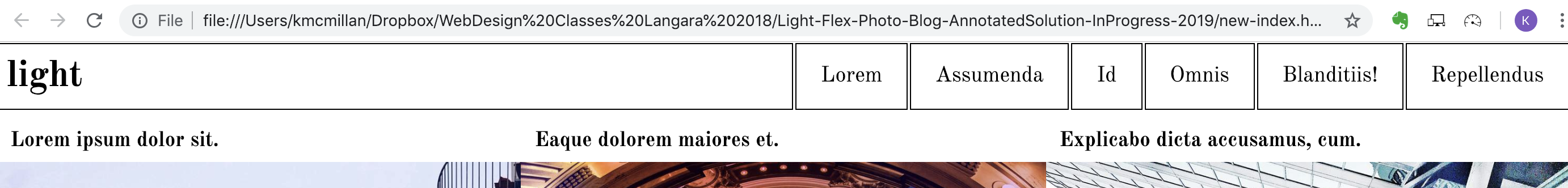
Here’s the result:
The menu and h1 arrangement looks good at the single-column breakpoint and at the start of the two-column breakpoint. However, as the window gets wider, we realize we’re not quite done yet:
We need to make sure we take care of a few things:
- the nav or ul in it needs to take the same vertical space as the h1 at bigger screen widths.
- the text (links) inside the LIs needs to be vertically centered.
- the text of the box inside the h1 needs to be vertically centered.
1. The spacing for the NAV or UL:
To find out what the source of the first problem is, size the browser window so that the problem shows up. Then inspect the header and click on the NAV in the code:
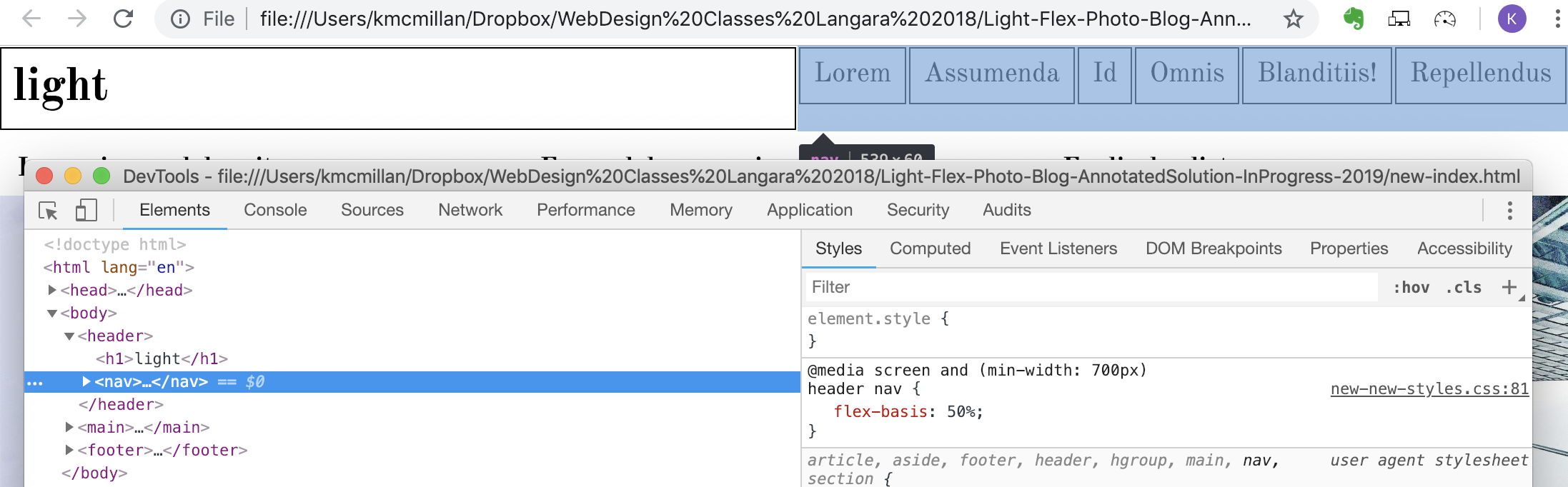
We learn by doing this that the problem is not the NAV. It is taking the same vertical space as its sibling h1. Instead, if we click on the UL in the inspector, we see the problem:
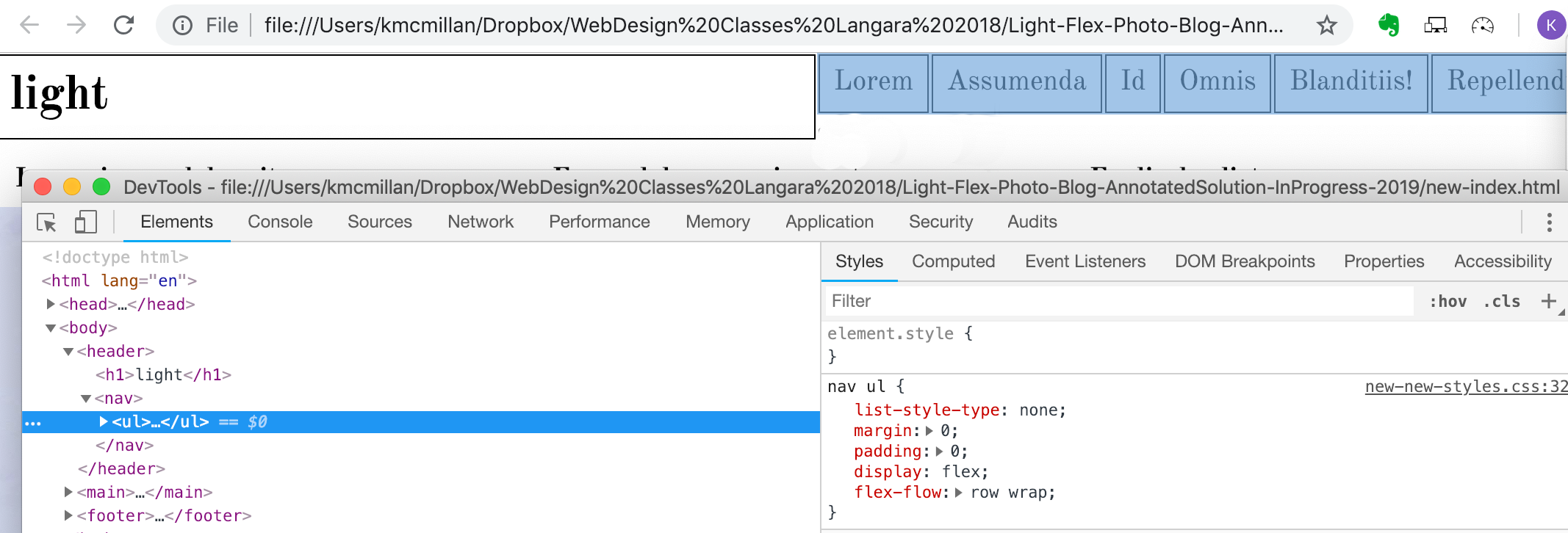
We see here, then, that the UL is not taking up the full height of the NAV. An easy fix: make the NAV a flex-parent, and set its UL child to be allowed to grow (via the flex-grow property).
  header nav {
    flex-basis: 50%;

    display: flex;
  }
  nav ul {
    flex-grow: 1;
 }
2. The vertical centering of the link text:
This is easily done. Make your NAV LIs flex-parents, so they can vertically center their (single) children:
  nav li {
    display: flex;
    justify-content: center;
    align-items: center;
  }
Justify-content will align the children on the row-axis. Align-items will align content on the cross-axis. If we are in row orientation (which is the default), justify content controls the x-axis and align-items controls the y-axis. However, those properties are reverse if we are in column orientation.
Test your page:
The h1 vertical alignment can be taken care of the same way, if you need to do so. I’ll leave that to you.
The Extra-Wide Layout
To produce the layout in the extra-wide screenshot, we need to rely primarily on positioning. First, make a 2000px media query and add a border to each article.
@media screen and (min-width: 2000px) {

  article {
    flex-basis: 25%;
    border: 1px solid black;
}

}
Suddenly our layout breaks. The problem is that our boxes are now 25% + 2px wide (because of the addition of borders).
The easiest fix for this would like be using box-sizing: border-box to the article style. This makes the browser include the border and padding inside the box width (by default it’s added to the box width).
Here’s the entire code for the positioning work we’re doing here:
@media screen and (min-width: 2000px) {

  article {
    flex-basis: 25%;
    border: 1px solid black;
    box-sizing: border-box;
    position: relative;
  }

  .image-box {
    width: 60%;
  }

  h2 {
    position: absolute;
    top: 1.5rem;
    left: 0;
    right: 40%;
    margin: 0;
    padding: .5rem;
    box-sizing: border-box;
    background-color:rgba(255,255,255,.8);
  }

  p {
    position: absolute;
    top: 1.5rem;
    left: 61%;
    right: 1%;
    margin-top: 0;
  }
}
The result looks like this:
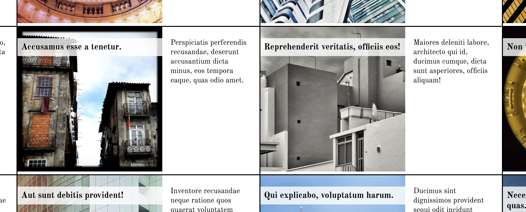
This looks good, but we have one final annoying this to fix here. Notice how the images are not touching the bottom of their article boxes?
To fix that, set images inside the .image-box DIV to display: block. Images are inline, which means that they behave like type. Text does not sit on the baseline in CSS: it sits in the middle of the line-height, and images behave the same way.
Block elements, on the other hand, do not behave like text, so changing the images to blocks means that they will not have that annoying space on the bottom.
I was a web designer for many, many years before I figured that out.
The “Row” Striping
Finally, let’s take care of the striping effect. Here’s how we do it. Add this to your 700px query:
  /* STRIPING ====== */
  article:nth-of-type(4n+3){
    background-color: var(--lightbg);
  }

  article:nth-of-type(4n+4){
      background-color: var(--lightbg);
  }
Remember at the beginning when I mentioned CSS Custom Properties? (It was in the BODY style). These work like variables in a programming language, allowing us to set a value in a single place, and then refer to it by name later.
In this case, I set a custom property to keep the background-color we want to use for the striping effect. If we later want to change the background stripe color, we just need to change the variable value in the BODY declaration.
Anyway, here’s how the rest of the above code works: when we use 4n in the nth-of-type decaration it means every fourth article. The +3 means starting at the third article.
The second declaration targets every fourth article, starting at the fourth article.
To figure out how to build these kinds of selectors without your head exploding, it can help to draw a diagram of the layout, with numbers in boxes to figure out the interval and start point.
Here we see the code producing the intended effect:
For the next bit of striping, include the following in your three-column media query:
  /* STRIPING ====== */

  article:nth-of-type(1n) {
    background-color: transparent;
  }

  article:nth-of-type(6n+4){
    background-color: var(--lightbg);
  }

  article:nth-of-type(6n+5){
      background-color: var(--lightbg);
  }

  article:nth-of-type(6n+6){
      background-color: var(--lightbg);
  }
The reason for the first declaration is that we need to remove the striping set in the two-column layout. The declaration means that every article bg color is set transparent. If you’re wondering why I am using nth-of-type to remove the bg color, it’s because I need to have the same level of CSS specificity as the declaration that originally set the bg color on some of the articles.
I will leave the remaining striping (at the four-column breakpoint) for you to figure out.
Thanks for your patience with a long exercise.