What To Do
- Download the Starter Files, and Screenshots.
- Examine the Screenshots.
- Write the HTML, CSS, and JavaScript to make a page that looks and behaves like that in the movie and screenshots.
NOTE: if this is a regular weekly exercise, the mark is out of 1, as usual. Consider the questions identified as “bonus” to be part of the exercise (and not for bonus marks).
The marks listed below are for if this is an exam.
Video Demonstration
Please ignore the video in the download: it has no sound.
Instead, watch this Loom video.
Articles: 10 marks
If we have covered Emmet in class, please generate the content using Emmet shortcuts: this will give you unique lorem ipsum.
If we have not yet covered Emmet in class, you can make one article and copy and paste.
- Site and Article Titles are Goblin One from Google Fonts.
- Everything Else is Merriweather from Google Fonts
- Each title has 3 words of lorem ipsum.
- Each paragraph has 20 words of lorem ipsum.
- Make as many articles are there are photos in your download.
- Check all typographic, alignment, and box model properties carefully.
Main Layout: 10 marks
- Responsive.
- 1 to 4 columns, simple footer.
- You determine the breakpoints.
- Make all rows in the layout full: if a row is not completely full at a particular responsive breakpoint, hide those articles.
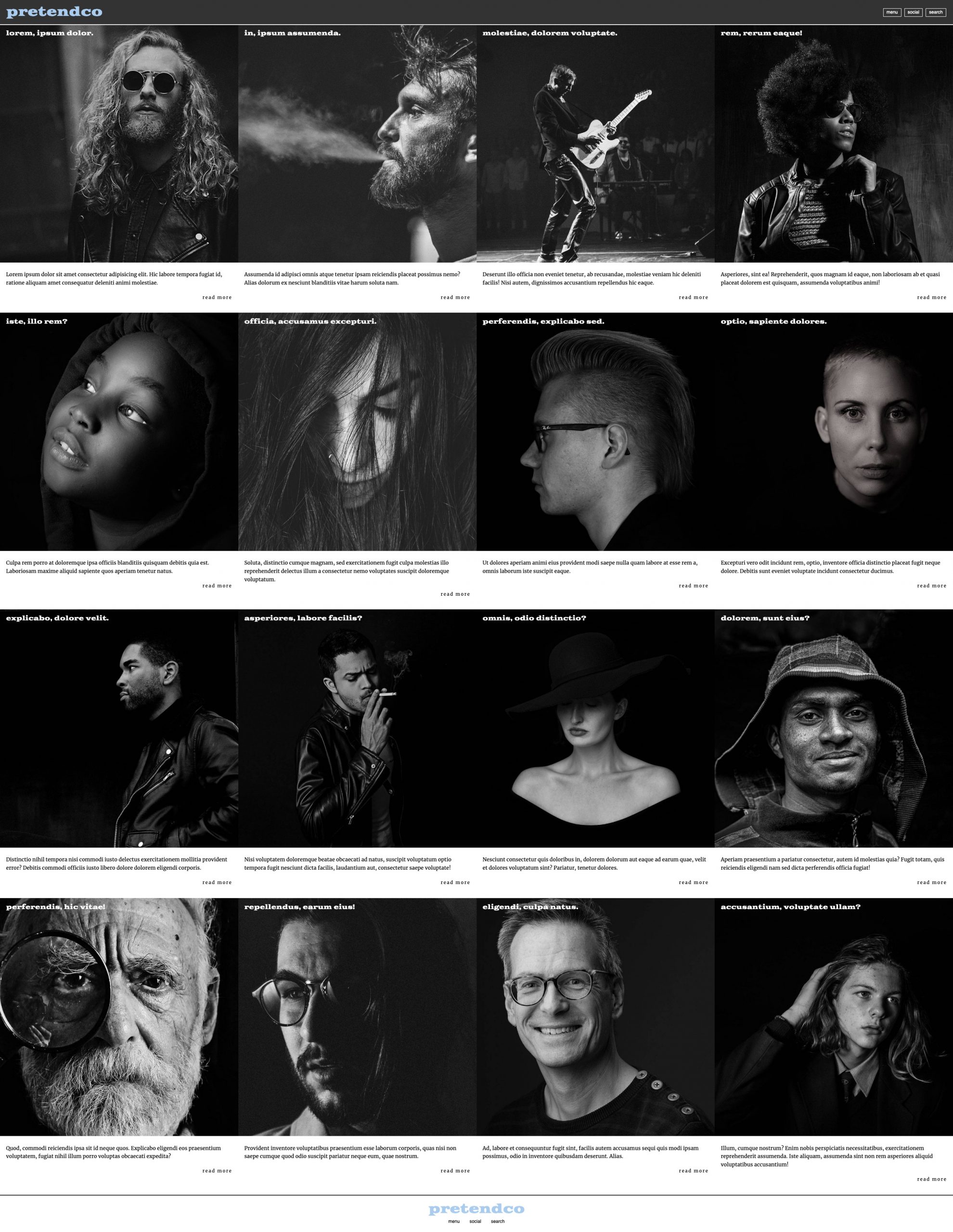
Header Area: 10 marks
- Dark translucent background: slightly see-through.
- Header stays in place when page scrolls.
- Scrolling content partially visible under header as page scrolls.
- At smallest responsive breakpoint, link text in header changes to icons (see in movie).
- At other sizes, links in header are actual text (see in movie).
- Make site title color as close as possible to the color in the screenshot.
- Elements are vertically centered.
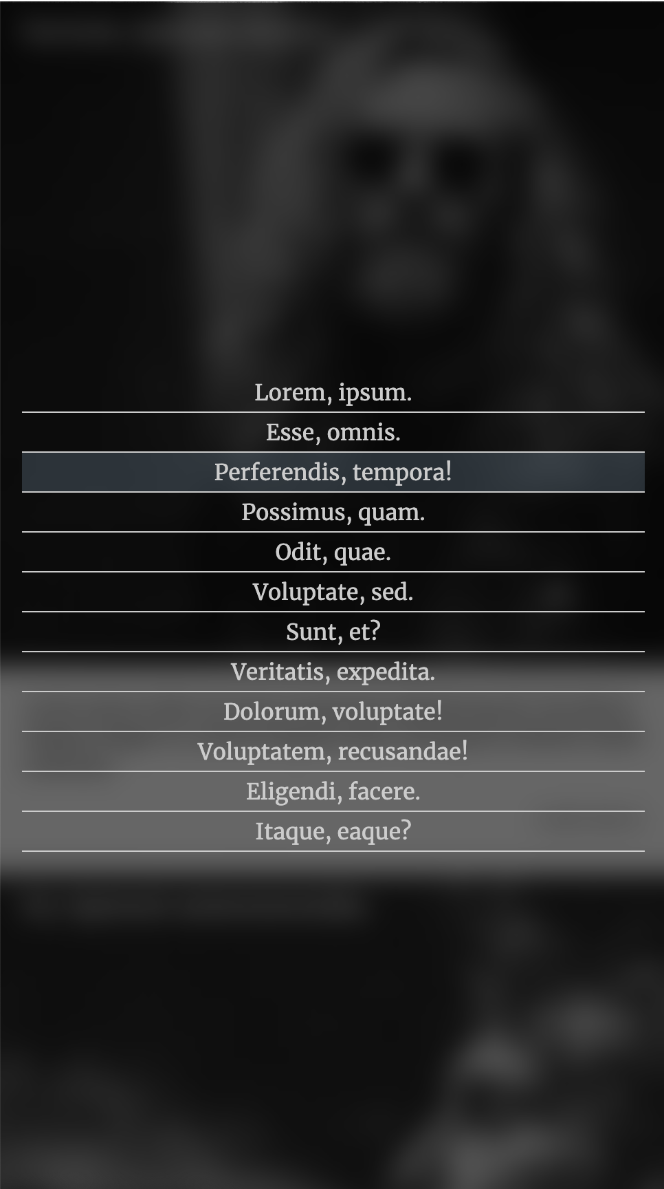
Menus & Links: 10 marks
- ReadMore link hover color is the same as site title color.
- Menu button hover background color is the same as title color. Foreground remains white.
- Side Menu link hover background color is a translucent version of the site title color.
- Main menu is hidden until button clicked.
- At click of menu button, main menu slides out from the right of the browser window.
- When menu is active it covers exactly one column of the main layout. See screenshot.
- In most of the screenshots and movie, the background behind the menu is blurred. You do not need to do that, unless you want bonus marks (see below).
- Even though there are three buttons in the top right of the header, you only need to have the MENU slide out. In other words, you don’t have to do a SOCIAL menu or a SEARCH form—unless you want to, for practice.
Bonus: 5 marks
- 2 marks: using the backdrop-filter property, blur content behind the active menu.
- 3 marks: add the ability to dismiss the menu by pressing the ESC key (Emily Carr Students: you do not need to do this one).