Please download the starter files and set them up as a new project in Atom, or any other editor of your choice.
Please also download the screenshots package.
In this exercise, you will make a single-page responsive design. You can use the Internet or your notes. If this is a test, you may not talk to anyone other than me or the Instructional Assistant.
Included in the download is an index.html file that has partially-complete HTML. You will need to add more. Validate regularly: if this is a test, part of your mark will be for having the validator say that you have no errors in your HTML and CSS.
In order to save time, I have marked up the articles in the exercise. All of them are identical, with the exception of the book cover image and title.
Try to make the layouts as close as possible to the ones in the screenshots.
The font used for the site name is from google: teko. All other type in the document is merriweather, also from google.
Book Characteristics
Each article must have the following characteristics:
- padding of .5rem on top and bottom
- padding of .5% on left and right
- margin of .5rem on top and bottom
- margin of .75% on left and right
Without these characteristics, you won’t get a mark for the main area layout.
Layouts
You decide all responsive breakpoints in the exercise. Make sure that nothing breaks at any size.
Make the layout take no more than 1700px. If the browser is wider than that, make sure that the whole layout is in the horizontal center of the screen.
Main Area
There will be five layouts for the main area. As the screen gets bigger, the main area layout changes, in this order:
- single column
- two column
- three column
- four column
- five column
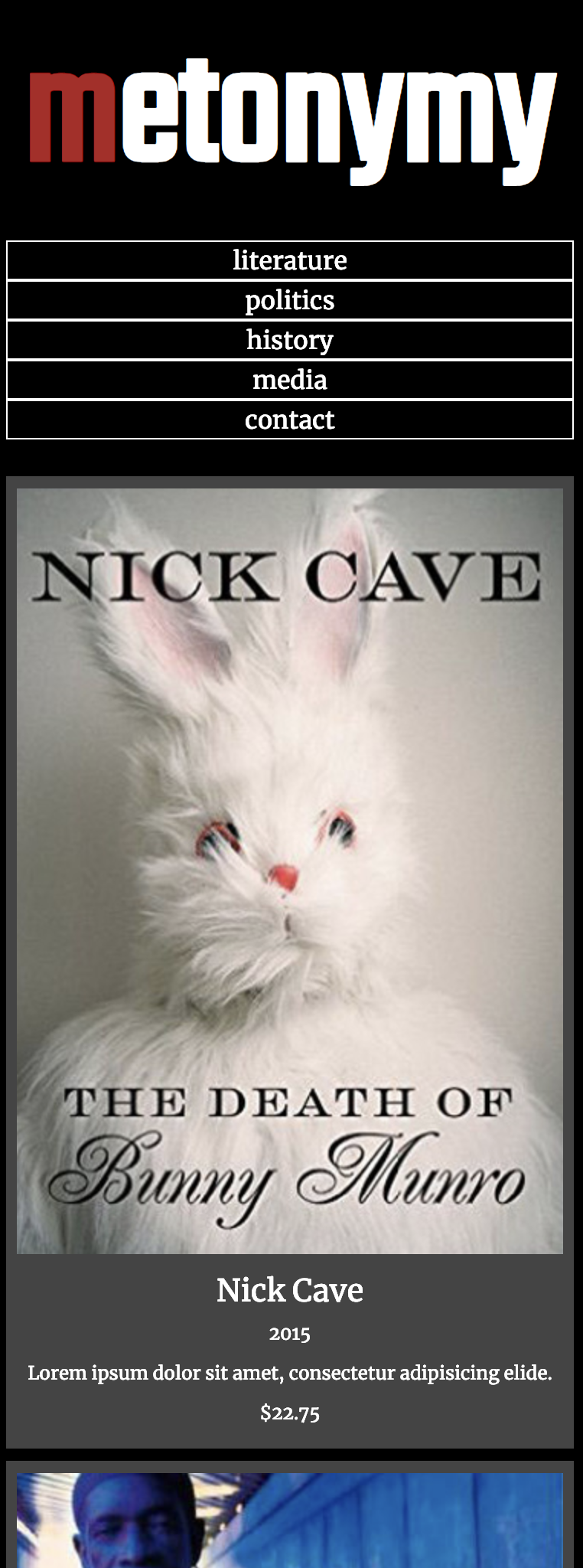
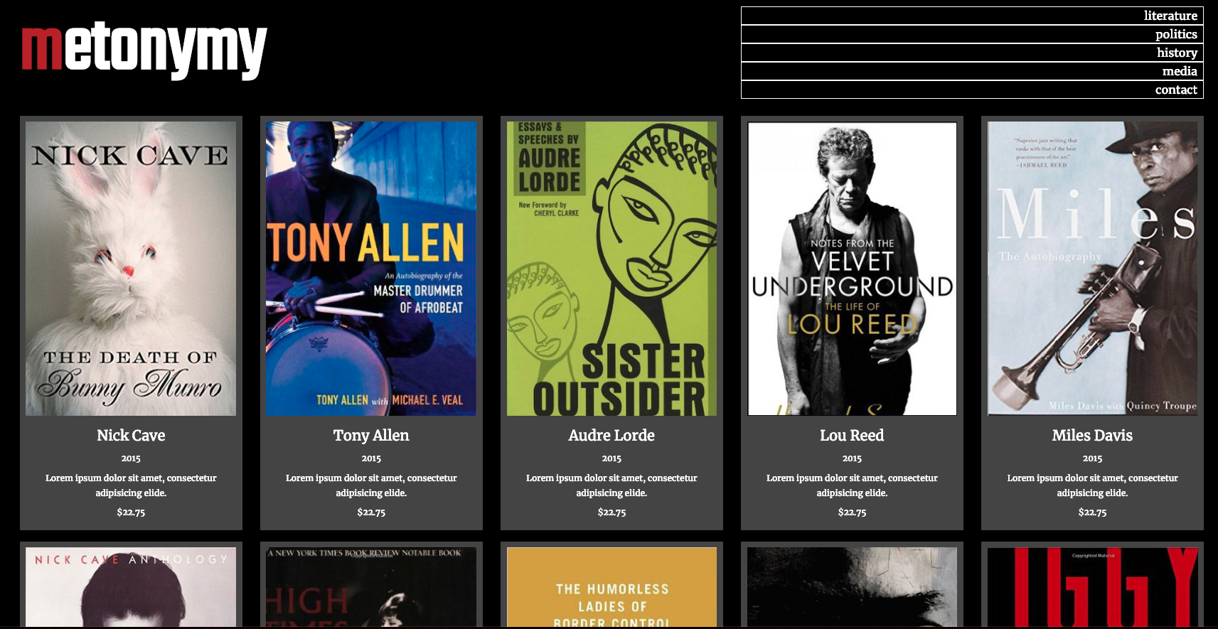
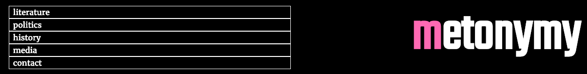
The smallest and largest layouts are shown above. Consult the screenshots for the differences between the other ones.
Header / Footer
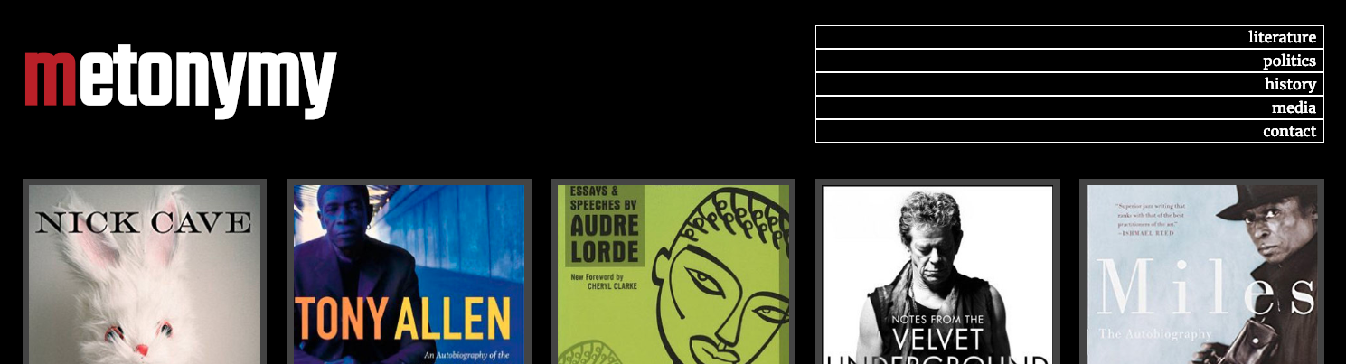
There are three layouts for the header and footer areas:
- small screens: h1 and nav stacked.
- medium and large screens: h1 and nav side by side, equal width
- extra large screens, h1 and nav side by side, unequal width.
The move to the “medium screen” header/footer layouts will occur at the same breakpoint as when the main area goes to three columns.
With item 3 here (for the extra-large screens), the navigation takes two columns when the main layout takes five columns.
The difference is shown in the following three screenshots.


Header vs Footer Differences
There are a few difference between the header and footer:
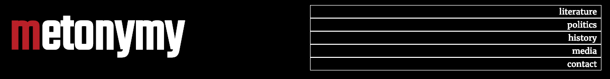
The first letter of the site name in the header has the color firebrick.
The first letter of the site name in the footer has the color hotpink.
When the main layout goes three column, the elements in the header and footer go side by side, but reversed:
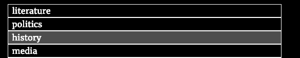
Hover Effect
When moused over, links exhibit the following effect:
Marking Matrix
If this is a test, your mark will be broken down as follows:
| Main Layout | 7 |
| Header / Footer | 5 |
| Typography | 2 |
| Article Format | 3 |
| Hover Effect | 1 |
| Validated HTML & CSS: No Errors | 2 |
Bonus Mark
For 2 bonus marks, make the site title and the nav vertically align perfectly.
When You Are Done
If this is a Langara test, please hand in the exercise to the class hand in folder. Otherwise, please show it me or our Instructional Assistant.