In the following exercise, you will make a sign-up form (and possibly a gallery).
To begin, please download the files you will require.
In the downloaded archive, you will find the following:
- a text file containing most of the text used in the page,
- the images to use in the exercise,
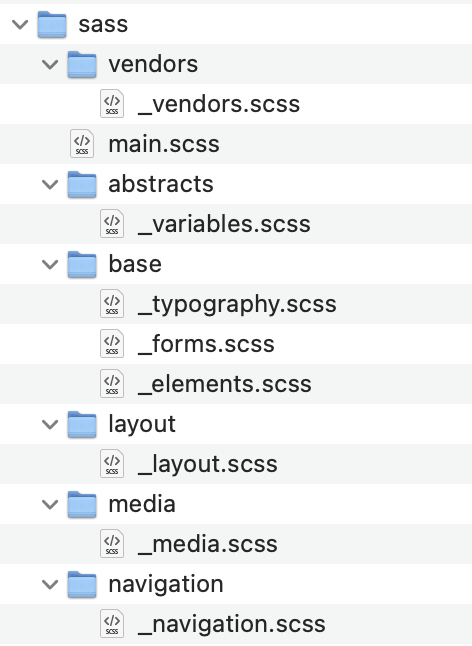
- a sass folder with subfolders,
- the screenshots
Change the name of the folder to your-full-name-jazzclass.
You can use the Internet, your notes, or previous files.
If this is a test, evidence of other collaboration or someone else doing your exam will be fully investigated and reported.
If this is a test, it is out of 20 marks.
In the final section, you must choose one of the two options to do.
If this is an exercise, it’s out of 1, and you must do both of the “option” tasks.
A Loom Video Run-Through
At this Loom Video URL, you’ll find a demonstration of the entire exercise or test, including the “options” parts.
Marks (If a Test)
| Use of SASS | 4 marks |
| Typography | 2 Marks |
| Layout / Content | 8 Marks |
| Option One or Two | 6 Marks |
Text Details
All text uses the charter, georgia, times, “times new roman”, serif font stack.
Make sure that every single element on the page uses that font combination.
All icons come from Font Awesome: user, envelope, map-marker, circle-question, lock, eye, and eye-slash.
The accent colors used in the exercise are orange and hsl(240, 20%, 40%). They appear in some text and some UI elements.
The links in the text (sweetwater and musiciansfriend) can be just testing links, made with just a hash tag (#) as the value of the href attribute.
SASS
If we have covered SASS in our course, you must use it here.
You must also use the provided folders and files, adding no additional files to the sass setup.

All color references in your code must be made with SASS variables.
Responsive Behavior
For the responsive states, consult the screenshots or Loom video.
The Form Markup & Styling
Style all the page elements as they appear in the screenshots.
Inside the form are three fieldsets, each with a corresponding legend element.
The three fieldsets are followed by a single submit (“join”) button or input.
Each input (other than the submit input, if you’re using an input) has an associated label.
Make sure that clicking on a label or the associated icon either focusses the cursor in the associated field or checks the associated button.
When the page loads, the cursor appears in the full name field automatically:

In fieldsets two and three, make sure that the user can select only one Instrument and only one Level: choose appropriate input types.
Guitar and Beginner must be pre-chosen when the page loads.
Make sure that text in the password input cannot by default be read (ie it displays like the typical ••••••• password text).
The names for the font awesome icons for the form elements are listed near the top of this exercise.
In the Instrument and Level fieldsets, hovering over each box makes the background turn the site’s blue accent color (listed above), with a short transition.
Note: your marker will be marking this exercise using Firefox. At this point in time, Firefox does not support the :has selector.
Hovering over the JOIN button or input will cause the background to transition to the site’s orange accent color.

FINAL TASK OPTIONS
Choose from either option one or option two.
Option One:
Form Interaction / Behavior
Option one requires JavaScript.
Country Details
When the user clicks the INFO button to the far right of the Country label, the following sentence appears beneath the form, with a transition that shifts subsequent content down (see the Loom video for a demonstration).

Clicking the Info button again will dismiss that text, allowing the subsequent content to slide back.
This text must remain accessible when hidden.
Consult the Loom video to see this behavior.
Toggle PW Text Visibility
When the user clicks on the eye icon, the password text is revealed. When it is clicked again, it sets it back to the typical •••••• display of password text.
This will require basic JavaScript, to modify properties of the password input field.

Toggle PW Visibility Icon
When the user clicks on the eye icon to reveal the password, the icon changes to an eye with a slash through it. This will require JavaScript.
See the above screenshot to see what that icon looks like.
Option Two:
Recent Graduates Section
If you choose the Recent Graduates option, you must make the layout shown in the bottom of the pages.
In this layout, which is demonstrated in the Loom video, the images that load must be of appropriate size for a user’s screen width, the screen’s pixel density, and the width each image takes up in the layout.
NOTE: because Chrome caches very aggressively, it can give misleading results when testing. So use Firefox to test what you’re doing here.
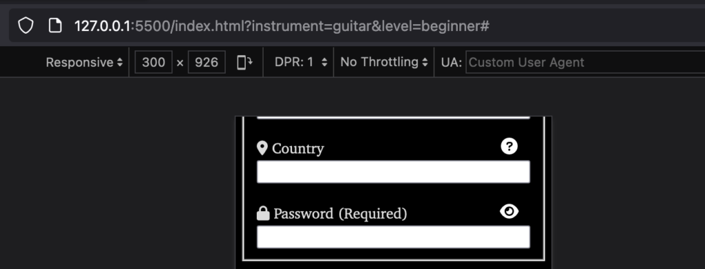
NOTE 2: in your testing, you may or may not see the 400px image (and possibly the 2000px one if you have a single density screen that is not very wide). This will depend on your screen resolution and pixel density. You can however, “fake it” using the Firefox Inspector’s Responsive Device Mode:

The screenshots are divided into high resolution and low resolution images to show that behavior. Consult the Loom video if this is not clear.
The supplied images come in 400, 800, 1400, and 2000 pixel sizes. All must be used in your code, so that you are practicing responsible responsive design.
The images used are numbers 1, 2, and 7 in each folder.
The images must be styled with CSS so that they appear greyscale.
When You Are Done
When done, please double-check that you renamed the folder correctly: your-full-name-jazzclass.
Then zip it up, and hand it into our course hand in folder.
At Langara, that would be BrightSpace. At Emily Carr, Moodle.