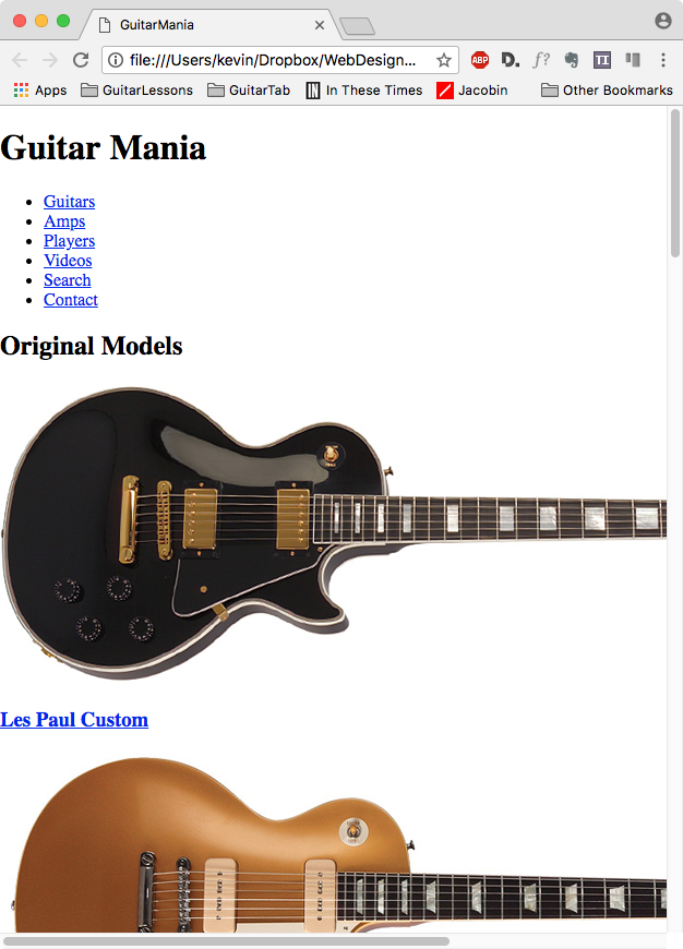
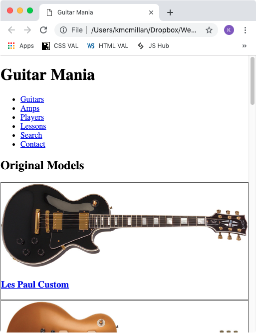
At this point, our page should look like this:

The first problem we notice is that under a certain size, the images go beyond the edge of the browser window rather than scaling with the page.
Responsive Images
The solution, and a fundamental technique of Responsive Web Design, is to make your images resize to fit their parent element’s CSS Box.
It’s easy to do this.
Open the file style.css if it isn’t already open. Add the following style:
img {
  max-width: 100%;
  height: auto;
}
This tells the browser that the image is allowed to shrink as its parent or containing element shrinks, and also to not let the image scale beyond 100% of its innate dimension.
(The height:auto just makes the scaling proportional in all browsers).
For styling purposes, let’s also add a border to the box holding the image and the h3:
.guitar-small {
  border: 1px solid #cccccc;
}
Test your page now. Shrink it to see if the images are scaling down and have the border. The page should look like this:

If it doesn’t look like this, consider validating your html & css. Make sure that you have saved both your HTML and CSS files.
Now let’s move on to styling our header, footer, and menu.