In the following exercise you will need to analyze the layouts of the various parts of the page, and then decide whether grid, flex, or a combination of both will give you the results seen in the screenshots and demonstration movie.
Downloads
First, please download the resources you’ll need: this is a collection of screenshots, and a collection of face photos for use in the Team section near the bottom of the page.
Demonstration
Here is a short Loom video describing the appearance and responsive behaviour of the page.
Typography
Please go to the website of The League of Moveable Type and download the League Gothic font.
Use @font-face syntax to load that font: you will use it for the headings in the page. If you need to review how to use @font-face, consult this CSS Tricks article.
Feel free to use WOFF2 font format only.
Use League Gothic for the site name, section titles, and widget titles (the titles for the lists in the “sidebar”).
Finally, make all other elements use the Google font Lora. This includes the article headings.
HTML Markup
You will need to decide what HTML to use to make your job of laying out the page easier, while maintaining semantics and accessibility.
Responsive Strategy
Use a mobile-first responsive strategy.
Header & Footer
At the smallest sizes the site title and navigation in the header are stacked, horizontally centered.
When there is enough room, those two elements appear at the far left and far right sides of the header.
Note the horizontal and vertical spacing of the footer, specifically the amount of space beside and between the two elements.
Articles Area
Each of the nine articles in the Articles area has a heading a random image, and a paragraph with 16 words of lorem ipsum.
Gallery Area
Each box in the gallery area is a figure with a figcaption. Inside each figcaption is a random country name and a random long date.
You can create those random city names and dates with the Visual Studio Extension called VSCode Random.
The city name must be bolded.
Figure out how to add this data in the most time-effective way. In this task, Emmet and Visual Studio Code’s multiple selection capability are likely to be very useful.
Section Headings
At small and medium sizes, the section headings look like this:

At larger sizes, they look like this:
In order to make life more interesting, for this exercise, you are not allowed to use the span inside the heading technique for this treatment and not allowed to use CSS positioning for this task.
Hint: pseudo elements are your friends here.
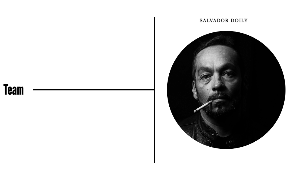
Team Area
Observe carefully the arrangement of the team member photos and names at larger sizes.
Arrange the team members so that at small screen sizes, they go two column, and that at larger screensizes, they go six columns. There will be no three-column or four-column layout.
Note the arrangement in the six-column layout, as shown below.
The names have changed from the screenshots. Use the new ones, which are listed below:
- Salvador Doily
- Sue Flay
- April-May June Jones
- Seamus XuXu Vivek Benedicto Gwynn Owens Simpson Rubber Chicken, Jr IV (Esq)
- Barbara Seville
- Russell Sprout
Make sure that the images align perfectly with each other: they don’t zig-zag, in other words.
Make sure, also, that the names align the way they do in this screenshot, even when they wrap (as in this screenshot).

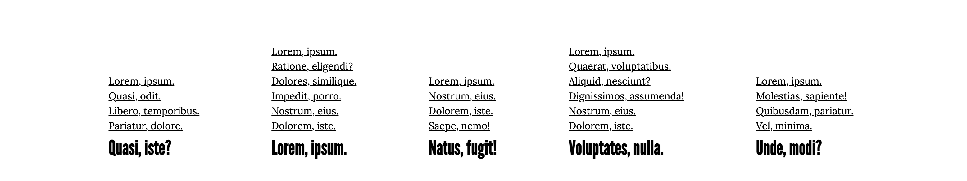
Sidebar
The sidebar is not actually ever on the side, but that’s a common term for a widget area in the WordPress world. The sidebar here is between the Team area and the Footer.
Each box in the sidebar contains a heading and a list. Note the arrangement and alignment of both at the larger sizes.
Note also the varying number of list items in each list.

Have fun!
To Hand In The Project
Langara WMDD Students:
Rename your project folder your-name-grid-o-flex, then zip it and hand it into Brightspace.
Emily Carr Students:
If I have asked you to work in pairs, when you are done, rename your project folder team-member-1–team-member-2–grid-o-flex and have one member of the team hand it in here.
To repeat: have only one team member hand in the project. Make sure that the project folder is named as above.