For this exercise, you will make a single page layout for a mock magazine website.
First, please download the starter files and the screenshots.
The HTML
I have given you a lot, but not all, of the HTML required.
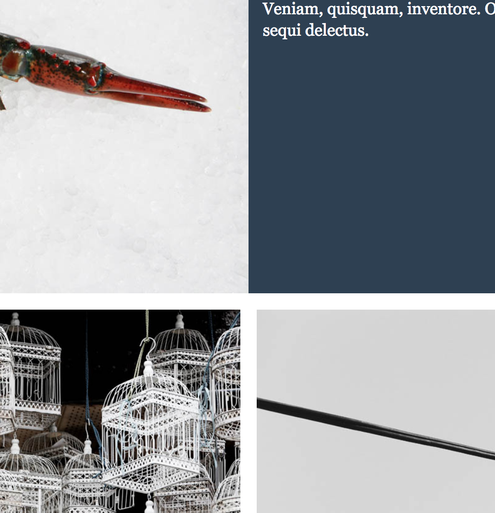
Try to get as close to the screenshot designs as possible.
I have given you all the code you will need for the form at the bottom of the page: your job is to style it as in the two form screenshots.
The Phone View
Consult the screenshot.
The Desktop View
You choose the responsive screen width breakpoints. Make sure that the layout does not break at any screen width.
Do not let the layout of the main content get wider than 1400px. Make sure that that content area is centered.
When the browser width is greater than 1400px, make sure that the section titles align with the left edge of the content (as in the DesktopView screenshot).
When that content is touching the edge of the screen, make sure that no text touches the edge of the screen (as in the MediumDesktopViewDetail screenshot).
The Form Screenshots
Firefox has a great full-screen screenshot ability, but it cuts off screenshots above a certain size. For that reason, I have included screenshots of the FORM at Desktop and Phone widths. It has two different layouts (like the rest of the exercise).
Hovers
There is a screenshot showing the hover state for the menu items as well as the submit button in the form.
The menu in the header needs to be list-based, with testing link HREF values (‘#’).
Fonts & Colors
Any sans-serif text is the Google font Fira Sans Condensed.
Any serif text is the georgia font stack.
Try to get the colors and spacing as close to those in the screenshots as possible.
Bonus Mark
The test is out of 15, but for two additional marks, make sure that the desktop alignment of the articles in each section is as in the center of this screenshot:
Marking Details
| Phone Layout | 2 |
| Desktop Layout | 6 |
| Form Layouts | 4 |
| Header (including NAV) | 3 |
| Bonus Mark | 2 |