One of the easiest things you can do to ensure that you pages do not present accessibility barriers is to make sure that your text and interface elements have high contrast.
The Web Content Accessibility Guidelines (WCAG) give recommendations on ratios representing contrast between light and dark. The ratios are always given as X:1, where X is a number.
For example, white text on a white background would be represented as a ratio of 1:1 (since there is no difference between the colours). Black text on a white background would be represented as a ratio of 21:1.
The minimum recommended value is 4.5:1—this is known as the AA standard.
The AAA standard offering full accessibility is a contrast ratio of 7:1.
The range of sites not meeting even the minimum ratio is huge.
A great tool for testing contrast ratios is Lea Verou’s contrast-ratio website. This tool accepts any color format a web browser understands—even with transparency.
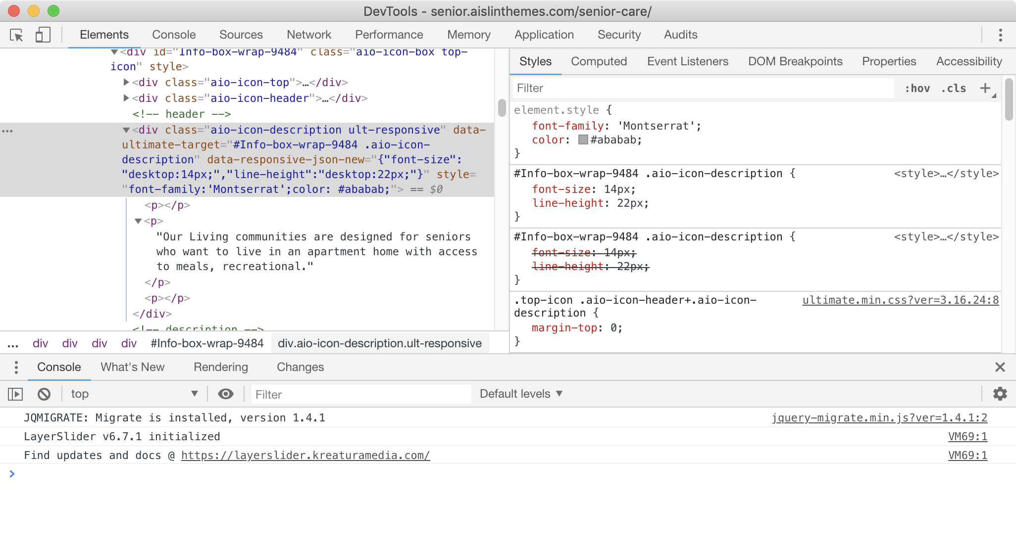
However, less well known is a tool built into the Chrome Developer Tools. To try it out, first please go (in Chrome) to a WordPress theme demo I saw the other day, ironically entitled Senior Care.
That page presents a typical corporate-style design. What is striking is how damn hard it is to read the text.

Notice the grey text in four columns underneath the big slider images? Inspect it by right clicking on a the one of the four paragraphs. After poking around in the inspector looking for the source of the color, I selected the DIV that is the parent of the text in the first column.
We see on the right hand side of the inspector that the color of the text is being written inline, probably with JavaScript. That’s why the CSS side of the Inspector shows the color as element.style and the actual CSS selectors have their color values overruled (represented by a line through the rule).
Click in the color paint chip in the element.style area that’s in the above screenshot. This will bring up the color picker:

About 60% of the way down, the color picker gives us the current contrast ratio—along with an icon warning that the current foreground-background ratio is making the type inaccessible.
I always joke that that icon looks like a non-smoking sign, but I digress (and it’s a dumb joke).
Anyway, click the disclosure arrow beside that icon:
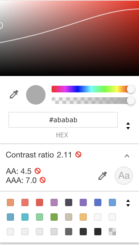
When you do that, the recommend contrast ratio values are presented, but a subtle UI element appears also: the curving line through the color field at the top of the picker. Above the line are colours that are inaccessible with the current background (as seen in the screenshot above).
Drag the circle that’s in that box under the line and observe both how your ratios change and how the text on the page changes:
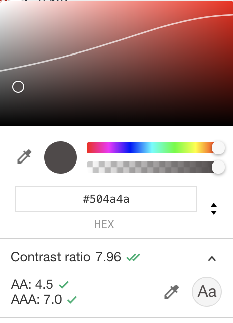
Easy.
In order to further improve the readability, I also increased the type size from the tiny 14px to a more reasonably 16px. And here’s the difference demonstrated—with the accessible text on the left and the original text on the right: