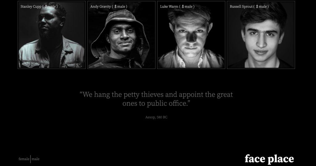
In this exercise, you will write a WordPress theme to output content the way it appears in the screenshots and Loom movie.
Initial Setup
For this exercise, please download the starter files (duplicator archives) and the screenshots:
Then please download this starter theme to start the project. If this is an exam, you must use this exact downloaded theme or your exam will not be marked.
Then, as usual, install the site in your development environment. Make sure that you create a new admin account as part of that process.
Rename the theme folder firstname-lastname-faceplace and install it in the site. Open the theme folder in Visual Studio Code.
In the new site, edit wp-config.php and set WP_Debug to true.
Important: in the style.css (or style.scss) file in your theme, call the theme your-first-name. In the AUTHOR field, use your FIRST and LAST NAME.
You will hand in only the theme. You will not need to make a Duplicator package.
Your task is to make a theme that outputs the site data looking as on the screenshots for the different responsive states. Zoom in on the screenshots.
TASKS
A quick Loom video describing the tasks. Note: if this is a test, you will not need to do all the tasks in the video.
This site is called faceplace. It presents a number of interesting faces, along with some details of each person.
Fonts
The font used throughout the site is Source Serif Pro from Google fonts. Choose appropriate font weights by looking at the screenshots.
Load the font the correct WordPress way.
Header & Footer
There are already two menus in the site you have installed. The main menu has links to the female and male tags.
Output this menu in the header of your site. In the Dashboard, you will need to select which menu goes in the menu location you create.
Output the Site Name.
Note the arrangement of elements at different screen sizes.


Front Page Content
Output four random men.
Output four random women.
Each man and woman will be styled as in the screenshots.
There are eight people in total.
As the page gets wider, your responsive states will move from 1, 2, and then 4 people in a row. Consult the screenshots and/or the video.
Article Form
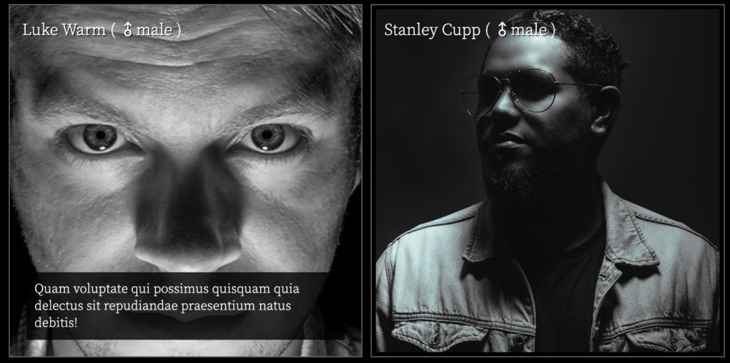
On the front page, each “face” card has the same layout and features. At all sizes, individual articles look like this:

The output for each “face” will be
- Title, linked to Single View
- Gender, linked to Archive (male or female)
- Gender Icon or Entity as Part of the Link to Archive
- Excerpt
The excerpt will not be shown until the card is hovered over. See the movie.
Additional Content
At the bottom of all pages of the site (above the footer), output a random Quotation. In this site, quotations are a custom post type (made with the CPT UI plugin) made up of custom fields (made with the Advanced Custom Fields plugin).
You will output the quotation and the source.

Navigation
When the user hovers over the name of the site (face place), that text needs to change to hotpink.
When the user hovers over the male | female menu, the link text needs to change to hotpink.
When the user is in an archive, the corresponding self-referential menu item needs to be light blue.
Hover Treatments on Front Page
When the user hovers over an article, the photo (not the article) will transition to twice its size and the excerpt will be shown.
The transition will take half of a second.
When the mouse leaves the article, the image will return to its original size, over the same amount of time, and excerpt will no longer be shown.
Make sure that the excerpt remains accessible even when not shown.
During the mouseover the article box itself must not grow or move, and the name of the person must not be covered by the photo at any time.

Clicking on the photo in home or archive pages will take the user to the single view of the post.
Single View
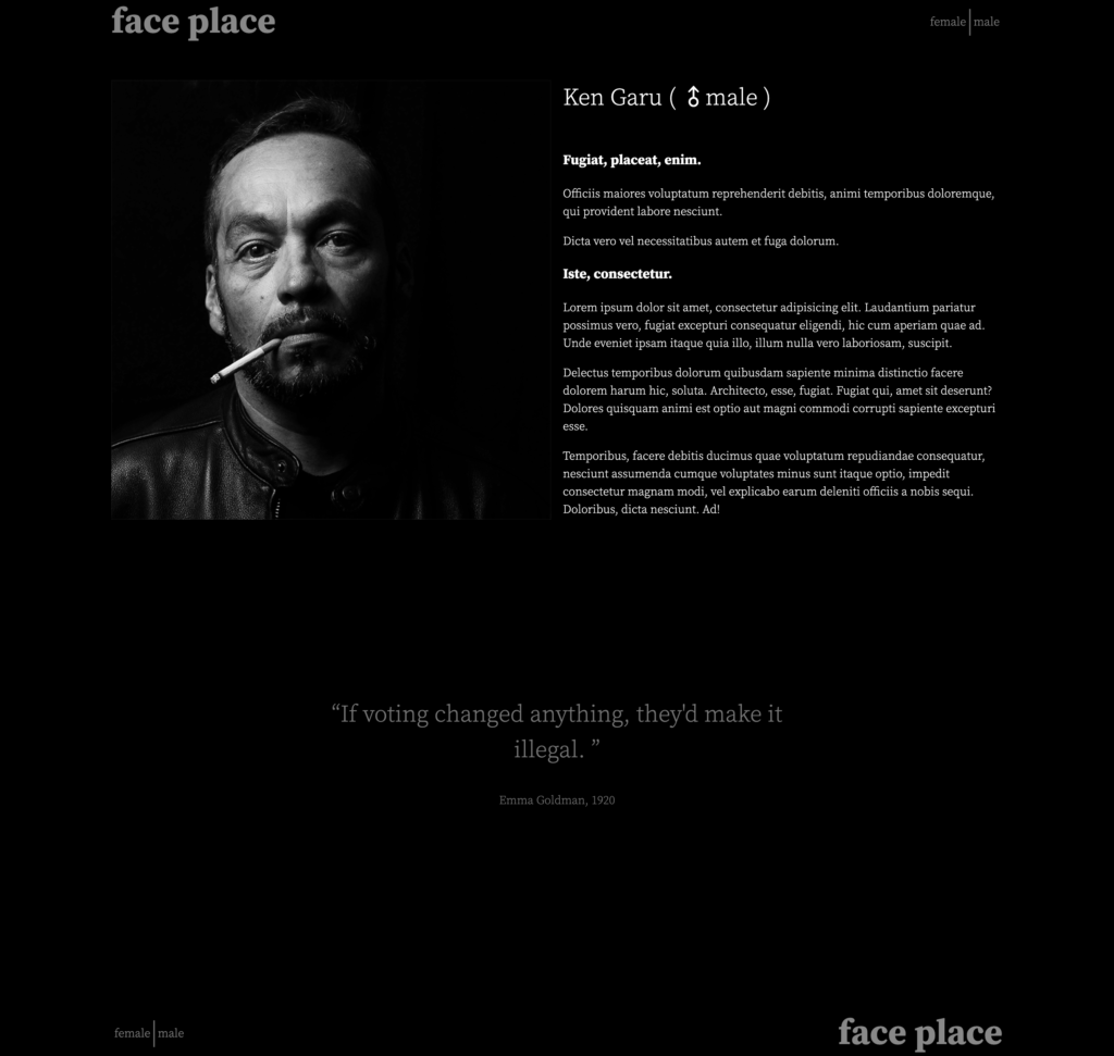
For single post views, the full content and not the excerpt is shown, in addition to the post thumbnail, and title.
Style the page as in the screenshots. Pay close attention to the alignments.

Marks
If this is a test, the breakdown of marks is listed below. If it’s a lab exercise, it’s out of 1, as usual.
| Typography | 5 marks |
|---|---|
| Header & Footer | 10 marks |
| Front Page Main Area | 10 marks |
| Front Page Content Hover Treatment | 10 marks |
| Quotation | 10 marks |
| Navigation | 5 marks |
| Single View | 10 marks |
When You Are Done
If this is a test, hand only your theme into the handin folder for the course. Do not hand in a Duplicator archive.