Initial Setup
Download Duplicator Site
For this exercise, please download the starter files and the screenshots collection, if I don’t distribute them in class.
These are big files, so the download might be a bit longer than that for most of the files on this site.
Most, but not all, of the screenshots for the exercise are also on this page.
Install Site in MAMP Environment
Inside the starter files archive is a Duplicator package and installer. Install the downloaded site in your development environment (likely MAMP).
Make a new theme folder called cities-your-name.
Inside the style.css file, include the following information.
- theme name: your first name
- author name: your first and last name
If you are a WMDD student, you must use SASS.
Screenshots
Now open up the screenshots collection.
Your task is to make a theme that outputs the site data looking as on the screenshots for the different responsive states. Zoom in on the screenshots.
Apart from the feature section on the home page, each regular post in the site has a title (city + number), a feature image, approximately 5 paragraphs, and a post summary. If you don’t see the post excerpt, go to screen options in the top right of the WordPress dashboard.
If This Is A Test
Do not worry about doing anything with the single template.
You will hand in only your theme. You do not need to use Duplicator at the end to hand in your work.
For that reason, any changes made in the dashboard will not be seen by me.
Common Features of the Design
The font used for the site title, site description, menu, and widget titles is the google font Kirang Haerang. All other type is the traditional georgia font-stack.
HEADER Area
At all sizes and on all pages, the header is centered at the top of the screen. The page scrolls normally: the header is not fixed positioned.

When hovered over, the colors in the name of the site, which is a link back to the home page, reverse:

If you look in the MENU area in the dashboard, you will see that the CITIES category has nested links. In WordPress, this creates a submenu. When CITIES is clicked, the submenu is revealed. That will require JavaScript. If you don’t get that working, make sure that the city categories are not hidden.
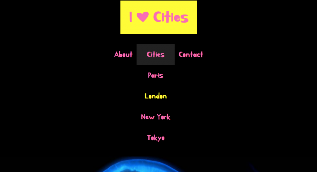
Home Page
Apart from the header, there are two main parts to the home page: CITIES section and the FEATURE area.
The FEATURE area, which is between the header and the CITIES area, is for BONUS marks (up to 25% bonus).
Please do the feature section only once you’ve done all the other parts of the test, as the feature section is more complex.
The Cities Area
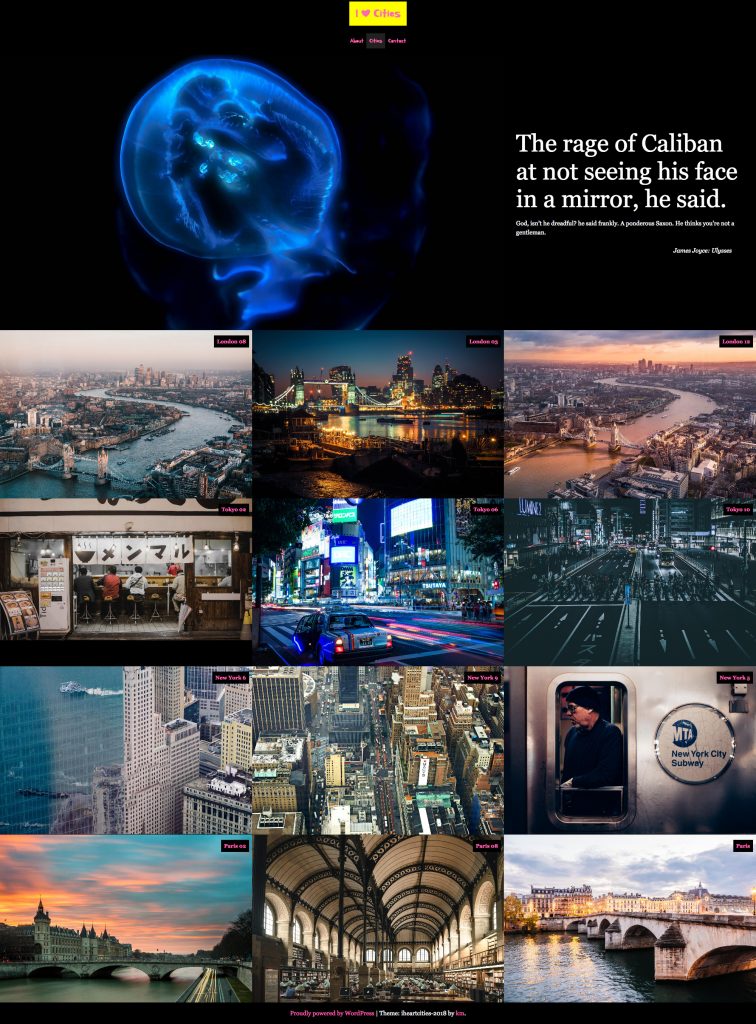
In the cities area, we have 3 posts from each of the four city name categories.
These articles load randomly, but we will always have three articles from London, then three from Tokyo, then three from New York and finally three from Paris.
At all browser widths, the post title sits in the top right of the feature image. Here they are at the large size.
Excerpt Hover Reveal
In the small layout, the excerpt appears below the feature image (see the downloaded screenshots).
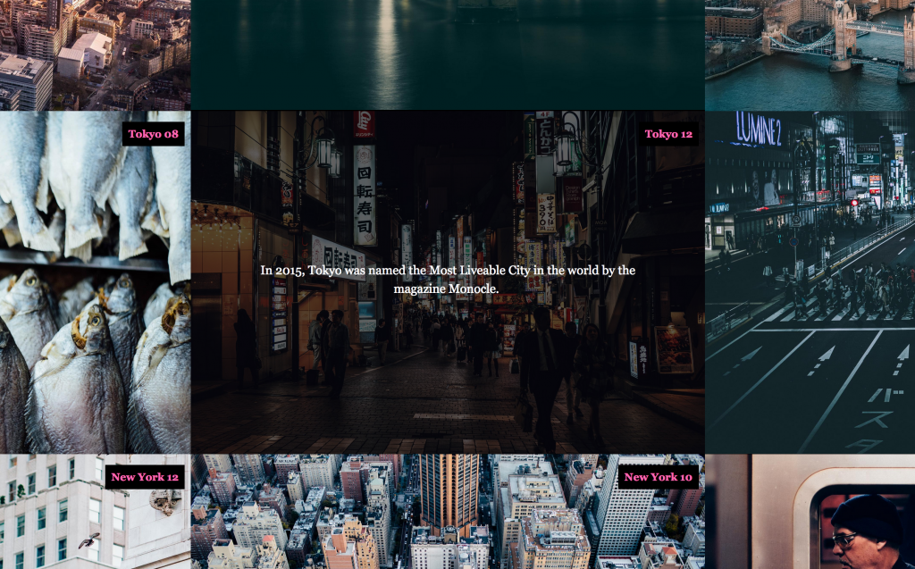
In the medium and large sizes, the excerpt appears only on hover. When the article is hovered over, the excerpt appears vertically and horizontally centered. The background of the hover is a translucent (partially see-through) black:
Category & Search Results
Search results and Category pages have three responsive states: small, medium, and large (single column, double column, triple column).
Category and Search results show the excerpt below the feature image for all sizes. No hover effects here.
NOTE: if this is a test, these pages should not include the SIDEBAR (which is near the bottom of these screenshots).
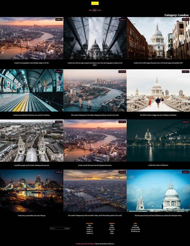
The only difference between the search and category pages is that the search results show the term(s) searched for in hotpink.
To test search queries, add a search field to the footer. Center it and put it above the site-credit. My apologies: there is no screenshot for this.
What Links to What
On Search Result and Category pages, clicking the page title or the post thumbnail will take the user to the full post view (which you do not need to do anything with, if this a test).
On the home page, the user needs to click the post title to be taken to the full post view.
(note to kevin: additional tasks commented out in revision so that the test does not take three weeks to finish…)
BONUS SECTION: The Home Page Feature Area
The feature section sits between the header and the cities section.
I’ve left this to last because it is the most challenging part of the test.
If you look in the dashboard, you will notice a Custom Post Type: Home Page Features. This was created with the Custom Post Types UI plugin, which is included with the duplicator package you installed.
To output Custom Post Type content, you will need to consult the WordPress Developer area section on WP_Query. You will need the post type slug to output custom post type content.
Each of the Home Page Features has two WordPress Custom Fields as well. In the screenshot below, the first and third text chunks are custom fields.
To output WordPress-native custom fields, use the line of code shown below.
You will need to change the word KEY to the name of the custom field. You can find that name in the dashboard by editing one of these Home Page Features custom posts. If you do not see the custom fields on screen, go to the top of the page and click SCREEN OPTIONS.
<?php echo get_post_meta($post->;ID, 'KEY', true); ?>;
The second text chunk in the screenshots is just the regular Home Page Feature post content.
The feature area will display 1 random Home Page Feature. At the small size, the custom fields and the post content sit underneath the post thumbnail. At the large size, they sit to the right of it.
MARKING METRIC
| Header Area | 5 Marks |
| Cities Area Layouts | 8 Marks |
| Excerpt Reveals on Hover | 3 Marks |
| Search & Category Archives | 4 Marks |
| BONUS: Feature Area | 5 Marks |
If this is a lab exercise, of course, the mark is out of 1.