Starter Content
First please download and install the duplicator archive that’s for this exercise. Check the version of PHP your MAMP is using.
Make sure that you create a new admin account as part of the installation.
Starter Duplicator Package (php 8)
Starter Duplicator Package (php 7)
Screenshots
Here is a collection of screenshots.
Starter Theme
Finally, please download this starter theme to start the project. If this is an exam, you must use this exact downloaded theme or your exam will not be marked.
Rename that folder firstname-lastname-thedayexercise
You can use SASS if you want, or just use plain CSS. If using SASS, feel free to change any of the SASS structure I put in the starter theme.
Setting Up Your Theme
Inside your stylesheet (css or scss, depending on whether you are using sass), change the name of the theme to your-first-name.
For the author, use your-first-and-last-name.
Debugging
In the new site, edit wp-config.php and set WP_Debug to true.
Loom Video
The Font Family
The font used throughout the site is the Google font Lato. You will need numerous weights, which you will determine from looking at the screenshots.
In all text that is placed on top of a photo, you must style in a way that ensures as much legibility as possible.
The Task
In this exercise, you will make a WordPress theme for a site called The Day.
If This is a Test
If this is a test, you will focus on the front page only. It has five sections: header, footer, features, cities, and people. Each will be discussed below.
In places, you do have to have links to the category archive or to the single view of a post.
Your single and archive views do not need to be styled, but they need to output the title, the feature image, and the excerpt (archives) or the content (single).
Header & Footer (3 points)
The header and footer look identical. Each will have the title of the site, and a menu. The menu is already in the WordPress site you downloaded, although you may have to enable it in the dashboard.
Here’s what the header and footer look like on a small screen:

Here’s what they look like on a big screen.
Note, the type size does not change: that is an illusion created by the scaling down of these screenshots.

When hovered over, the links in the menu transition over .5s to white.
Features Section (6 points)
The first section after the header is the features section. In it, you will output four random posts from the features category.
Each post in features needs to have:
- the feature image (linked to the single view of the post)
- the title
- the content of the three date-related custom fields.
These fields are made with the Advanced Custom Fields plugin: they are not the native WordPress custom fields.
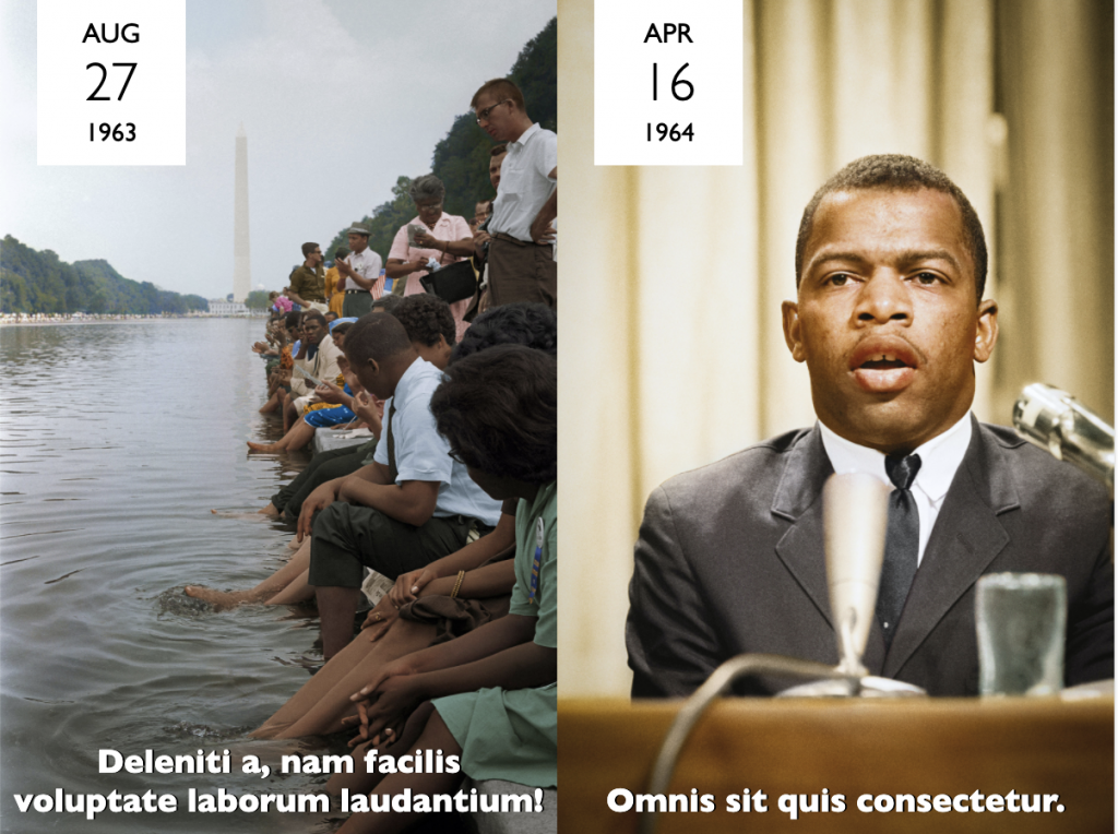
Features Responsive Layout:
The posts are arranged in a single column for phone, two columns for tablets, and four columns for large screens.
At all sizes, each individual post will look like this.

Note, the vertical alignment of the post title text when it wraps.
People Section (4 points)
The People section comes just before the footer.
I am covering the People section here, out of the page order, because it is quite similar to the Features section, and it is less complex than the Cities section.
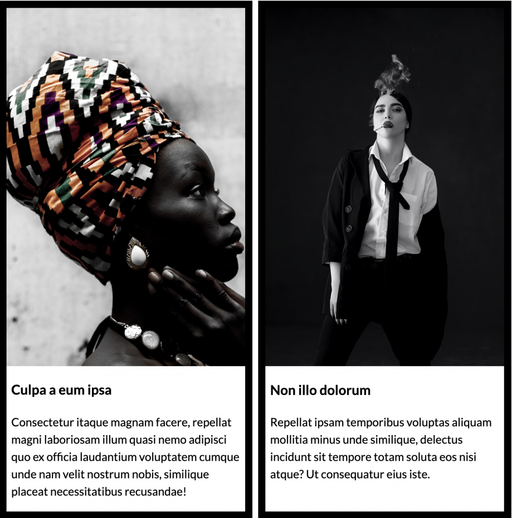
For the people section, output the four most recent posts in the People category.
Each post in the people section must have:
- the feature image (linked to the single view of the post)
- the title (linked to the single view of the post)
- the excerpt
The posts in the people section are arranged in a single column for phone, two columns for tablets, and four columns for large screens.
Here is a screenshot from the two-column view.
Cities Section (7 points)
The Cities section occurs between the features section and the people section.
With this section, you have a choice between the satisfactory (6points) and the awesome (9 points) options.
The awesome option takes the cities section layout further, and is explained at the end of this section.
In both options, you need to output nine random posts from the paris, tokyo, berlin, and new york categories in a single query.
A useful reference for figuring out how to do this is this part of the WordPress Code Reference.
Features Common to Both Options
Regardless of option, each post must have
- feature image (linked to single view of the post)
- category link (at top)
- title (at bottom, linked to single view of the post)
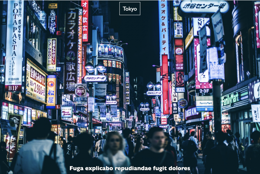
Note, again, how the post title text aligns:

Responsive Layout: Small Size
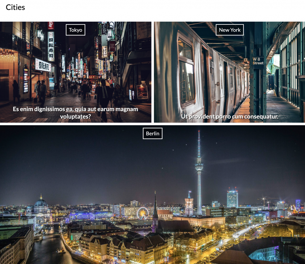
At small size, the cities section layout is single column.
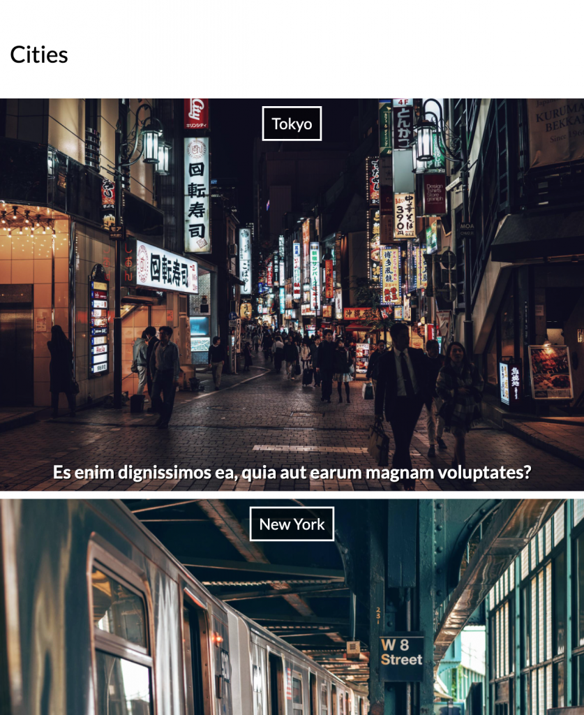
At medium size, the layout changes: the third, sixth, and ninth posts take twice the width of the other posts:
Bonus — The Awesome Option (5 points)
The awesome option, which enables you to earn an additional 5 points, takes the cities section layout further with an additional two larger responsive layouts in this cities section.
For those layouts, please consult the screenshot files that have xlarge and xlarge in their file names, or the loom video, or both.
When You Are Done
Make a copy of your theme. Make sure that the folder is named correctly: your-name-thedayexercise.
ZIP your theme folder up, and upload it to Brightspace.
Do not email it to me.
After the exam closes, you will not be able to submit your work.
NOTE for MAC Users: make sure that your copied theme folder does NOT have an arrow icon on the theme folder. That is a shortcut to the files, not the files themselves. These shortcuts are made when a file is dragged from the Applications folder (where your MAMP installation most likely is) rather than copied. The safest way to copy is to right-click to copy from that area of your hard drive.