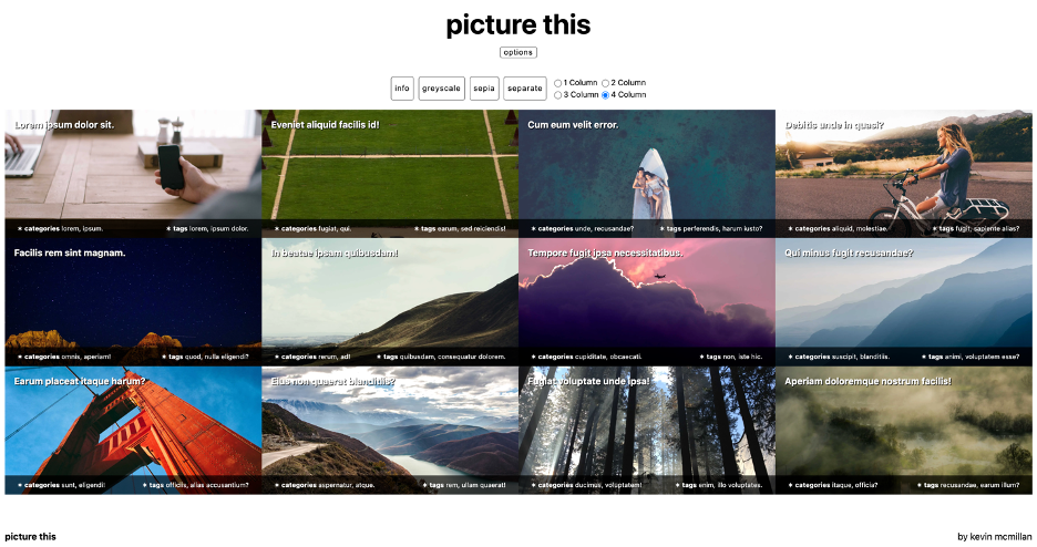
In this exercise, you will create a single page site called picture this. The font throughout is the system-ui stack.
If this is a test, the breakdown of marks for each section is in brackets. If it is not a test, the whole exercise is out of 1, as usual.
Here is a Loom video demonstrating the look and behaviour of the page.

Create The Content (10 marks)
- Header: A header with the site title (picture this)
- Header: A row of buttons
- Header: A form giving a choice of 1, 2, 3, or 4 columns
- Main: 12 Articles. In each article will be the following:
- Heading: four random words of lorem ipsum
- Random image: 2560 x 1280, webp format.
- Categories: two random words of unique lorem ipsum
- Tags: three random words of unique lorem ipsum
- You may of course have additional divs or spans for styling
Header Behavior (15 marks)
- Site title scales with browser width
- Options button is always visible
- When options button is clicked, “Options Group” slides in, with transition
- When options button is clicked, site title scales down, with transition
- Options Group has two parts: regular buttons and radio buttons
- Radio buttons do not appear under 1280px screen width
- See screenshots and movie for styling and behavior
Main Layout (15 marks)
- 1, 2, 3, 4 columns
- Breakpoints: 640px (2 col), 960px (3 col), 1280px (4 col)
- Article title sits at top of image. Add a small shadow for legibility.
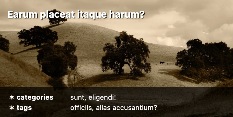
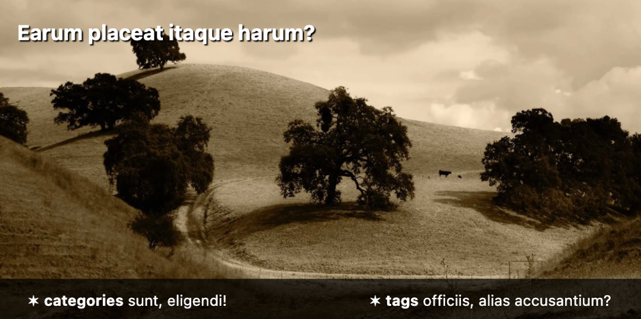
- Article meta (tags, categories) is at bottom of image, with translucent background.
Regular Button Behaviors — Card Options (20 marks)
- Initially, the article title and meta areas in each card have zero opacity
- When INFO is clicked, the card titles and meta areas appear, with .5s transition
- When GRAYSCALE is clicked, all images go grey, with 2s transition (CSS Filter)
- When SEPIA is clicked, all images go sepia, with 2s transition (CSS Filter)
- When SEPARATE is clicked the image cards move 3rem apart, with .5s transition
The above section will require basic JavaScript (classList).
Radio Button Behaviors — Column Options (20 marks)
- As noted, the column option radio buttons appear only at 1280px breakpoint
- Before 1280px, the columns options area can be set to display: none
- When a column option is chosen, the MAIN area layout will change to that number of columns. No transition.
- Column option choices made above 1280px will have no effect below 1280px.
In other words, when the user resizes the page below 1280, the original media query breakpoints must apply (and the Column Options buttons disappear).
These behaviors can be accomplished with JavaScript, but can also be accomplished with (modern) CSS.
Meta Area Responsive Behavior (15 marks)
There are two different layouts for the Meta Area (where the categories and tags are).
These layouts are in response to the width of the card, not the browser width.
The first layout is for when the Card is less than 400px wide:

The second layout is for when the Card is more than 400px wide:

Footer (5 marks)
- This layout, using your name (screenshot shows image from MAIN, not part of footer)

Handing in Your Project
- First, make sure that your project folder is named your-name-picture-this
- Then zip the folder and hand it into Brightspace.