For this exercise, there is nothing to download, except for the screenshots.
In the exercise, you will make a single page for an imaginary software company called Photon Software.
The page will display details of five apps built by the company. Each app’s details will occupy one panel in the page.
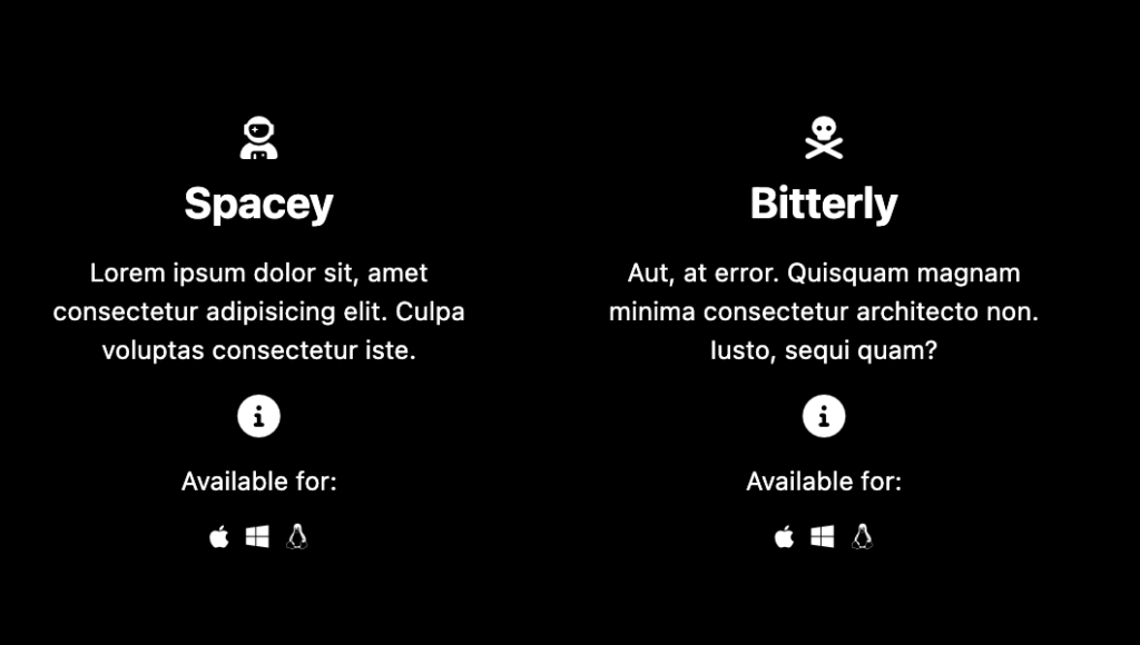
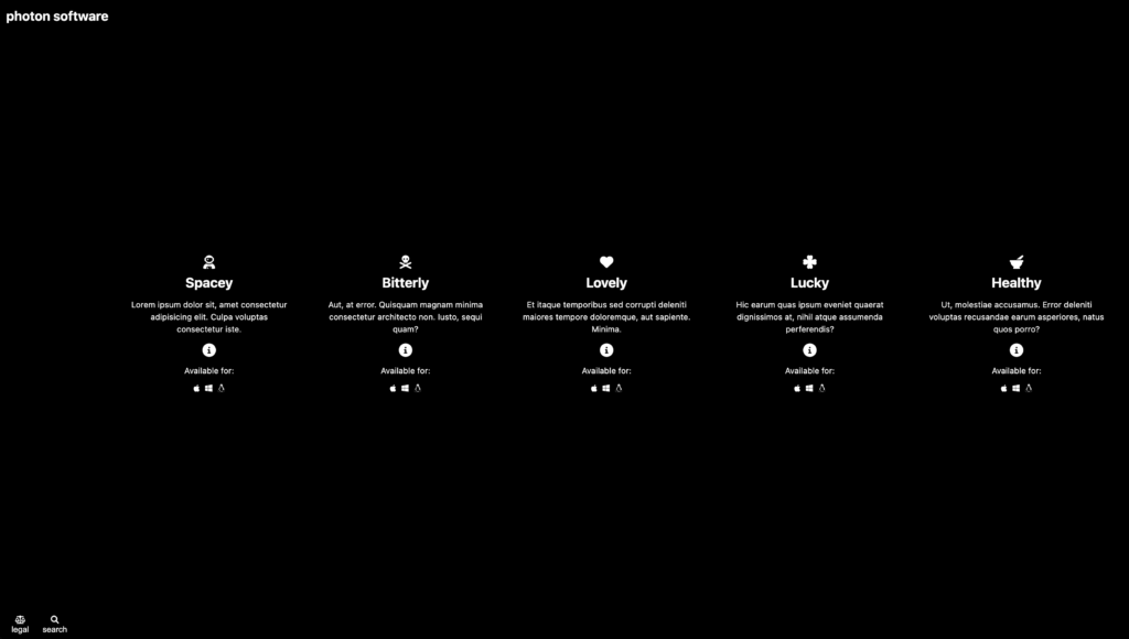
Please look at the screenshots to see the small and large screen size layouts. There is no medium view.
A Loom Video Demonstrating Page Appearance and Behaviour
The Content of Each Panel
Each app panel will initially show the following:
- An icon for the app. You will choose those icons: you cannot use social media icons, the icons in the screenshots, or icons we’ve already used in class. Your icon set must be unique to you, in other words.
- A name for the app. You give each a name. To make the layout easier, make each name a single word.
- Twelve words of lorem ipsum. These words must be different from panel to panel.
- An info button, inside an HTML Details element.
- An Available for area. Three panels with icons for Mac OS, Windows, and Linux. Or you can use an iOS and Android icon pair instead.
- These Available For icons must be accessible links.

Fonts
Just use the system-ui font stack. This is available in Visual Studio Code (or Emmet).
The Info Button Behaviour
As noted, this section will use an HTML Details element. If you’ve never used details before, here’s a good CSS Tricks article.
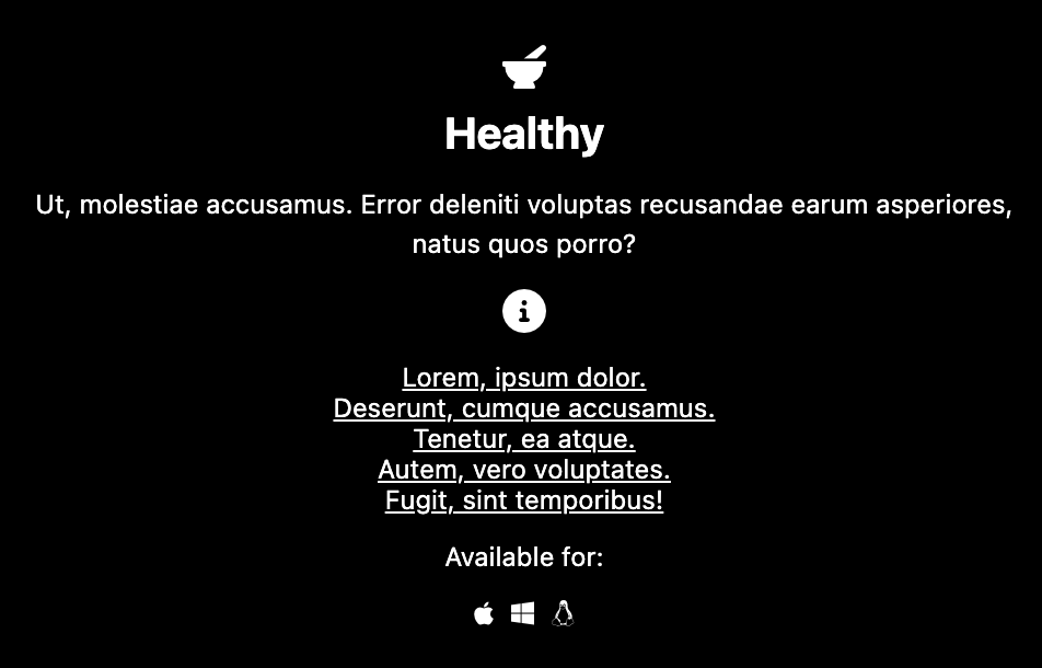
When the info button is clicked, the following additional content will appear between the info button and the Available for area:
- A list with five items, each with three words of lorem ipsum. The lorem ipsum text in each app panel must be different from that in other panels.
- The text in each of these list items must be a link
- The text must be centered
- When the user hovers over the info button, the cursor will change to signify that it is clickable.
Here is that content revealed in one panel in the phone layout:

The Desktop View
Here is the layout at desktop size, with no panels open:

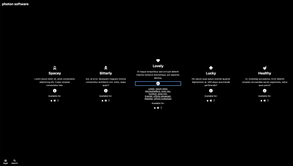
And with one panel open.

JavaScript Component
So far, we’ve used no JS. However, you will need it in this part.
When the user clicks on the legal button, three paragraphs will show up under or beside the header area (depending on responsive state). Please see the screenshot.
When the user clicks on the legal button, a simple search form will show up under or beside the header area (depending on responsive state).
Please see the screenshot.
Marking Metric
| Content Creation & Styling | 4 |
| Phone Layout | 4 |
| Desktop Layout | 4 |
| Details (working & styled) | 4 |
| Legal and Search (working & styled) | 4 |
When Done
When you are done, please rename your project folder your-name-photon-software and hand it into Brightspace (Langara) or Moodle (Emily Carr).