For this exercise, there is nothing to download, except for the screenshots.
In the exercise, you will make a single page for an imaginary software company called Photon Software.
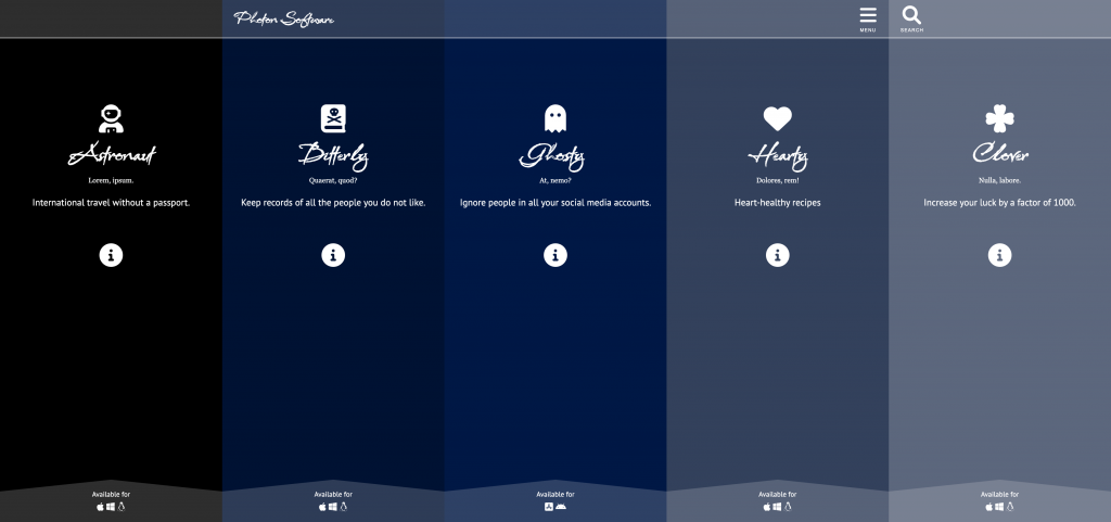
The page will display details of five apps built by the company. Each app’s details will occupy one panel in the page.
Please look at the screenshots to see the small and large screen size layouts. There is no medium view.
A Loom Video Demonstrating Page Appearance and Behaviour
Note: if this is a two-hour test, you can skip the following components:
- the SASS or CSS Custom Properties part
- the “raised part” of each panel’s “footer” area.
The Content of Each Panel
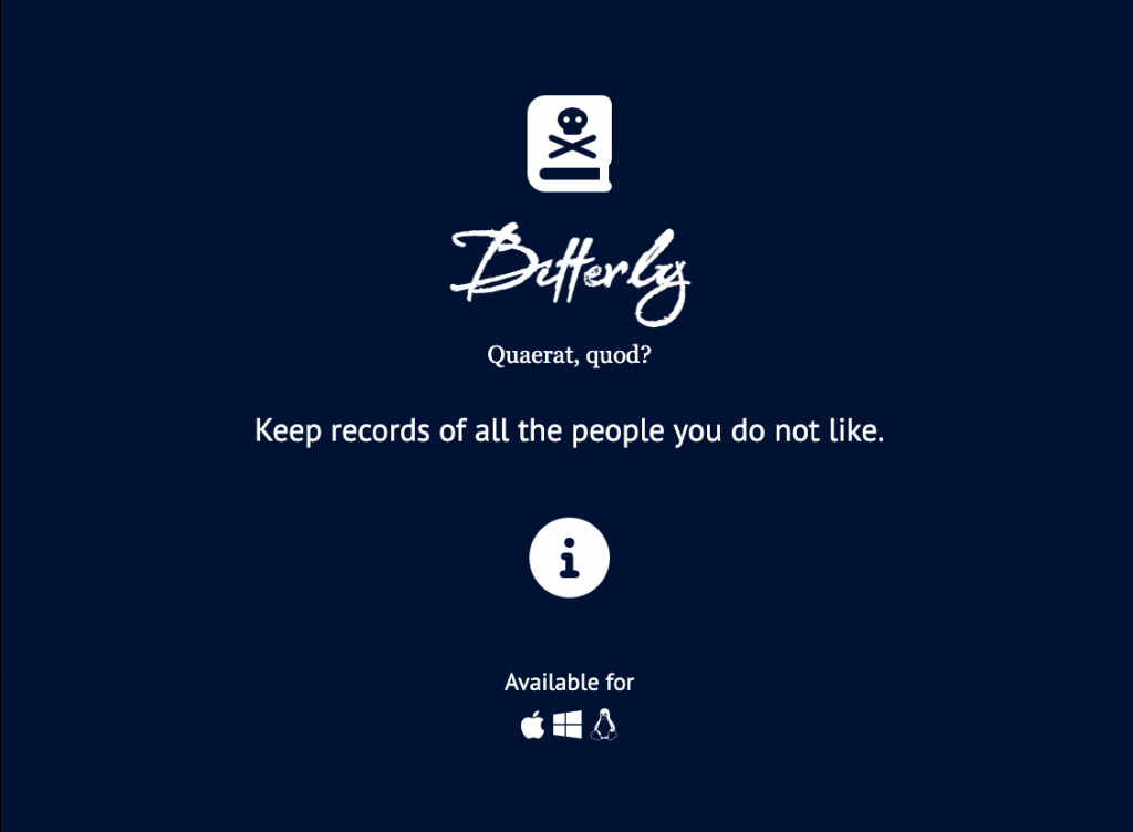
Each app panel will initially show the following:
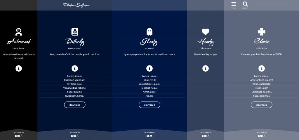
- An icon for the app. You will choose these: you cannot use social media icons, or the icons in the screenshots. Your icon set must be unique to you, in other words.
- A name for the app. You give each a name based on the chosen icon. To make the layout easier, make each name a single word.
- Two words of lorem ipsum. These words must be different from panel to panel.
- The marketing text listed in the next section of these instructions.
- An info button
- An Available for area. Four panels will have icons for Mac OS, Windows, and Linux. The third panel will have icons for iOS and Android.
The Marketing Text
The description of each successive app must use this text:
- International travel without a passport.
- Keep records of the people you don’t like.
- Ignore people in all your social media accounts.
- Heart-healthy recipes.
- Increase your luck by a factor of 1000.
Fonts
You must use the following fonts
- Company & App name: you choose one Google display font (except for Babylonica, the one used in my screenshots)
- Sans-serif: Google, PT Sans (with fallback)
- Serif: georgia, times, etc (ie with fallback)
SASS or CSS Custom Properties
Note: if this is a two-hour test, you can skip this SASS or CSS Custom Properties section.
All your colors must be variables. These can be done either with sass or css custom properties (ie css variables).
In other words:
- if using css custom properties, you do not need to use sass.
- if not using css custom properties, you must use sass
Panel Colors
The first panel must be pure black. The second panel will be dark blue. The remaining three panels will be successively lighter shades of blue.
You choose all the blue colors.
All your text must be white. Make sure that the chosen panel background colors are dark enough for the text to still be readable.
The Info Button Behaviour
Note: this will not use an HTML details element. Instead, you will use JavaScript to make the interaction occur.
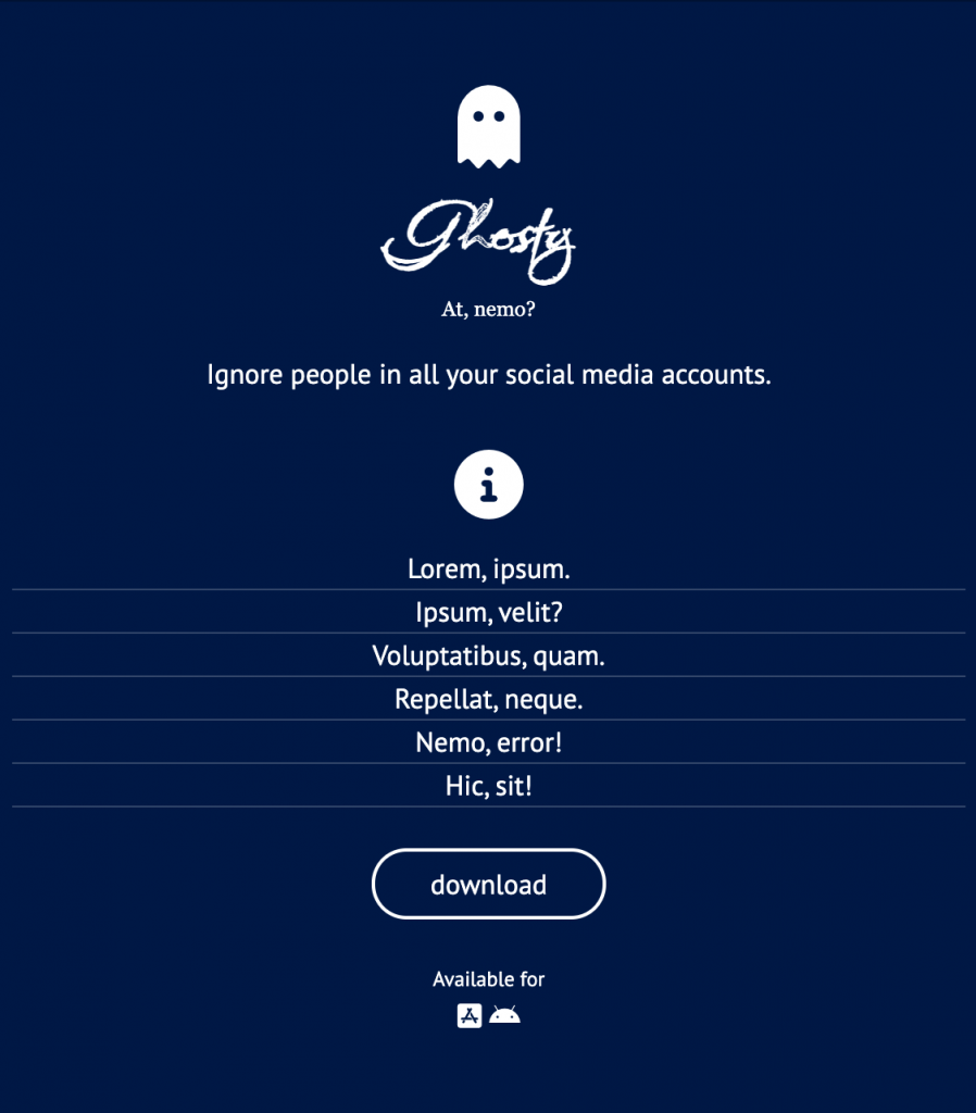
When the info button is clicked, the following additional content will appear between the info button and the Available for area:
- A list with six items, each with two words of lorem ipsum. The lorem ipsum text in each app panel must be different from that in other panels.
- A download button
Watch the Loom video (link is at top of this page) in order to understand what transition behaviour (a slide) I am looking for in phone and desktop views.
Hint: the code in the visually-hidden class we use for accessibility has some very good ideas for possible use in creating the sliding effect here.
Here is that content revealed in one panel in the phone layout:
The Desktop View
Here is the layout at desktop size, with no panels open:
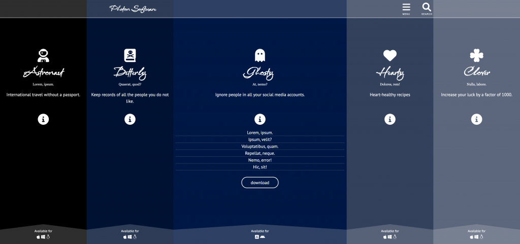
And with one panel open.
Finally, with multiple panels open.
A Partial Marks Variation on the “info” transition:
If you can’t create the “content sliding” effect for the reveal of the additional info and the download button, for less “interaction” marks you can leave an empty space between the info button and the panel footer and just have that content fade in or out on click.
If you can’t get any of the JavaScript working, make sure that the info and button are visible.
Marking Metric
| Content Creation (including icons, colors, fonts) | 6 |
| Phone Layout | 3 |
| Desktop Layout | 6 |
| Interaction | 5 |
When Done
When you are done, please rename your project folder your-name-photon-software and hand it into Brightspace (Langara) or Moodle (Emily Carr).