For this exercise, please download the starter files. This will include an html file and a folder of images.
And please download the screenshots.
Finally, here is a Loom video describing the task.
There is already lots of HTML in the page. Feel free to add to, or subtract, from that HTML.
Font Awesome is already added to the page, and the icons are put in already, too. The required Google fonts have been added to the head of the document.
You will need to add a stylesheet, and a JavaScript file.
Your task is to make the page appear and behave as closely as possible as it appears and behaves in the screenshots and movie. Make sure to study carefully each responsive state, particularly their alignments and spacing.
Component One: Add Your Name to the Document
Please add your full name to the TITLE and H2 tags in the document (replacing the phrase your name in each).
Component Two: Typography (5)
There are three Google fonts added to the page: all type on the page uses two of them. One font family is not used.
Look at the code that is added, then look at the screenshots, and figure out which fonts, sizes, weights, etc are applied to which elements in the page.
Look at everything related to typography closely.
Component Four: Header & Footer Responsive States (10)
Style these page sections as pictured in all the screenshots. Link text for icon links must be hidden but remain accessible.
Component Five: Main Area (10)
Style this page section as pictured in all the screenshots.
Component Six: Our Team (10)
Make this page section lay out and align as pictured in all the screenshots.
Note the interesting arrangement at the largest responsive state.
Component Seven: Back to Top Link (5)
Make this element when clicked cause the page to scroll back to the top gradually rather than jumping instantly to the top.
This can be done with plain CSS: no JavaScript required.
Component Eight: Volunteer Form (10)
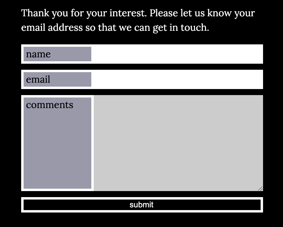
Style the form to look as close as possible to how it appears in the screenshots.
The form fields’ backgrounds will turn light grey when clicked in.

Component Nine: Image Credit Behaviour (10)
When the credits button is clicked, information about each image will slide up from the bottom of each article, as in the screenshot below.
When the credits button is clicked again, those information panels slide down until they are no longer seen.

The volunteer button will turn hotpink when hovered over, but it does not have any additional functionality.
When you are done:
When you are done, please rename your folder lastname-first-name-page-exercise.
Then zip the folder, and hand it into our Brightspace (Langara) or Moodle (Emily Carr) class hand-in folder.