In this exercise, you will create a WordPress website called Guitar Kitty devoted to the Squire Hello Kitty Guitar.
There are two versions of this exercise: it is important that you download the correct starter files:
Langara WMDD students: please download this version:
Emily Carr students: this is the version for you to use.
Demonstration Movie
A full Loom movie demo of the site appearance and behaviour.
Note: lots of screenshots are further down this page.
About The Sample Content
- 48 Regular Posts. Each of these is about a Hello Kitty guitar.
- Each regular post has a number of custom fields attached (custom fields version only)
- Three regular post categories: lovers, haters, and on the fence
- One Custom Post Type: Non-Kitty Guitars.
- 22 Not-Kitty Guitars.
- Non-Kitty Guitars taxonomy of Company: Fender, Gibson, Ibanez, Music Man. These will be used in the Footer menu.
NOTE: If you are an Emily Carr student, you can ignore the Custom Post Type Non-Kitty Guitars parts. However, if you want a small challenge, try to get the Non-Kitty Guitars menu working, too.
Project Setup
- Install the sample content, adding a new admin so you can login.
- Langara College Student: Use the Create Block Theme plugin to make a blank theme. Activate it.
- Emily Carr Student: Install the Neve FSE theme and activate it.
Output Format
- The site does not use a static home page. It uses WordPress default blog structure.
- The archives and front page layouts are almost exactly the same. The archives have two additional blocks. See screenshots.
- Kitty and Non-Kitty archive layouts will look the same (see bonus)
- Single kitty and non-kitty guitar page layouts will look the same (see bonus)
Big Hint
- The Cover Block is your very big friend in this exercise!
The WordPress Template Hierarchy
As you work out how to do this task, think about the WordPress Template Hierarchy: it can make your job much easier.
A simplified map of the WP Template Hierarchy.
Setup & Typography (10 marks)
- Set Default Content Width to 720px
- Bebas Neue for Site Title
- Bebas Neue for Menus
- System UI / System Default for all other text.
- No links underlined.
- Header links black
- Header h1 goes pink on hover
- Text links medium blue, with pink on hover.
- Line Height of 1.55
- No text ever touches the edge of the screen or the edge of a visible box
Site Header (25 marks)
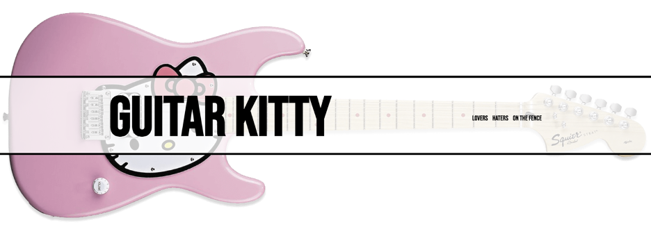
- The header always displays a feature image.
- On single views of posts, it displays the feature image of the post
- On front page and archives, it always displays the feature image of the first article.
If the first article changes, the header image will change.
Site Header Layout
- Vertically centered translucent “bar” holds site title and menu
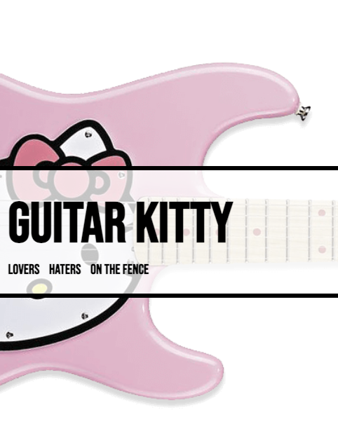
- Small Size: title and menu align left, in a vertically centered “stack”
- Medium Size and Larger: these items align on either side, vertically centered
- See the screenshot.
Site Header Image Sizing
- It is OK for parts of that image to go off the edge of the screen at some sizes.
- However, the nose of the cat must always be visible on screen
- Make sure that when the image “moves”, that it does with a transition.
- This will require custom css.
- In this task, your Browser’s Inspector is your best friend.
- See movie for details.
Site Header Site Title
- On the home page, the site title will scale gradually with browser width, but not get too small or too large
- On other pages, the site title will not scale
- This will require custom css
- See movie for details
Menus (10 marks)
- Top Menu is categories: lovers, haters, on the fence
- Bottom menu is Not-Kitty Guitars company taxonomy: Fender, Gibson, Ibanez, Music Man
(Emily Carr Student: you can skip this, but try working it out, for a nice challenge).
Footer (5 marks)
- The footer is the same on every page in the site
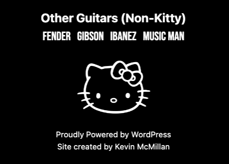
- It has the “other guitars (non-kitty)” text, the companies menu, the site logo link, the “proudly created” credit and site created by your name.
- The spacing must be perfect: centered horizonally but also perfectly centered vertically within the black background
- See the screenshot
Front Page & Archives (25 marks)
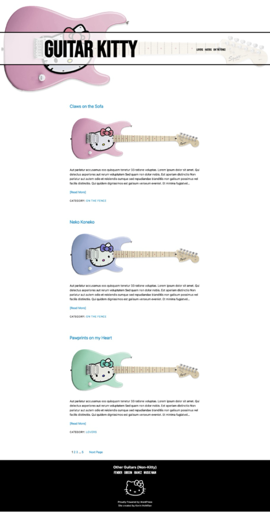
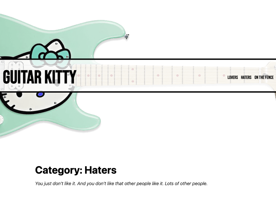
- The layout of the front page and all archives is exactly the same, with one difference: archives have title and description.
- Each article here will have a title (linked), a feature image (linked), a summary, a read more link, and a category link
- Below the collected articles will be a pagination section
- See the screenshots
Single Views (25 marks)
The single view of any post will have the following.
(Emily Carr students: ignore the custom fields parts)
- Feature image in header area
- Post Title, not linked
- Custom Field: Guitar Rating with “bird” icon (see screenshot).
- Content
- Feature Image, not linked
- Custom Fields: Guitar Owner and Original Price
- Category Link
- Next and Previous Posts links
- See the screenshots
Bonus (10 marks): Company Archives & Single View
For a 10% bonus to make up for any marks you missed (ie you can’t go above 100%), make sure that the not-kitty company archives and single post views look and behave the same as those for regular post archives and single views.
Note: the non-kitty guitars do not have custom fields. You can pretend that they have the same custom fields as regular posts, however, or assume that they will be added in the future.
Emily Carr students can ignore the Custom Fields issue altogether.
More Screenshots
Header, Full Size Layout
Header, Small Size Layout
Footer, All Sizes
Front Page (note: many articles trimmed from screenshot)
Top of Archive Page (Remainder is the same as home page)
Single View (Large)
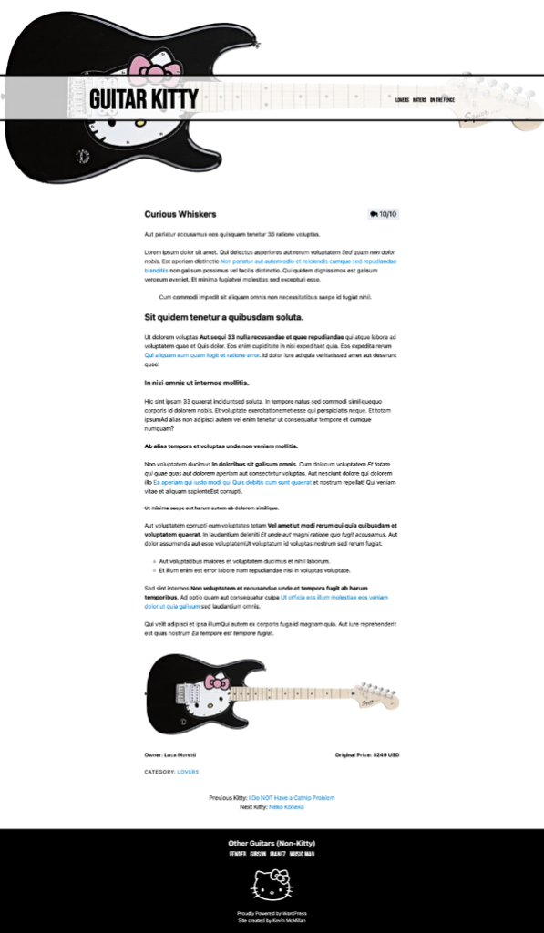
Single View Small (Some paragraphs omitted for screenshot)

When You Are Done
When you are done, make a Duplicator Package of the site.
Put the installer file and archive file in a folder named your-full-name-guitar-kitty in it (no spaces).
Make sure that your archive is not unzipped. Do not rename the archive. Make sure that it is not only a few kilobytes.
Then zip that folder and hand it into BrightSpace (Langara College) or Moodle (Emily Carr University).