In this exercise, we’re going to build a simple horizontal menu to illustrate a potentially frustrating aspect about using floated elements.
The HTML
Imagine that you have a header, an H1, and a UL with a class of “menu-top” at the top of your site. The HTML would look something like this:
<header>
<h1>The Gibson Les Paul Story</h1>

<ul class="menu-top">
  <li><a href="#">Goldtop</a></li>
  <li><a href="#">Custom</a></li>
  <li><a href="#">Junior</a></li>
  <li><a href="#">Special</a></li>
  <li><a href="#">Standard</a></li>
  <li><a href="#">Deluxe</a></li>
  <li><a href="#">Studio</a></li>
  <li><a href="#">Custom</a></li>
</ul>

</header>
Some Basic CSS
In your stylesheet, we could have something along these lines:
header {
  background: #ccc;
}

header h1 {
  text-align: center;
  color: black;
  font-family: trebuchet, arial, helvetica, sans-serif;
  font-weight: normal;
  font-size: 3em;
  line-height: 4em;
  margin-top: 0;
}

ul.menu-top {
  list-style: none;
  padding: 0;
  margin: 0;
}
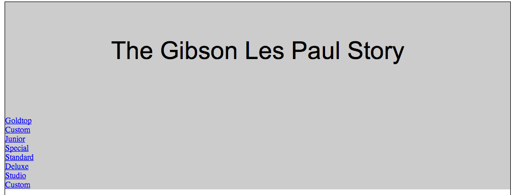
At this point, our menu will look like this:

Tweak The Menu CSS
Now add a style to float the list items in your header menu. Additionally, give them a width that spreads them out all the way across the banner: I have 8 menu items, so I will make each 12.5% wide (100/8 = 12.5).
.menu-top li {
  float: left;
  width: 12.5%;
  text-align: center;
}
Now the menu should look like this:

Notice how the menu “drops out” of the bottom of the header element?
The Fix
The fix for this evolved over years of work and discussion by web designers. It became known as “clearfix.”
.clearfix:before,
.clearfix:after {
    content: " "; /* 1 */
    display: table; /* 2 */
}

.clearfix:after {
    clear: both;
}

/**
 * For IE 6/7 only
 * Include this rule to trigger hasLayout and contain floats.
 */
.clearfix {
    *zoom: 1;
}
Add this to your stylesheet. Then add the clearfix class to your header element.
A slight disgression, perhaps: this is a modern version of the micro-clearfix technique, as devised by web designer Niccolas Gallagher. For additional information, go to his site. Or google the thousands of pages on which variations of the technique are discussed.
Your menu should now look like this:

Additional Information
For a video on the clear property and the use of the clearfix “hack” to force containing elements to “self-clear” child elements, go here on the cssreset website.