First, please download the starter files and open them in Visual Studio Code.
In this class demo, we will explore the use of the SRCSET and SIZES attributes of the IMG tag. These allow us to deliver optimally-sized images for different screen resolutions and pixel densities.
We will then move on to an examination of container queries. Think of these as being like media queries for elements. They allow us to deliver styles conditional on the width or height of an element, rather than the width or height of the browser window.
Container queries, in other words, allow us to create styled components whose appearance or responsive behaviour is solely dependent on their own dimensions.
So if we have a single card in a div, for example, it might take on a row orientation, whereas if we have three cards, the cards themselves could arrange their children in column orientation.
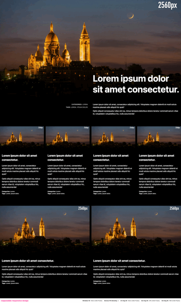
In the example below, all of articles are styled with container queries rather than media queries. The sections holding each row, however, are styled with media queries.
We also see different images size being delivered depending on what the browser needs to display the image optimally for the particular monitor I took this screenshot on.
( Click for full size. )
