Hopefully this exercise has given you some ideas about how to build WordPress templates.
A number of things, of course, remain to do.
There is a social menu, so please figure out how to add font-awesome icon fonts to each of the social links, while hiding the link text with underscores’ screen-reader-text class. The wordpress developer page on wp_nav_menu will be useful here.
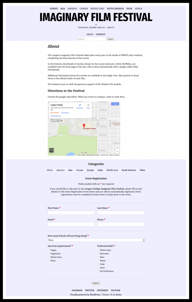
If you look at the screenshot of the home page, you will notice there is a second menu area with links to ABOUT and CONTACT. Please make that work. You will need to edit functions.php and header.php.
Check that the site works on a phone.
A nice 404 page would be a good idea. With some research, you could add a more prominent search form, lists of recent posts or comments, another menu, etc.
Speaking of search, a more nicely-styled search box in the header should be on the agenda.
I did not do very much styling in this exercise. To get the design to look closer to what it does in the screenshots, you need to study the screenshots and then figure out how to implements what is done in them in CSS.
You should make major use of FLEX and/or GRID. Both display modes can be very helpful, for instance, in the sections where content has to appear in the page in a different order from the way it appears in the source. Places where that happens include the index loops, the header, the archives and the SINGLE view.
Check your PAGE template, since there are a couple pages in the site.
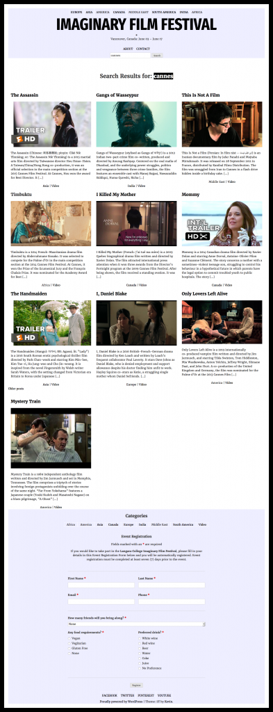
Test the search results page. Test the archives. Here are my search results from a sample search. (Click image for greater detail.)
Here I have specified a summary rather than the full content of the post, for example, and the order of content in each article is different from the order on other pages.
Be sure, also, to edit the list of font-weights coming from Google, once you have decided how many you are actually going to use.

