The icon fonts component of the exercise stipulated that you had to use icomoon.
The reason for this is that you should not just automatically choose font-awesome. There are lots of things you can do with icomoon and similar services—like uploading your own icon files, or generating SVGs, etc—that you cannot do with font-awesome.
So go to icomoon.io and click on the red IconMoon App button at the top of the page.
Go to the hamburger menu on the left. Choose New Empty Set. You can give it a name by clicking on the smaller hamburger menu on the right side of the new set. Then click on edit metadata:
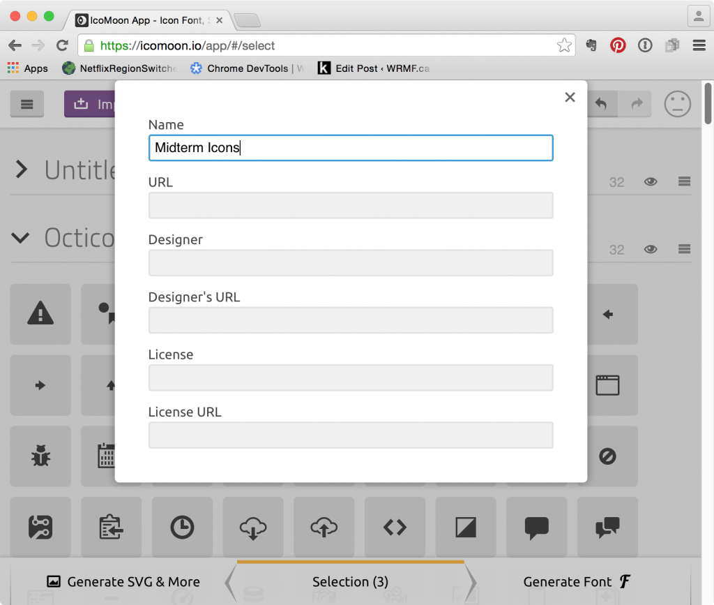
After closing that window, go the bottom of the page and click on the add icons from library link.
Now search through the available libraries and find icons that work for the design, and still have a sense of unity to them.
Here’s ones I thought I could use in the exercise. A few come from the Bronkic 1979 set. Others came from other sets on icomoon. Check that the ones you use are creative commons licensed: each library has a link to the licensing. And, yes, I didn’t use all the icons below in the actual exercise. At one point, I was planning to.
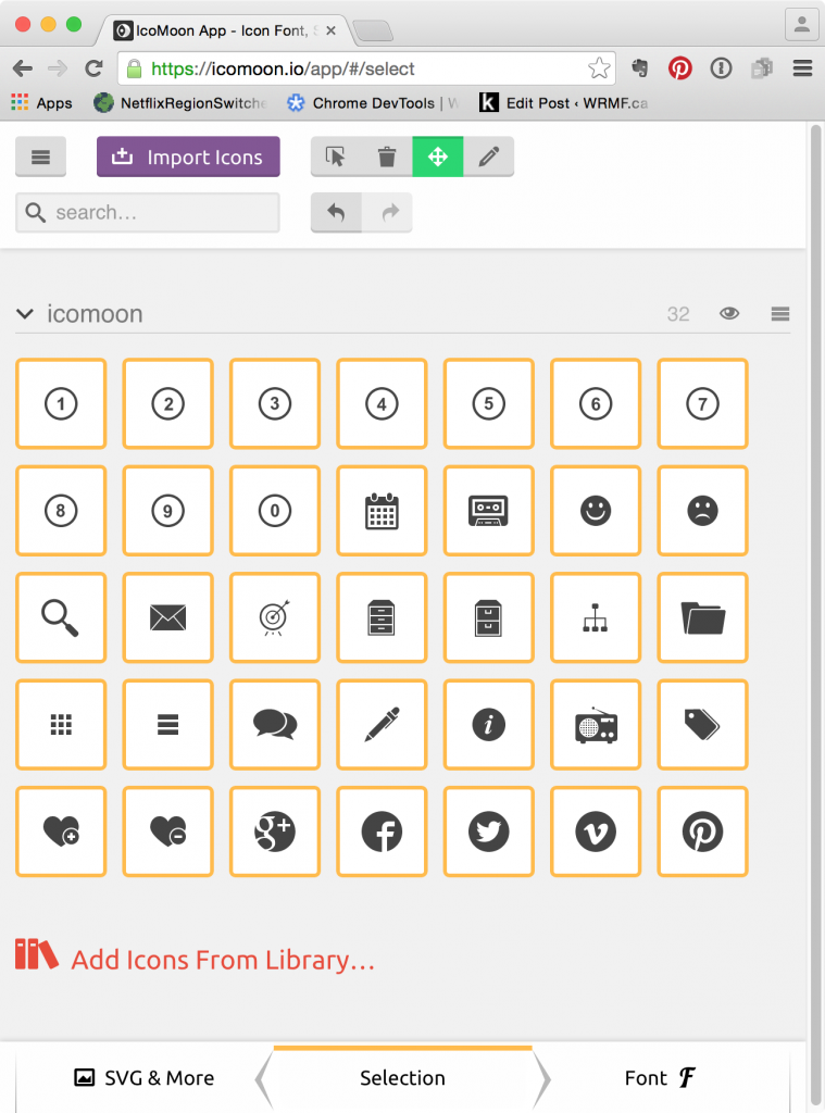
Once you’ve got a set that you think will work, click on the Generate Font icon at the bottom right. The next screen will allow you to name each icon.
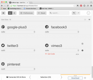
For example, it would probably be a good idea to change facebook3 to facebook, if don’t have other FB icons in the set. These names are later reflected in the CSS classes that will come with the font: icon-facebook is likely more intuitive than icon-facebook3.
Once you’ve named the icons in a logical way, click the big DOWNLOAD button in the bottom right.
Now put the icon font folder into your site. Open up the file style.css and copy that code into your stylesheet. Notice that the @font-face declaration contains paths to the font files being used. If you keep the same path intact, you won’t need to update the path. To do this, copy the fonts folder into the same folder your stylesheet is in.
USEFUL INFO: in the downloaded folder from icomoon is a file called selection.json. Don’t throw it away. The non-premium use of icomoon does not allow you to save your selections and projects in the cloud, but you can upload this json file, which will then load your selections. This will save a lot of aggravation when you need to add an icon to your set, etc.
Here’s what I copied into my stylesheet.
/*ICON FONTS ============================================================= */
@font-face {
font-family: 'icomoon';
src: url('fonts/icomoon.eot?fvf98t');
src: url('fonts/icomoon.eot?fvf98t#iefix') format('embedded-opentype'),
url('fonts/icomoon.ttf?fvf98t') format('truetype'),
url('fonts/icomoon.woff?fvf98t') format('woff'),
url('fonts/icomoon.svg?fvf98t#icomoon') format('svg');
font-weight: normal;
font-style: normal;
}

[class^="icon-"], [class*=" icon-"] {
/* use !important to prevent issues with browser extensions that change fonts */
font-family: 'icomoon' !important;
speak: none;
font-style: normal;
font-weight: normal;
font-variant: normal;
text-transform: none;
line-height: 1;

/* Better Font Rendering =========== */
-webkit-font-smoothing: antialiased;
-moz-osx-font-smoothing: grayscale;
}

.icon-number1:before {
content: "\e908";
}
.icon-number2:before {
content: "\e909";
}
.icon-number3:before {
content: "\e90a";
}
.icon-number4:before {
content: "\e90b";
}
.icon-number5:before {
content: "\e90c";
}
.icon-number6:before {
content: "\e90d";
}
.icon-number7:before {
content: "\e90e";
}
.icon-number8:before {
content: "\e90f";
}
.icon-number9:before {
content: "\e910";
}
.icon-number10:before {
content: "\e911";
}
.icon-calendar:before {
content: "\e900";
}
.icon-cassette:before {
content: "\e917";
}
.icon-smiley:before {
content: "\e91a";
}
.icon-sad:before {
content: "\e91b";
}
.icon-magnifier:before {
content: "\e91c";
}
.icon-envelope:before {
content: "\e91f";
}
.icon-target:before {
content: "\e901";
}
.icon-cabinet:before {
content: "\e902";
}
.icon-cabinet2:before {
content: "\e903";
}
.icon-sitemap:before {
content: "\e904";
}
.icon-folder:before {
content: "\e905";
}
.icon-grid:before {
content: "\e906";
}
.icon-list:before {
content: "\e907";
}
.icon-comments:before {
content: "\e912";
}
.icon-pen:before {
content: "\e913";
}
.icon-info:before {
content: "\e914";
}
.icon-radio:before {
content: "\e915";
}
.icon-tags:before {
content: "\e916";
}
.icon-heart:before {
content: "\e918";
}
.icon-heart2:before {
content: "\e919";
}
.icon-google-plus3:before {
content: "\ea8a";
}
.icon-facebook3:before {
content: "\ea8e";
}
.icon-twitter3:before {
content: "\ea93";
}
.icon-vimeo3:before {
content: "\ea9e";
}
.icon-pinterest:before {
content: "\ead0";
}
You will no doubt have noticed the class naming convention: icon- + name of icon.
So use these classes with empty span elements to insert the icons into the document. Here’s one example, from the social icons menu (and, yah, I forgot to rename the icon from facebook3 to facebook).
<li><a href="#"><span class="icon-facebook3"></span><span class="visuallyhidden">Facebook</span></a></li>
Test the page. There’s our icon.

Take care that you put this span inside the <a> tag: otherwise, the icon won’t be clickable.
Accessibility
The screenshot in the exercise shows just the icon rather than the associated text. The task here, then, is to hide the text—without hiding it from screenreaders for the visually impaired.
The best way to do that is to google the phrase visuallyhidden: you will find numerous pages discussing a bit of code that originally was found in a project called HTML5 Boilerplate—which was developed by some very smart people as a development community best practice foundation document for web projects.
CSS Tricks has an article on how you can use the visuallyhidden class to ensure accessibility: https://css-tricks.com/places-its-tempting-to-use-display-none-but-dont/
You can get the code snippet in that article, too.
In a nutshell, the code will make elements it’s applied to very small and visually cut off. But those elements will not be hidden from screenreading software. In this way, the needs of the visually impaired (for whom an icon does not serve) are as respected as the needs of the visually unimpaired (for whom the removal of visual clutter may well be appropriate).
Anyway, copy the visuallyhidden code into your stylesheet. Then wrap the text you want to hide—like the word Facebook in the above—in a span with the visuallyhidden class, like so:
<li><a href="#"><span class="icon-facebook3"></span><span class="visuallyhidden">Facebook</span></a></li>
And this is what it should look like now:

Now use your best Sublime Text, Atom, or other editor techniques to apply these two span techniques to the rest of the links that require icons.
This should leave us with icons that look like this (although not side by side, like below, of course):

![]()
Now we can once again use flex to arrange the icons. (If you’re wondering why I use pixels for the .nav-social li margins, it’s because it doesn’t matter here: I’m not trying to make everything add up to 100%, since there’s going to be enough leftover space that I don’t need to worry about the icons wrapping or otherwise reflowing).
.nav-social ul {
display: flex;
justify-content: center;
}

.nav-social li {
margin: 10px 2px;
font-size: 24px;
}

.nav-social a {
color: black;
transition: color .5s;
}

.nav-social a:hover {
color: indianred;
}


.post-meta ul {
 display: flex;
 justify-content: center;
 margin-bottom: 1rem;
}

.post-meta span[class^="icon-"] {
 margin-right: 4px;
}