In this exercise, you will configure a WordPress theme using the Customizer and custom CSS.
To begin, please download the following zip archives.
Then please watch this Loom video description of the project.
Exercise Setup
- Install the starter content. Create a new admin user as part of that process
- Do not delete the kevinmcmillan admin user
- Install and activate the Sydney classic theme
- When prompted, do not install the Starter Sites
- Do not install any plugins
Basic Details of The Site
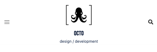
- Site Name: Octo
- Site Tagline: Design / Development
- Bebas Neue font for all Headings
- System UI font stack for the other text
- Line Height for site 1.5. Base font size for site 16px
- Logo: octo-logo.png. Favicon: octo-favicon.png
- Front page is NOT a static page. It is the regular WordPress front page.
- Front page and Archives have a maximum of six posts before pagination.
- Some CSS will be required with most sections
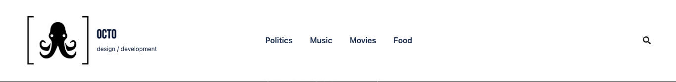
Header (20 pts)
- Two layouts: Desktop and Tablet/Phone
- Compare the screenshots for layout and alignments
- Logo is 100px on Desktop, and 65 px on Tablet/Phone
- Site name is 26px on Desktop and 20px on Tablet/Phone
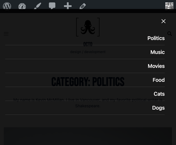
Mobile Menu (10 pts)
- Obviously only on Tablet/Phone
- Background is slightly translucent black. Text is white.
- When visible, menu covers entire width of screen
- Consult screenshot
Front Page (30 pts)
- From YouTube find a black and white video. Put that video in the hero area.
- Phone / Tablet: 1 column. Desktop: 3 columns.
- Article area covers most of screen width: make aligment with header elements.
- Meta: date, category, author. Excerpt length: 45 words.
Archives (20 pts)
- Archives look the same as the front page, with category name and description, and no hero area.
- In the description for each category, add the following
“My name is [insert your name]. I live in Vancouver, and my favorite [insert category reference] is [insert something that makes sense]” - See screenshot for details
Single View (20 pts)
- Most content covers nearly the entire width of screen. Align with Header elements.
- Text and Comments area do not get wider than 800px. Those blocks are also centered.
- Last page of this test shows Desktop and Phone / Tablet views side by side.
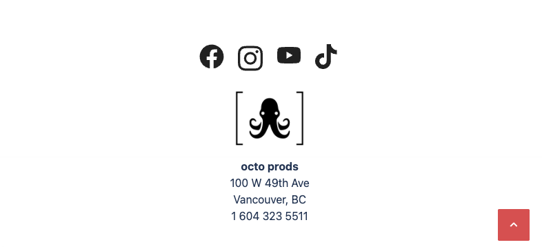
Footer (20 pts)
- This section is for bonus points. You can get up to 20 extra points to make up for any places you’ve missed.
- Footer content is stacked and centered.
- Same layout for all screen sizes. Nothing changes.
WHEN YOU ARE DONE
- Make a new Duplicator package of your work
- Download the installer and zip file of the Duplicator package. Do not rename either one.
- Put those two files in a folder
- Name that folder FirstName-LastName-Octo
- Zip that folder
- Hand it into Brightspace
NOTE on Marking Scheme
Ignore the following if you are doing the exercise as a weekly assignment.
If you are writing this as a test, the maximum mark you can get on the test is 100%.
But there is a 20% bonus section (footer) to make up for anything you might have missed.
| Header | 20% |
| Mobile Menu | 10% |
| Front Page | 30% |
| Archives | 20% |
| Single | 20% |
| Footer | 20% |