In this exercise, you will write a WordPress theme to output content the way it appears in the screenshots.
Initial Setup
For this exercise, please download the starter files. If the php8 version does not work for your version of mamp, download the php7 version.
- Faceplace Starter Files (php 8.0.8)
- Faceplace Starter Files (php 7.4.2)
Then please download the screenshots collection.
Finally, please download this starter theme to start the project. If this is an exam, you must use this exact downloaded theme or your exam will not be marked.
Rename the theme folder yourfirstname-lastname-faceplace
Then, as usual, install the site in your development environment. Make sure that you create a new admin account as part of that process.
In the new site, edit wp-config.php and set WP_Debug to true.
You may use SASS. Feel free to just use regular CSS.
Important: in the style.css (or style.scss) file in your theme, call the theme your-first-name. In the AUTHOR field, use your FIRST and LAST NAME.
At the bottom of every page on your site, output the following phrases:
Proudly Powered by WordPress. Site by your name.
Your task is to make a theme that outputs the site data and styles it like it looks on the screenshots for the different responsive states.
Note that there are some responsive states for which there is no screenshot: these are for when the only difference is an additional column in a layout.
This site is called faceplace. It presents a number of interesting faces.
Fonts
The font used throughout the site is Source Serif Pro from Google fonts. Load it the correct WordPress way.
Header
There are already two menus in the site you have installed. The main menu has links to the female and male archives.
Make a menu location called Main Menu with menu_main as the slug.
Output this main menu in the header of the site.
In the Dashboard, you will probably need to select which menu goes in the menu location you create.
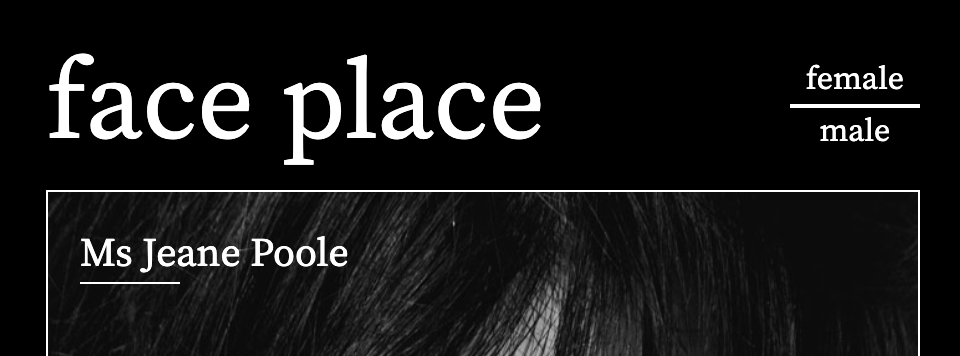
The Site Name
Output the Site Name. Make it a link back to the home page, except on the home page itself.
Hide the site tagline, accessibly
Output the site description, but hide it accessibly.
The site description or tagline is the text faces from many places. Hide that text, but make sure that it is still accessible to screenreaders.
Remember: this must be done in the theme, not in the Dashboard.
Style the header area like in the screenshots (small and medium & larger views are below):

Front Page
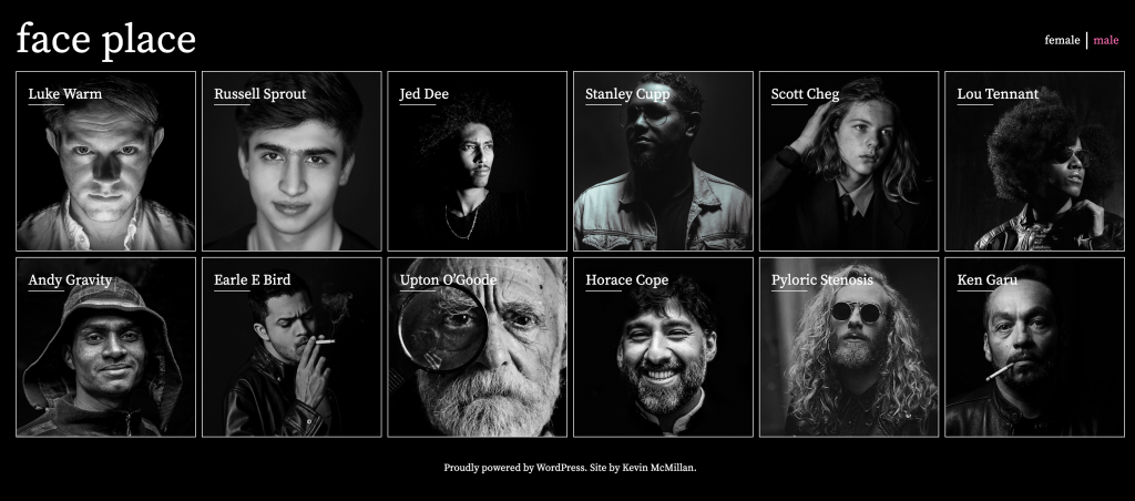
Output six random women.
Then output six random men.
There must be six women before six men.
Each man and woman will have their name and feature image.
As the page gets wider, your responsive states will move from 1, 2, 3, 4, and then 6 people in a row.
Note: the screenshots do not show all the states (certain column numbers, in other words).
Mr / Ms Text (Front Page only)
On the front page only, add Mr to the front of each man’s name on the front page, and Ms to the front of each woman’s name.
Add a 50px-wide line underneath the start of each person’s name on home and archive pages, but not single pages.
Links
When a user clicks the following, they will be taken to the following places, with the following excerptions:
- Site Name: to home page, except when on home page
- Post Title: to single view, unless in single view
- Post Thumbnail: to single view, unless in single view
- Menu Links: to the respective archive
This is, of course, to avoid self-referential links.
Don’t worry about “fixing” self-referential links to the archives.
Archives
Important: on the archives, the faces appear in the default reverse-chronological order, not randomly.
Make the menu show which archive the user is in (see below) by setting that link to hotpink. In the screenshot below, we are in the archive of male faces.
The archives will have responsive states of 1, 2, 3, 4, and 6 people in a row, depending on page width—just like the home page.
Single View
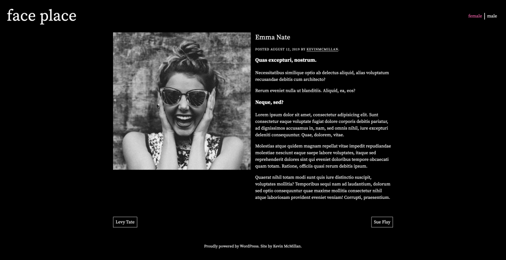
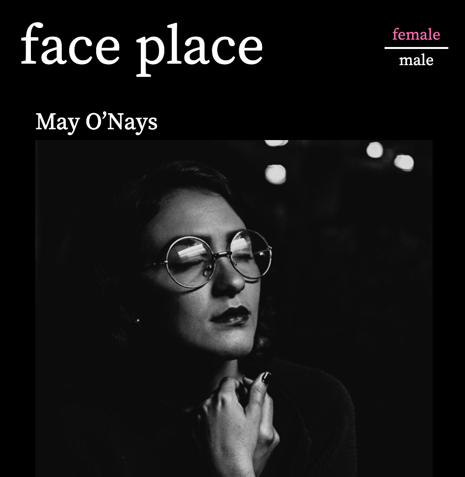
Single post views will show the following (check the screenshots):
- Post title
- Post feature image
- Post meta: when the article was last modified
- Post author (a link to the archive of posts for that author)
- Post content
- Next and Previous Post Links
Style the page as in the screenshots. Pay close attention to the alignments.
Here is the full size. Note: the downloaded screenshot is missing one line (posted + date + by author archive link). It is included in the screenshot below.
Possible Bonus Marks
For one bonus mark, figure out how to make the single view next and previous post links be limited to posts from the same gender.
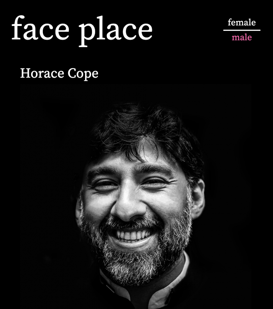
For three bonus marks, figure out how to make the menu in single views reflect the gender of the individual profiles. To do this most easily will likely require JavaScript.
Marks Breakdown
Here is the breakdown of marks if this is a test. If it’s a lab exercise, it’s out of 1, as usual.
| Header | 2 marks |
|---|---|
| Front Page | 6 marks |
| Archives | 4 marks |
| Navigation | 3 marks |
| Single View | 5 marks |
| Possible Bonus | 4 marks |
When You Are Done
Hand in only your theme into the handin folder for the course. Do not hand in a Duplicator archive.
Zip the theme before handing it in. Make sure that your theme folder is named correctly, and that the theme itself is named correctly (in styles.css).
Important: make sure that you are handing in the theme, not a shortcut to its location on your hard drive. If you are on a Mac, remember that Apple’s default permissions structures create shortcuts when content is dragged from the Applications folder (which is ultimately where your theme is).