In this exercise, you will write a WordPress theme to output content the way it appears in the screenshots.
Initial Setup
For this exercise, please download the starter files and the screenshots collection.
Then please download this starter theme to start the project. If this is an exam, you must use this exact downloaded theme or your exam will not be marked.
Rename the theme folder firstname-lastname-faceplace
Then, as usual, install the site in your development environment. Make sure that you create a new admin account as part of that process.
In the new site, edit wp-config.php and set WP_Debug to true.
You may use SASS. Feel free to just use regular CSS.
Important: in the style.css (or style.scss) file in your theme, call the theme your-first-name. In the AUTHOR field, use your FIRST and LAST NAME.
You will hand in only the theme. You will not need to make a Duplicator package.
Your task is to make a theme that outputs the site data looking as on the screenshots for the different responsive states. Zoom in on the screenshots.
TASKS
This site is called faceplace. It presents a number of interesting faces, along with some details of each person.
Fonts
The font used throughout the site is Source Serif Pro from Google fonts. Load it the correct WordPress way.
Header
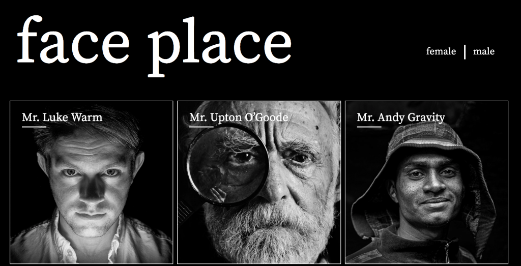
There are already two menus in the site you have installed. The main menu has links to the categories of female and male.
Output this menu in the header. In the Dashboard, you will need to select which menu goes in the menu location you create.
Output the Site Name.
Hide the site tagline, accessibly
Output the site description, but hide it accessibly.
The site description or tagline is the text faces from many places. Hide that text, but make sure that it is still accessible to screenreaders.
Remember: this must be done in the theme, not in the Dashboard.
Style the site name and the menu like in the screenshots (small, medium & large views are below):


Front Page
Output six random men.
Output six random women.
Each man and woman will be styled as in the screenshots.
There are twelve people in total. This allows us to make nice even layouts, because there are a lot of numbers that 12 can be evenly divided into.
As the page gets wider, your responsive states will move from 1, 2, 3, 4, and then 6 people in a row. Consult the screenshots and/or the video below.
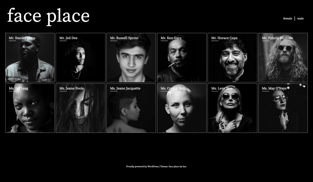
The video below shows the responsive layout changes as the home page and the archive pages get progressively wider
Mr / Ms Text (Front Page only)
Add Mr in front of the name of each man’s name on the front page, and Ms in the front of the name of each woman’s name. (All of the screenshots show this).
Add a 50px-wide line underneath the start of each name on home and archive pages, but not single pages.
Alternate By Gender
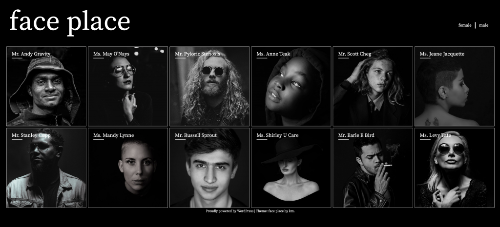
Figure out how to make the display of the men and women on the front page alternate by gender (male-female-male-female, etc).
Note: none of the downloaded screenshots show the front page’s gender sort.
There are at least four ways to do this:
- Plain, old-fashioned CSS
- CSS generated with a SASS for loop
- CSS written inline with PHP
- “Pure” PHP: no inline CSS
Archives
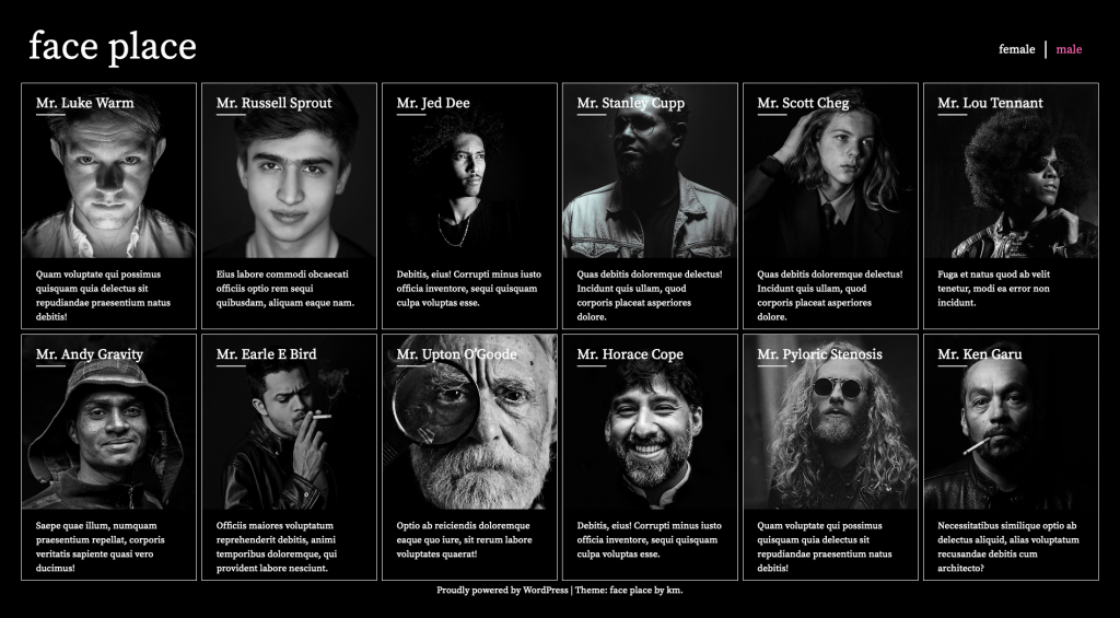
When a user clicks on male or female in the menu, they will be taken to an archive. In the archives, beneath each photo will be the text in the excerpt field of the post editor.
Make the menu show which archive the user is in (see below)
The archives will have responsive states of 1, 2, 3, 4, and 6 people in a row, depending on page width. Check the screenshots.
Navigation
When the user hovers over the name of the site (face place), that text needs to change to hotpink.
When the user hovers over the male | female menu, the link text needs to change to yellow. This must happen regardless of where the user is in the site.
When the user is in an archive, the corresponding self-referential menu item needs to be hotpink.
This video shows the various menu hover effects in action:
Hover Treatments on Front Page and Archives
When the user hovers over an article, the photo (not the article) will transition to twice its size and a CSS sepia filter will be applied.
The transition will take a quarter of a second.
When the mouse leaves the article, the image will return to its original size, over the same amount of time, and the sepia filter will be removed.
During the mouseover the article box itself must not grow or move, and the name of the person must not be covered by the photo at any time.

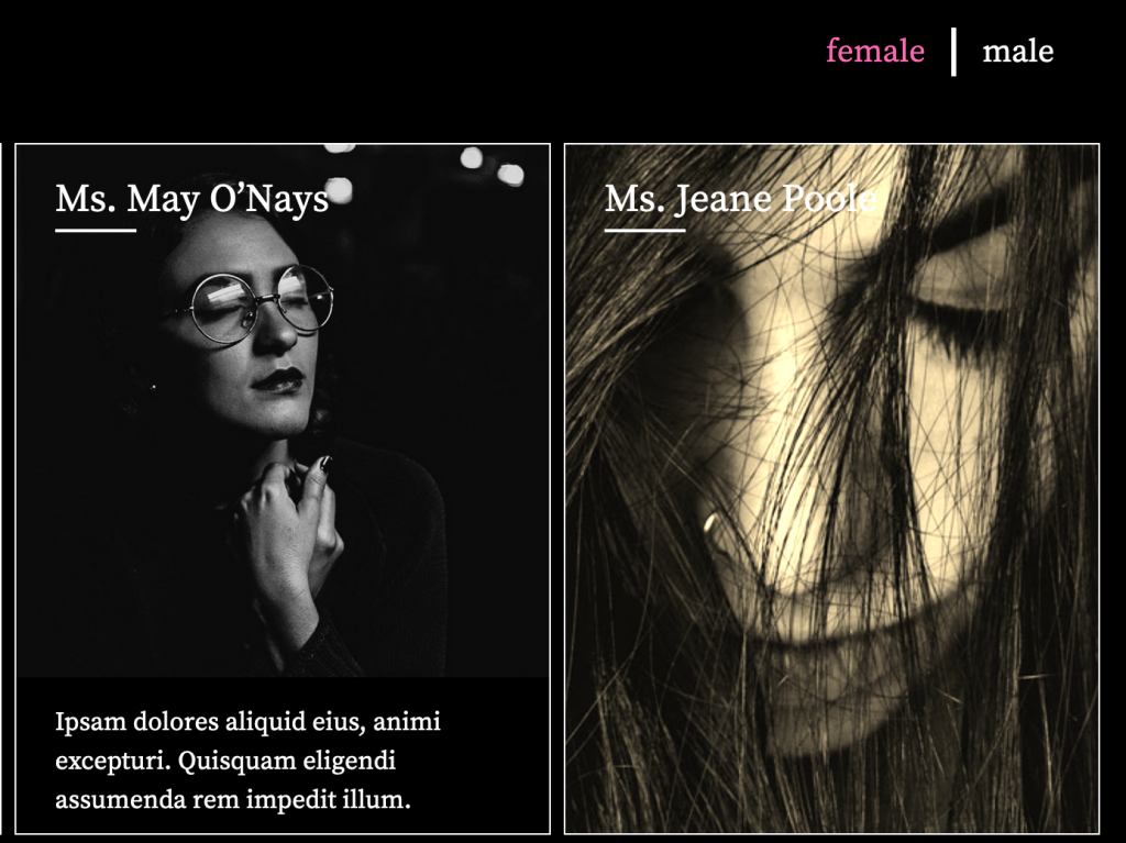
On the archive page, the photo on hover will cover the excerpt, but not the person’s name:
And here’s a video, hopefully not belabouring the point:
Clicking on the photo in home or archive pages will take the user to the single view of the post.
Single View
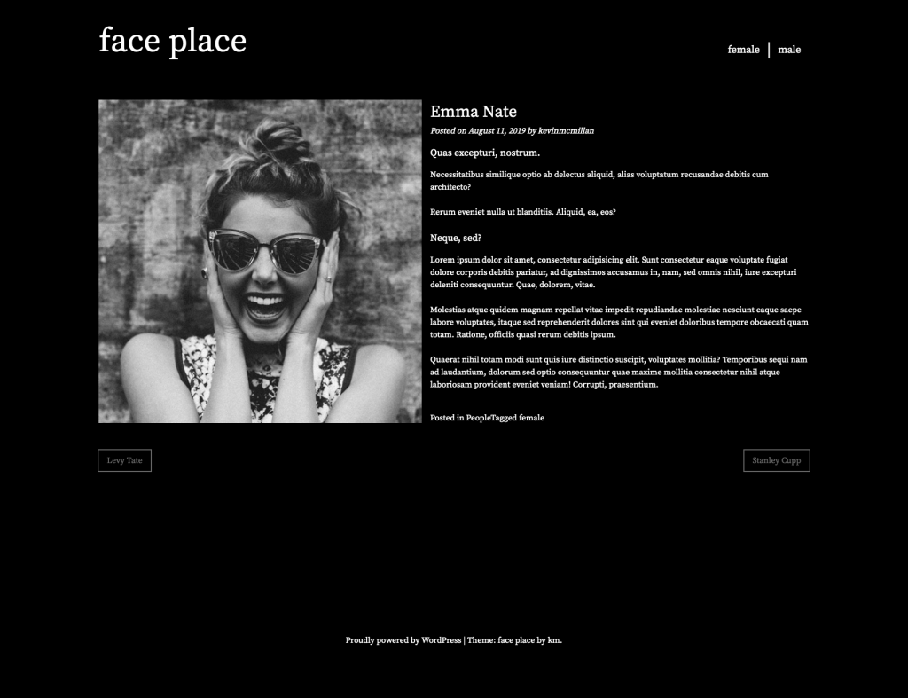
For single post views, the full content and not the excerpt is shown, in addition to the post thumbnail, title, and links to next and previous articles.
Style the page as in the screenshots. Pay close attention to the alignments.
Here is the full size. Be sure to look at the small size thumbnail too.
MARKS, if this is a test. If it’s a lab exercise, it’s out of 1, as usual.
SHRUTI: your mark breakdown is at the top of the page.
| Google Font | 2 marks |
|---|---|
| Header | 5 marks |
| Front Page | 10 marks |
| Hover Treatment | 10 marks |
| Archives | 10 marks |
| Navigation | 3 marks |
| Single View | 10 marks |
| Alternating by Gender | Additional 50% on whole test |
When You Are Done
If this is a test, hand only your theme into the handin folder for the course. Do not hand in a Duplicator archive.
If this is an exercise, show your site to me or our teaching assistant, if we have one.