Other Parts of the Site
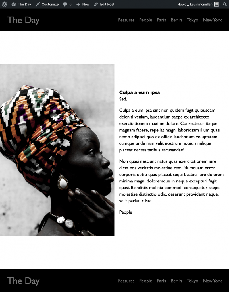
The single view of any post will show the feature image, the title, the content, and the category. Obviously, in single view, the feature image or title should not have a link to the single view.
It will look like this on small screens: feature image, title, content

And it will look like this on larger screens:

Depending on screen width, and content length, the image might be taller or shorter than your content. That’s fine.
Make text readability the main rationale for changing from phone view to bigger.
Archives
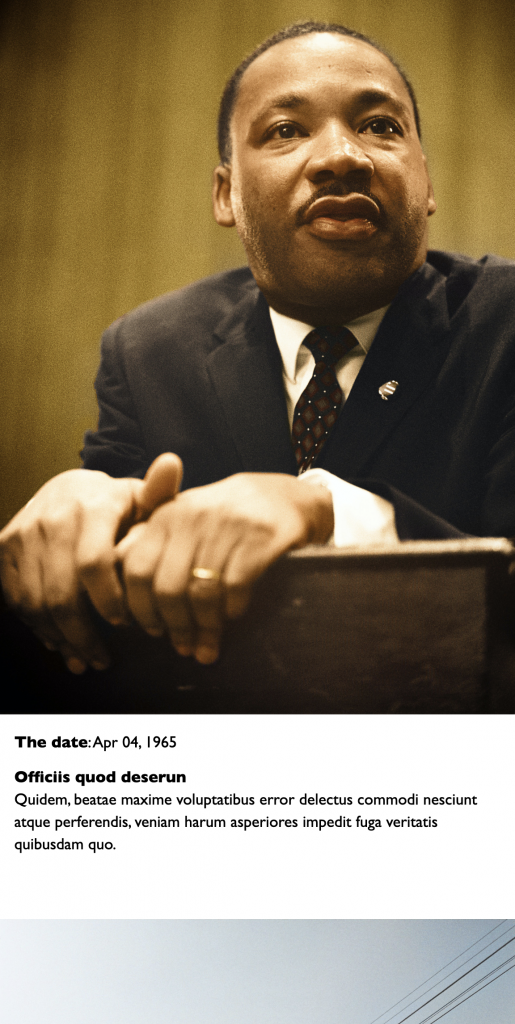
Archives will look like this in phone view. Archive posts will have feature image, title, and content.
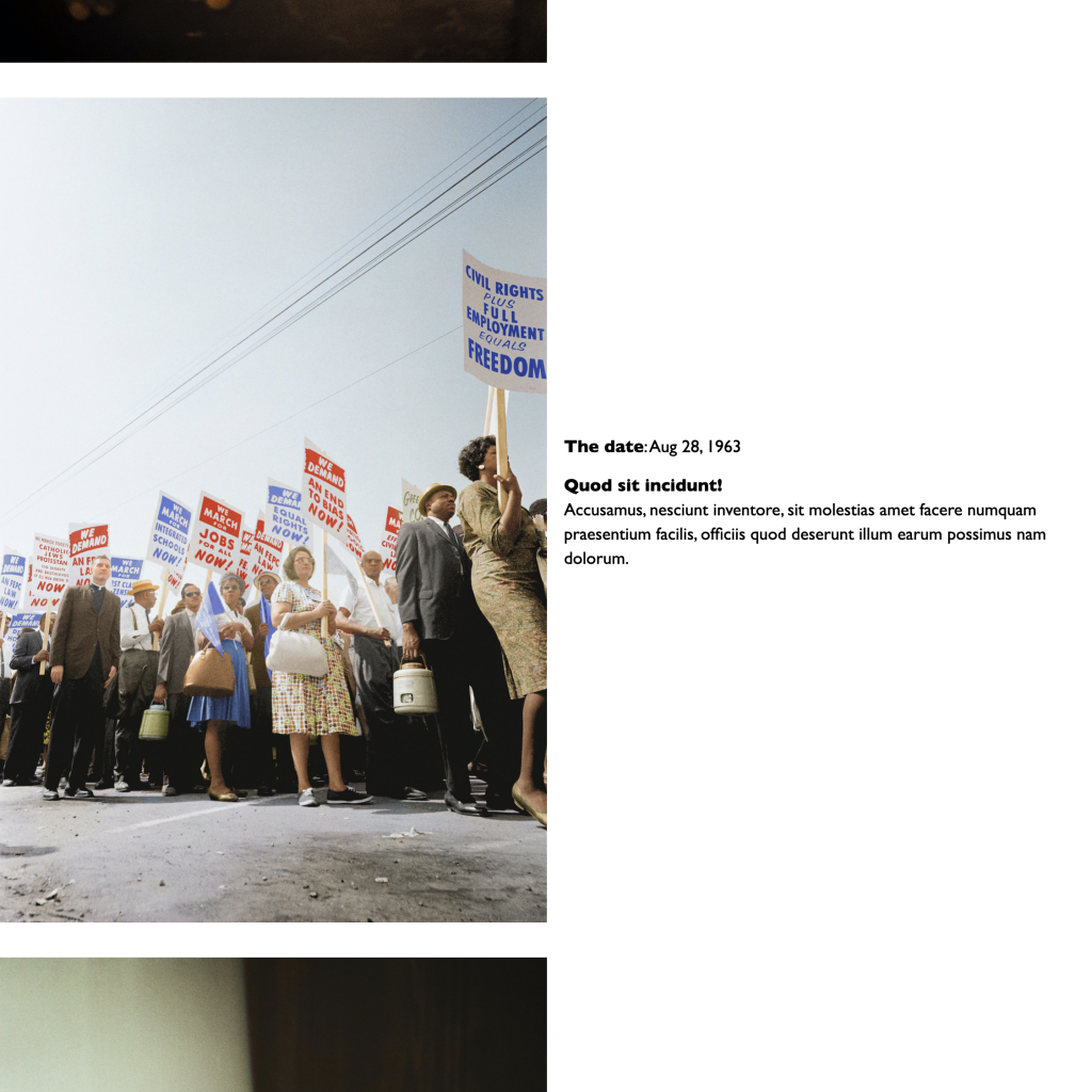
The features archive will also have the Date: Month Day, Year line as seen in the screenshots below.

Archive posts will look like this at bigger sizes:

As always, choose your responsive breakpoint by the need to ensure reading comfort.