In this exercise, you will build two significant parts of a WordPress theme: the home page and the single post view.
You may use your notes or the Internet.
If this is a test, talking to anyone will result in a zero grade.
Initial Setup
First, please download the following:
- the duplicator package
- a starter theme with the comments template file
- the screenshots
- the background images
Install the Duplicator package in a new WordPress testing environment.
Rename the downloaded starter theme to metonymic-your-initials and install it in the duplicated site. Open the theme in your editor of choice.
Change the theme name to metonymic-your-initials (for example, metonymic-km) and enter your first and last name in the author field of the style.scss file.
(If you’re in WMDD4840, you must use SASS, so don’t put this information in the style.css file).
The downloaded start theme is basic. You will need to make at least one more theme file.
Finally, put the downloaded background images into a folder inside your theme folder. There are three images (one for the header, and two for the footer).
You will access these images via CSS using the normal relative paths CSS typically uses. You will not need PHP to do the background images. All paths for background images must be relative to your compiled style.css file.
Typography
The site name (metonymic) is set with the Google font smokum.
All other type is set with the traditional georgia, times, ‘times new roman’ font stack.
Comments & Next and Prev Posts
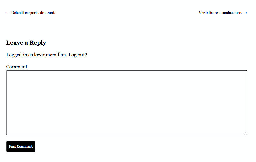
If you look at either of the screenshots of the single view of a post, you will notice that are links to the next and previous post, and that there is a form for users to enter comments on the article.

Inside the starter theme is file called comments.php.
You will not need to edit this file. However, to call the file, you will need to add the following code to the template file that will output the single view of the post.
// If comments open or at least one comment, load comment template.

 if ( comments_open() || get_comments_number() ) :
     comments_template();
 endif;
To output the next and previous post links, do some research in the WordPress developer sites.
Understanding The Tasks
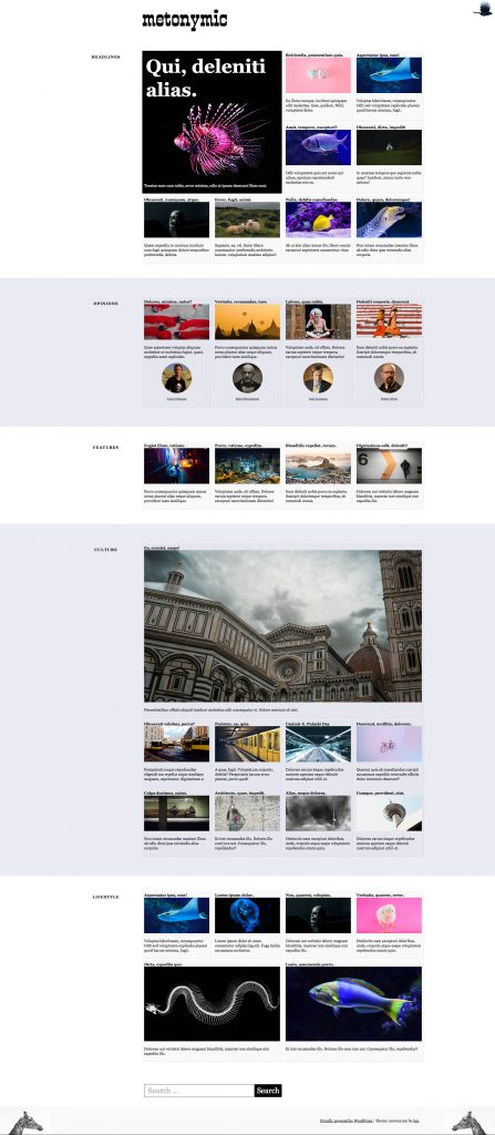
Please study the screenshots of the small and large states of the two content areas we are concerned with here. Assume that the screenshots show you the entire inner area of the browser. The light blue background color in some sections goes right to the edge of the page.
You will need to zoom in to the various areas in order to assess what kinds of alignments and spacing are required in different contexts and responsive states.
On the home page, here is the content that you will load in each section:
- Headlines Section: nine random posts from the Headlines Category
- Opinions Section: the four most recent posts from the Opinions category.
- Features Section: the four most recent posts from the Features category.
- Culture Section: nine random posts from the Culture category.
- Lifestyle Section: six random posts from the Lifestyle category.
Author Gravatars
In the opinions section on the front page, you’ll see names and gravatars of the authors. To output the gravatars, use this code.
Make sure that clicking the name of the author takes the user to an archive of their posts. You do not have to style that archive, just output it.
Things I’m Looking For
- correct output of all content
- strong attention to detail with the styling
- consistent styling, spacing, colors, and alignments
Links
The only things that need to be links are:
- the site name at the top of the page on the single view, linking back to the home page
- each post title and feature image on the home page, linking to the single view
- the author name in the OPINIONS section, linking to an author archive (which we won’t actually style here)
Background Images
In the screenshots, you will notice that the top right, bottom left, and bottom right corners of the browser window have background images. You downloaded those images above.
Sidebars
This exercise does not require a sidebar.
Tag: With-Feature-Image
You might notice that some posts are tagged with the phrase with-feature-image. Please ignore that: that tagging is for another exercise I’m developing that will be based on this one.
Handing In Your Work
If this is a Langara test or makeup exercise, please hand in only your theme to studentshare. Do not make a Duplicator package.
If it’s not a Langara test, please just show me or our Teaching Assistant the working site.
Marking Rubric
- Correct Output of All Content: 40%
- Home Page Styling: 40%
- Single View Styling: 20%
