(…continued from part one of this exercise…)
Now we’ll build the additional layouts the site requires.
Header Area
If we resize the screen quite wide, the site logo will get absurdly big. We’ll limit that by using our space more economically.
First resize the browser window to determine at what size to change the header layout.
Then set the site header to grid. We will have the logo take the same space as the main menu, but the secondary menu will take half the space allotted for those two:
@media screen and (min-width: 740px) {
    .site-header {
        display: grid;
        grid-template-columns: 1fr 1fr .5fr;
        grid-gap: 1rem;
    }
}
That will produce this layout:

Our items are in their columns, but the vertical alignment is ugly, to say the least. To fix that, add the align-items property:
@media screen and (min-width: 740px) {

    .site-header {
        display: grid;
        grid-template-columns: 1fr 1fr .5fr;
        grid-gap: 1rem;
        align-items: center;
    }

Everything looks like it is vertically aligning at this point
Now make the UL in the main menu a four-column grid and do a couple small tweaks for the secondary menu. Remember that all this is inside the media query:
    .menu-main ul {
        display: grid;
        grid-template-columns: repeat(4, 1fr);
        justify-content: center;
    }
    .menu-secondary ul {
        font-size: 1rem;
        justify-content: end;
        max-width: 100%;
    }
Cool. We’re almost done with the site-header area. However, if you look closely, there is an alignment issue. Specifically, secondary menu is not aligning vertically with the main menu.

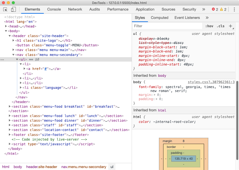
The thing to do immediate: use the browser’s dev tools to inspect the elements.

We quickly should find what’s responsible: the UL inside the secondary menu has not had its default 8px of margin-top zeroed out. Fix that by setting its margin top to zero.
The two menus should now align nicely.
The Food Menus
Possibly the trickiest part of the layout is the food menus at desktop size:

If you draw out the needed grid, though, it’s not really that difficult. The key here is to explicitly state which column and row you want each item to be in. Otherwise, grid’s default auto filling of grid cells will make the task look more confusing than it actually is.
We have four items to arrange on our grid: the .section-heading and three divs, each with a table inside.
- The .section-header will take the first column and all the rows, and be aligned in the vertical center of the column.
- The .main food menu will take the second column and both rows.
- The .sides and .drinks food items will take the third column, one row each.
- Logically, then we need three columns and two rows.
- The first column is about 50% the side of the other two columns.
- There is a gap only between the columns, not between the rows.
Start, then, with setting up the grid parent.
  .menu-food {
        display: grid;
        grid-template-columns: .5fr 1fr 1fr;
        grid-template-rows: 1fr 1fr;
        grid-column-gap: 1rem;
    }
If we look at how the browser outputs this, we see the four items placed into the three-column grid.

Now, if we explicitly place items where we want them to go, we can easily make the desired layout:
.menu-food .section-heading {
    grid-column: 1;
    grid-row: 1 / -1;
}
.main {
    grid-column: 2;
    grid-row: 1 / -1;
}
.sides {
    grid-column: 3;
    grid-row: 1;
}
.drinks {
    grid-column: 3;
    grid-row: 2;
}
This creates this layout:

We have one just one more thing to do: to get the .section-heading to align in the center of the column, not stretch and cover both rows.
Since we don’t want to affect other elements, we won’t put the align property on the grid-parent.
Instead we will use the align-self property:
.menu-food .section-heading {
    grid-column: 1;
    grid-row: 1 / -1;
    align-self: center;
}
And voila!

Staff Area
In the mobile view, the staff member is a staff. Here, we’ll turn it into a row.
.staff {
    display: grid;
    grid-template-columns: repeat(3,1fr);
    grid-gap: 1rem;

}
And just for fun, we’ll set the gradient to no longer go top to bottom (the default behavior), but rather left to right.
.staff {
    display: grid;
    grid-template-columns: repeat(3,1fr);
    grid-gap: 1rem;
    background-image: linear-gradient(to right, black,
           hsl(300,20%,20%), black);
}

Location-Contact Area
For bigger screens, we are going to have the contact information sit in the top right corner of the map, which means that we must use positioning. The key is understanding the structure of our HTML:
- the parent section has a class of location-contact.
- it has two children: the iframe and the .contact-info div.
- we need to position the .contact-info within the space occupied by .location-contact div.
- we must, therefore, set .location-contact to relative positioning to ensure that contact-info has a positioned ancestor to use as its positioning context
- and we must then set contact-info to absolute positioning to place it in relation to its positioned ancestor, location-contact.
.location-contact {
    position: relative;
}
.contact-info {
    padding: .5rem;
    position: absolute;
    top: 1rem;
    right: 1rem;
    width: 180px;
    background-color: rgba(255,255,255,.9);
}

Footer Menu
We’ll just leave that as is for now.
Coming Soon
At a later date, I’ll add a section on making our navigation and secondary menu structure hidden at small sizes, to be made visible when a so-called hamburger menu is clicked.
Thank you for your patience with a long exercise.