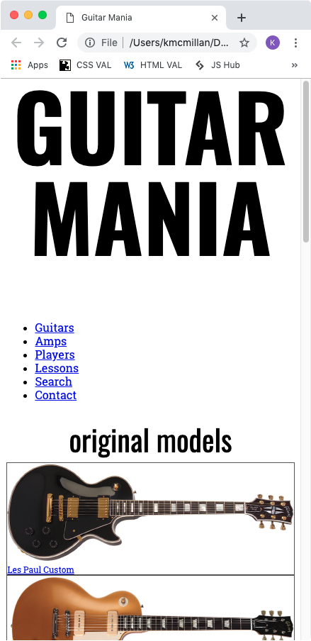
Typography
We have not covered in this class how to use Google Fonts in your website.
But … I want you to work out how to do that on your own.
As part of that process, go to the Google fonts website. You need to select the fonts Oswald and Roboto Slab.
As of this writing, the process to use the fonts on your site is as follows:
- Search for the desired font
- Click Get font
- Search for another font (if needed)
- Click Get font
- Click Get embed code
- Click Copy code
- Paste that code into the head of your document.
Once you’ve made those two fonts available to your page, make some basic typographic styles. If any of what we’re doing here doesn’t make sense, try adding the CSS properties one at a time and then saving the file and reloading the page in the browser to see the effect of each line.
In your style.css file, add the following CSS:
/* Typography ========================================= */

h1, h2 {
	font-family: oswald, helvetica, "arial narrow", sans-serif;
}

h1 {
  font-weight: 700;
  font-size: 6rem;
  margin-top: 0;
  text-align: center;
  line-height: 1;
  text-transform: uppercase;
}

h2 {
  font-weight: 400;
  text-transform: lowercase;
  font-size: 2.6rem;
  text-align: center;
  margin-bottom: .75rem;
  margin-top: 2rem;
  line-height: 1;
}

h3 {
  font-family: "Roboto Slab", courier, "courier new", monospace;
  font-weight: 400;
  margin: 0;
  font-size: .75rem;
}

a {
  font-family: "Roboto Slab", serif;
}
Test your page at a narrow browser width. It should look more or less like this:
Some Header Tweaks
Now let’s work on the menu.
/* LINKS AND MENUS ========================== */

a {
  font-family: "roboto slab", serif;
  text-decoration: none;
}

nav ul {
  list-style-type: none;
  margin-left: 0;
  margin-top: 0;
  padding-left: 0;
  text-align: center;
}

nav a {
  font-size: 1.4rem;
  line-height: 2;
  color: black;
  background-color: #eee;
}

nav a:hover {
  background-color: #bbb;
  color: white;
}
The NAV UL style here reflects an extremely common approach:
- removing the LIST dots with list-style-type: none, and
- removing the space the browser reserves for the dots. (We use margin-left and padding-left because different browsers have used different default ways of reserving the space.)
Test your page. The menu should look like this, at this point:
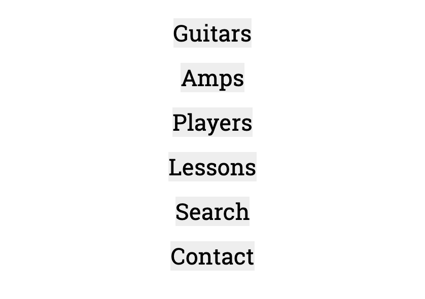
So the list dots are gone. A couple additional things should also be apparent here.
First, the link background color is not going all the way across the page: rather, it is only as wide as the text in each link. The reason for this is that an anchor is by default an inline element, only as wide as the text itself.
Second, the link triggers only when we mouse over the text of the link. Again, this is because an inline element does not take up the full width of its containing or parent element.
To fix both issues, change the NAV A element to have a block display property.
nav a {
  font-size: 1.4rem;
  line-height: 2;
  color: black;
  background-color: #eee;
  display: block;
}
This gives us what we’re looking for:
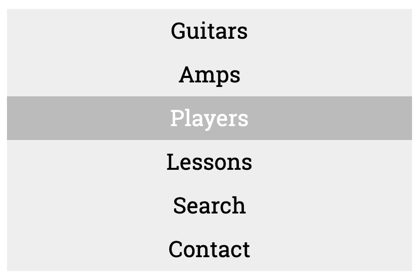
In other words, the anchor elements now take up the full width of their parent elements (the LIST ITEMS) and the hover state is triggered not just over the link text, but beside that text as well.
(In the screenshot, I’m hovering over the PLAYERS link row).
GRID: Refining the Menu Layout
In earlier areas web design, it was very common to set the display property of menu LI elements to inline-block. This was once a very effective approach.
However, more precise control of how our elements line up becomes available to use if we use new display methods such as grid or flexbox.
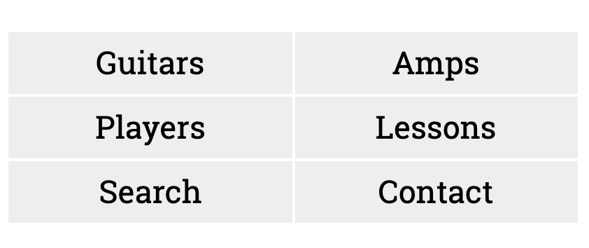
Both have an extremely elegant simplicity. To see this in action, add the following three properties to your NAV UL style:
nav ul {
  list-style-type: none;
  margin-left: 0;
  margin-top: 0;
  padding-left: 0;
  text-align: center;

  display: grid;
  grid-template-columns: 1fr 1fr;
  grid-gap: 2px;
}
The menu should now look like this:
How DISPLAY:GRID Works
The essential thing to remember with the DISPLAY:GRID property is that it involves parent elements and their immediate children.
Setting DISPLAY:GRID on a parent element tells it to arrange its children in columns and rows (in a grid, in other words).
The grid-template-columns and grid-template rows properties give us very precise ways of constructing grids for our content.
In the site menu we just built, for example, we have told the NAV UL to arrange its child LIs into two columns: the FR unit used here means fraction of the available space. By giving equal FR values we create two equally-sized columns.
In other words, because we have six LIs in this UL, the grid-template-columns value we gave will create three rows of two list items each.
The space between the LIs here is controlled by the grid-gap property. In this case, we are specifying a 2px gutter between the rows and columns of our grid parent UL.
We will see more of how to work with CSS grids when we are writing the CSS for our various responsive states.