For this exercise, you will produce a basic layout and wire up a very basic interactivity.
You will code all the HTML & CSS.
First of all, download the image you need for the exercise.
I am not specifying the font, but you must chose one that looks as close as possible to what’s used in the screenshots. This includes sizes (as seen most completely in the third screenshot).
Document Structure
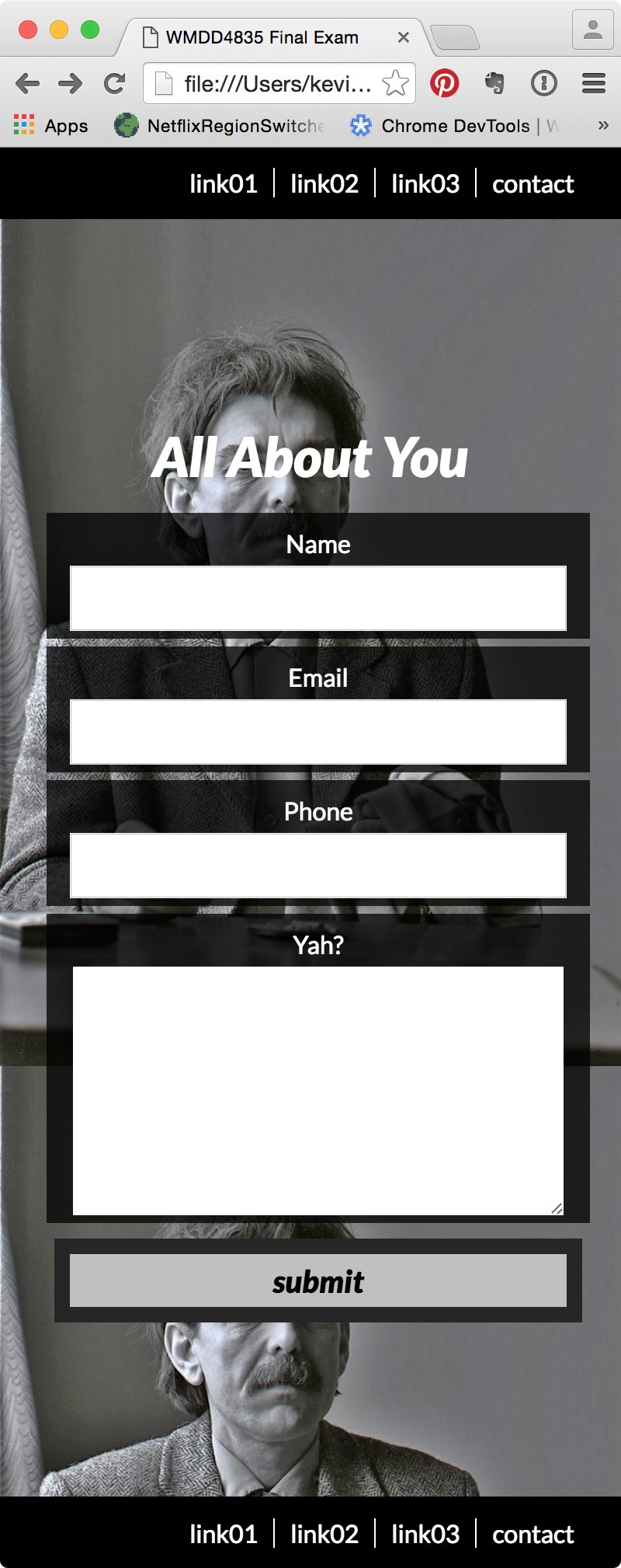
When the document loads, the user should see a layout like this, which covers the entire height and width of the browser.
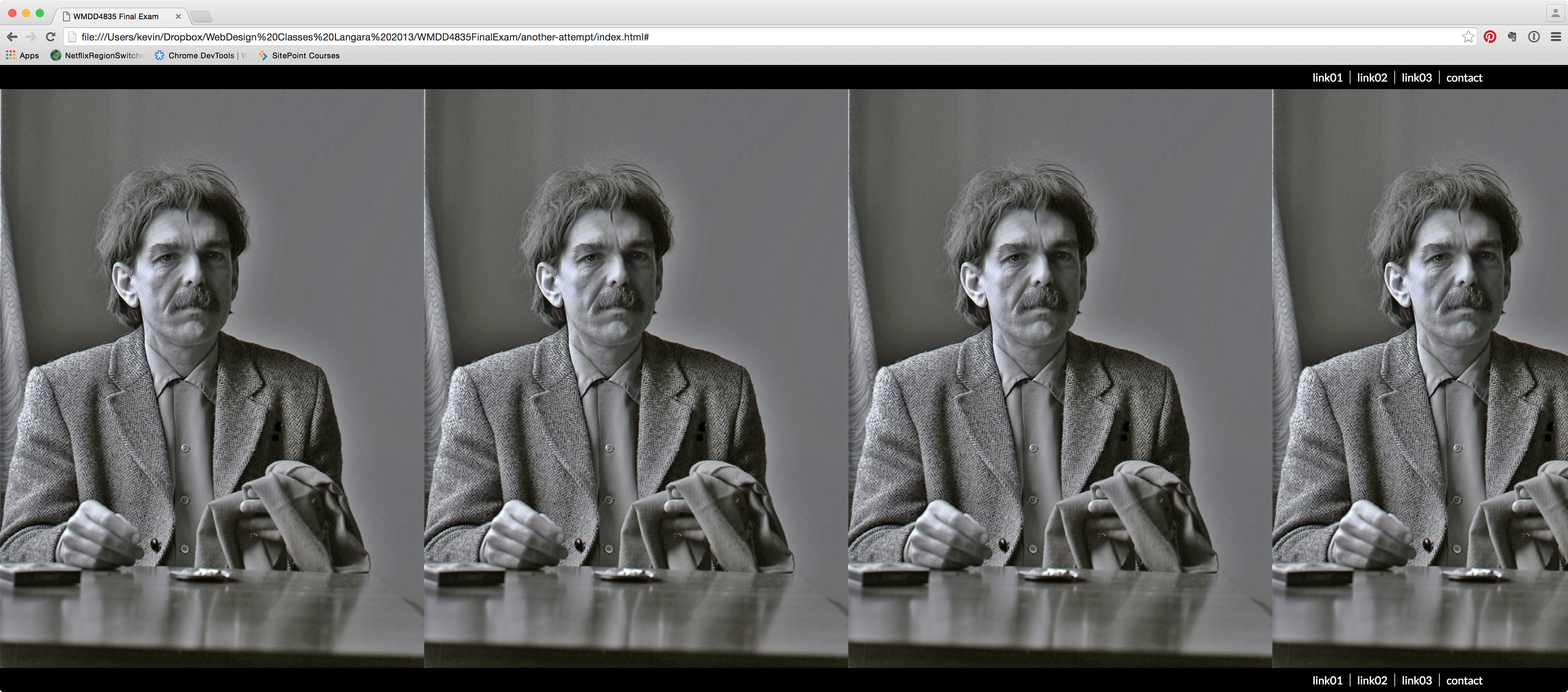
There are three areas in the above layout. Combined, they take the entire height of the browser.
- a header with a menu with four links (to the right). There is a border between links, but not at the beginning or the end of the menu.
- a main content area with, as a background image, the image you downloaded above. This main area should take approximately 80% of the browser height. Depending on browser height or width, the user may see the photo more or less times.
- a footer with a menu identical to the menu in the header
When the user clicks either contact link, a form should appear, fading in over 1 second, looking like this once fully faded in.
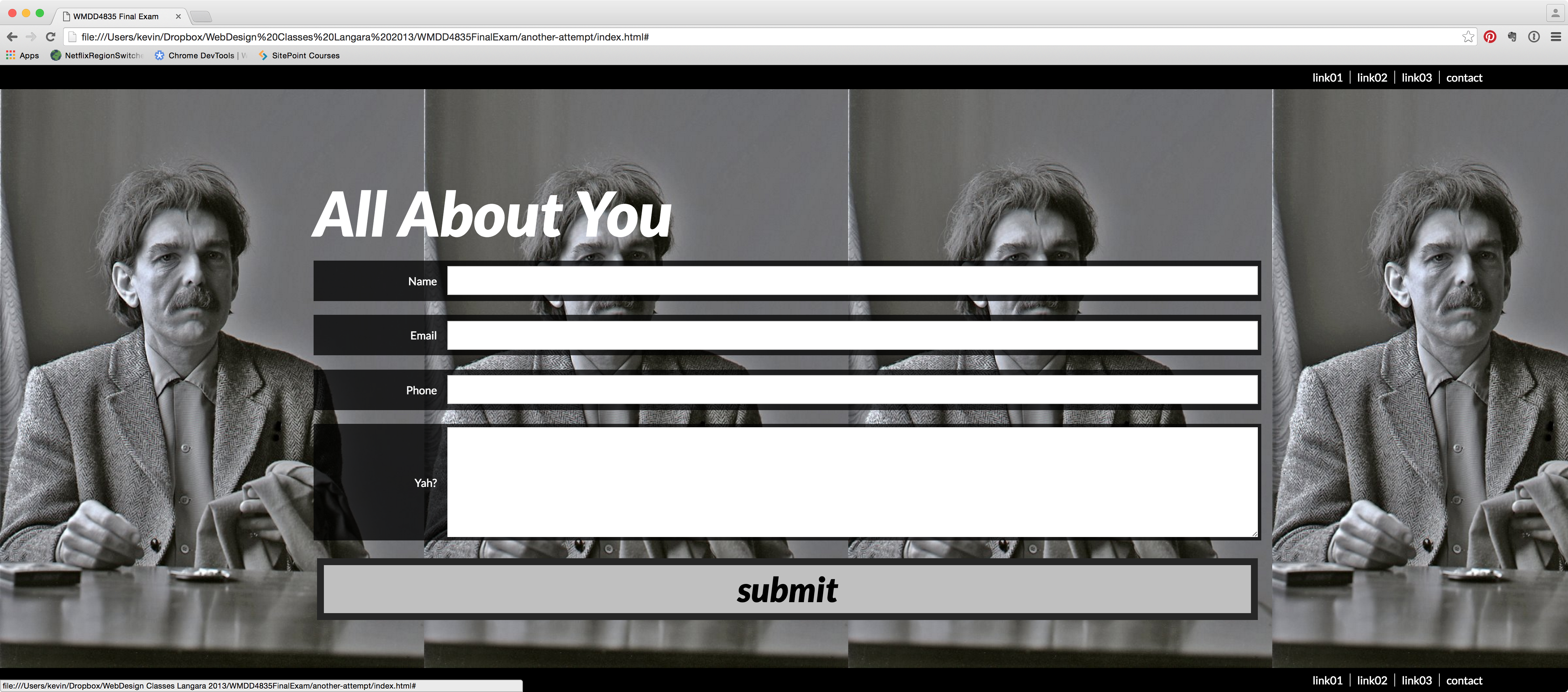
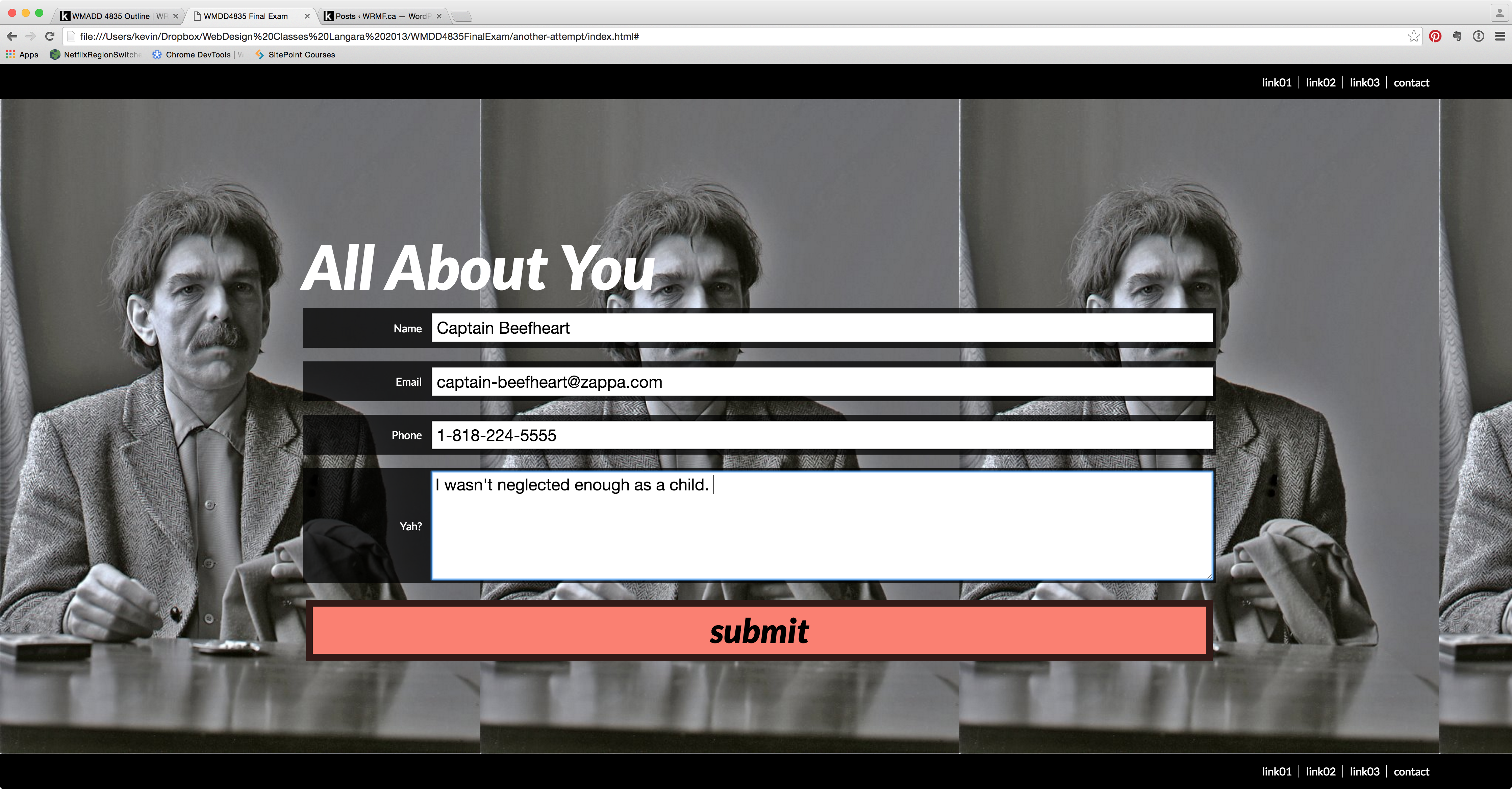
When the user types into the form, the size of the type must be close to the size in the screenshot below. When the user hovers over the SUBMIT button, it must turn salmon color (just use that color name) over 1 second.
Responsive Component
Under 600px, the form must arrange itself like this: