Please download the files for this exercise.
In this exercise, we will explore ways we can establish vertical rhythm on a page by being aware of the font-sizes, line-heights, and margin values of our text. We will first do the exercise using pixel units, because they are easier to wrap our brains around. However, pixel layouts have serious drawbacks—especially so in a mobile-first responsive-web-design world, so we will then learn how to use ems instead, to afford ourselves of their many advantages.
The latter part of the exercise might stretch your brain a bit, but stick with it and you will have acquired one of the cornerstone concepts for RWD.
What is Vertical Rhythm?
Vertical rhythm is when our type is arranged in a consistent order as we travel down the page. Central to this idea is the baseline, a concept borrowed from print design but adapted for the web. Having a consistent vertical rhythm, especially when combined with a logical typographic scale, makes a page look more designed, even if the viewer isn’t aware of what’s creating that effect.
That said, not everything needs to line up on the baseline. The idea is to have your paragraph text do so, and preferably elements adjacent to that text. You don’t need to make a total fetish of it, in other words.
Our Sample File
Open the index.html file up in a browser, and in your web text editor of choice.
In both, you will see a very basic file.
We begin with a <header> area with a site title and a menu of a few simple links.
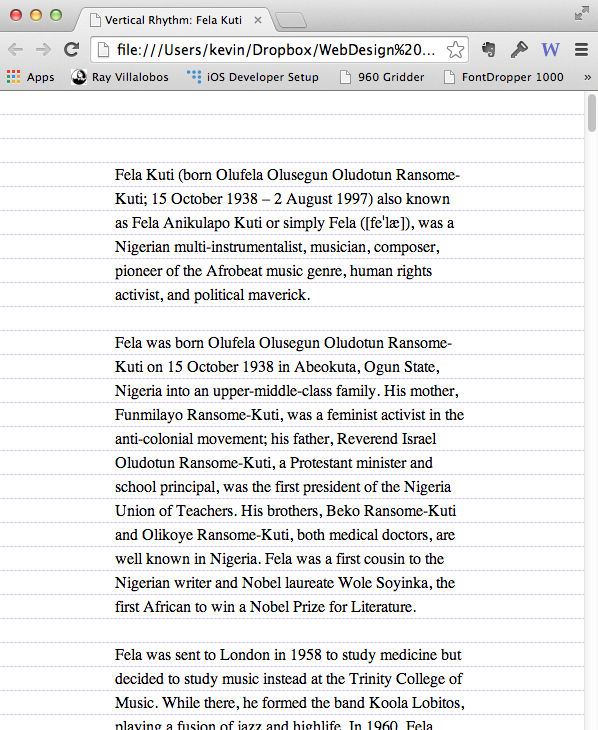
Beyond that we have an article about the Nigerian musician Fela Kuti. It’s marked up with an h1, a couple h2s, a few h3s. There’s an image—ignore that it’s an image of a cat for now (from a web image placeholder service, useful for FPO layout machinations).
And that’s about it.
Make a new file called styles.css. Save it in your same folder as the index.html file and then put a link to in in the <head> of this document.
<link href="styles.css" rel="stylesheet">
In the styles.css file, add the following
body{
    font-family: georgia, serif;
    font-size: 100%;
    line-height: 1.5;
    background-image: url(https://basehold.it/i/24);
    margin: 0;
    padding: 0;
}
The font-size value here tells the browser to use its default size, which generally works out to 16px. The line-height means 150% of this default size. Note that the line-height is unitless: this is so that values don’t compound (don’t worry at all if that doesn’t make sense at this point).
In the background-image line, we are using a web placeholder service (https://basehold.it) to set a 24px high repeating background image throughout our document. We choose the 24px value here because that is the amount of space created by our default line-height. In that background property, the last number in the URL value is what creates the height of the grid. To change the grid value, just change that last number of the URL.
Save the css file. Make sure your html file is saved too.
View the webpage in a browser. Presumably it looks pretty crappy at this point, but don’t worry. The paragraph text isn’t even lining up along our vertical grid. Let’s fix that.
Setting Up The Rhythm
Paragraphs
First add the following style to your stylesheet to aid our diagnostics.
h1, h2, h3, h4, header, img {
  display: none
}
This will hide everything except the paragraph text in this document. We’re doing this for diagnostic reasons: to simplify things so we can track down what’s causing the content to break the vertical rhythm.
Save everything and test the page again. You should see here that the type is still not following the vertical grid we’ve set up.
What gives?
To try to demonstrate, add the following to your CSS:
p{
    margin-top: 0;
}
Test the page again. You will notice that the first paragraph lines up between the gridlines, then the fourth, the seventh, the eleventh, and so on.
Amend your p style as follows:
p{
    margin-top: 0;
    margin-bottom: 0
}
Everything now lines up because there’s no space between the paragraphs. If we want to keep this arrangement, we’ll need to amend the paragraph style further:
p{
    margin-top: 0;
    margin-bottom: 0;
    text-indent: 1em;
}
In other words, here we signify new paragraphs with indentation. The 1em value is equal to 1 “em space” in the font used.
A lot of people like paragraphs being structured this way. However, others prefer the block style, with space between paragraphs used to set off their beginnings and endings. It’s definitely the default style on the web, so let’s figure out how to do it.
To do this we obviously need to manipulate margin values. What value works here?
Amend your paragraph’s style as follows:
p{
    margin-top: 0;
    margin-bottom: 0;
    margin-bottom: 24px;
}
Test the file. The type should fit within the gridlines perfectly. Remember that’s the baseline created by the body’s default (16px) font-size with a 1.5 line-height (ie 150% of the font-size).
Now add the following style and then test the page:
body {
	margin: 20%;
	margin-top: 72px;
}
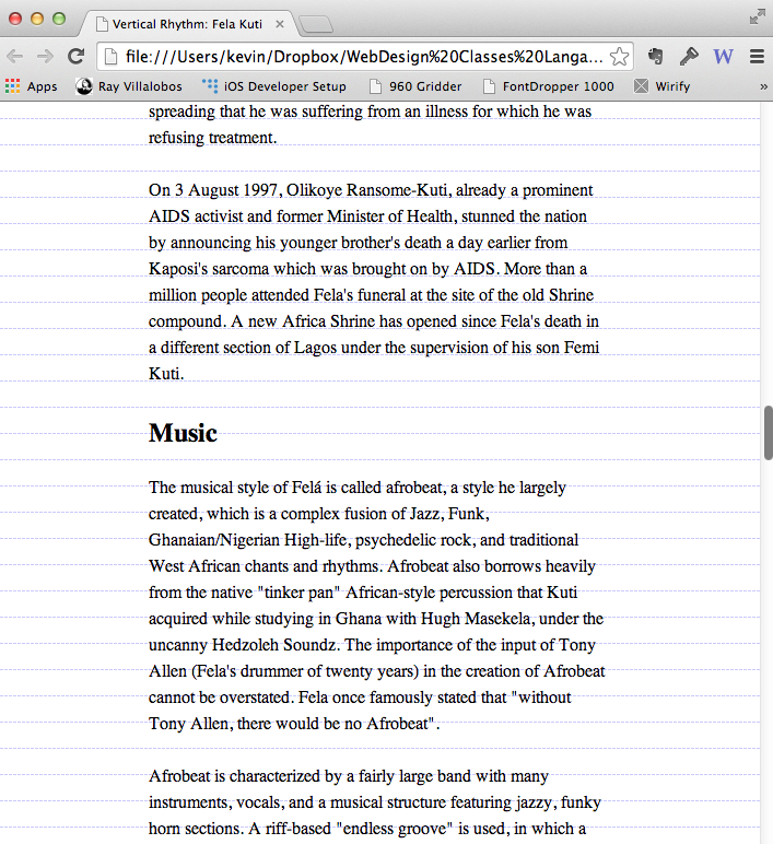
The page should look something like this:
Our paragraph vertical rhythm is taken care of.
Measure?
On to the Headers
We originally hid our headers with a group declaration:
h1, h2, h3, h4, header, img {
	display: none;
}
Remove the H1 and H2 from that declaration. Now scroll through the document and see how the paragraph text is, over time, pushed away from the middle of our gridlines.
To fix this, we need to make sure that our headers take up space in 24px increments. We do that by setting font-sizes and margin values that when combined add up to multiples of 24.
About Line-Height
You may be wondering by now why the type is not sitting on the baseline, as it would in a publishing application.
It’s important to keep in mind how line-height works.