Why Use Icon Fonts?
A couple of significant reasons have contributed to the widespread use of icon fonts for interface graphics.
First of all, an icon font is a single file—typically very small at that, because designers will make fonts that contain only the needed symbols. These will be stored in utf upper regions (font geek talk that you can ignore here) where they won’t be confused with glyphs with intrinsic meaning (like letters or punctuation marks). The more files a server tries to download simultaneously, the slower the site (all other things being equal), so keeping all the interface icons in a simple file is good for performance
To get around the downloading a bunch of small files problem, many designers formerly combined icon graphics into css sprites then used background-position properties on sized elements to reveal and hide individual graphics in the sprite sheet. However, this technique eventually fell out of favor. One reason for this is that our element sizes are typically fluid in responsive designs. Moreover, in the new world of increasingly high resolution screens, bitmapped interface graphics can often end up looking fuzzy. Because fonts are vectors, they remain sharp, especially if used at the “original” size or at a multiple thereof.
How to Do It
Download our sample files for this exercise. Inside you will find two html files: index-start and index-completed. You will work with the first, obviously.
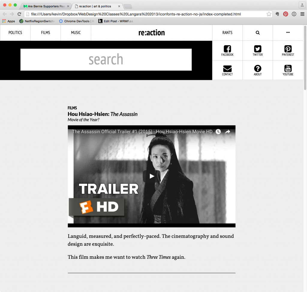
We will do the icons for a hypothetical blog layout. Screenshots for the page (wide and narrow) are in the screenshots folder.
Here’s the top of the page:
And here’s the footer:

In case you’re wondering why I have a both a visible search box and a search icon (the magnifying glass), here’s why: in a later exercise in this course, we will use JavaScript or jQuery to hide the search box and social icons on page load, then make the magnifying glass and ellipsis figures act as buttons to reveal those two items. For now, however, just pardon the redundancy.
FontAwesome
There are a number of different ways to use icon fonts. In this exercise, we will use one of the most common: fontawesome.
To use an icon font, we first need to get the browser to download it. This is just like using a google font.
Normally, at the fontawesome site, you sign up for an account and get one free font kit.
However, you can also do this without signing up for an account—by googling font awesome cdn (cdn stands for content distribution network). Please do this.
One of the search results will be for cdnjs.com. Click the link to that site.
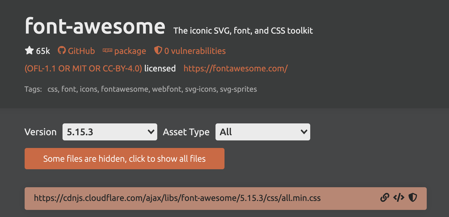
In the first row click on the icon for the link (it’s in the bottom of the screenshot above).
Now, in the head of your HTML document, make a link for a stylesheet, using the copied URL for the href value.
Add Your Own StyleSheet
Inside the css folder, make a new stylesheet file and link to it in the head of your index-start file.
The Syntax
Now go to the FontAwesome Docs page (from the top menu). The first example of sample code should look like this:
<i class="fas fa-camera"></i>
<i class="fas fa-camera"></i>
<span class="fas fa-camera"></span>
I, and many others, typically use an empty <span> element, but other people will use an empty <i> element.
In the comments with this code on the fontawesome site are good explanations of the css class naming conventions.
There will always be two classes on a fontawesome icon. One will always start with fa but will end with a letter. Those letters are listed below
| fas | font awesome solid (free) |
| fab | font awesome brands (free) |
| far | font awesome regular (not free) |
| fal | font awesome light (not free) |
| fad | font awesome duotone (not free) |
So here’s one of our menus:
<ul class="menu-social">
 <a href="https://facebook.com">Facebook</a>
 <a href="https://twitter.com">Twitter</a>
 <a href="https://pinterest">Pinterest</a>
 <a href="https://contact.reaction.ca">Contact</a>
 <a href="https://about.reaction.ca">About</a>
 <a href="#">YouTube</a>
</ul>
Directly in front of the word FaceBook, put in an empty <span> element. In other words, put it inside the actual link code, so that the icon will be clickable.
Then go to the FontAwesome Icons page and find one of the FaceBook Icons—say, the Facebook-Square icon. If I click on it, I get the CSS classes needed to use that icon. Add them to your empty span, like so:
<span class="fab fa-facebook-square"</span>
Ultimately your code for that link will look like this:
<li>
  <a href="https://facebook.com">
   <span class="fab fa-facebook-square"></span>Facebook
  </a>
</li>
Test the page. You should see something like this:
Visually Hidden Elements
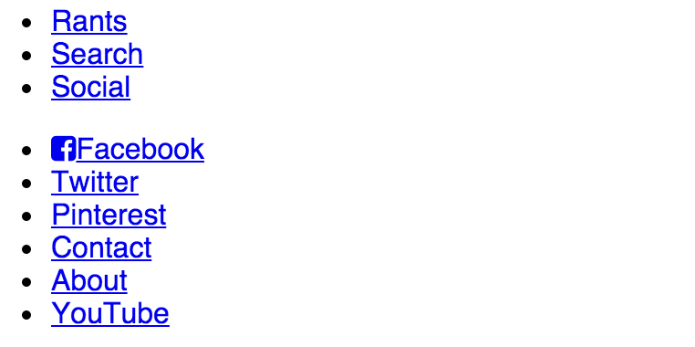
If we look more closely at the screenshot of the completed layout (detail below), we see that the search and social link text does not show up (items two and three in the shot above).
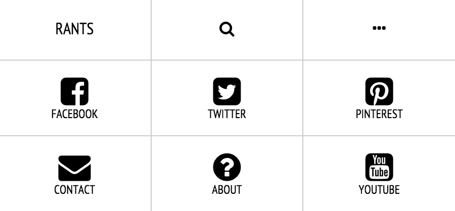
In the bottom six buttons, the words appear underneath the icons. That’s just a matter of styling, working with the display property.
For items two and three in the above screenshot, we need to hide the text—but in a way that makes the links still accessible to the visually impaired. If we delete that text, screen-reading software will have no way of making sense of the element. Display:none has also been found to be inaccessible, as most screenreaders will ignore content hidden that way.
Fortunately, a lot of work has gone into finding a viable solution: the visually-hidden class. If you search for that phrase, you’ll see it explained on a wide range of pages, include ones for icomoon (another icon font solution we might use in a later class), html5boilerplate, and the very influential A11Y project.
We’ll borrow the code from the A11Y Project. From that page, take the second code snippet:
.visually-hidden { /*https://developer.yahoo.com/blogs/ydn/clip-hidden-content-better-accessibility-53456.html*/
    position: absolute !important;
    clip: rect(1px 1px 1px 1px); /* IE6, IE7 */
    clip: rect(1px, 1px, 1px, 1px);
    padding:0 !important;
    border:0 !important;
    height: 1px !important;
    width: 1px !important;
    overflow: hidden;
}
body:hover .visually-hidden a, body:hover .visually-hidden input, body:hover .visually-hidden button { display: none !important; }
To hide a word or phrase then, wrap it in a SPAN tag with a class of visually-hidden.
 <li>
<a href="#">
  <span class="fab fa-search"></span>
  <span class="visually-hidden">Search</span>
</a>
</li>
This will produce this effect: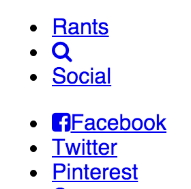
And Now Your Task: Finish The Page
- Add all the icons in the header
- Add the required icons in the footer, including that for Creative Commons
- Style these menus
- Style the rest of the page as closely as possible to that in the screenshot
- Make the page responsive
- Figure out how to make the videos responsive. That will take some googling.
- Take care with the typography. I use a number of google fonts. See if you can match the ones in the screenshots to ones at Google. Try to get the sizes, spacing, and hierarchy as set up in the screenshots. I’m not sure who said half of web design is typography, but he or she was right.
Have fun.
There is an index-completed file in the download, if you get really stuck. But try to work your way through problems rather than looking at what I did: you might find a better way, or a way that makes more sense to you.