Note 2023: webp is now a well-established format. However, the use of the picture element, as discussed here, can be used to serve a newer format like AVIF, while providing a fallback to browsers that do not support that format. The technique is identical to the one discussed here.
The largest contributor to file size on nearly every website is the images, so in trying to make our websites perform better, it’s a very good idea to start there.
As always, there’s a fine line between performance and visually compelling work, but we do a a lot with less if we consider some of the following ways to minimize our file sizes:
- svg
- gradients rather than images
- pixel-density media queries
- webP graphics (or next generation formats like AVIF).
Elsewhere on this site, there are exercises on icon fonts, svg, svg sprites, and gradients. This exercise will focus on the last of those listed: the webP file format.
You might not have heard of webP, but it has lots of potential—for both lossy and lossless compression.
Developed by Google and released in 2010, webP is, at the time of this writing, supported by about 94% of browsers worldwide. [ Here’s caniuse.com’s latest stats for the format. ]
Please download the files we’ll use for this exercise.
Once you unpack the files you’ve downloaded, look inside the image-formats folder: it has a folder of jpegs and two folders of the same images saved in webp format (with different quality settings). Compare the file sizes.
You’ll note that WebP allows us to cut file sizes by 30 to 50% or more.
How to make WebP images
Photoshop did not natively support WebP for quite a while, but it does now. However, webp is not a selectable option in most of the various ways to export web graphics in Photoshop.
Instead, you can save in the format via File > Save as…
Another solution is XnConvert, which is free for Mac, Windows, and Linux. It actually supports over 500 file formats so it’s a good utility to have anyway.
How to run a batch conversion process in XnConvert.
There are also a number of command line tools you can use.
Make A Test Page
Make a new HTML page. If you look in the images folder you will see that the file names are sequential, so that will make using Emmet to put all 15 in the page, using two formats, easy.
Here’s the syntax. You will no doubt notice the use of SOURCE element (which you may know from the VIDEO element) and SRCSET (which also works with the IMAGE tag).
<picture>

<source srcset="image-formats/webp/q80/image-01-q80.webp" type="image/webp">

<img src="image-formats/jpg/image-01.jpg" alt="jpg and webp demo">

</picture>
What happens here is that if the browser supports WebP, it will download that image and skip the jpg. If the browser doesn’t support the WebP format or doesn’t understand the PICTURE element, it will download the jpg as a fallback.
In most browsers now, you will see images that have WebP80 written in the top right. In browsers that don’t support WebP you will see that JPEGs are loaded.
A win-win situation.
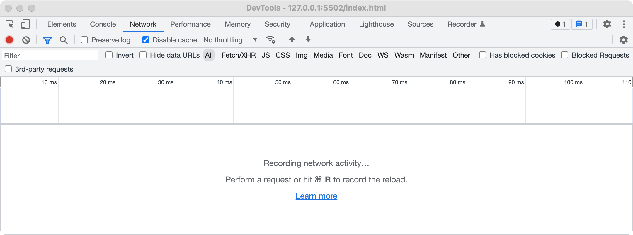
Now let’s find out the total file size of the downloaded images. To do that Inspect the page and go to the Network tab.
When you get to that tab, it will look like this:
Now reload the page:
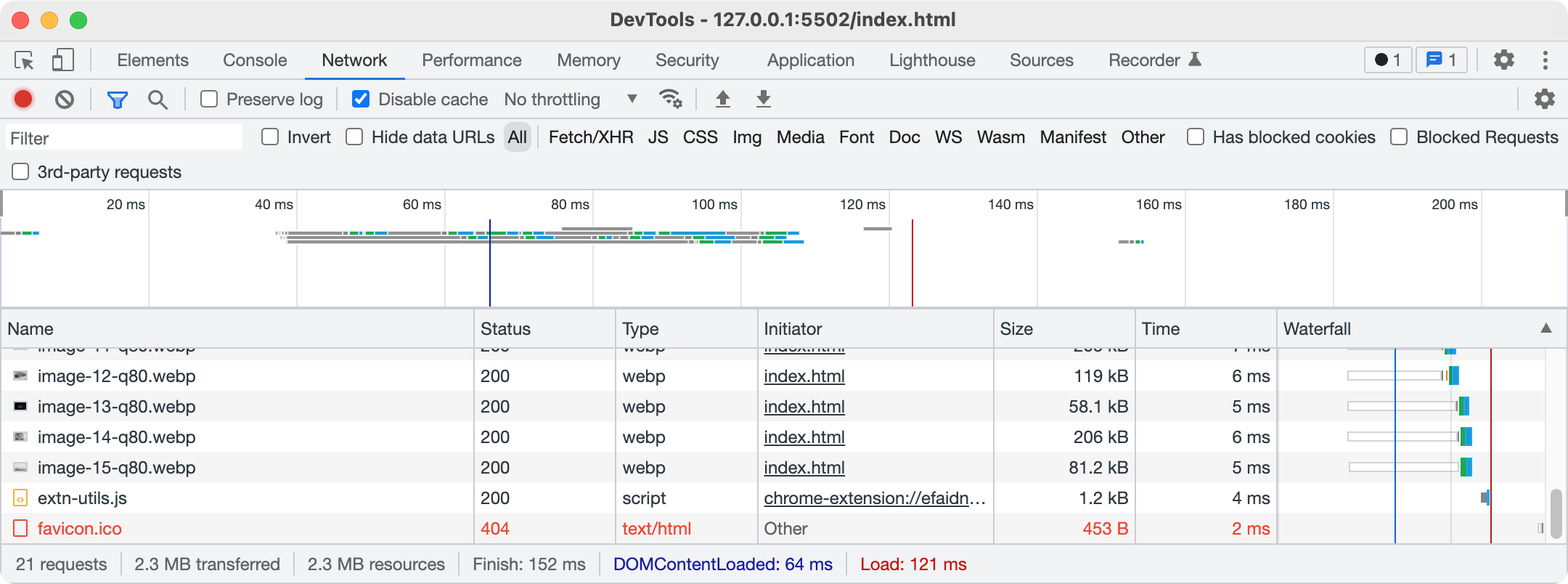
At the bottom of the window, you will see that the 15 downloaded webp images (and the stylesheet and the html) take approximately 2.3mb.
Try changing the file types to the quality 70 images. You can do that by changing all instances of the number 80 in our HTML to 70.
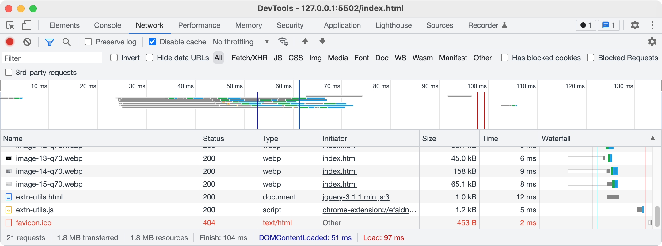
Here we see that we have decreased the file size to 1.8mb.
In contrast, if we comment out or delete all the source elements inside our picture elements, we can see the size of the images when JPGs are downloaded.
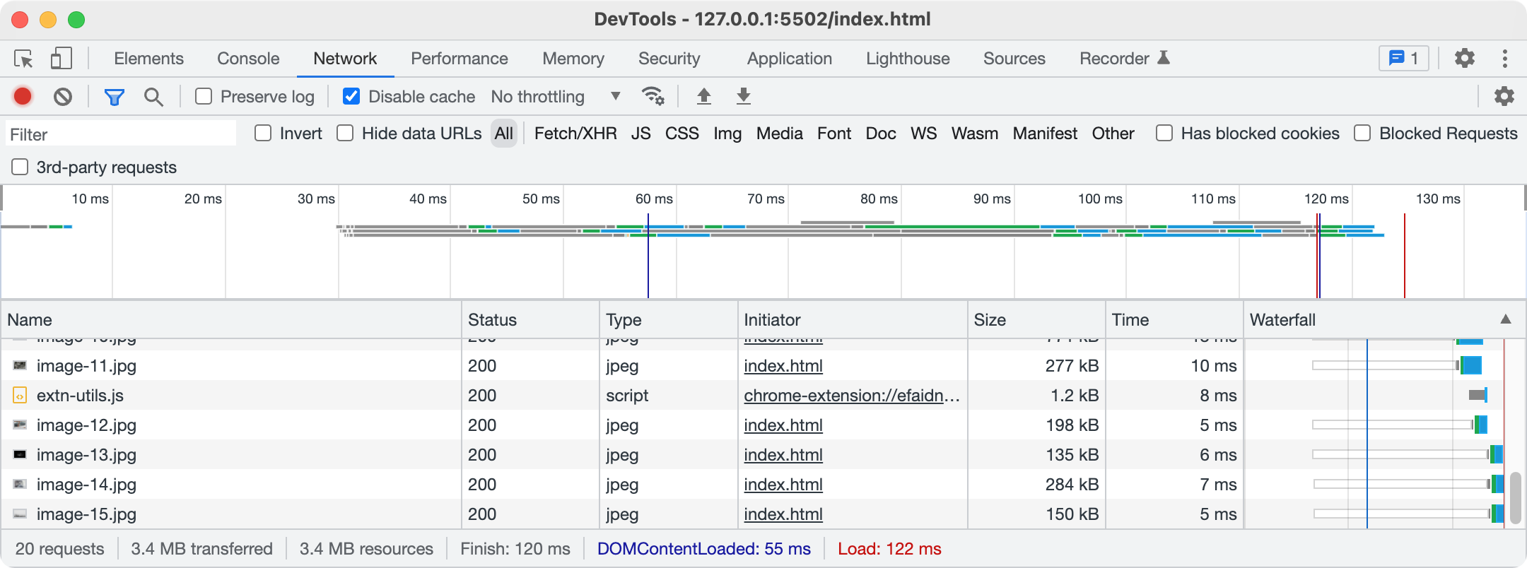
That results in a 3.4 mb total file size for the page — almost twice the size of the 70 quality-setting webp images, and more than 50% bigger than the 80 quality-setting webp images.