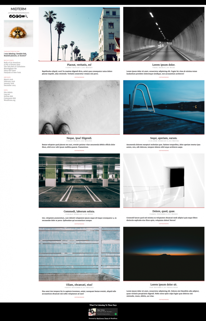
In this exercise, you will build a mockup of the first page of a magazine-style WordPress theme called Midterm. It will look more or less like this, but consult the screenshots that you will get shortly, because the design has changed a bit.
Download the starter files here.
The Task
Build the layout as close as possible to that illustrated in the screenshot files that are contained in the files you downloaded.
Use FLEXBOX for the entire layout.
The screenshots are captured on a Retina 27″ iMac, so there’s lots of detail. Zoom in on the files to get a sense of what I’m looking for.
Notice that the sidebar remains the same width throughout. Only the article area, and the articles themselves (including the photos contained inside) change size. The main differences between the layouts are described below:
- Small Layout: single column, menu initially hidden
- Medium Layout: two columns in article area, centered header at full width, menu initially hidden
- Wide Layout: three columns, menu always visible. Menu button always hidden.
The fonts used are from Google: Lato & Merriweather (sans-serif and serif, respectively).
For the font icons, use Font-Awesome 4. You will notice that the HTML for the post-meta section (the credits and categories in each article) does not have any classes or spans on the links. Use Atom selection techniques to make the task of adding the classes and spans a simple one.
Do all your testing in Chrome. You can ignore other browsers for now.
One small caveat: in a real production site, I would of course not use images at the size I’ve supplied to you. For designing a layout, however, this is perfectly normal. You don’t need to size them down in this exercise.
Apart from blacks and greys, there is one main color used: #cd5c5c. I used the complimentary of that color in some places too. Figure out how to get that color without just using the eyedropper tool in Photoshop.
Links
When the use hovers over the MENU or TOP buttons, the background color changes to the complimentary color.
Menu Component
As the screenshots show, when the layout goes to the largest breakpoint, the menu button will disappear and the entire menu will be shown.
Conversely, at the medium breakpoint and smaller, the menu will be hidden and the menu button will appear.
Clicking on the menu button will cause the menu to appear. Clicking on it again will cause the menu to disappear again.
In a later class, we will do the JavaScript to enable this, with transitions. At this point, just make stuff appear or disappear via CSS.
Spotify
In the main footer of the site in the screenshots, a Spotify playlist is embedded. That playlist is right here. Figure out how to embed the small version of this playlist. Only do this if you have done the rest of the exercise.
And if the Langara network is causing any issues with Spotify in a local page slowing down loading, just drop this part of the task.
If you don’t do this, you will not lose any marks.