Main Document Structure
I’ve written five separate articles on the various parts of this exercise that will take you through most of the building of this project. Here’s a link to the original exercise.
Here and there, though, I use some code that I don’t cover in the articles: most of it’s for small formatting tweaks. If you use the download link below, you can find that code for yourself.
Download a more-or-less completed version of the exercise.
In this first article, I want to focus on how we build the overall flexbox-based structure of the document. Later parts will focus on the typography, icon fonts, javascript, and transitions.
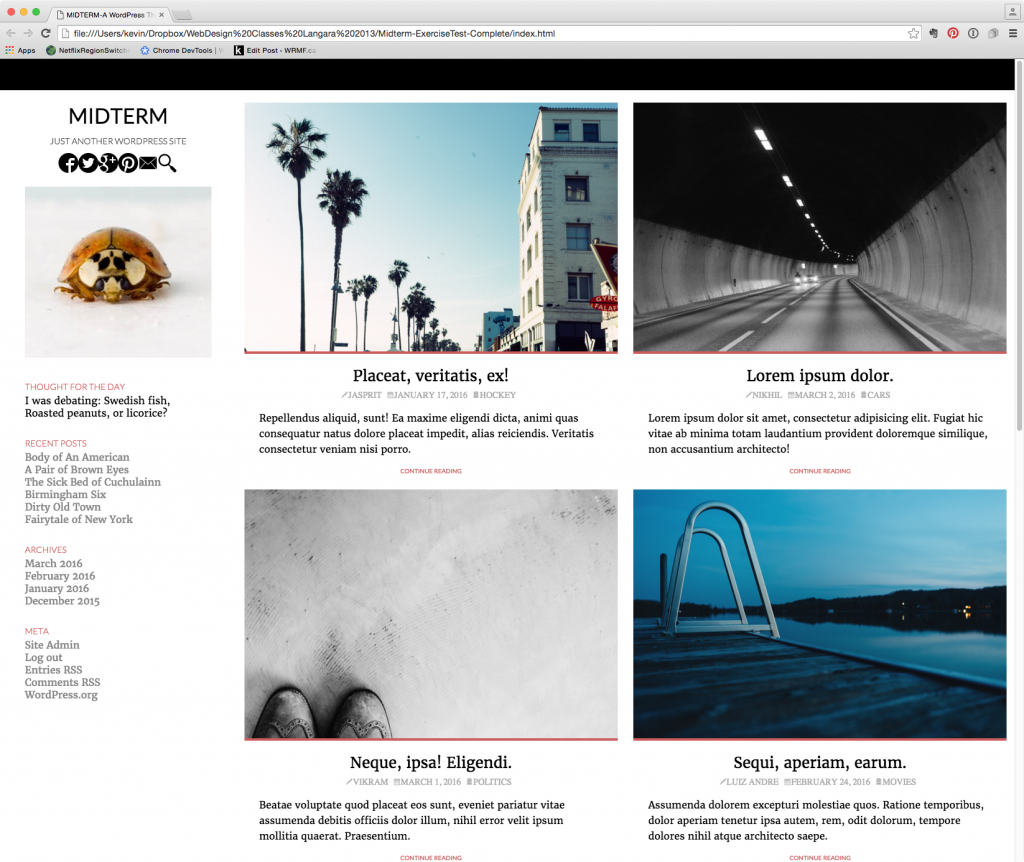
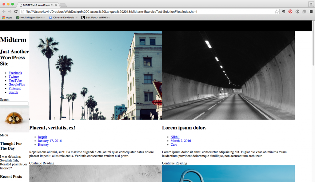
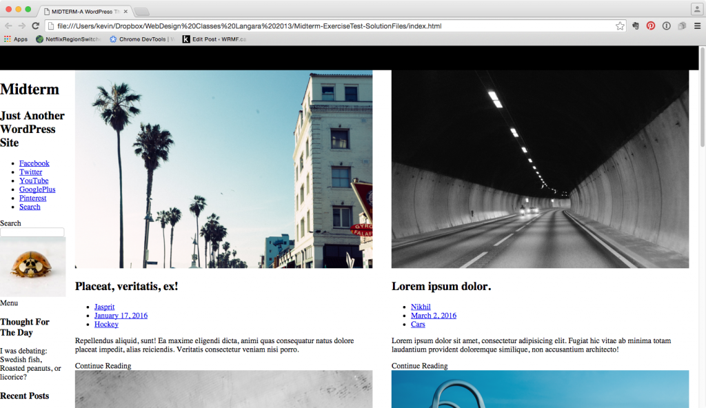
As a reminder of the task, here’s some screenshot details.
Here’s the same page at a medium width:
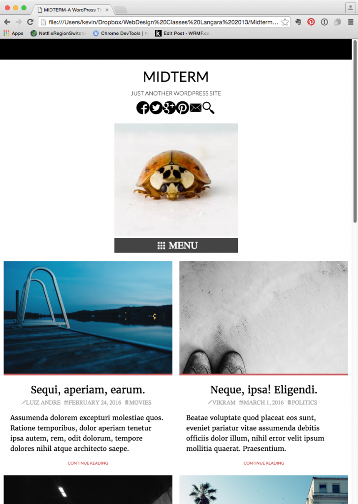
The narrow breakpoint has the same layout as the medium one, with the exception that the articles shift to a single column (rather than the two column view in the screenshot directly above).
Ultimately, though, whether we are looking at the layout on a phone, a tablet, or a desktop, we will see that the outer structure of the entire document is laid out in a single column, with three “layers”:
1) Top Admin Bar (black area)
2) Main Content (with header/sidebar, then article section)
3) Footer ( black background, site-credit, Spotify embed )
Before we do anything, however, let’s first add the standard responsive images code to the stylesheet. This code should be automatically added to almost all your stylesheets. Without this code, our images won’t scale, so our design won’t be responsive.
img {
max-width: 100%;
height:auto;
}
As well, since the top bar of the site (#site-admin) is empty, I will here make a style to give it a minimal height, etc, so we can see it:
#site-admin, #site-footer {
background-color: black;
color: white;
min-height: 50px;
}
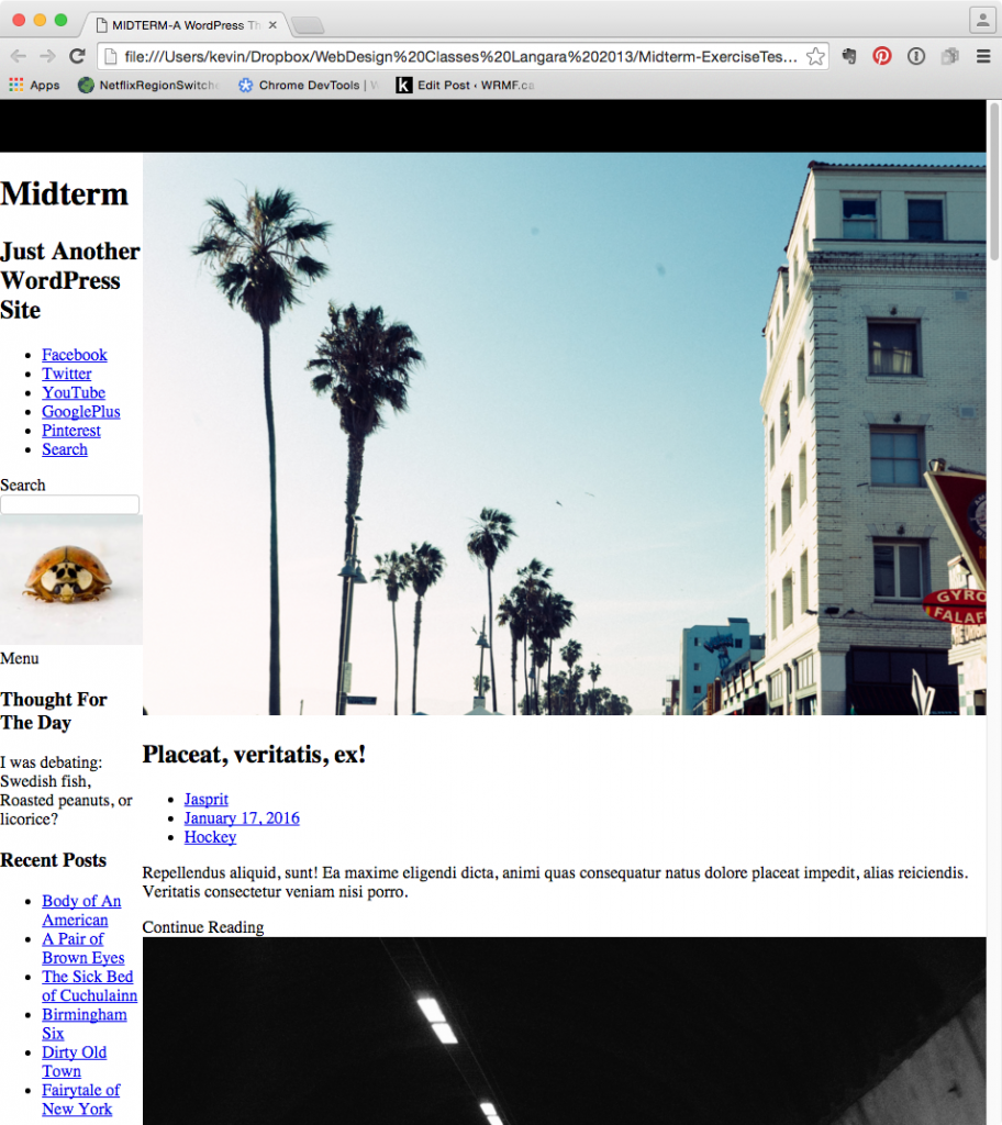
Test your page: a big part of our mobile layout is done.
As its narrowest breakpoint, the articles stack: two columns rearrange into one. So the mobile layout essentially involves doing nothing. Obviously, the main responsive design changes in the document take place in the Main Content area, but these take place at a wider breakpoint.
Set The Outer Structure
Remember that flex works on the direct children of any element defined as display:flex, so we should ensure this first, outer, layer structure by setting the body css to the following:
body {
display: flex;
flex-flow: column nowrap;
}
This should ensure that our main outer structure remains throughout all our breakpoints. In other words, it will ensure that the main layers of the document never wrap beside each other. As well, it should ensure that we can have perfect visual vertical alignment—of header and footer to top and bottom of the document, respectively.
Inner Structure: Main Content
Subdividing further, we can break the MAIN CONTENT area down into two subsections: the sidebar & the collection of articles.
If we look into the supplied HTML, we see that right after the #site-admin DIV is a DIV with an ID of wrapper-main-content. There are two direct children of this element: #sidebar and main.content.
Again, remember how flex works: on the direct children of a flex-container. So if we add the following CSS:
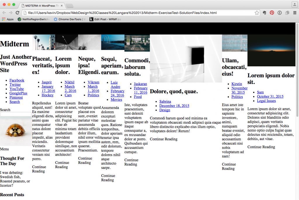
#wrapper-main-content { display: flex; flex-flow: row nowrap; } This should be the effect:
Of course, this layout (sidebar/header on the side) is meant only for our widest layout. So keeping to the mobile-first agenda, immediately wrap that code in a media query. For now, it’s fine to just guess at the needed dimension.
@media screen and (min-width: 1200px){
#wrapper-main-content {
display: flex;
flex-flow: row nowrap;
}
}
This means that our code is very minimal—which is really the point of mobile first.
Deeper Inside: Articles Layout
Finally, let’s take care of the article layouts. At medium width and beyond, we want the articles to arrange themselves side by side. Look at the HTML. The parent of all the articles is the main element (with a class of content). Add this code:
@media screen and (min-width: 700px) {

main{
display: flex;
flex-flow: row;
}

}
Which should produce something like this:
If you’re not sure how flex works, this will probably seem really strange. But what’s happening here is that the default value of nowrap is applied. So modify your CSS to the following:
@media screen and (min-width: 700px) {

main{
display: flex;
flex-flow: row wrap;
}

}
If we do this, the layout will look like it was before we added the FLEX shorthand: the articles arrange in a single column. This is because the articles are as wide as the browser window, so they can’t wrap. But if we add the following to the style, things start taking the appearance we’re looking for:
@media screen and (min-width: 700px) {

main{
display: flex;
flex-flow: row wrap;
}

main article {
flex: 0 0 47%;
}

}
So what does flex: 0 0 47% actually mean here? This is shorthand for the following three properties:
- flex-grow
- flex-shrink
- flex-basis
The first two properties work like proportion. If one flex-item has a flex-grow property of 1 while another has a flex-grow property of 2, the second one will receive twice as much of the “leftover” space.
A value of 0 on each means that the elements will neither grow nor shrink.
The final value, flex-basis, here works as the width of the elements. So if we set them to 47%, there will be 6% left over. In the above screenshot, we see that to the right of the second article in each row. To distribute that leftover space, modify your CSS to add the justify-content property:
@media screen and (min-width: 700px) {
main{
display: flex;
flex-flow: row wrap;
justify-content: space-around;
}

main article {
flex: 0 0 47%;
}
}
And here’s the result:
We now have our essential structure. And how many CSS rules have we written to produce this layout? Four.
Obviously, the layout is nowhere near close to perfect yet, but the basic structure is there.
You might be asking here, though, that since our articles didn’t grow or shrink horizontally, why are we even bothering with flex?
One good answer concerns the vertical axis: as the articles’ text reflows at different browsers widths, each row accommodates that. With a float-based layout, this can actually lead to flow drops, where boxes can get enjambed, necessitating more and more clears and/or clearfixes. One of the compelling features of flexbox, in other words, is that flex-item boxes are aware of each other.
Now Work on the Sidebar
Add the following to your CSS:
#sidebar {
 display: flex;
 flex-flow: column nowrap;
 flex: 0 0 300px;
 padding: 0 40px;
}
Here, we are telling the #sidebar not to expand or shrink, but just to stay at 300px width. As well, by giving it 40px padding on the right and left, we push it away from the edge of the browser and the article section. Ultimately, then, we are making the sidebar 380px wide. ( If we were using a reset stylesheet like normalize, if the padding wasn’t making the box wider, it would be a good idea to check to see if box-sizing:border-box were set there. )
Finally, add this CSS:
@media screen and (min-width: 700px) and (max-width: 1199px) {

#sidebar {
flex: 0 0 100%;
}

}
This is now ensuring that when the browser window is between 700 and 1199px, the sidebar will take up the full width of the screen.
Your layout will now look pretty good, ready for the typographic and other tweaks we will apply to it in subsequent sections.