Import the Fonts
The exercise said to use google fonts: Merriweather for serifs, and Lato for sans-serif.
While working out a layout, I will often include all the weights of the typeface. That way I can experiment to get the best treatment of type. Always remember, however, to go back into your document and edit the import declaration, removing any weights or fonts that aren’t used. Otherwise, you’re asking your user to download unused resources, which slows your site down.
So, from the google font repository, I would add this to my CSS:
@import url('https://fonts.googleapis.com/css?family=Merriweather:400,300,300italic,400italic,700,700italic,900,900italic|Lato:400,100,100italic,300,300italic,400italic,700,700italic,900,900italic');
Use the Fonts
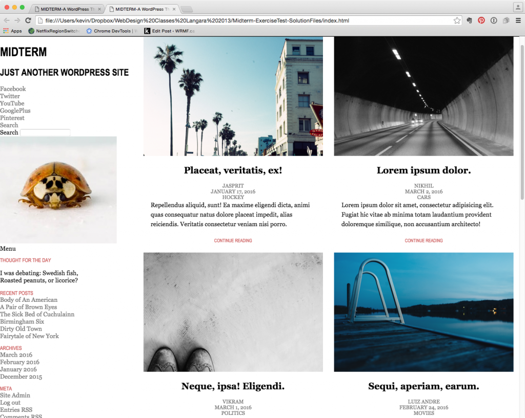
In doing any task, it’s a good idea to first take time to figure out what is being asked for. Look at the supplied screenshots and then look at the html file, and then try to style as much of the common typographic and stylistic concerns as concisely as possible. This saves time. It also makes cleaner code, because there are fewer styles to worry about.
For example, we can get a big chunk of the typographic basics done with only a few rules. For example, we can set the basic font-face properties for the entire document in two rules.
Notice also that in the code here, I am as much as possible using flexible units (primarily percentage) for anything that contributes to width (such as width, margin and padding, for example). This makes the content much more responsive. For example, if we used 20px of padding on an element, the relative proportion taken up by the padding will vary as the parent container changes dimension.
/* TYPOGRAPHY ==================================*/

body {
font-family: merriweather, georgia, times, "times new roman", serif;
font-size: 16px
}

.site-title, .site-tagline, .widget-title, .post-continue-button {
font-family: Lato, "arial narrow", sans-serif;
text-transform: uppercase;
}

article {
text-align: center;
}

article p {
text-align: left;
line-height: 1.6;
margin: auto 4%;
}

article h1 {
font-size: 1.5rem;
}

article .post-meta {
text-transform: uppercase;
font-size: .85rem
}

#site-footer {
text-align: center;
}

.post-continue-button {
font-size: .75rem;
color: #cd5c5c;
margin: 1.5rem auto;

}
.widget-title {
color: #cd5c5c;
margin-bottom: 0;
font-weight: 100;
font-style: normal;
font-size: .85rem
}

/* LISTS and MENUS =====================================*/

ul {
list-style-type: none;
margin: 0;
padding: 0;
}

ul a {
text-decoration: none;
color: #777;
}
So where does that leave us?
We still have some tweaking to do, primarily with font-weights, spacing, and sizing, but I’ll leave that to you.
Next up: implementing the icon fonts and the JavaScript.