Finally, let’s figure out what to do with respect to browsers which don’t support Flex—or support it badly.
Test In A Range of Browsers
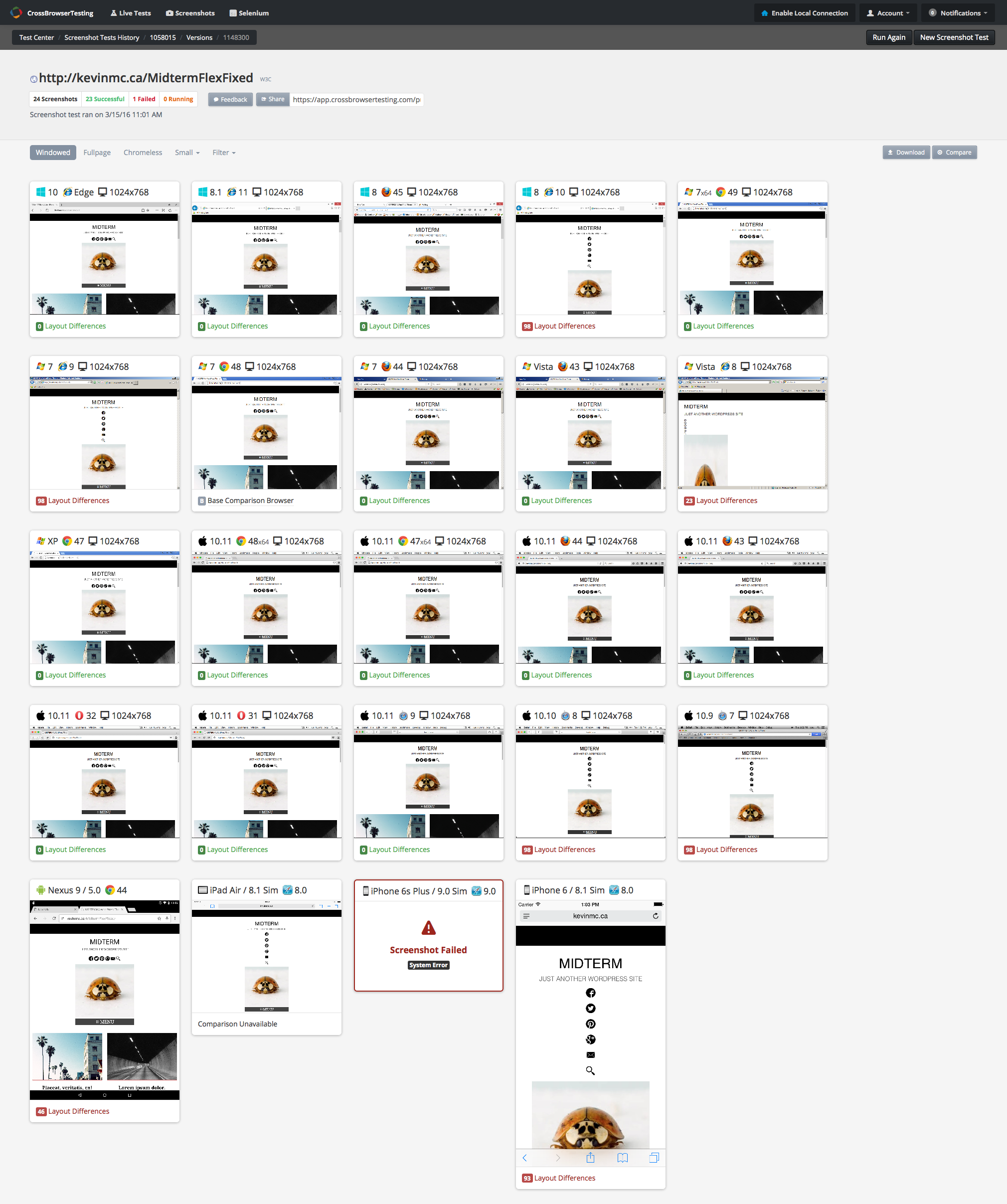
First of all, let’s get a screenshot of the likely suspects.
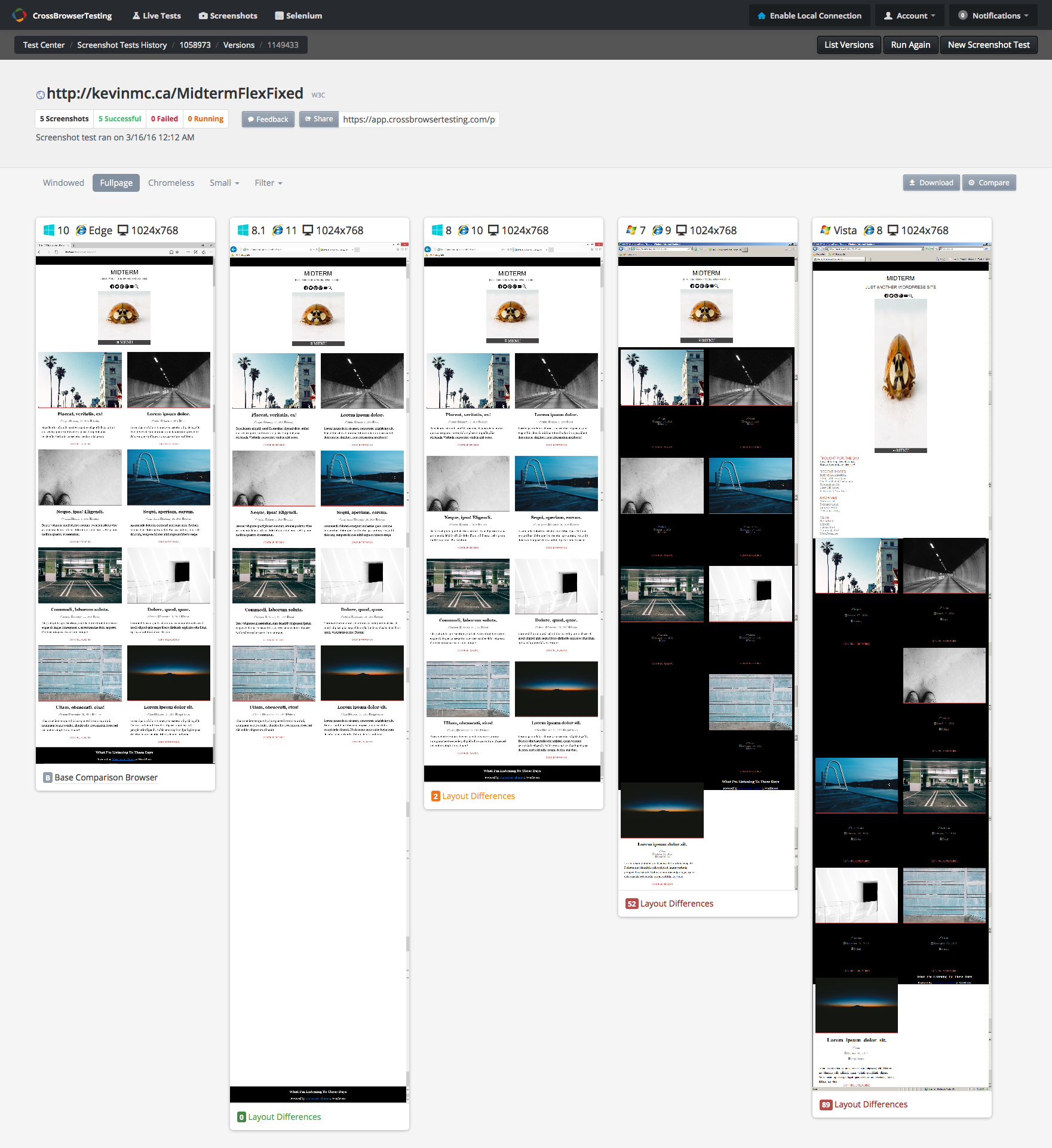
Here’s a link to a range of screenshots generated using the crossbrowsertesting.com service. I’m not sure how long these links stay live, so if this link is broken, download this image of the screenshots. Hopefully the actual link works, though, because you can actually filter the results by OS, Browser, etc. Try chromeless and large, for example. Filter by OS, or browser, etc.
There are a number of such services—some paid, like crossbrowsertesting, and some free but typically more limited—that let you take screenshots of, or interact with, your pages running in a range of operating systems, devices, and browsers. The range of screenshots and testing options, combined with some very useful ways of filtering and/or downloading your data and screenshots, makes crossbrowsertesting an excellent service if you work on a lot of sites, use more cutting-edge techniques, or guarantee browser support minimums to clients.
Anyway, we see in the screenshot that our our layout is working quite well in a range of browsers. I work on a Mac, so testing Windows browsers, particularly IE, is important at this stage. Filtering for IE only produces these results:
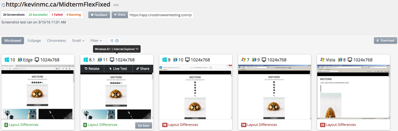
Viewed at Full Size, we see these results (click for a bigger image of the screenshot):
So there are a few things to fix, here.
- IE8-10 not recognizing Flex, or Flex-Basis in Articles
- IE8-10 not recognizing Flex, or Flex Basis in Social Nav menu
- Extra space after Article block in IE11
- IE8 photo stretching
Let’s tackle them now.
First of all, let’s see if we can make IE10 behave.
Add Vendor Prefixes
With anything newish in CSS, you will encounter the use of vendor prefixes. These are additions to CSS properties (or sometimes, values) that browser makers add while the spec is in development.
Typically the vendors use these prefixes:
- -webkit- (Safari, some versions of Chrome, newer versions of Opera.)
- -moz- (Firefox)
- -o- (Old versions of Opera)
- -ms- (Internet Explorer)
The recommended pattern is to put necessary prefixes first, followed by the official spec, as below:
.some-thing-of-some-sort {
-webkit-transform: rotate(30deg);
-ms-transform: rotate(30deg);
transform: rotate(30deg);
}
So how to decide which prefixes to use?
You can of course look them up at caniuse.com, but that is exceptionally tedious. Instead, your best bet is to use utilities like AutoPrefixer, which will automate the use of vendor-prefixes, using data from caniuse.com.
Fortunately, there is an AutoPrefixer plugin for Sublime. Before you install it however, install node.js if you don’t already have it ( to see if you have it, in Terminal type node –version ).
Once you’re ready to add prefixes to your CSS, in Sublime press Command-Shift-P to bring up the Command Palette.
The option to Autoprefix CSS should be right near the top. Choose it.
Another option, particularly if you’re a hardcore developer type, is to use build tools like gulp or grunt. Build tools are a better way, because they keep your CSS clean (compiling your CSS or SASS into stylesheets you upload but never edit). But setting one up is beyond the scope of this article.
A simpler online AutoPrefixer, although much less methodical, will also work for this exercise. If you’re Autoprefixing that way, once you’ve got your layout working in a modern browser like the latest Chrome, copy your CSS into the AutoPrefixer form at that web page, then copy the processed CSS back over your original CSS.
All the above ways of using AutoPrefixer will let you choose (either on the web page or via config options) how many browser versions to support, etc. Most people recommend going back two browser versions, as a lot of browsers (such as Chrome) will automatically update themselves now.
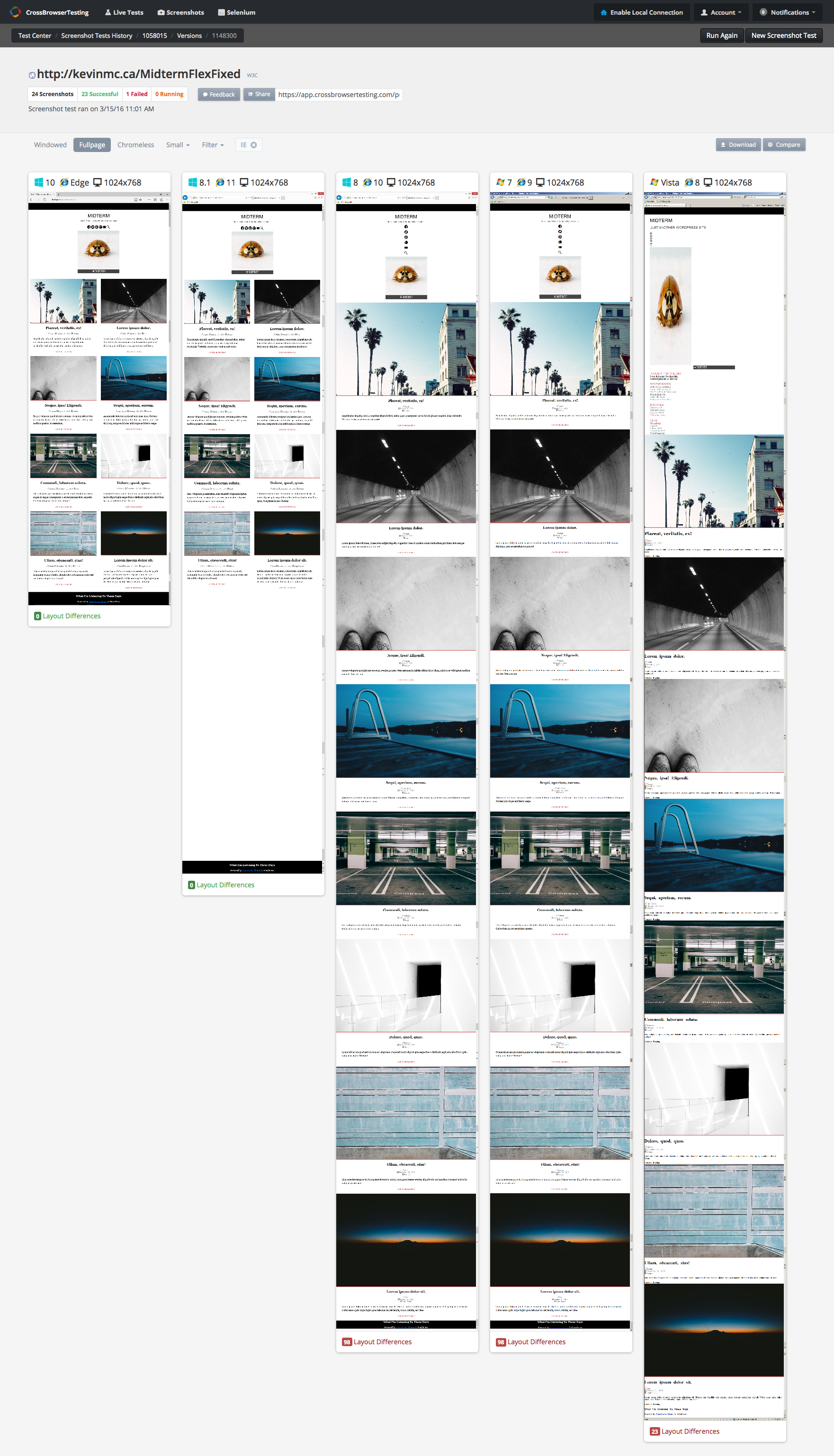
Whatever way you choose, make your CSS autoprefixed. Now test on your target browsers. Here’s a new view of our crossbrowsertesting.com array of IE screenshots. Notice how IE10 is now behaving? Its layout looks as good as that for the Edge browser, or for Chrome, etc.
Now we have IE9 and IE8 to take care of, if we decide that we’re still supporting Windows XP.
We can target IE in a number of ways.
- IE Conditional Comments: IE5 – IE9: Quirksmode.com Reference
- Browser Support Detection via Modernizr.js
Because it’s more useful going forward (IE conditional comments have legacy application only, as they’re not used in modern Microsoft browsers), I’ll here focus on browser support detection.
Test For Browser Capabilities: Modernizr.js
Years ago, browser sniffing was the rage. The idea was that different code could be delivered to different browsers (as IE and Netscape, etc often had greatly different ways of rendering content). The modern practice is to test for capabilities.
And the easiest way to do that is to use modernizr.js. At this website, you can select a feature, or features, that you wish to see if the browser supports. The modernizr website will create a script that when included in your web page will programmatically test the browser’s support for your selected features.
If a browser does support said feature or features, the modernizr script will add a class to the HTML tag. If the browser doesn’t support a feature, the script will add the same class (but prefixed with no- ). For an example, look at this screenshot:
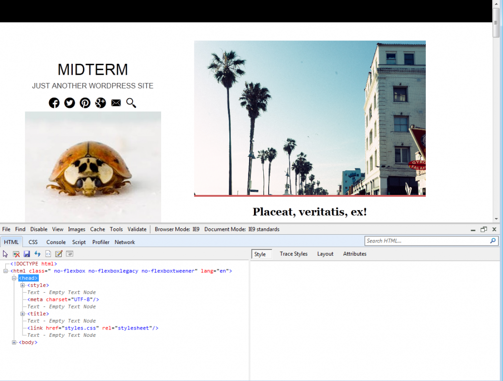
Here we see our page loaded in IE9 in a Virtual Machine, open to the IE Developer Tools. Notice, in the Dev Tools, the HTML tag: three classes ( no-flexbox, no-flexbox-legacy, and no-flexboxtweener ) have been appended by Modernizr.
This illustrates, in other words, how Modernizr enables us to deliver alternate or additional styles to browsers that don’t support whatever feature we want to test for.
More information on the various ways you can use modernizr’s feature detection.
Add Your Detects
At the modernizr.com website, click on the add your detects button. In the SEARCH field, type flex and select all four flex-related properties that are returned:
- Flexbox
- Flexbox (legacy)
- Flexbox (tweener)
- Flex Line Wrapping
If you click on any of these, you can find relevant information and history (and examples of usage) about the property.
If you wish to support IE8, make sure that you also click the html5shiv option at the side of the page. This makes IE8 correctly treat html5 block elements (such as Article, Header, Section, Footer, etc) as block elements, rather than inline elements (which can really bork a layout!)
Now click the big pink BUILD button.
When the dialog box comes up, choose Download in the first row (the build row, in other words).
Add this script to the <head> of your HTML page(s), not at the bottom of the page, like you might do with a lot of other scripts.
Keeping in mind the classes added above, we can modify our CSS with the following code, targeting browsers (like IE9) that don’t support FLEXBOX (the first rule is actually for IE8, which doesn’t correctly treat HTML5 block elements, as discussed above).
/* FLEX FALLBACKS =============================== */

article, header, section, footer, figure {
 display: block;
}

.no-flexbox main article {
 width: 47%;
 margin: 1.5%;
 float: left;
 box-sizing: border-box;
 }

.no-flexbox .nav-social li {
 display: inline-block;
 float: left;
 margin: 1%;
}

.no-flexbox .nav-social ul {
 width: 190px;
 margin: auto;
}

.no-flexbox .site-banner {
 clear: both;
 margin: auto;
}


.no-flexbox #site-footer {
 clear:both;

}
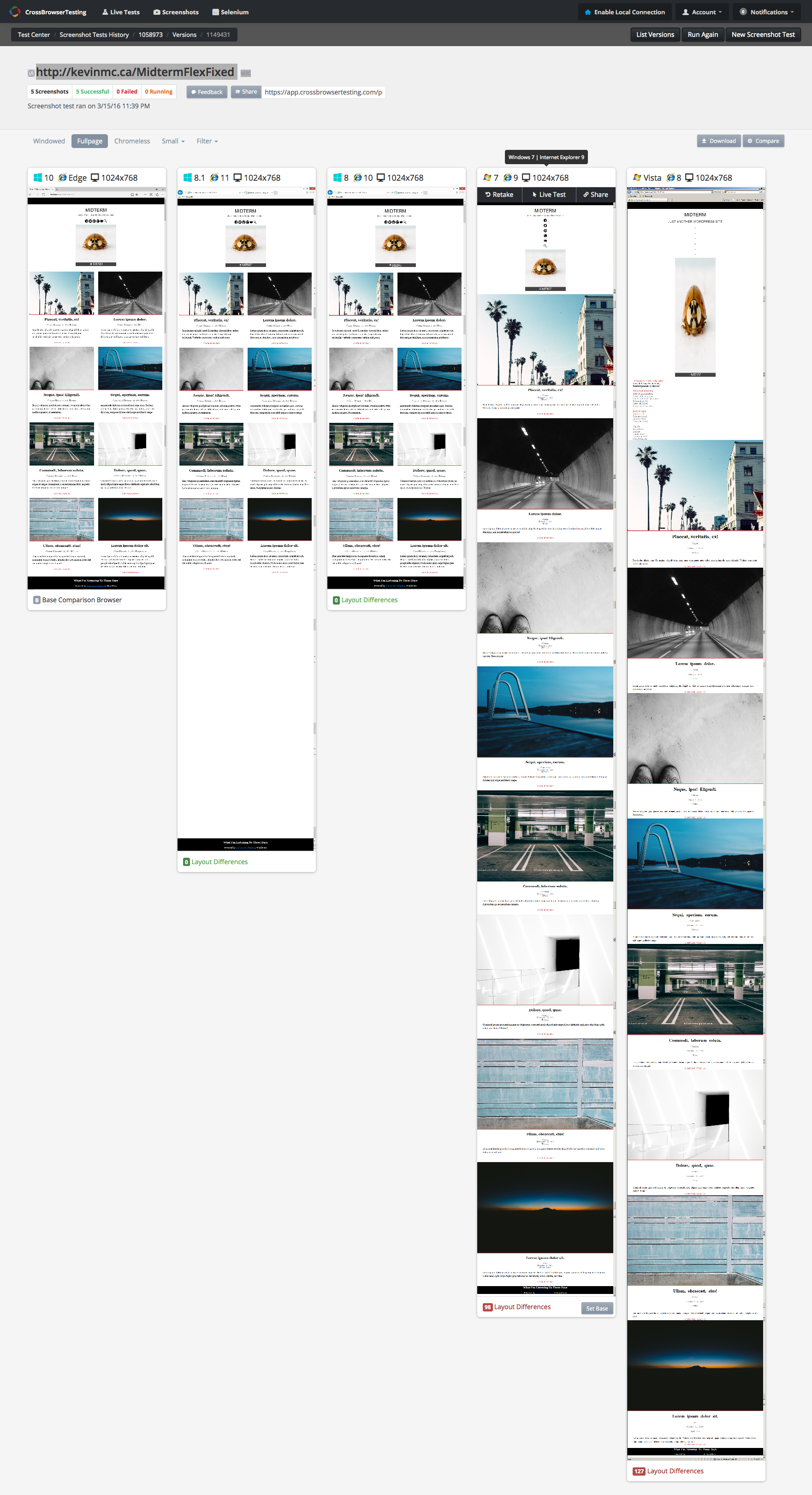
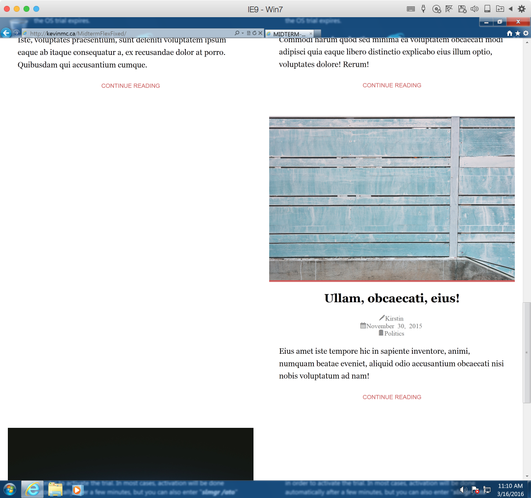
Run your screenshot tests again. We should be getting closer:
It’s improved: the articles are now side by side. But IE9 and IE8 have some weird issue with the footer not clearing correctly: the black background is likely the result of the floated articles causing their container (main) to collapse.
Let’s remedy that by using clearfix on the container holding all the articles. First, copy the Nicholas Gallagher micro-clearfix code into your stylesheet, then add the clearfix class to the main element in the HTML:
<main class="content cf">
I would also clear the footer just to be safe. So here now is what the page should look like in IE9 (loaded on my Mac via Parallels Desktop):

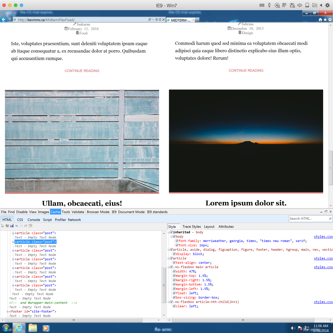
It looks good at first, but then when we scroll down, we find the annoying “float drop” that can occur if floated elements aren’t the same height (if you remember the GuitarMania exercise, an image being 1px shorter than other ones caused the issue there).
In a nutshell, the fifth article is a tiny bit taller than the sixth. As a result, the seventh article is getting stuck right on the protruding bottom of the fifth article, so it’s not able to get all the way over to the left side.
The solution is to use the clear property to force it underneath. In fact, so that the problem doesn’t occur again, I would clear all of the odd articles
.no-flexbox article:nth-child(odd){

clear: left;

}
This means, in short, that any odd article (1, 3, 5, 7, etc) will refuse to have any floated element beside it on the left. In this way, the odd elements will always be pushed below the preceeding odd ones. As a result, the odd articles will never have article to their left.
( An interesting little side note: notice how the IE9 Developer Tools are showing my nth-child(odd) as nth-child(2n+1)? Strange. )
This returns the flow of articles to what we were expecting in the original layout.
This last bit of IE9 troubleshooting demonstrates well why FlexBox is so important. With browsers that support it, we no longer need to be cowboys at the float rodeo.
And for that reason, as browsers like IE9 fade into history so too will some of the pains associated with traditional ways of laying out a page in CSS.
As For IE8
As for IE8 and its stretched image, one fix might be to use a conditional comment and hardcode the width and height of the image to IE8 only. To do that, put this in the head of your document.
<!--[if IE 6]>
<style>
    .site-banner {width: 300px; height: 300px}
</style>
<![endif]-->
If you want to do more with IE8 fixes, consider making an IE8-only stylesheet and put the above code in it, then using a link tag rather than inlining the styles via the style tag.
Remaining Work
We looked at only one breakpoint here. Test your page at wider and narrower ones. There will still be a lot of things to fix, but what we’ve done here should point the way.
And as much as possible test on real devices.