Using Floats For Two-Column Layouts
This exercise will help you understand how to make a two-column website layout using the CSS float property.
If you need a quick refresher on the float property, read this.
This exercise will hopefully also reinforce your understanding of HTML paths and the CSS Box Model.
First of all, please download the files you need for this exercise. If you need a starter file, copy code from htmlshell.com.
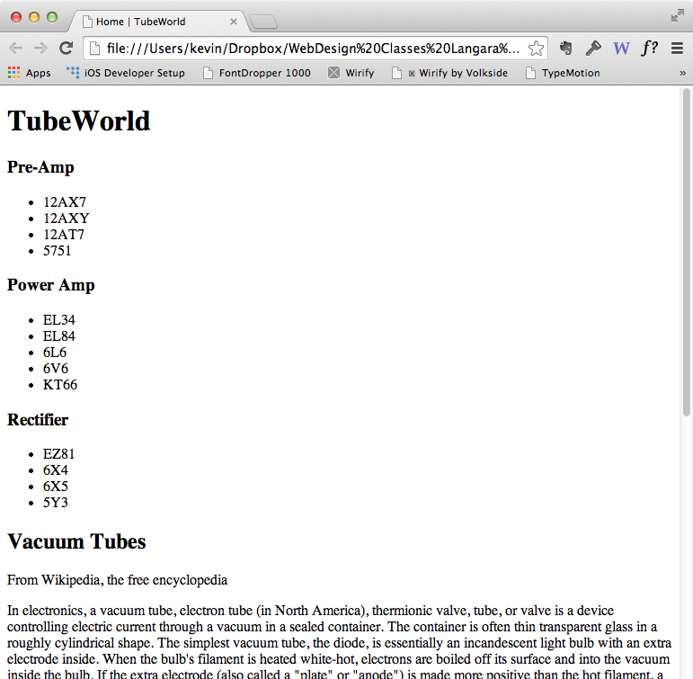
We are going to make a very basic site that looks (more or less) like this:
If your computer doesn’t automatically unpack these zip files, double-click them. This will open the compressed folder containing all our site files.
Put the html5skeleton file inside the tubeworld folder and rename it index.html.
Open that file in your html editor of choice (such as TextWrangler, SublimeText, or Notepad++). ( Remove any code between the <body> tags, if you downloaded my skeleton file, above. )
Change the title of this page to Home | TubeWorld.
Add the “Banner”
Just past the opening <body> tag, put in our site banner name: TubeWorld. Wrap it in opening and closing <h1> tags.
In the tubeworld folder there is a subfolder called textfiles. Open the file called Introduction.txt and copy and paste that text into your index.html file—right after the opening H1.
If you’re using TextWrangler and the lines of text seem to go on forever, go View < Text Display < Soft Wrap Text. If you are using Sublime Text, you can set Word Wrap under the View menu.
Save the page and then test it in a web browser. Notice how all the text we’ve just pasted in looks like one big paragraph rather than separate elements?
Mark Up The Content
Wrap the phrase Vacuum Tubes in opening and closing <h2> tags. If you are using Sublime Text, here’s the easy way to do this:
- triple-click in the line of text to select it all
- press control-shift-w to wrap the selection in a tag. The default is <p>, but you can just type h2 to replace the opening and closing <p> elements.
- ( if the From Wikipedia line is beside the closing h2 after this operation, put it on its own line by clicking in front of it and pressing Return )
Wrap each of the paragraphs in opening and closing <p> tags.
If you are using Sublime Text, here’s the quick way to do this:
- select all the unmarked paragraphs by clicking and dragging from top to bottom
- from the Selection menu, choose Split Into Lines (Command-Shift-L on Mac). When you do this, you’ll see multiple cursors appear. In other words, your single selection of one block of text has now changed into multiple selections of smaller blocks
- press control-shift-w to wrap the now-multiple sections.
- You will notice that there are now a number of empty paragraph tags, which were Returns in the original text document. To fix this, select one of the <p></p> pairs (ones without text) and either go Find > Quick Find All or press command-control-g. This will select all the empty pairs, which you can then press delete to get rid of.
Even though it looks different from other paragraphs in our screenshot, the attribution element (“from wikipedia…”) doesn’t need to be a header. Just make it a paragraph too. We will style it to look different later.
Test again.
Add The Menu & Mark It Up
In the textfiles folder, there is a file called mainmenu.txt. Open it up, and copy and paste its contents above the H2 in the index.html file.
Let’s mark up that menu.
There are three categories of vacuum tube: preamp, power amp, and rectifier tubes. Each has a bunch of different tube types listed. Mark up these categories with <b> tags and each group of tube types as a separate unordered list.
So you’ll have three of these B+UL combinations. Here’s what the code for one would look like. Please type it out rather than copying and pasting.
<b>Pre-Amp</b>
<ul>
<li>12AX7</li>
<li>12AXY</li>
<li>12AT7</li>
<li>5751</li>
</ul>
Make each tube type a “testing” link ( a href=”#” ).
Hint for Sublime Text users: you can select multiple elements, using Command-D (Control-D on Windows). Doing that allows you to select the opening List Item and then retype it, plus the opening anchor tag & href—at which point, you could then multiple-select the closing List Item and add the close of the anchor tag. If that doesn’t make sense, ask me in class.
Here’s what it would look like after we added the links.
<b>Pre-Amp</b>
<ul>
<li><a href="#">12AX7</a></li>
<li><a href="#">12AXY</a></li>
<li><a href="#">12AT7</a></li>
<li><a href="#">5751</a></li>
</ul>
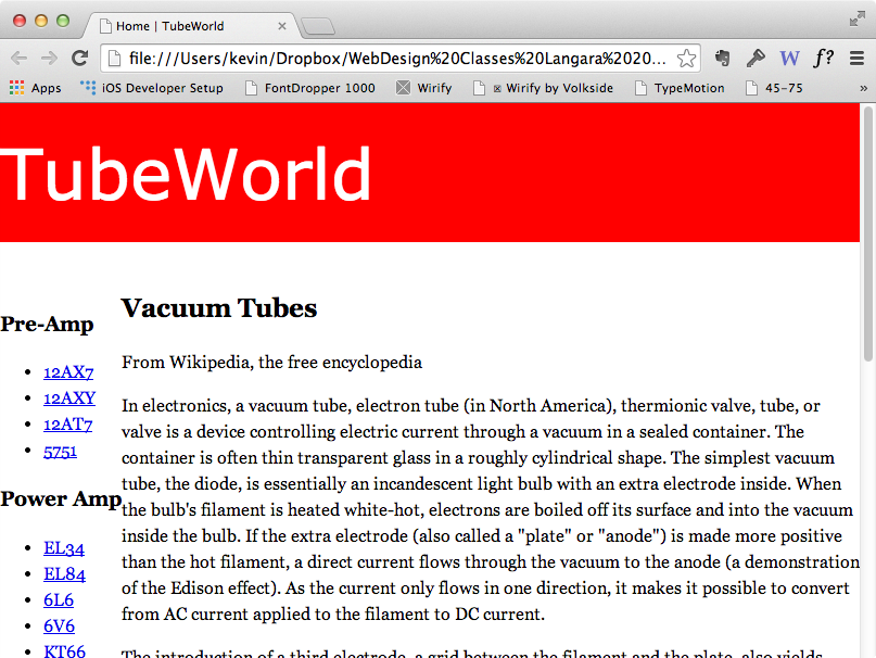
Your basic page should look something like this. ( Note: the <b> elements won’t be quite as big as in the screenshot. This reflects code changes that arose with HTML5 document structure).
Setting Up The Banner
Look at the screenshot. We see an obvious two-column layout below a “banner” that spans the entire width of the document. Let’s start with the banner. In the <HEAD> of the document, put the link to a stylesheet:
<link href="styles.css" rel="stylesheet">
Make a new file called styles.css. Make a style for body. In it, use the following values:
body {
   font-size: 16px;
   line-height 1.5;
}
Note that I’ve not specified a unit for the line-height. This will make every element have a line-height of 1.5 times its own value, rather than 1.5 times the 16px we set in the body style. If that does not make sense right now, don’t worry.
Now make the <H1> style. Give it a font-family value of “Trebuchet MS”, Arial, Helvetica, sans-serif and a font-size of 3rem. (Feel free to go to cssfontstack.com to choose different fonts if you want, or to use different font sizes.)
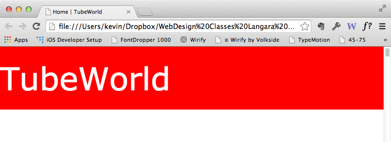
Give the H1 style a red background-color and white color (this sets the text color). Test the page in a browser. It should look like this:
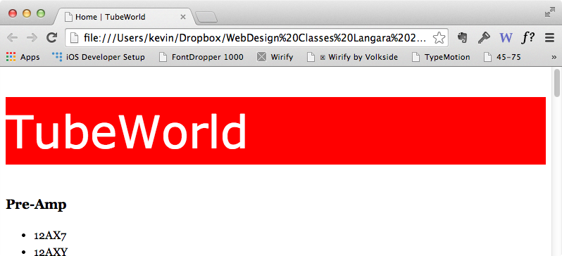
We see that the red background color goes (nearly) all the way across the document (like we’d expect with a block-level element). But there’s a ton of space above the red bar. Remember the CSS box model, and the fact that every browser has certain default values for various elements and properties.
These defaults ensure that unstyled text is still readable, but they can get in our way from time to time. The nice thing about CSS, though, is that it allows us to override these default values.
One such value is the amount of margin-top on the H1. Add margin-top: 0; to your H1 style. Now test the page. Notice how much that space has been reduced?
So here is the state of our H1 CSS right now. (I’ve also set the font-weight to normal to remove the bolding).
    	h1 {
    	font-size: 3rem;
    	font-family: "Trebuchet MS", arial, helvetica, sans-serif;
        font-weight: normal; /* removes bolding */
        background-color: red;
        color: white;
        margin-top: 0;
        }
However, the red banner isn’t going all the way up to the top of the page. The reason is that the <body> has also default margin and padding values. In your stylesheet, set those to zero. Save the stylesheet. Test the html page again. It should look like this:
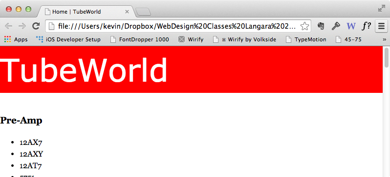
In other words, it’s nice and snug to the edge of the browser window.
Finally, let’s increase the height of the banner. Add line-height: 2; value to the h1 style. Remember that line-height is literally the height of the line a piece of text sits on. If we use a percentage or a unit-less value here, it is a multiple of the font-size. Note how the text sits: right in the vertical middle of the line, not on a baseline, as in a Publishing application like InDesign.
The nice thing here is that we’ve kept our html very simple, but still got good results from a few lines of CSS. The h1 should look like this now:
Add Sectioning Elements to Set up The Column Structure
Now, let’s take care of the column structure. To do that, we are going to add a couple of new elements to our markup: article and nav. Both are block-level element that allows us to group chunks of content together and treat them like single elements.
In the HTML, wrap a ARTICLE tag around the code from the H2 (inclusive) to right before the the closing <body> tag.
<article>
<h2>Vacuum Tubes</h2>
From wikipedia, etc
...and a bunch more paragraphs, omitted here for brevity.
</article>
Now wrap a single NAV with an ID of “menu” around your three b+ul group of code, like this (note: some of the tube names are changed in my example below. Just keep the ones you have.)
<nav>
<b>Pre-Amp</b>
<ul>
<li><a href="#">12AX7</a></li>
<li><a href="#">12AXY</a></li>
<li><a href="#">12AT7</a></li>
<li><a href="#">5751</a></li>
</ul>

<b>Power Amp</b>
<ul>
<li><a href="#">12AX7</a></li>
<li><a href="#">12AXY</a></li>
<li><a href="#">12AT7</a></li>
<li><a href="#">5751</a></li>
</ul>

<b>Rectifier</b>
<ul>
<li><a href="#">12AX7</a></li>
<li><a href="#">12AXY</a></li>
<li><a href="#">12AT7</a></li>
<li><a href="#">5751</a></li>
</ul>
</nav>
Float the Menu
To set up the columns, we need to remember how floated elements work.
First, the floated content must go first in the HTML. Content that comes later in the HTML will come up beside the floated element.
Second, the floated content must have a width, if it is a block-level element.
If we don’t give a width to the NAV, it (being block-level) will take up the whole width of the containing element (the body in this case) and the float won’t appear to work.
Make a style for nav.
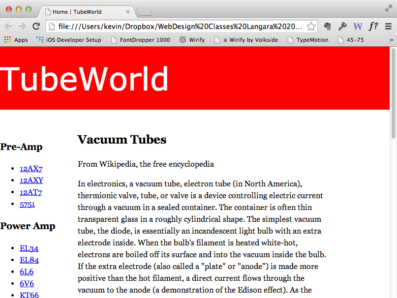
Add “float:left” to it. Give it a width of 20% for now. Test the page. It should look, more or less, like this:
Style the ARTICLE
Now make a style for article. First of all, set a margin value of “0 15% 100px 20%”. This CSS shorthand specifies, in order: margin-top, margin-right, margin-bottom, and margin-left. To remember the order, use a mnemonic of TRouBLe. Or just remember that it goes clockwise.
The page should now look like this:
There’s a big chunk of our layout taken care of. The rest is tweaking.
Some Class Styles
We will very often want more granular control over our styling than the relatively brute force method of styling tags. As a simple example, we may want to style one paragraph different from the others. To do that, we make a new style in our css—beginning with a period to signify that it is a class. Then we apply that class as an attribute to an html tag (or tags) in our document.
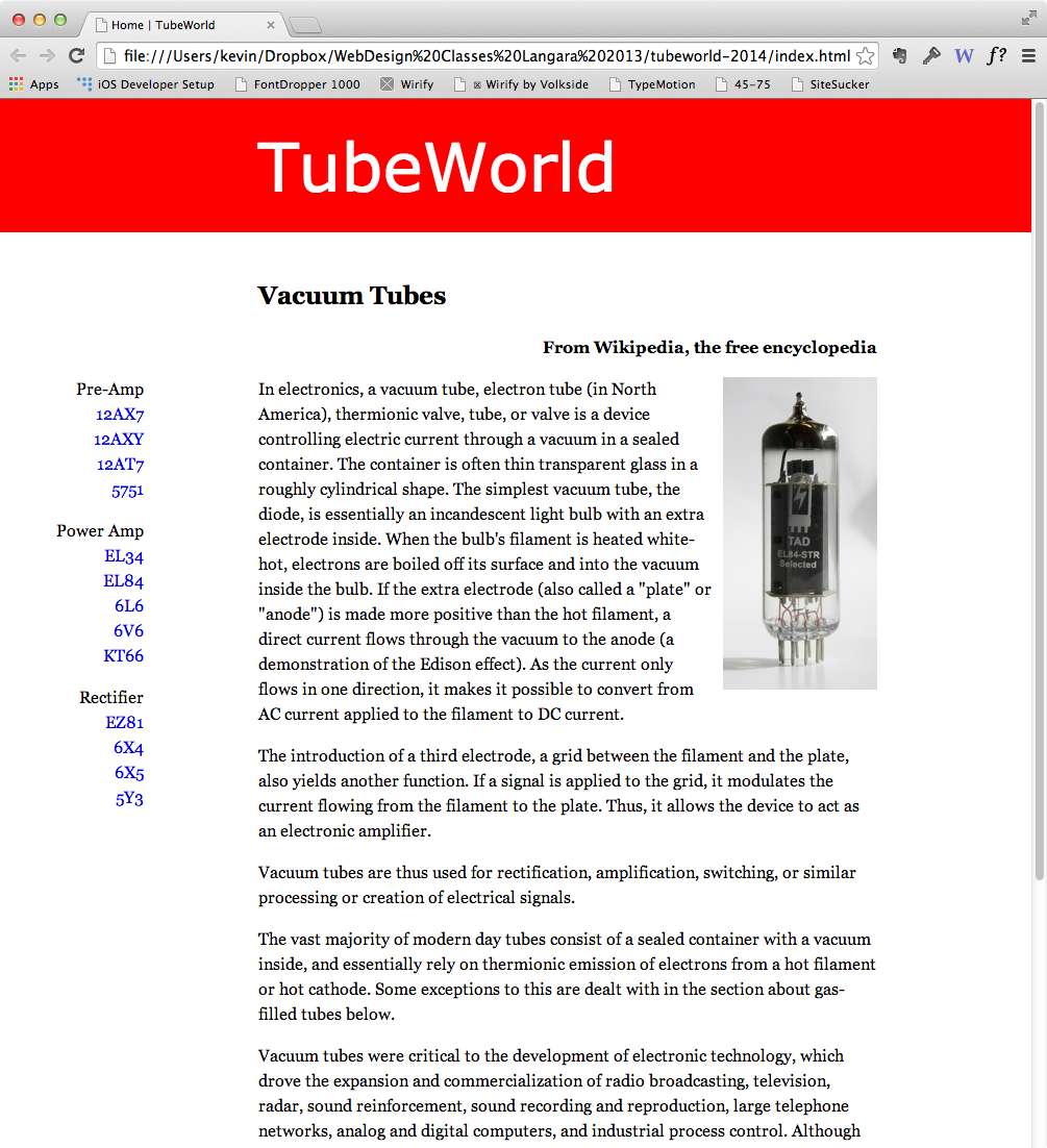
Click just inside the first paragraph. Put in the EL84 image. Make a class style with a name like .floatright and apply it as an attribute to the image:
<img src="images/el84.jpg" class ="floatright" alt="EL84 tube">
In that class style, as you can guess, put the code to float the image to the right and put a small margin-left to keep the text from bumping up against the image.
We could also style the “From Wikipedia…” paragraph with a class. Make a class style called .attribution and apply it as an attribute to that paragraph.
The CSS for both styles should look something like this:
.attribution {
text-align: right;
font-weight: bold;
 }
The HTML will look like this:
<p class="attribution">From Wikipedia, the free encyclopedia.</p>
Things should now look like this:
Style the Menu
Menus are very commonly marked up using Unordered Lists that are styled in various ways that make changes tp the “listness” of their appearance.
To do that here, we need to remove the dots from our menu ul. Here’s the code:
nav ul {
   list-style: none;   /* remove bullets */
   margin-left: 0;     /* remove space reserved for bullets */
   padding-left: 0;    /* remove space reserved for bullets */
   }
Other Aspects of the Design
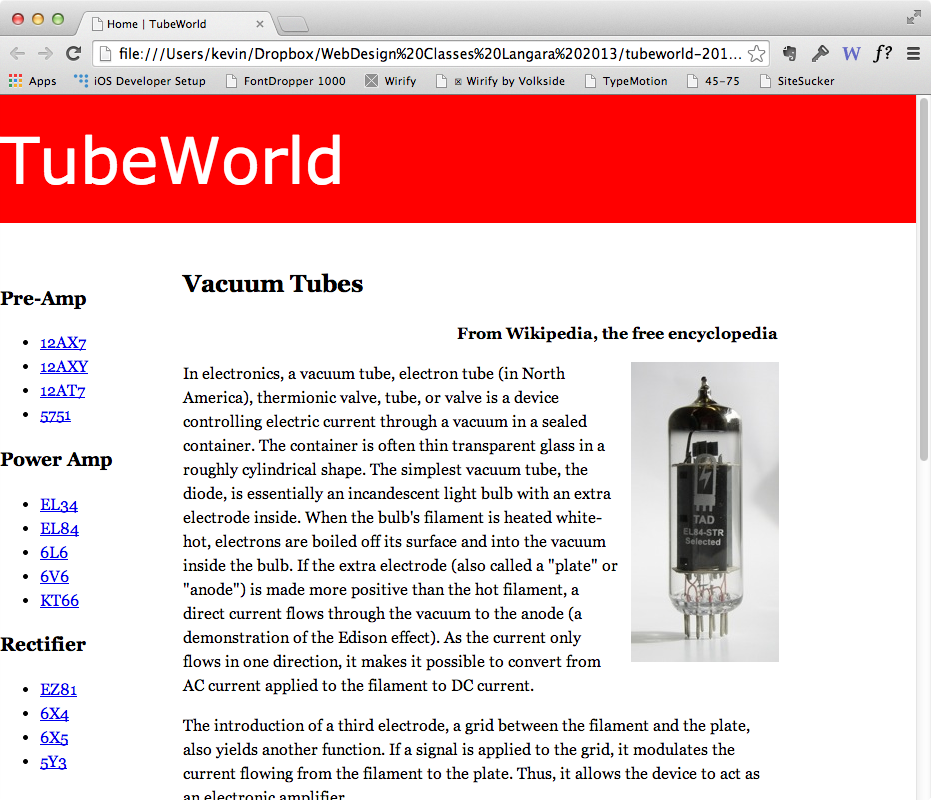
Below is the semi-final screenshot. See if you can replicate it.
In particular, try to figure out how to close the space between the #menu b and the list that appears after it, for example. Notice, also, that I’ve moved the edge of the menu over from the side of the page.
As well, figure out how to get the h1 to line up with the left edge of the article text.
Another thing you could do is set a max-width on the article in order to ensure that the line does not get too long. A good tool for checking line lengths is the 45-75 BookMarklet. For extra versatility use rems: that way, if you increase or decrease the default font-size (on the body), your line lengths will remain consistent.
In these tweaks, you may have to tweak values of things we’ve styled already.
If you want a hint, here’s one: the key to your solution rhymes very, very closely with the css box model.
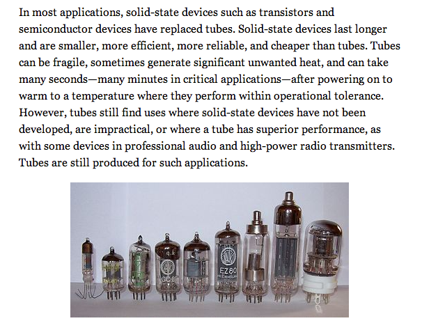
For bonus marks: insert the tubes.jpg image in the bottom of the article. Figure out a way to the image show up in the center, as in the screenshot below.
Hint: images are line-level elements, which means that they behave like text, so if you know how to center text, you’re half-way there.
The Other Pages
If you want practice, please finish the site. Inside the textfiles folder are three additional files. Copy and paste the content from each into new html files. Link the stylesheets to them. Add one image per page. There isn’t a corresponding image for the KT66 article, so just use one you’ve used already.
To add order to your site, put those files inside the pages subfolder. Now amend those files’ links to the stylesheet, and the paths to the images.
To do that you need to put “../” in the front of the path:
<link href="../styles.css" rel="stylesheet">
The ../ in front of a path means go out of the folder you are presently in. In other words, it means to travel up one directory level.
To add an image to a page inside the pages subfolder, you would need to code it like this:
<img alt="" src="../images/MullardEL34.jpg">
This means get out of the folder this referring file is in, then go into the images folder, and select MullardEL34.jpg.
Remember make sure that your menu items work for the links for which we actually have articles.
Finally, make your h1 a link back to the home page. Try to figure out (or google) how to keep the color of the h1 white, rather than have it adopt the default blue link color. As well, make sure that it isn’t underlined, either.