Please download the Duplicator archive for this exercise, then download the screenshots package. The Duplicator archive contains all the site content, including the menus.
It also includes an UNDERSCORES starter theme with two modifications:
- Post thumbnails will already have links to their respective posts (you will still need to put the_post_thumbnail() into the appropriate theme file).
- All YouTube videos will be automatically wrapped in a DIV to make it easier for them to be styled responsively. You will need to get some CSS from this page, however.
Any sans-serif fonts used are the helvetica, arial, sans-serif font stack. Any serif fonts are the Google font LORA.
No page in the site will have a sidebar.
If we have done SASS in class, please use it in the exercise.
Use Grid and Flex for your layout: no floats.
Make sure that you are testing the site with Google Chrome, as that is the browser I will mark with.
How To Hand In The Exercise
If this is a lab exercise, show me the finished result.
If it’s a test, please make a Duplicator archive of the site. Make sure that you do this in Chrome.
Then hand it into the class handin folder, in a folder called JazzIconsTheme. Inside that folder there needs to be a file called installer.php and a zip archive with a long name. Make sure that you did not accidentally unzip the zip file.
If I have asked you to do the exercise in groups, please include a TEXT file named group.txt, which lists your group members.
Marks Breakdown
If this is a lab exercise, the mark is out of 1 (as usual), with a possible 50% bonus (for the single view styling).
If this is a test, the mark breakdown will be more detailed:
| Header | 10% |
|---|---|
| Menu | 15% |
| Article Styling | 20% |
| Home, Archive, Search Layout | 40% |
| 404 Page Text Change | 5% |
| Search Page Heading | 10% |
| Single Post Bonus | 50% |
Header Area
The header on all pages will look like this. The Underscores starter theme has a button that appears at smaller widths in the header. Remove it.
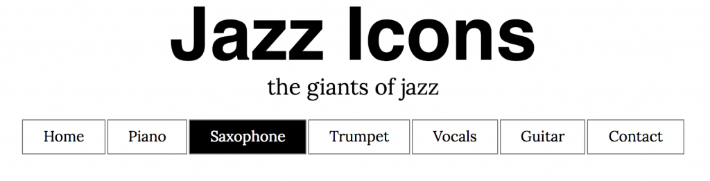
Menu
The menu will have the following items: a link to home, category links, and a link to a Contact page.
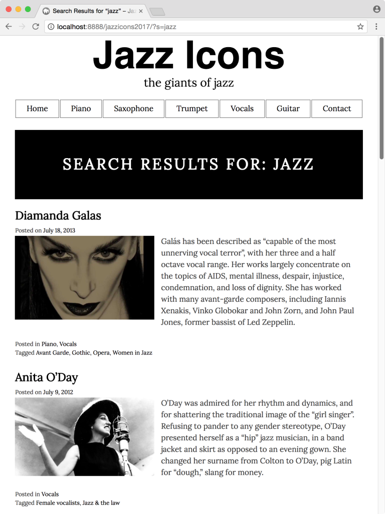
With the menu, make sure that the user’s current location in the site is indicated. In the above screenshot, the user is on an archive listing all posts about Saxophone players.
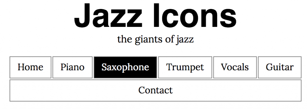
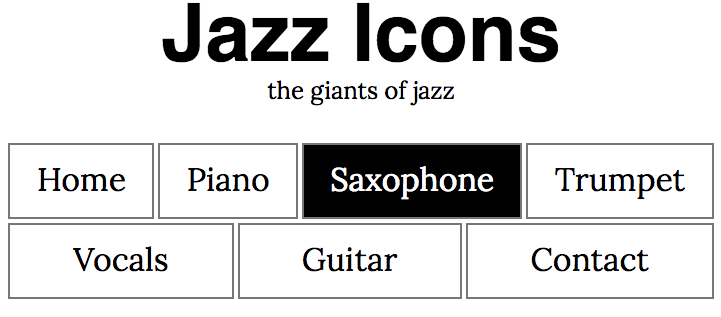
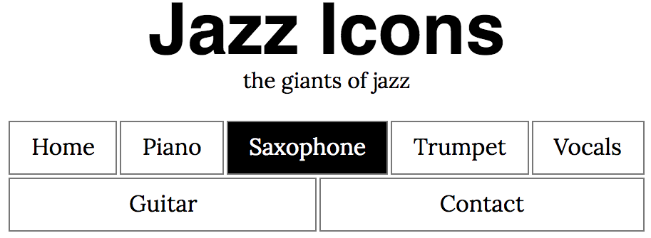
Menu: Responsive Strategy
The screenshot above shows menu items when they fit into one row. At smaller browser widths, the menu items reflow. Both rows in the menu will always take the full width of their content area. The menu items, in other words, automatically take whatever space is available to them.
Articles
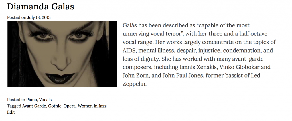
On the home page, category archives, and search results, each article will look like the screenshot below. Think about what this means for your templating.
On those pages, each article will have the post title, the posted-on date, the post excerpt, the feature image, and the post and category links. ( A logged in user might also see the EDIT link as well ).
Home Page, Archive Pages, Search Results Layout
These pages will all behave the same way:
- at full screen width, the articles sit three in a row (if available)
- at medium width, the articles site two in a row (if available)
- at small width, the articles sit in a single column, but with the main text still beside the image
- at small phone width, the articles sit in a single column, but with the main text now underneath the image
Consult the downloaded screenshots to get what I mean here. You determine the breakpoints needed.
404 Page
For the 404 page, change the phrase It looks like nothing was found at this location. The new line will be We’re sorry: there appears to be no content at this location.
Search Page
On the Search Results page, make the heading that shows the search results stand out like this:
Single Posts
This part is for a 50% bonus.
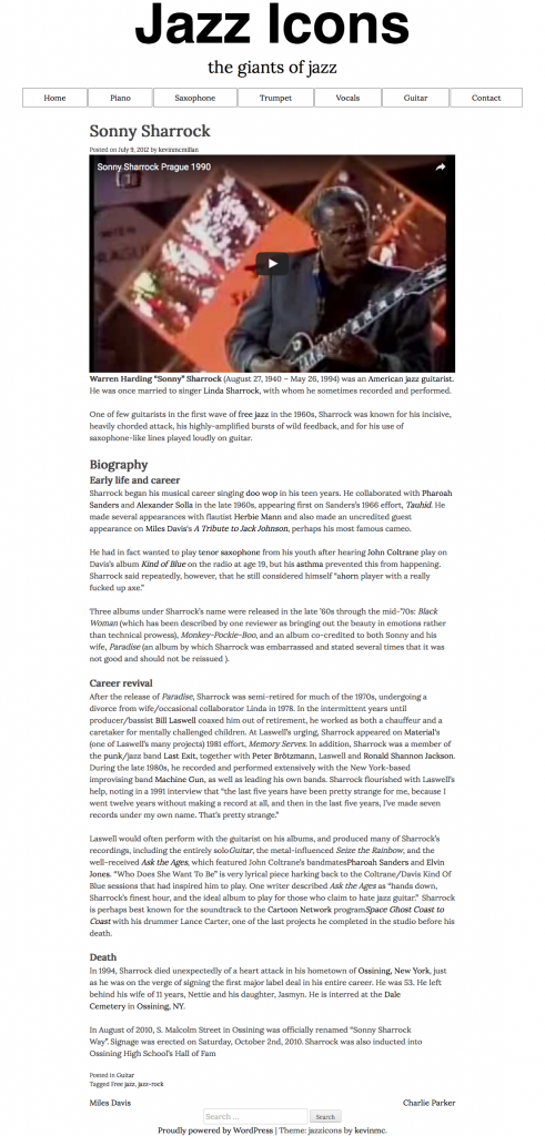
When a user clicks on the title of post or the thumbnail, they will be taken to the single view of the post.
It will look like this. Click it for a bigger view, or consult the downloaded screenshot file.
The text will be in the middle of the screen. It will be prevented from getting too wide. The thumbnail will not appear.
The video, which is the first thing in the content window, will be responsive. To make the videos responsive, please consult this page.