For this exercise, you will build a common design pattern: a top-hidden navigation scheme.
You will also work more with icon fonts and @font-face.
First of all, please download the files you need for the exercise.
Text CleanUp
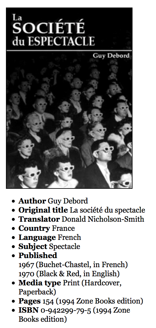
The file you’ve downloaded is for an imaginary politics website. This page is discussing a famous work of political theory called The Society of the Spectacle.
Test the page in a browser. Scroll through the text until you find a quotation. You will notice that the quotation marks are incorrect: they’re using inch symbols. Please change these to “smart quotes.” You do not need to use entities: just proper quotation marks.
And, please, do not do this manually. Figure out a more efficient and foolproof method.
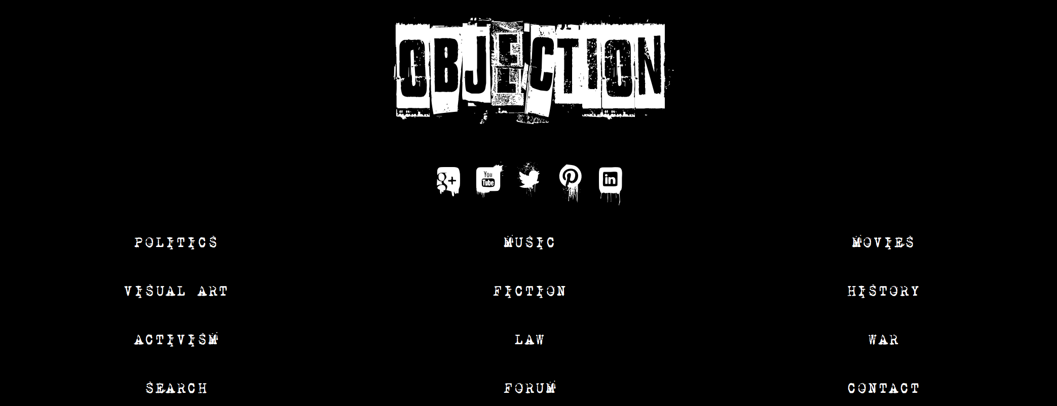
Menu Fonts
Here is our menu at desktop width. There is one logo file included in the download. You will make the fonts for the social icons and the link text.
Icon Font Generation
For this part, you will make your own icon font. Download the font Nightmare On Social Media.
Install it on your system:
On Mac, put it in /Users/YOU/Library/Fonts. Normally, the LIBRARY folder is hidden on the Mac, but you can get to it easily if you click on the desktop, go to the GO menu, and then press Option on your keyboard. That will make the hidden Library available in the menu. Go to that menu item and then the Library folder will open.
Instructions on how to use Illustrator to make your own icon font from this downloaded font.
Main Menu Font Conversion
Obviously, the font treatment for the main menu items requires a distressed font. Download this free one. Do NOT install it on your computer.
Instead, use the FontSquirrel Web Font Generator to convert it into the font formats needed for web use.
Now make your menu look like the screenshot above.
Main Task: The Menu Design Pattern
Next, figure out how to make a functioning menu as illustrated in the following screenshots:
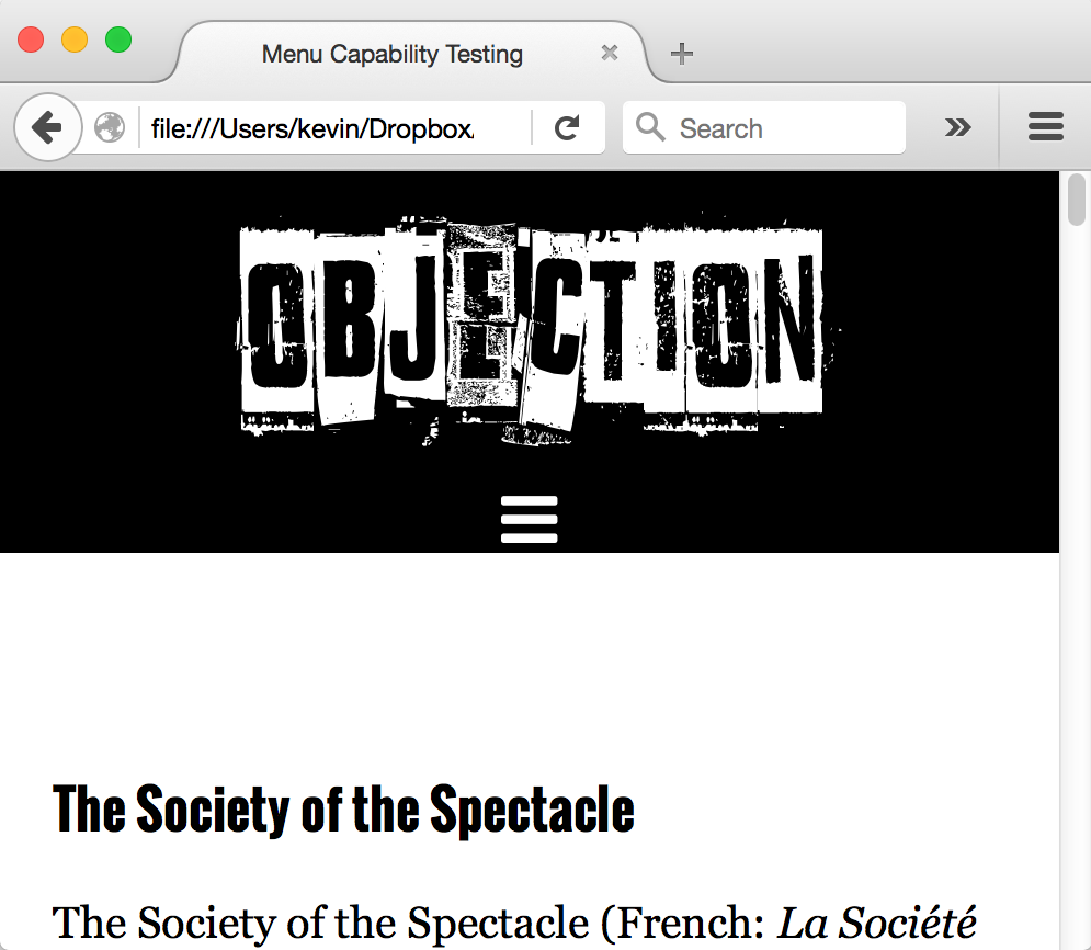
Phone Width:
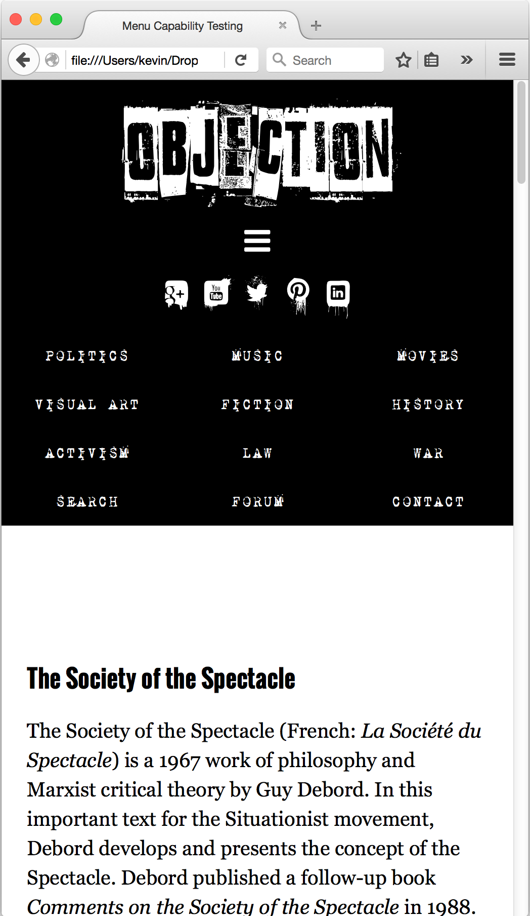
Phone Width, Menu Down:
Make sure that the page always displays the menu when the browser width is greater than 700px. Test carefully.
Final Task: Layout Tweaking
Put the aside to the right and the article to the left above 700px. Below that, put the aside underneath the article.
Mark up and style the aside so that it looks like this ( at full width ). Note that the PUBLISHING DATE list item has a nested list.
For the final results, look at the screenshots enclosed in the original download.