I’m going to assume that you probably didn’t have any problems with the layout components of the Hamburger Menu Exercise, so I’m not covering that part of the exercise here. If you did have layout or font icon issues, come see me, and we can go through any areas of difficulty.
In other words, this page focusses on the text clean up, and the so-called “hamburger” menu tasks. (If you’re not interested in the text clean up, skip down to the menu construction.)
Task 1: Text Clean Up
The problem was that the text in the page was not using typographically correct quotation marks.
Compounding the problem is that this text is laid out as HTML, so we can’t just do a search and replace on the file. HTML attribute values are enclosed in the “dumb quote” variety of quotation mark. If we replace the dumb quotes with smart quotes, the attribute values won’t work and the HTML won’t validate.
Ultimately, we will want to search and replace the following patterns of text:
| Search For | Replace With |
|---|---|
space + " |
space + “ |
" + space |
” + space |
? + " |
? + ” |
! + " |
! + ” |
. + " |
. + ” |
etc …
Task 1 Possible Solutions
- If you look in the file, you will notice that there are no attributes in the main sections (the article in particular). You could copy that section into a new file, do the search and replace machinations described above, and then paste the changed content back into the original file.
- Another option would be to do a search and replace that changed the attribute “quotation marks” into another “placeholder” character. You’d have to search for the marks appearing after equals signs, or before closing HTML tag brackets. Then you could do the main search and replace, then change the “placeholder” characters back to “dumb quotes.”
- Another option would be to do a search and replace for the above character patterns, but to replace them with opening and closing quotation tags (<q></q>). This would be the most semantic solution, and probably the easiest to do.
Task 2: Building the Hiding Menu
As noted above, I’m going to assume you didn’t have trouble with the layout, so please download the “mostly completed” file below:
AnimatedMenuExercise-TopDownHamburger-SolutionStartingPoint
Open the index file in Chrome and the site folder in the text editor of your choice.
Hide the Burger …
You’ll notice that the “hamburger” icon is visible regardless of browser width. Let’s hide it under, say, 700px.
At the same time, let’s also use this media query to ensure that the menu is always visible above that browser width:
Add the following into the empty navigation classes toggled with js section of the stylesheet:
@media screen and (min-width: 700px) {
 .nav-main-toggle {
    display: none;
}

.nav-drawer {
     display: block;
}
}
This second style will ensure that our menu will always be visible above that size.
Hide the Menu …
Now hide the menus under 700px:
@media screen and (max-width: 699px){

    .nav-drawer {
        display: none;
    }
}
Here, I’m deliberately taking a “mobile-last” approach. By that I mean that I am putting the hiding of the menu in a media query. This means that browsers that don’t understand media queries will NOT have the menu hidden by default.
Build The Menu JavaScript …
You will notice, in the files you downloaded above, an empty menu.js file. It’s already linked to in the index page, in the SCRIPT tag just before the closing body tag.
Select the Hamburger and the Menu Area
In that menu.js file, make some variables to store references to our hamburger as well as to the “drawer” (my term) our menus sit in:
var hamburger = document.getElementById('navToggle');
var navDrawer = document.getElementById('navDrawer');
I’m using the getElementById method because support for it goes back forever. As well, it’s faster than other methods of DOM traversal: since there can only be one instance of each ID in a document, the browser stops looking once it’s found the first instance of each ID.
Now check that you’ve selected these elements correctly, by adding a console.log statement to your code, passing the two variables to it:
var hamburger = document.getElementById('navToggle');
var navDrawer = document.getElementById('navDrawer');
console.log(hamburger, navDrawer);
Load the page, then Inspect it. Incidentally, two Chrome keyboard shortcuts are worth knowing at this point.
- command-option-i opens the Inspector (“i for “inspector”)
- command-option-j opens the Inspector at the Console
(“j” for “javascript”)
Anyway, if you open to the console, you should see this:
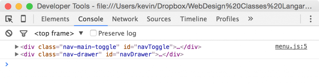
This tells us that our code and references are correct, so you can now comment out the console.log call in your code.
var hamburger = document.getElementById('navToggle');
var navDrawer = document.getElementById('navDrawer');
// console.log(hamburger, navDrawer);
Listen For Clicks
Now we wire the hamburger button to respond to clicks by adding an EventListener.
var hamburger = document.getElementById('navToggle');
var navDrawer = document.getElementById('navDrawer');
// console.log(hamburger, navDrawer);
hamburger.addEventListener();
Here we pass to the addEventListener the name of the event (as a string), and an anonymous function. Especially when starting out, always build in stages rather than trying to write an entire line from left to right:
var hamburger = document.getElementById('navToggle');
var navDrawer = document.getElementById('navDrawer');
// console.log(hamburger, navDrawer);
hamburger.addEventListener('click', function(){});
Now split the curly braces:
var hamburger = document.getElementById('navToggle');
var navDrawer = document.getElementById('navDrawer');
// console.log(hamburger, navDrawer);
hamburger.addEventListener('click', function(){

});
And insert a call to console.log:
var hamburger = document.getElementById('navToggle');
var navDrawer = document.getElementById('navDrawer');
// console.log(hamburger, navDrawer);
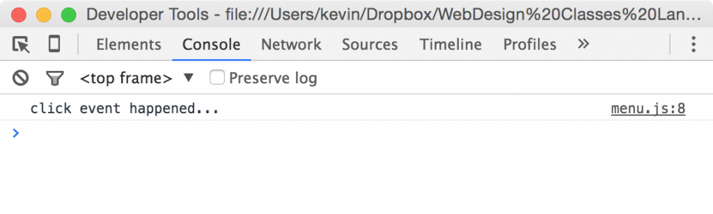
hamburger.addEventListener('click', function(){
console.log('click event happened...');
});
Test your page and then open the console:
Toggle Classes On Click
At this point modify your script to the following:
var hamburger = document.getElementById('navToggle');
var navDrawer = document.getElementById('navDrawer');
// console.log(hamburger, navDrawer);
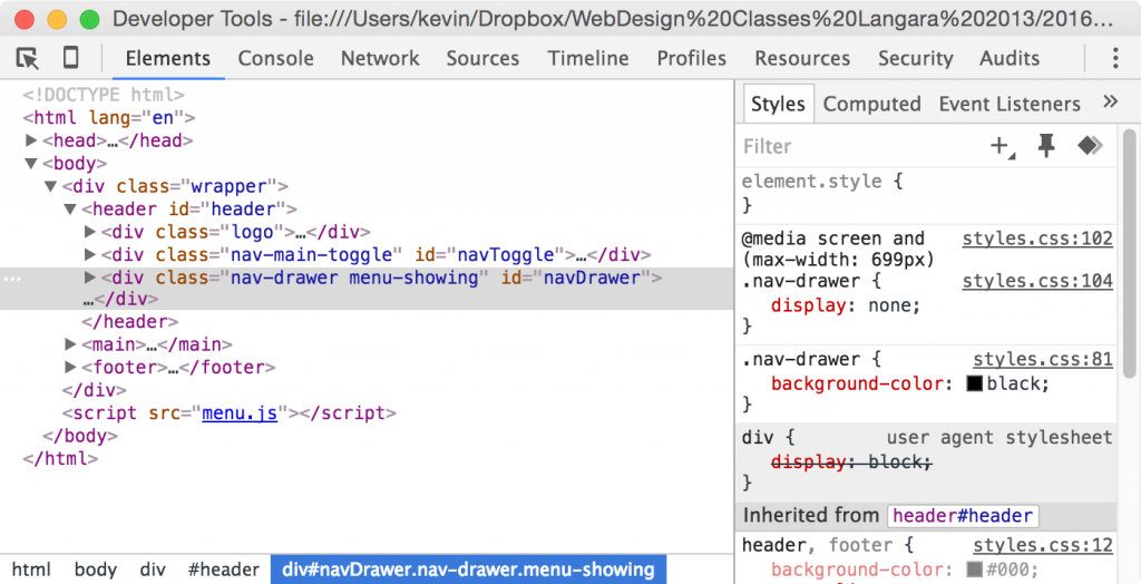
hamburger.addEventListener('click', function(){
console.log('click event happened...');
navDrawer.classList.toggle('menu-showing');
});
Test the page: you will see the console message indicating a click, but open the Elements section of the Inspector and examine the code (the #navDrawer area, in particular). Click the hamburger a couple times to see the class being added and then removed.
Write the Class
So we can toggle the menu-showing class very easily. Now we need to actually write the css for it. To begin, put something simple like this:
.menu-showing {
display: block;
}
Test your button (under 700px, remember). Clicking the hamburger makes the menu visible. Clicking it again hides it again.
When the menu “drawer” is visible, the header grows and subsequent content shifts down the page. When it’s hidden, that space closes up.
This is great so far, but the effect is really abrupt.
Turning the Visible/Hidden States into Transitions
If you add a transition to your menu-showing state class and test the page, the menu will work, but there won’t be a transition between the states. This is because it’s impossible: there is no midway between display: block and display:none.
However, we can achieve the same effect using other properties. First, we’ll “hide” the .nav-drawer in a slightly more roundabout way.
Edit your .nav-drawer style, removing the display property and adding height and overflow properties:
@media screen and (max-width: 699px){

    .nav-drawer {
        height: 0px;
        overflow: hidden;
        transition: all .5s ease-in-out;
    }

    .menu-showing {
        height: 160px;
        overflow: visible;
    }

}
If we test the page, we see the menu operation now working, but we could tweak it further.
First of all, the hamburger icon needs to signify that it’s clickable when hovered over. Fortunately, the CSS cursor property is available to do that job. In the header area of the stylesheet add this style after header .fa-bars:
header .fa-bars:hover {
    cursor: pointer;
}
I would first of all change the height of the .nav-drawer to 1px and give it a margin-top value of -1px.
You will also notice that the change from overflow: hidden to overflow: visible is not smooth (which shouldn’t be too surprising, in light of the fact that they’re distinct states, not part of a continuum. The main clue of this is seen in the main article text jumping down immediately after the hamburger button is clicked.
I will add some suggestions to this document at a later date, but for now, this should be enough for you to work with.
And Finally …
We have a few more considerations. If we look up browser support for the JavaScript classList property (https://caniuse.com), we will see that IE9 and below, as well as Opera Mini 8, do not support it.
One solution is to use a polyfill. Polyfills are ways developers “graft on” support for features that are not natively supported in various browsers. A very famous one, HTML5Shim (aka HTML5Shiv) added HTML5 support to earlier versions of IE.
One such polytfill for classList is available at https://github.com/eligrey/classList.js.
Another approach would be to use modernizr. We will cover modernizr in a future class, if we haven’t used it already.
If you want a tidied up version of this file, click this link.