This exercise follows on from the first part of the Guitar Mania web design exercise.
Our client has decided she wants some revisions to the design.
Go to the following URL and look at the page that is there: https://kevinmc.ca/guitarmania2014.
Your task in this exercise is to take what we did in the previous one and change it to make it consistent with the design revisions. Test the above page at different browser widths (ie big and small).
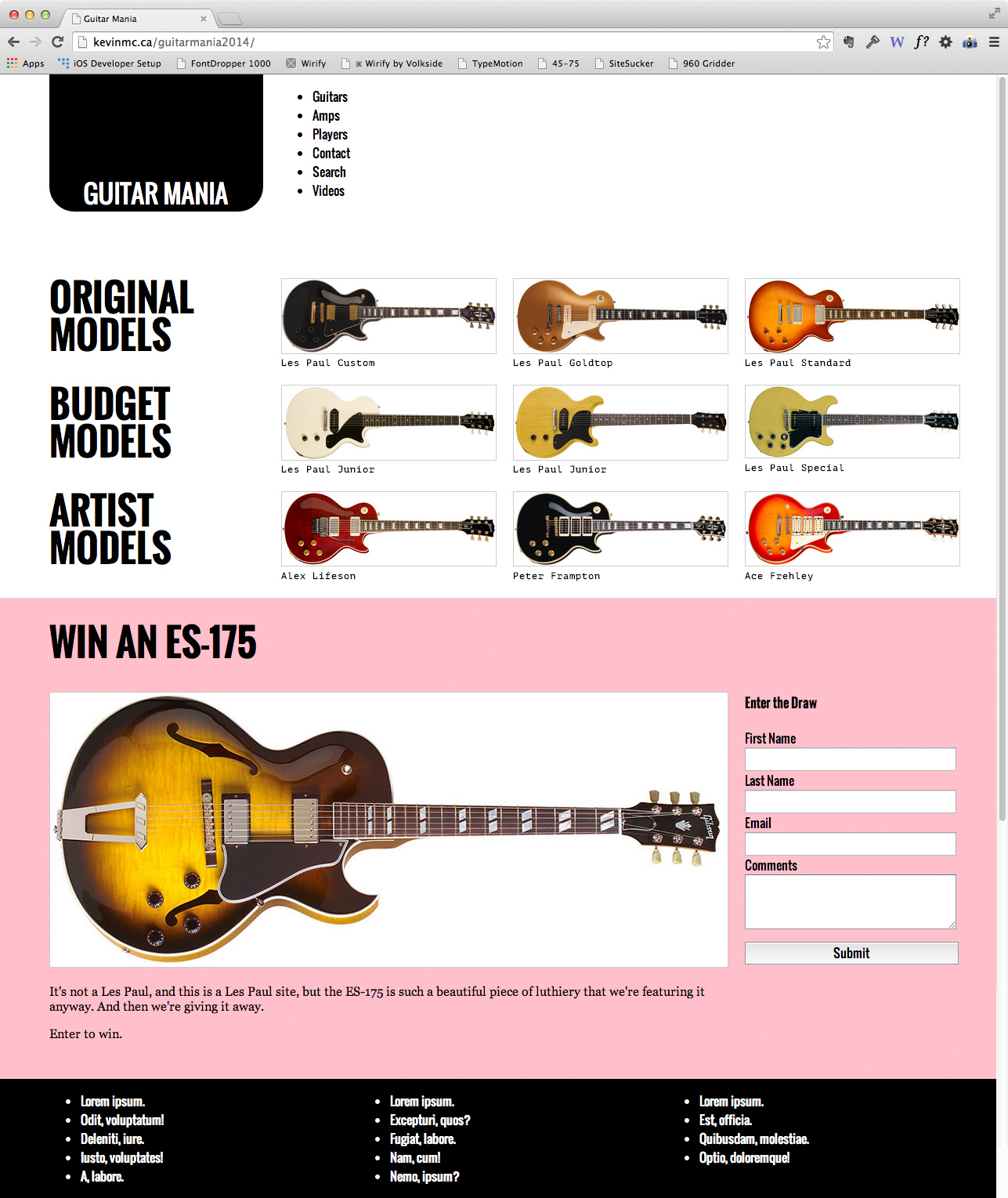
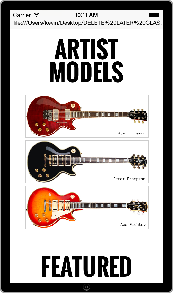
Put in the footer (the black bottom area in the Desktop screenshot). Arrange the content the way it is in the example (4 abreast in desktop view, single column in phone view).
To figure out how to place the Guitar Name on top of the picture, read this discussion of the POSITION property.
Change the heading text of the Featured section to Win An ES-175. Put this whole DRAW area in pink on desktop, as in the example.
Notice how the last paragraph of the DRAW section (“Enter to Win”) disappears on mobile? Make that happen.
Do not look at my code, either via Inspector or View Page Source. The main layout code is from 2014, which means that it used floats to lay out the page. Modern methods like grid and flex are far superior.