The Variable Grid System & Responsive Design
In this exercise, we are going to use a fluid (percentage-based) grid system in order to build a responsive web site.
If you are taking my ECUAD Advanced WordPress course, we will build this site and then turn it into a WordPress theme.
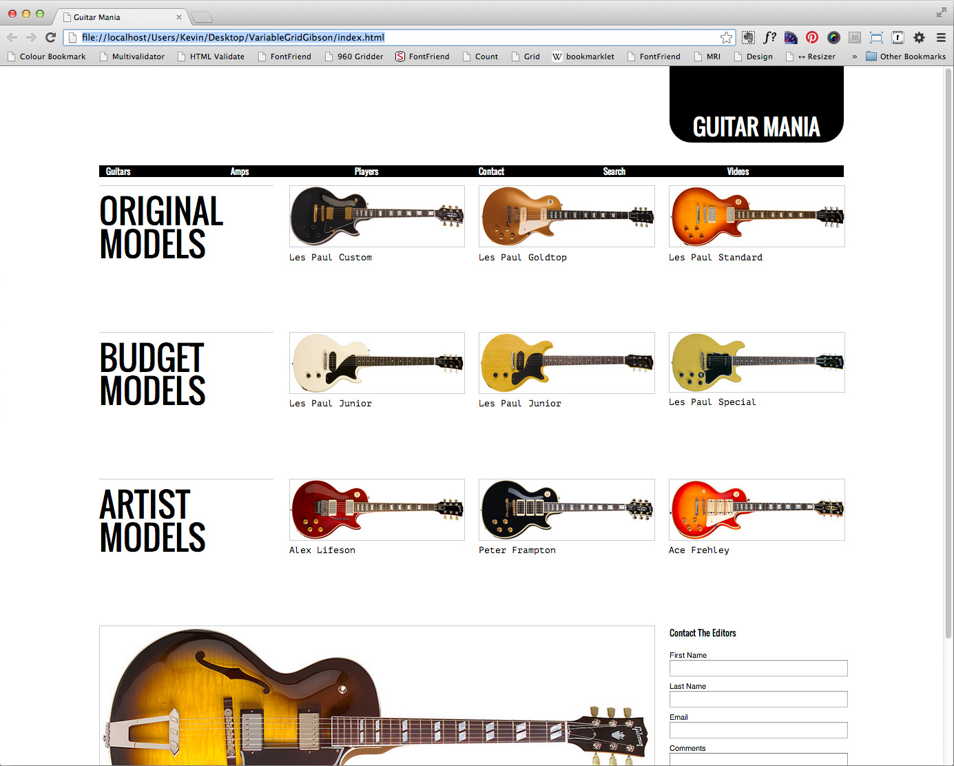
Here’s what our final comp is going to look like:
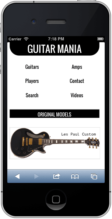
And here it is in iPhone:
The keys to this kind of layout:
- A Percentage Based Grid
- Fluid Images
- CSS3 Media Queries
The Basic Setup
Please download the files we will need for the exercise.
If the archive doesn’t automatically expand, double click it to expand it (Mac) or right-click (Windows). This will give you a folder named VariableGridGibson. Inside that folder is a folder of images, a folder containing an empty css folder and a folder containing a finished version of the project, if you need to look at it.
( Here and there, you will find minor differences in the finished version’s code: I’ve modified this exercise a bit since it was written.)
Next, we need to download a couple of stylesheets to use as foundations for the project.
First, go to the normalize.css webpage and download the latest version of this “starter” stylesheet into the empty css folder. Make sure you name it normalize.css. This stylesheet neutralizes differences between browsers so we can build upon a level playing field.
Second, go to the website for the variable grid system.
( If the site is down, here’s a file I made with it ).
Here we will generate a CSS grid for the exercise. In the Column Width field, change the default from 60px to 80px. This means that we will generate a 1200px grid system.
In the 960 Fluid section of the webpage, click on Download CSS File. If the CSS file opens in the browser window, go File < Save and use fluid_grid.css as a file name. Save it into the css folder.
Finally, download an HTML5 skeleton file and save it as index.html at the top level of the site folder (VariableGridGibson).
Wire up the stylesheets to this html file by adding the following three lines inside the <head> of your document.
<link href= "css/normalize.css" rel= "stylesheet">
<link href= "css/fluid_grid.css" rel= "stylesheet">
<link href= "css/style.css"  rel = "stylesheet">
Make a file called style.css and save it inside the css folder. In that file, put the following
body {
  width: 95%;
  max-width: 1200px;
  margin: 0 auto;
  padding: 0;
}
This will make the whole document take up 95% of the browser window, but also ensure that the total width of our content never exceeds 1200px. The margin: 0 auto value will center the content horizontally and bring it right up to the top of the screen.
Back in the HTML file, put the phrase Guitar Mania inside your <title> tags.
Inside the <body> of your document, put in the following code:
<header>
<h1>Guitar Mania</h1>
<nav>
<ul>
	<li><a href="#">Guitars</a></li>
	<li><a href="#">Amps</a></li>
	<li><a href="#">Players</a></li>
	<li><a href="#">Lessons</a></li>
	<li><a href="#">Search</a></li>
	<li><a href="#">Contact</a></li>
</ul>
</nav>
</header>
Test your page. Make sure that this content is showing up.
Establish The Grid System & Add The Main Content
Now wrap everything that’s inside the body tags inside a DIV with a class of container_12. This will set the ultimate wrapper for our content.
After the closing <header> tag, put in the following code:
<section id="original">
<h2>Original Models</h2>

<div>
    <img src="images/custom.jpg">
    <h3>Les Paul Custom</h3>
</div>

<div>
    <img src="images/goldtop.jpg">
    <h3>Les Paul Goldtop</h3>
</div>

<div>
    <img src="images/standard.jpg">
    <h3>Les Paul Standard</h3>
</div>

</section>
<!-- END ORIGINAL -->;
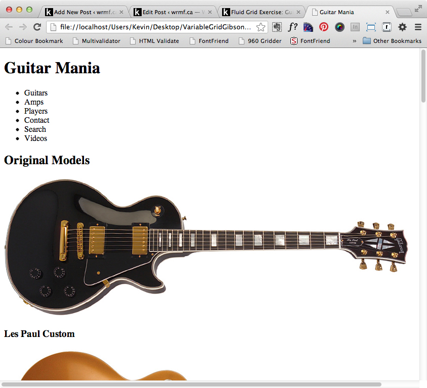
Test the page in a browser. It should now look like this:
Now add to the H2 and to the three inner <sections> a class of grid_3:
<div id="original">
<h2 class="grid_3">Original Models</h2>

<div class="grid_3">
    <img src="images/custom.jpg">
    <h3>Les Paul Custom</h3>
</div>

<div class="grid_3">
    <img src="images/goldtop.jpg">
    <h3>Les Paul Goldtop</h3>
</div>

<div class="grid_3">
    <img src="images/standard.jpg">
    <h3>Les Paul Standard</h3>
</div>

</section>
<!-- END ORIGINAL -->
If we test our page in a browser, no change is yet evident.
The problem is that the images are so big that the values in the grid stylesheet don’t work.
Responsive Images
The solution, and a fundamental technique of Responsive Web Design, is to make your images resize to fit your box. It’s easy to do this.
Open the file style.css if it isn’t already open. Add the following style:
img {
  max-width: 100%;
  height: auto;
  border: 1px solid #ccc; /* For the design, not for responsiveness */
}
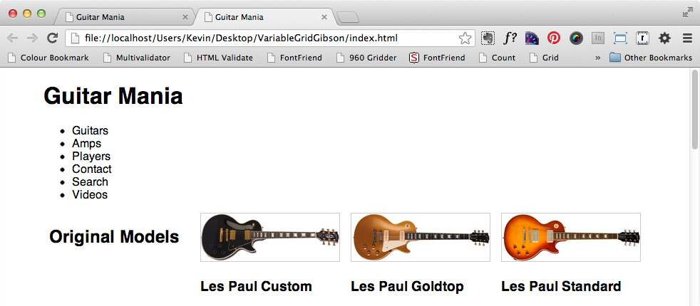
Test your page now. It should look like this:
If it does look like this, copy that row (the <section> with a ID of original). If it doesn’t look like this, consider validating your html & css.
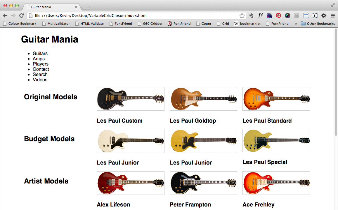
Paste that row twice after it. Change the IDs of the pasted outer <section> elements to budget and artists, respectively.
Change the h2 text in the second row to Budget Models and the H2 text in the third row to Artist Models.
In the second row, change the H3s to: Les Paul Junior, then another Les Paul Junior, and finally Les Paul Special.
In the third row, change the H3s to: Alex Lifeson, then Peter Frampton, and finally Ace Frehley.
With rows two and three, change the images in the inner sections to their correspondingly named guitar pictures.
Test the page. It should now look like this:
Back to the Header
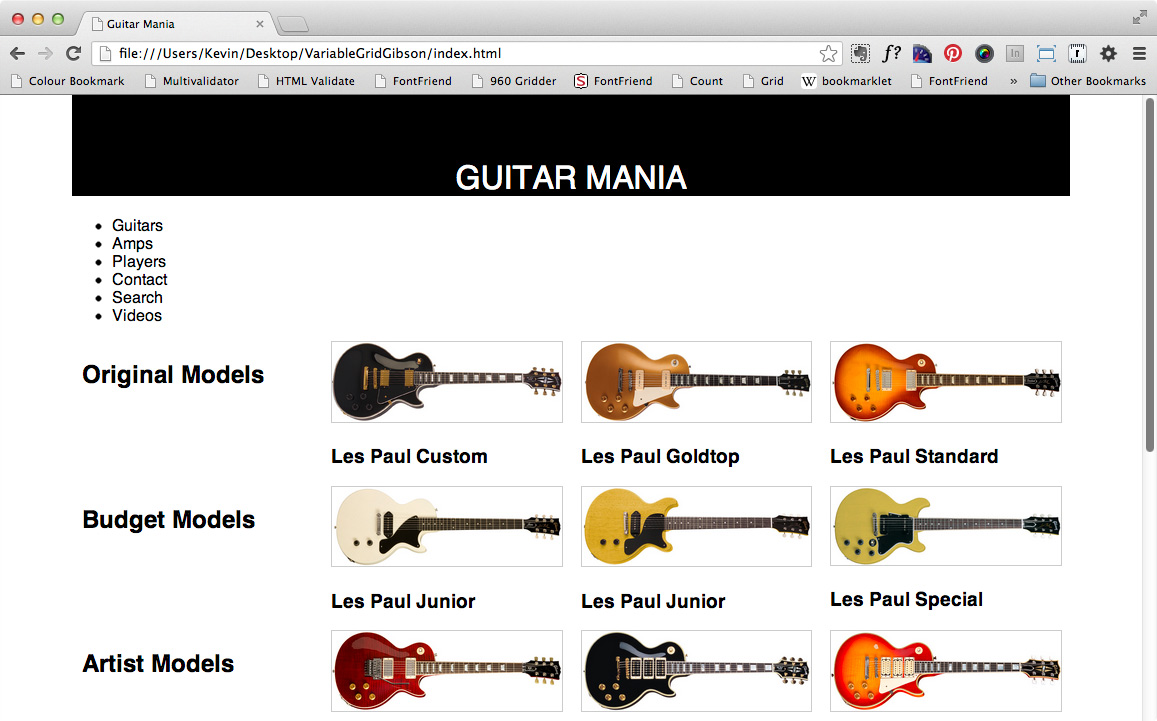
Now let’s style the h1 text. In your style.css file, add the following CSS;
header h1 {
  font-size: 2em;
  padding-top: 2em;
  margin-top: 0;
  font-weight: normal;
  background: black;
  color: white;
  text-transform: uppercase;
  text-align: center;
}
Test your HTML page. It should look like this:
In your HTML, add to your h1 two classes:
<h1 class="grid_3 push_9">Guitar Mania</h1>
Test your page. It should now look like this: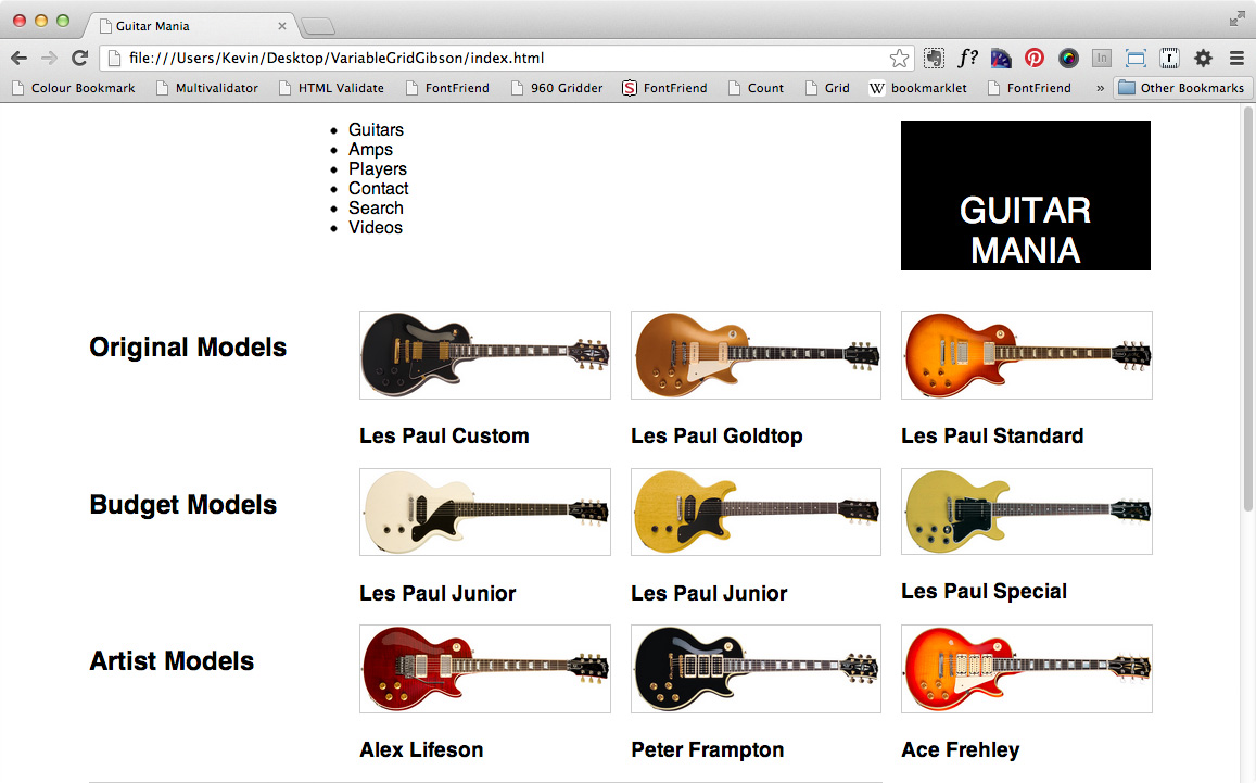
So now our H1 is taking up 3 columns, like each of the guitar boxes.
About That Menu…
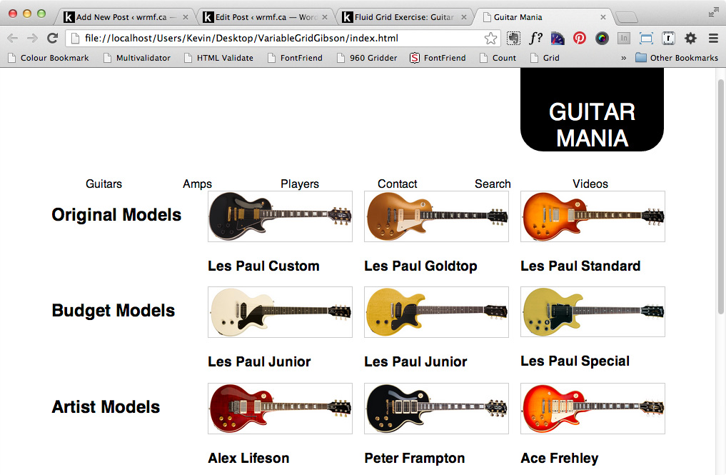
Notice how the menu came up?
This is owing to the use of the push_XX classes. These classes use positioning to move elements over. But when an element is positioned, it is removed from normal flow: it is as if other elements don’t know it is there anymore. The solution is to add a top margin to the menu that pushes it below the positioned element.
If that explanation doesn’t make sense to you, there’s an alternate approach we can take, which doesn’t use CSS positioning and is therefore conceptually easier.
- Remove the classes on the H1
- Wrap the h1 in a DIV.
- Add two classes (grid_3 & prefix_9) to that DIV.
- Add a grid class to the menu to make it take up 12 columns
The result would be this code:
<div class="grid_3 prefix_9">
<h1>Guitar Mania</h1>
</div>
<nav class="grid_12">
<ul>
	<li>Guitars</li>
	<li>Amps</li>
	<li>Players</li>
	<li>Contact</li>
	<li>Search</li>
	<li>Videos</li>
</ul>
</nav>
The prefix_XX classes add columns of padding. We couldn’t add a prefix class to the h1 itself, because it has a background-color. Since background-color extends into the padding of an element, that would have made the h1 appear to span all 12 columns, rather than the 3 we want it to.
We have six menu items, luckily. This means that we can use grid_2 classes on the LI elements. If we didn’t have a number that went into 12 evenly, we’d have to do some math.
Tweak the H1.
Add the following to your h1 style:
border-bottom-right-radius: 16px;
border-bottom-left-radius: 16px;
This will give you rounded bottom corners on your main site name.
Does it look perfect now? Nope:
Style the Menu
Let’s add a background color to the menu. In our style.css file, add the following
header nav {
  background: black;
  color: white;
}
Test your file. It will look like the menu has disappeared. But it hasn’t. What’s happening here is common when you use floated elements. Open up the fluid_grid.css file. Notice how all the grid_XX classes have float:left as one of their properties?
Specifically, if all the children (or the last children) of an element are floated, the parent element will appear to shrink (ie backgrounds will disappear and borders will collapse).
The secret to fixing that is to use the clearfix hack.
For an explanation of clearfix, read this.
Copy the clearfix from the page linked to above, or from one of the many others that discuss this hack. Paste it into your style.css file.
Apply the clearfix class to the UL that’s inside your NAV.
More Tweaks: Typography & Margins
Let’s add some Google fonts. Go to https://google.com/webfonts and choose some fonts. ( If you don’t know how to do that, read this.)
Be sure to choose the CSS way—using an @import directive—rather than the html way.
I’ve selected two fonts and will add them to my stylesheet by pasting into the top of my style.css file the @import statement generated for my font choices at google:
@import url(https://fonts.googleapis.com/css?family=PT+Mono|Oswald:700,400);
Specifically, I choose PT Mono and Oswald.
I won’t go through the values I used here. Rather, you can figure them out from this screenshot, or style to your own tastes.

A Task For You: More Content
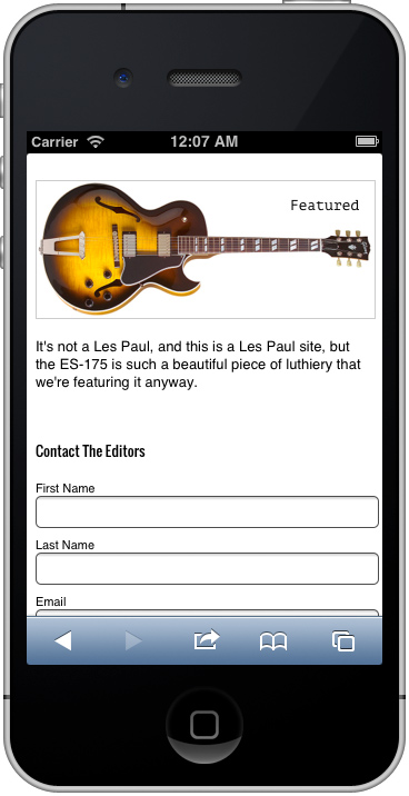
Note the additional content in the screenshot above. Please add it in. The image is of a Gibson ES-175, which you can find in the images folder. The h3 that goes with the image says Featured and the paragraph below that says:
It’s not a Les Paul, and we’re a Les Paul site, but this Gibson ES-175 is so gorgeous that we decided to feature it anyway.
Beside that is a form entitled Contact The Editors, with fields for First Name, Last Name, Email, and Comments.
The submit button uses a CSS gradient.
Our Last Task: Responsive Design
It may sound funny that after all these steps with the desktop design, I can actually claim to be following a Mobile First methodology.
But I am.
To demonstrate, I would like you to do two things:
First, add the following to the head of your html document:
<meta name="viewport" content="width=device-width, initial-scale=1">
As you probably know (depending on which class you’re in, or whatever background you bring to this task), this will force the mobile device to not scale sites down on the assumption that they’re all 960px.
Secondly, change the <link> to your fluid_grid.css file in your index.html page. Specifically, add the following attribute
media= "screen and (min-width: 800px)"
So the whole line will be
<link href="css/fluid_grid.css" media="screen and (min-width: 800px)" rel="stylesheet">
From the Mozilla Developers Network, more information on why the viewport meta tag is required.
Test your page in the Apple mobile simulator. Or test it on your phone by uploading it to webspace and then going to that URL on your phone.
You’ll notice that a chunk of your layout is already done. Here’s what the bottom of the layout looks like:
What Did That Actually Do?
The way we used the media query technique above was to load the grid-styles.css file only if the browser width was 800px or higher.
Why did I choose 800px? By resizing my browser window and looking for points at which the design started to break down. These are called breakpoints.
My breakpoint was approximately 800px.
So by not loading my grid_styles until the browser width was 800px or higher, I ensured that my layout would be only 1 (wide) column. In other words, all my boxes (being block elements like section, nav, ul, li, and the various headers) would exhibit their default behavior: taking up 100% of the browser width, and therefore stacking one after another down the page.
In my style.css file, however, I’d like to add some styles to target elements when the browser width is at less than 800px.
@media screen and (max-width: 800px){

header nav ul {
  font-size: 1em;
  line-height: 2em;
}

h2 {
  font-size: 1em;
  line-height: 1.5em;
  background: black;
  color: white;
  text-align: center;
  font-weight: normal;
}

section div {
 position: relative;
}

section h3 {
  position: absolute;
  right: 1em;
  top: 1em;
}

nav ul li.grid_2 {
  width: 50%;
  margin-bottom: 1em;
  font-size: 1em;
  color: black;
  text-align: center;
  float: left;
}

header nav ul{
background: white;
}

} /* END 800px QUERY */
More on media queries, from CSS Tricks, a great web resource.
Another thing we could do is shrink the H2 type a bit between 801px and 1024px so that the category headers don’t look out of proportion to their associated story sections. Here’s the query: I’ll let you discover appropriate values.
@media screen and (min-width: 801px) and (max-width: 1024px) {

}
What About Internet Explorer 8?
Good question. At this point in time, you will likely decide not to support IE8 anymore. After all, Microsoft doesn’t support versions under IE11 anymore. Usage data for each browser is available at caniuse.com: click on the SHOW ALL button, then hover over each browser version you want to know the usage stats for. At the time of writing, IE8 is near .5% in global usage.
However, if you did need to support IE8—imagine you’re making a site for a political candidate, for example—there are fairly simple workarounds.
Internet Explorer before version 9 doesn’t support media queries.
Recall that we used the media attribute on the <link> to our fluid_grid stylesheet.
This means that people running IE on Windows XP will see a single column layout (the mobile first design, in other words) rather than the slick multiple-column extravaganza we’re giving to our non IE8-using friends.
Unless we do something. The fix is to use conditional comments, in order to serve the fluid_grid.css file to IE8 and below.
Add this to the head of your document. Put it just before or immediately after the more-complete link to the fluid_grid stylesheet that other browsers get.
<!–-[if lte IE 8]>
  	<link rel="stylesheet" href="css/fluid_grid.css">
<![endif]–->
This conditional comment is ignored by all browsers. IE 8 and below, however, read it as a directive to do something: in this case, to load the fluid grid styles. This would mean that the grid system would be in operation regardless of browser width, but it’s better than nothing.
CSS-Tricks.com, among many other sites, has more information on using IE Conditional Comments to serve IE-specific stylesheets.
If decide not to support IE8, you can use conditional comments to inform the user of that fact and recommend other browsers such as Chrome or Firefox—more recent versions of which were supported in IE.
NOTE: since the variable grid system is often down these days, you can find a nearly-identical approach at Stephen Bau’s github repository.
Guitar images © Gibson Brands. Used with permission.