In this exercise, you will make a photo blog home page. Please download the starter files and the screenshots files.
There are three sections to this page: a header, a main area, and a footer.
The font used thoughout is the Google font Old Standard TT.
If this is a lab exercise and not a test, please make the HTML yourself using Emmet rather than using the HTML file supplied with this exercise.
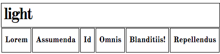
Header / Footer
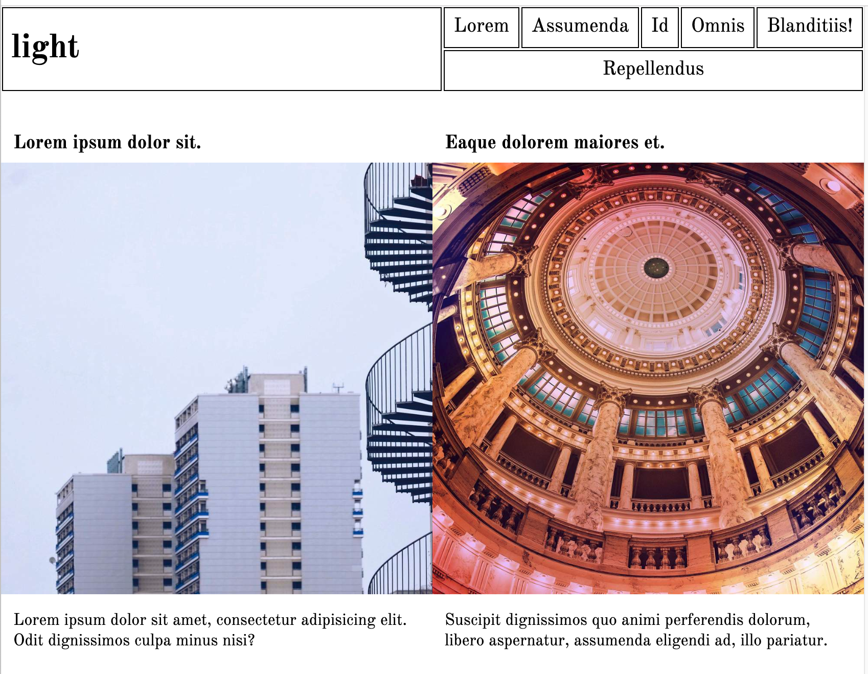
The header and footer look and behave almost the same way: the only difference is that the footer does not have the site name (light). In the header, the site name box will take 1/3, while the nav element will take 2/3. It will look like this at full width:
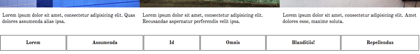
As the page width decreases, the header area will arrange itself like this:
In the footer, make the menu take the full width of the page (the screenshot is showing a small slice of the MAIN area, so you get a better idea of how the footer behaves in relation to it).
You do not have to make the items into actual links. Just focus on getting the layout correct.
Main Area
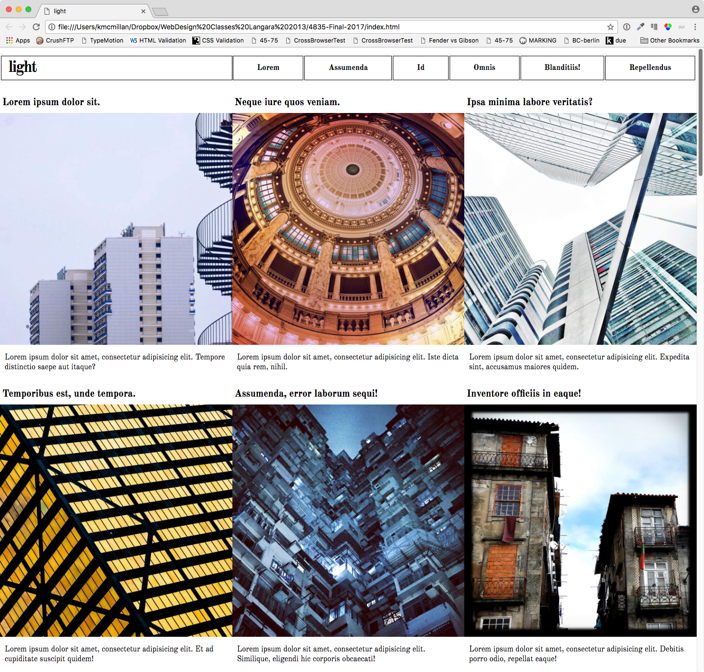
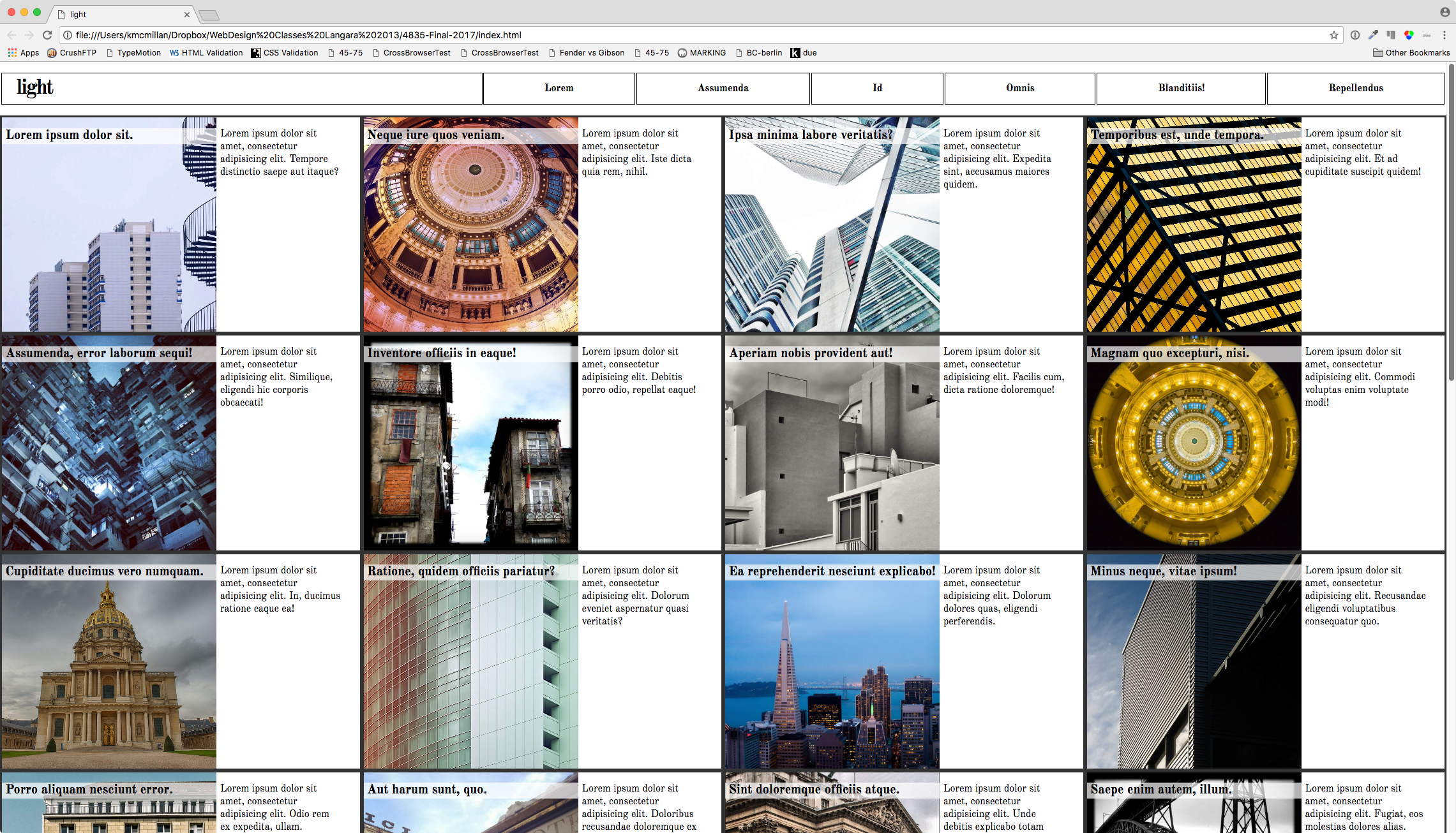
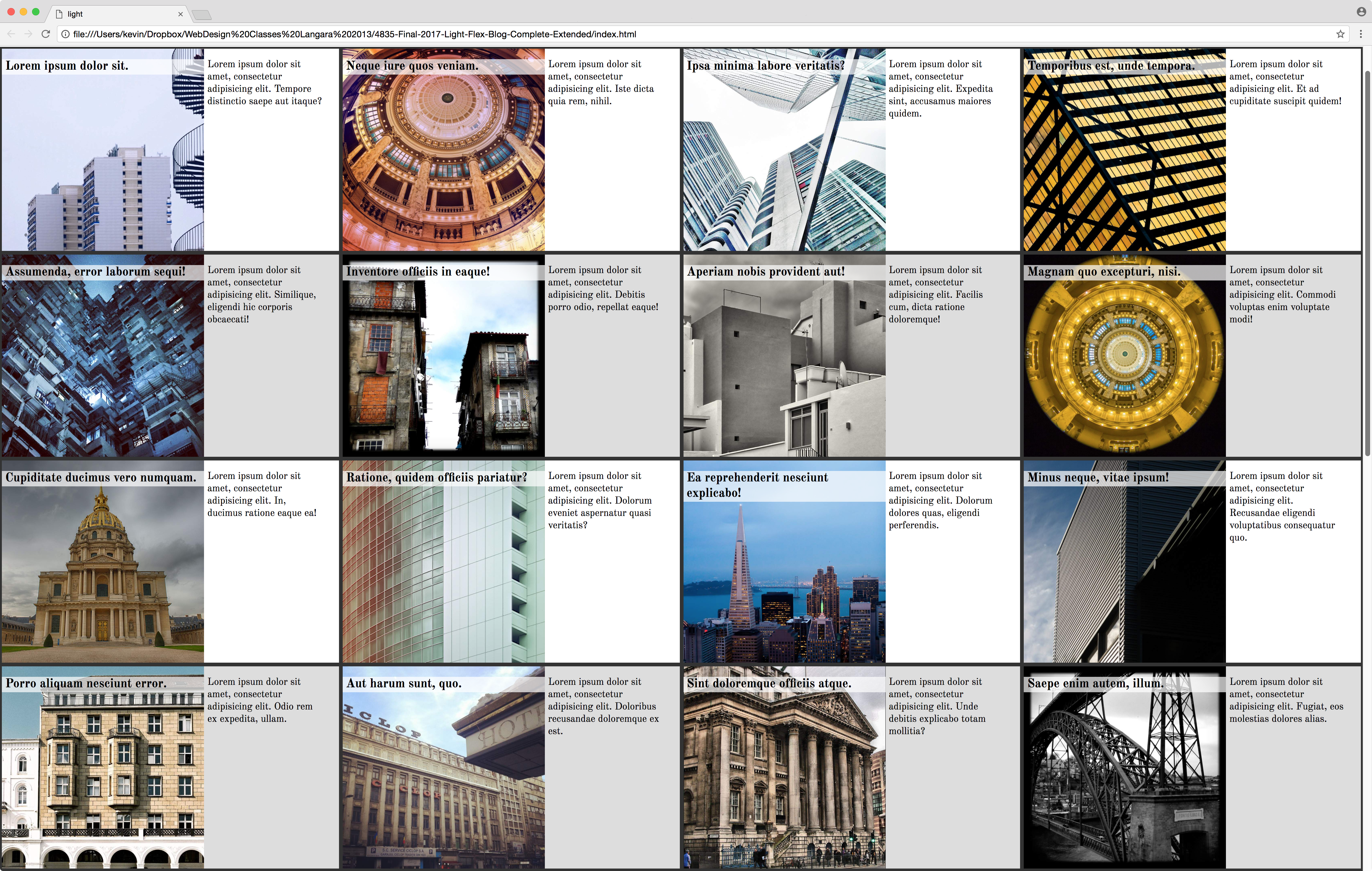
The main area consists of 30 articles. Each article has an h2, an image in a DIV, and a single paragraph.
There are four responsive states: small, medium, large, and extra-large. Click on any of the screenshots for a bigger view, or consult the screenshot files you downloaded from the top of this page.
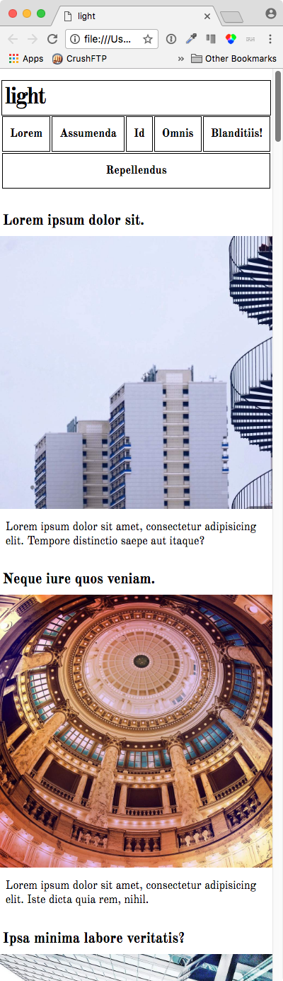
Medium
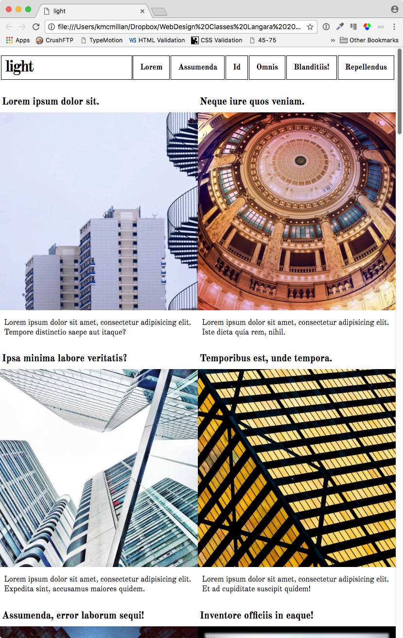
Large
Extra Large
Bonus Task 1
For a 50% bonus, figure out how to add a light grey background to alternating rows of articles, starting with the second row, without using classes or adding to the HTML.
Do not add the striping in single column view. Add it once the articles have rows of two, three, or four articles each.
Obviously, the striping must change with the responsive breakpoints.
Bonus Task 2
For another 50% bonus, make your header area go 50% – 50% (instead of the thirds split as originally done) when the main area is arranged in two columns, with the elements arranging like in the screenshot below:
All images in this exercise are from Flickr, with creative commons licensing. Attributions are here.